La Puerta

Second year GMD student, Alex Gabriel Oquendo, describes how he developed a new brand identity for a client.
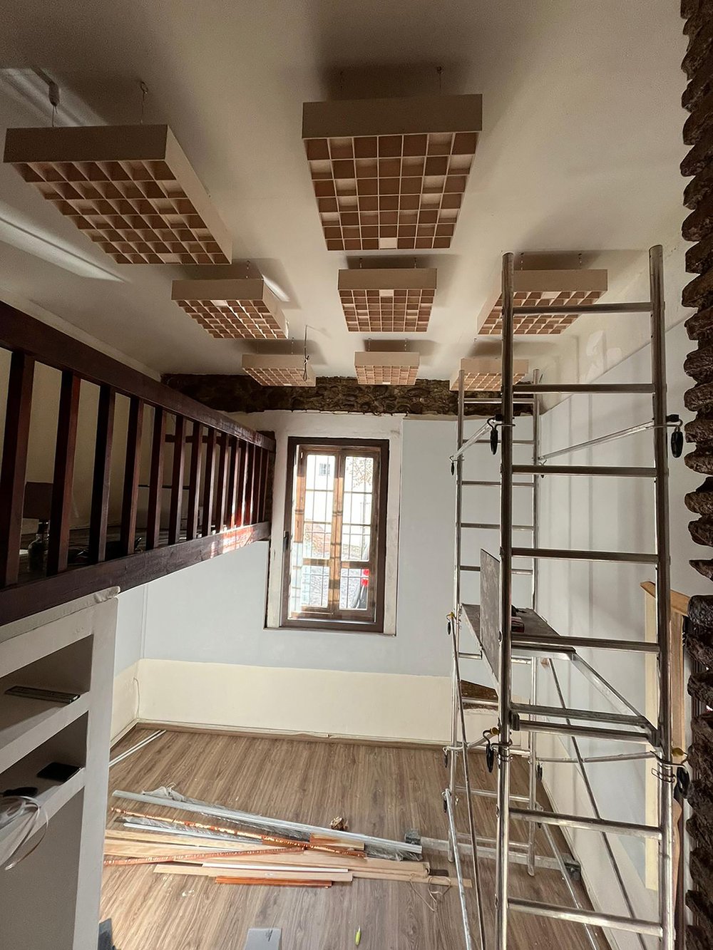
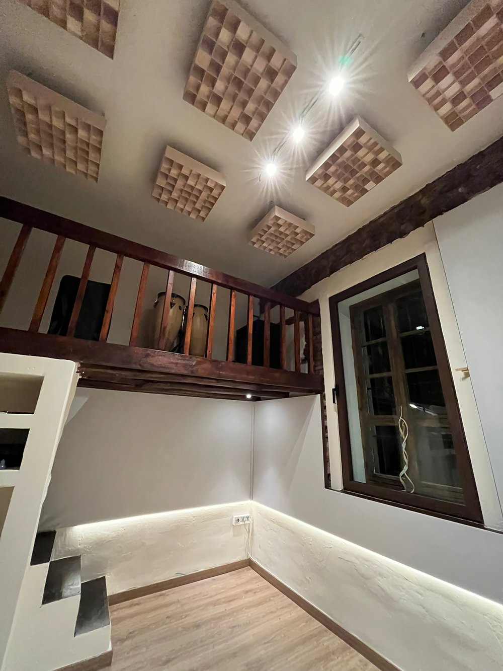
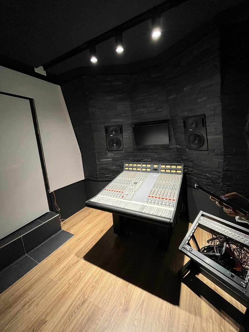
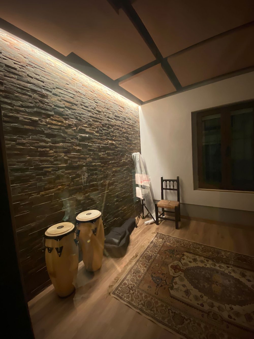
During the second year of my GMD studies I was working remotely, designing and furnishing a recording studio in Granada, Spain. Through this job I was given the opportunity to design the studio’s visual identity. Since I was familiar with the space and the people I was working with, it was relatively easy to identify how my clients wanted to present themselves and how they wanted to be perceived visually.
I began my design process through research. I identified visual musical elements that every musician would recognise, and that could inform my design; like a pentagram, musical notes and VU meters. Next, I began analysing the space and context of the studio, gaining lots of inspiration from the architecture, and the location. The studio is situated in the Albayzin, a neighbourhood with a rich history. To enter the space you have to walk through a massive wooden door. Without a question, the most unique design feature of the studio, had to be incorporated in the design.
Thanks the development of the design, we collectively decided to name the studio “La Puerta” (The Door).
Instagram: @alexoquendo.arts
