Ambra Liu
Email address
moc.liamtoh@uil_arbmaWeb Portfolio
www.instagram.com/ambraliu.designBiography
Hi! I’m Ambra, an Italian-born Chinese graphic designer, now based in London. I enjoy every aspect of this field, and especially have a strong interest in branding and identity design, editorial design and visual communication. I strive to create works that are concrete (non-abstract), that have a clean design and effectively deliver the message.
Portfolio
Mondrian Reinterpretation
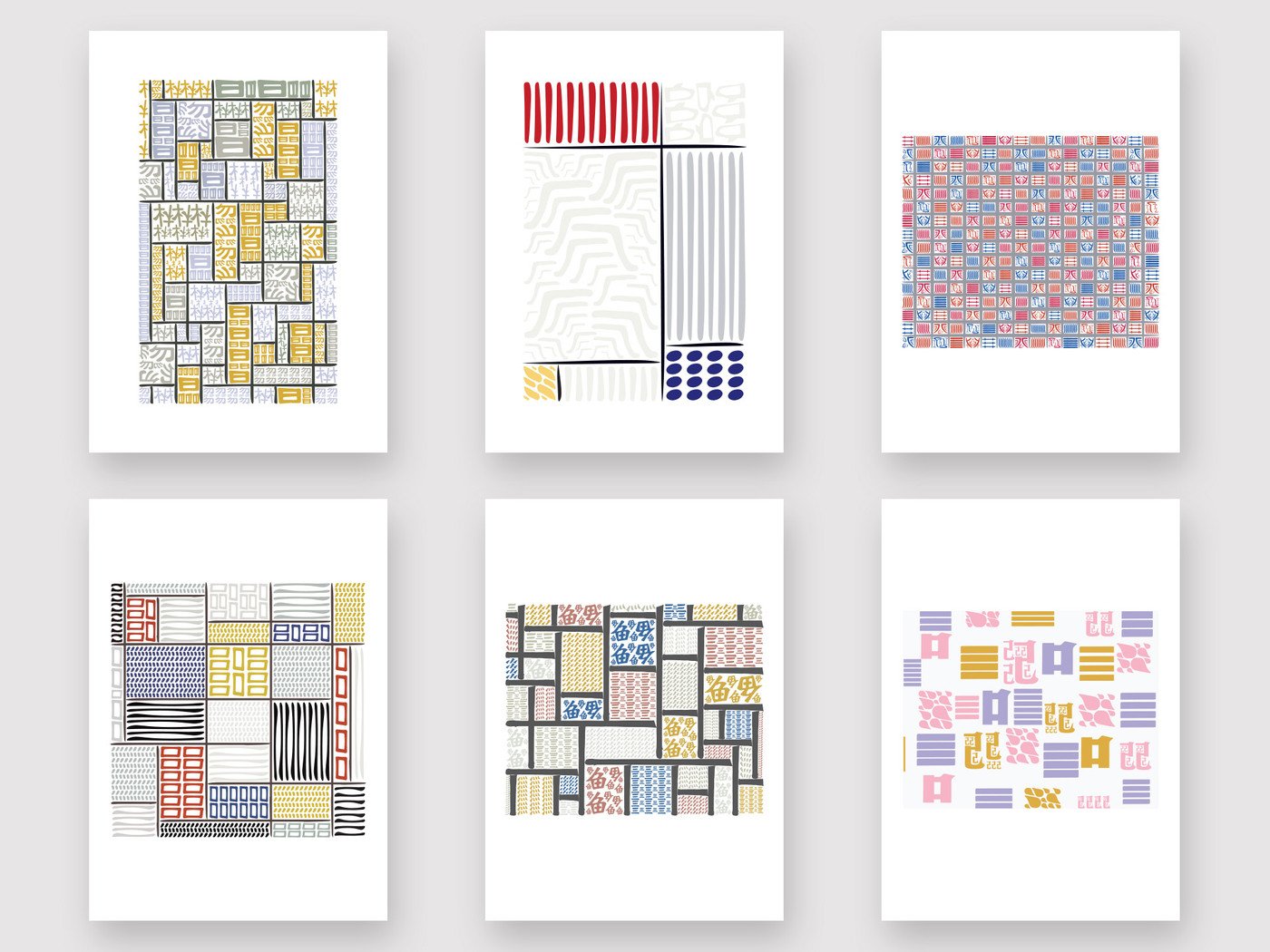
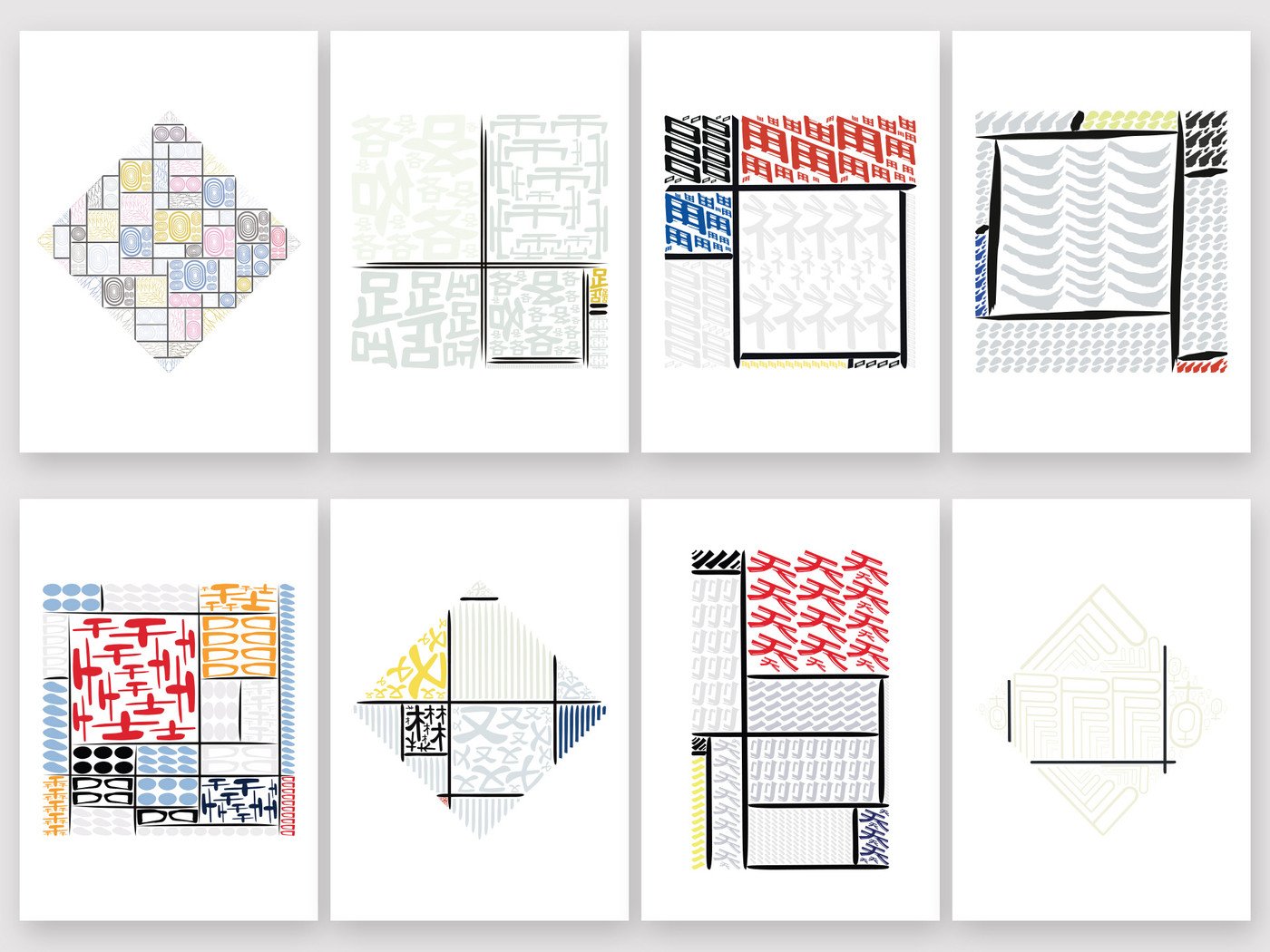
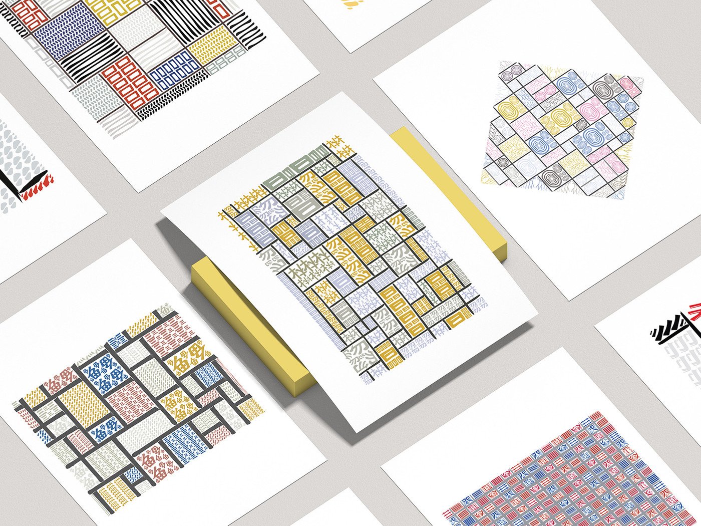
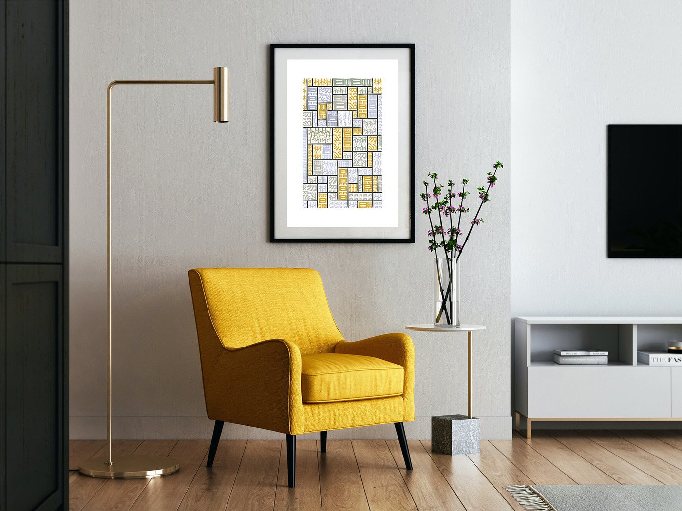
This project aims at exploring the beauty of Chinese characters, how they can be complex yet so simple; by breaking them into pieces and using the fragments generated, I reinterpreted Piet Mondrian’s artworks produced during the De Stijl art movement, that went from 1917 to 1931.
The reason why I chose this particular artist and this particular period of time, is because I think there are many similarities between the principles of this movement and Chinese characters. The De Stijl movement “posited the fundamental principle of the geometry of the straight line, the square, and the rectangle, combined with a strong asymmetricality”; Chinese characters came a long way to be what they are now, very simple but, at the same time, very complex symbols. A lot of characters are made of geometrical shapes (squares, rectangles, circles) and lines; and although some have lots of shapes and are complicated to write, they still look very clean and minimal.
The final outcome of this project consists of a series of 14 posters / prints.
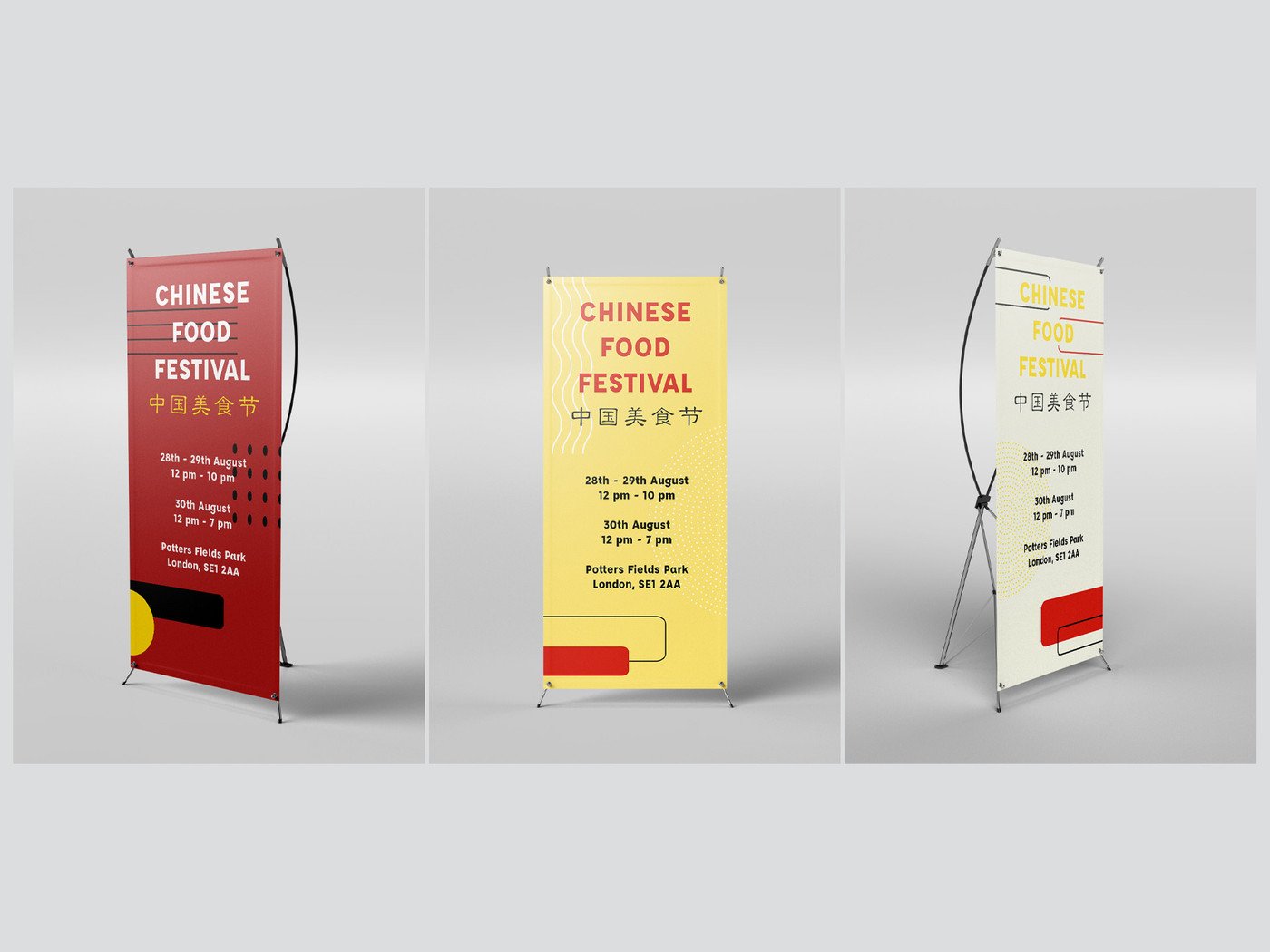
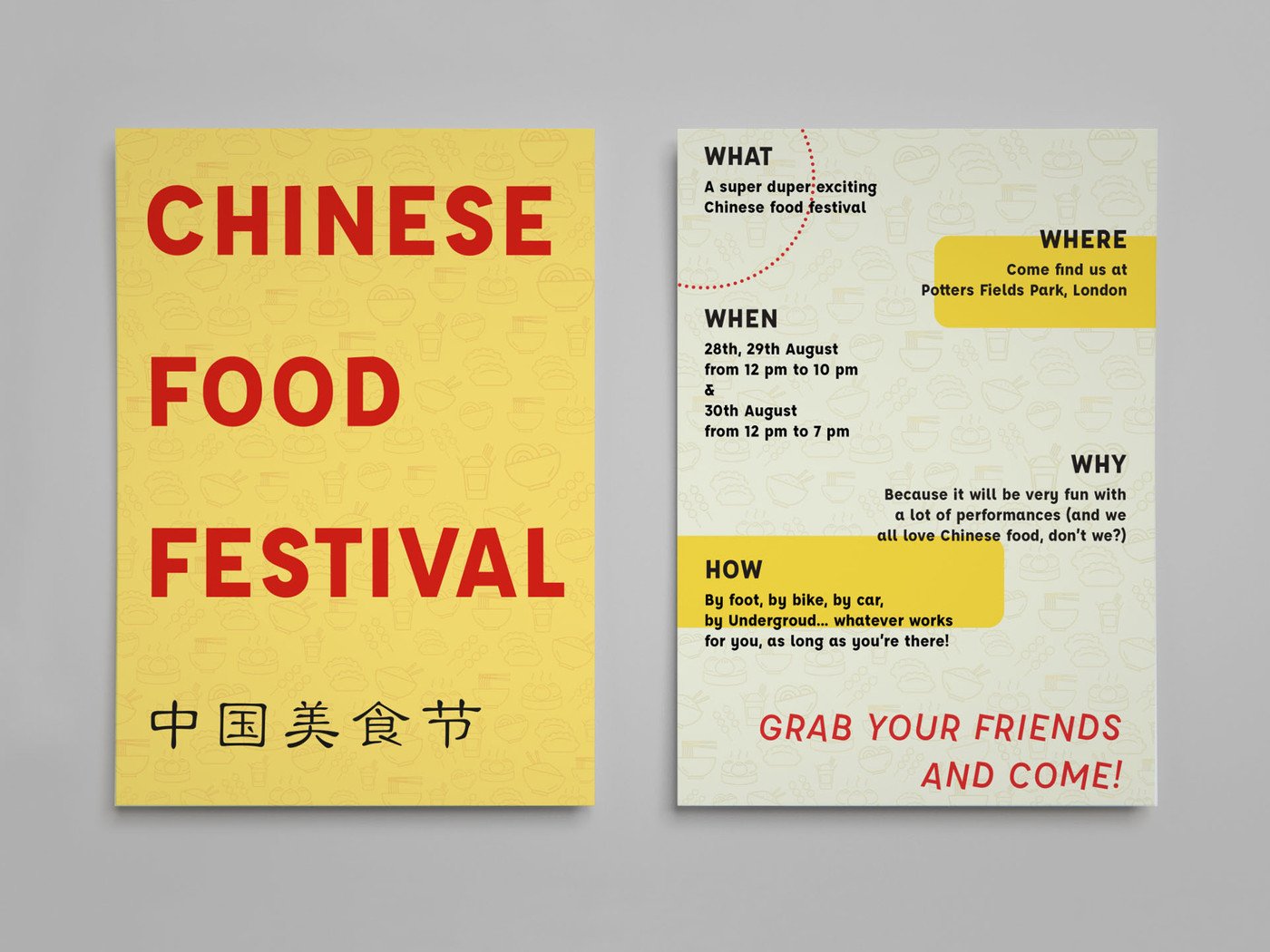
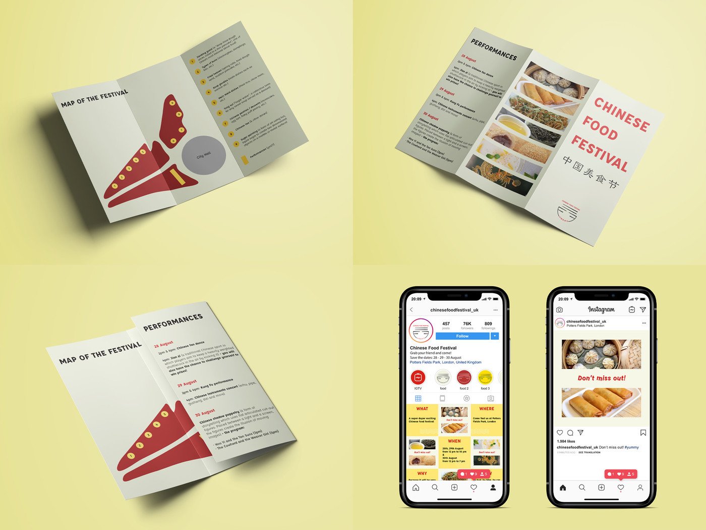
Mainstage - Chinese Food Festival
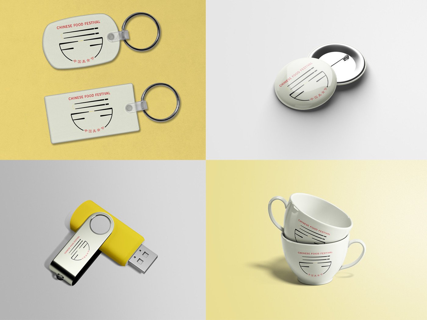
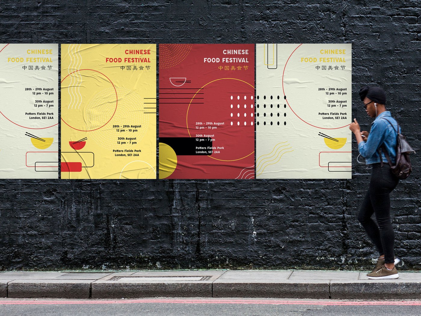
The Chinese Food Festival is a conceptual festival which purpose is to spread the beauty of Chinese culture through food. Held at Potters Fields Park, a small public park located south-west of Tower Bridge and south-east of City Hall, London, this three-day festival marks the end of the summer and occurs during the last days of August.
The main activity of the Chinese Food Festival is obviously eating a lot of food, but a series of performances are also provided to entertain people and to bring the audience into this beautiful culture.
My idea is to convey a festival that is tied to the ancient core but has a modern touch.
Visual Thesis
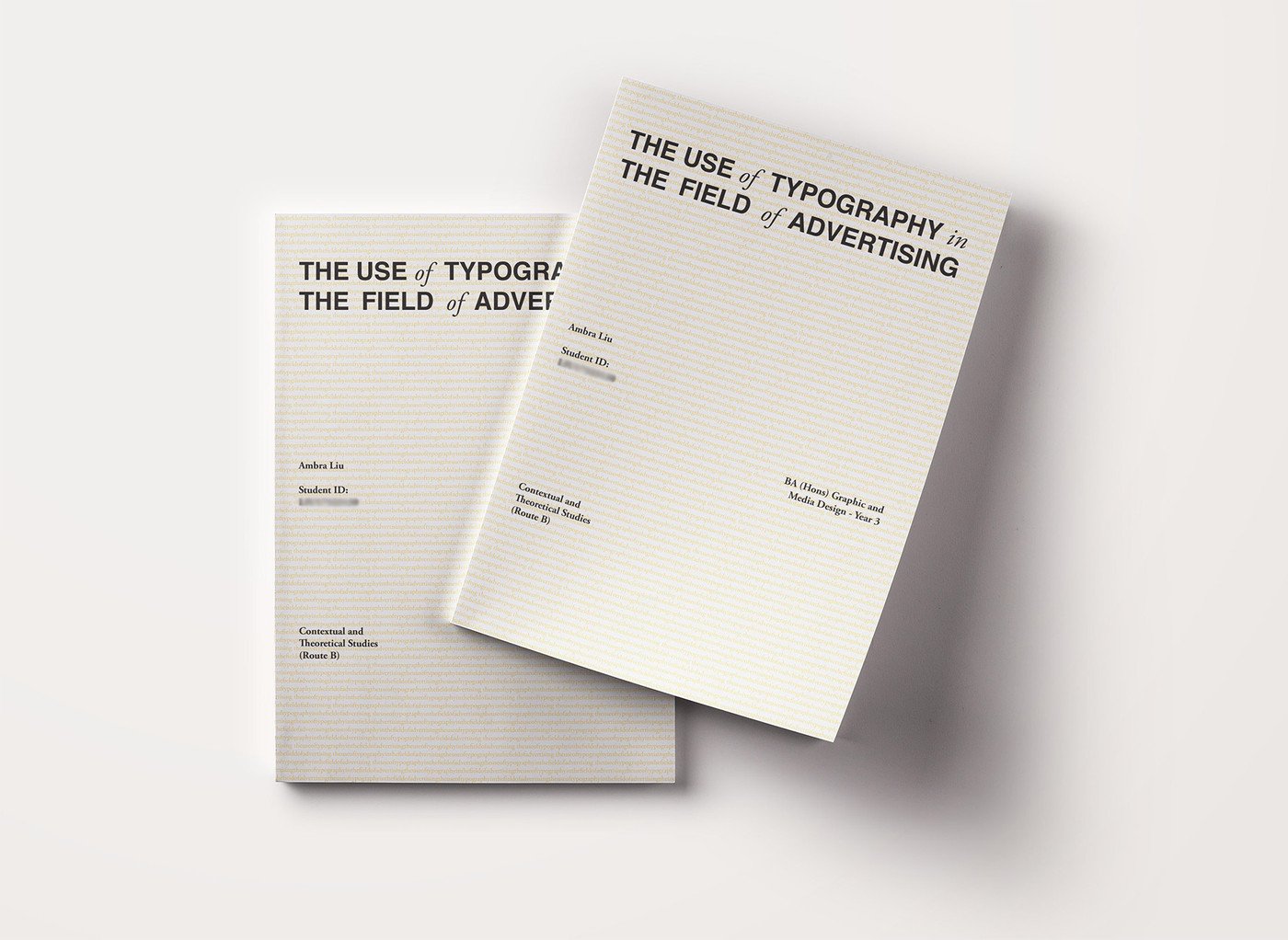
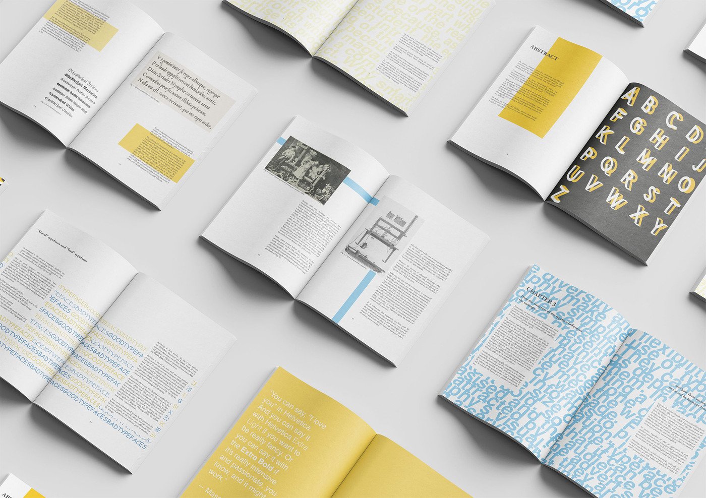
For the designed version of the final thesis, I produced an editorial piece.
My idea was to create an outcome that is in line with the topic of the thesis (typography in advertising). One of the reasons behind this choice is because, as a graphic and media student, the editorial design field has been introduced to me since the beginning of the course, but the main reason is because I wanted to present a sort of magazine, a smart tool through which a company can advertise its product. Why smart? Firstly, because it has a long lifetime and requires almost no maintenance: for instance, a magazine at the hairdresser is probably kept for a long time, which means that it has been viewed by more than one client and that the ads inside this publication have been repeatedly noticed.
I used colour palettes that could enhance the involvement of the reader – yellow and blue were used as the main colours: they are two colours that go together well: the former brings warmth and optimism, inspiring us to feel positive and look to the future with renewed hope, while the latter calms the boundless yellow and adds some responsibility and tranquility into the mix.
