Annabel Schick
Email address
ku.oc.liamtoh@kcihcs.lebannaBiography
I am a graphic designer looking to take on new challenges and work with other professionals to create new and compelling design responses to briefs. I love to work on projects that have some form of social impact and that work towards social change. During my degree, my work has focused on designing communicative systems and concepts. This has included creating protest movement *British When it Suits to designing my thesis: Brexit, Lies and Propaganda.
Portfolio
Brexit, Lies and Propaganda
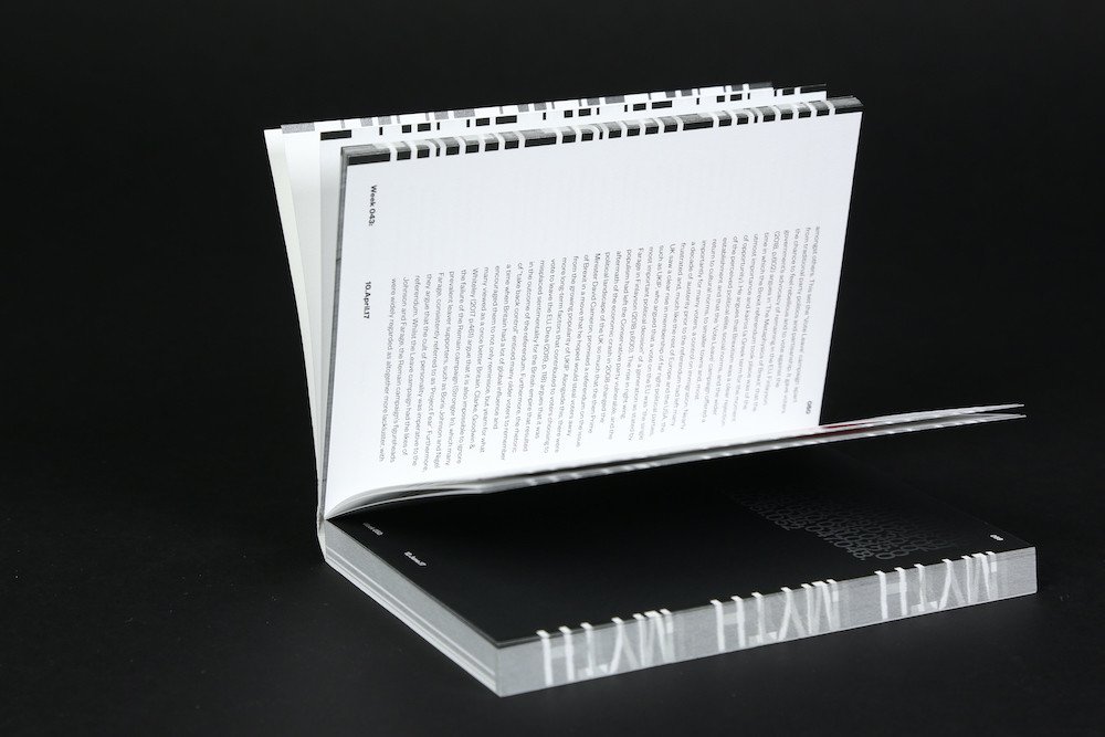
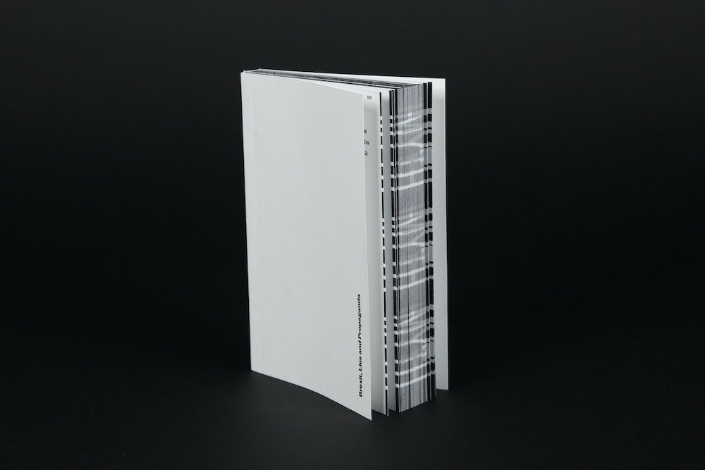
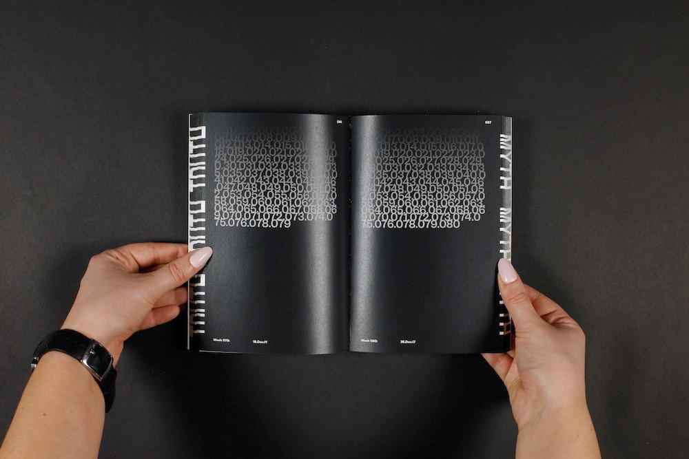
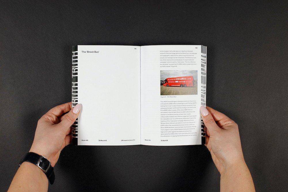
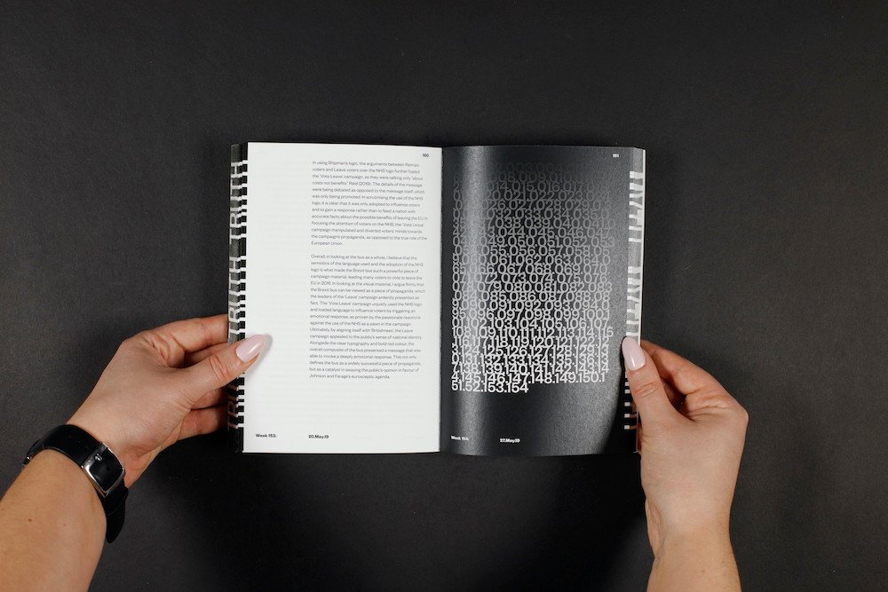
A visual response to my written thesis: A semiotic analysis of the visual language and media of the 2016 'Vote Leave' campaign, and how this can be read as propaganda. The main body of the book contains as many pages as there have been weeks following the referendum, showing the lingering presence of Brexit and how it continues to consume UK politics. On the pages containing the text of the thesis, white space is used to reflect the divide in the country and the proportion of the referendum result, with around 52% of the page being used and the other 48% being left blank. Finally, on the fore edge spine of the book, I have chosen to represent the dichotomy between truth and myth, as these words become visible depending on which direction you bend the book to show the hidden message, much like the concealed messages of the pro-Brexit campaign.
24 Point
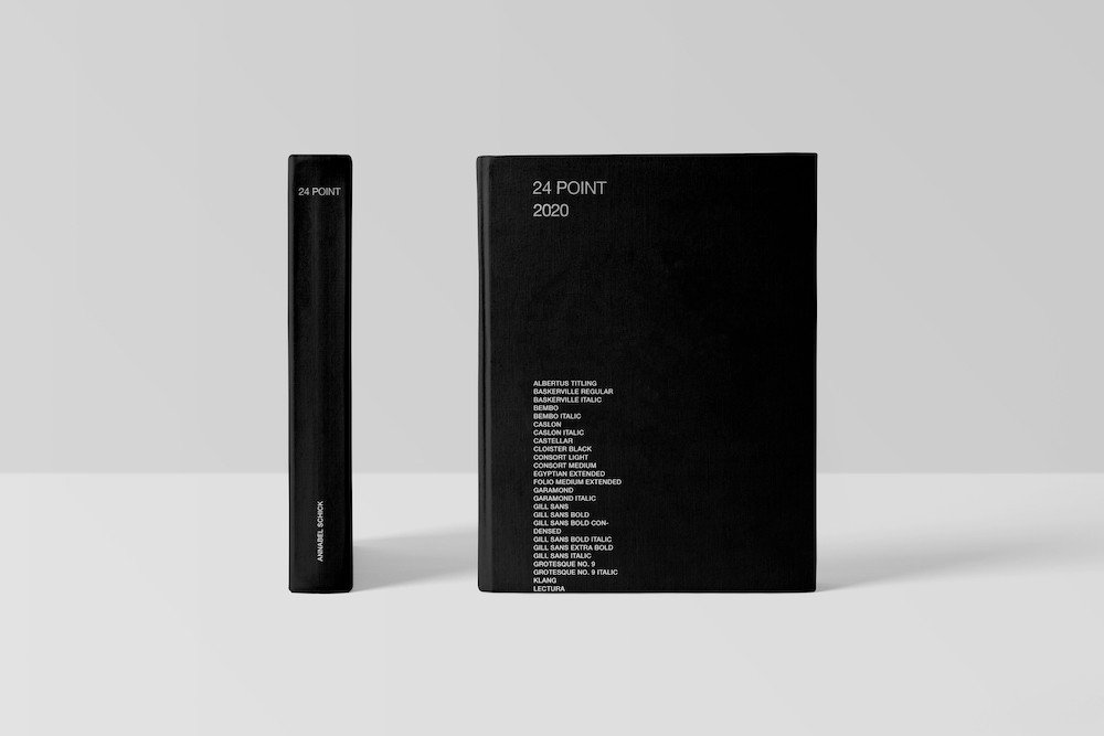
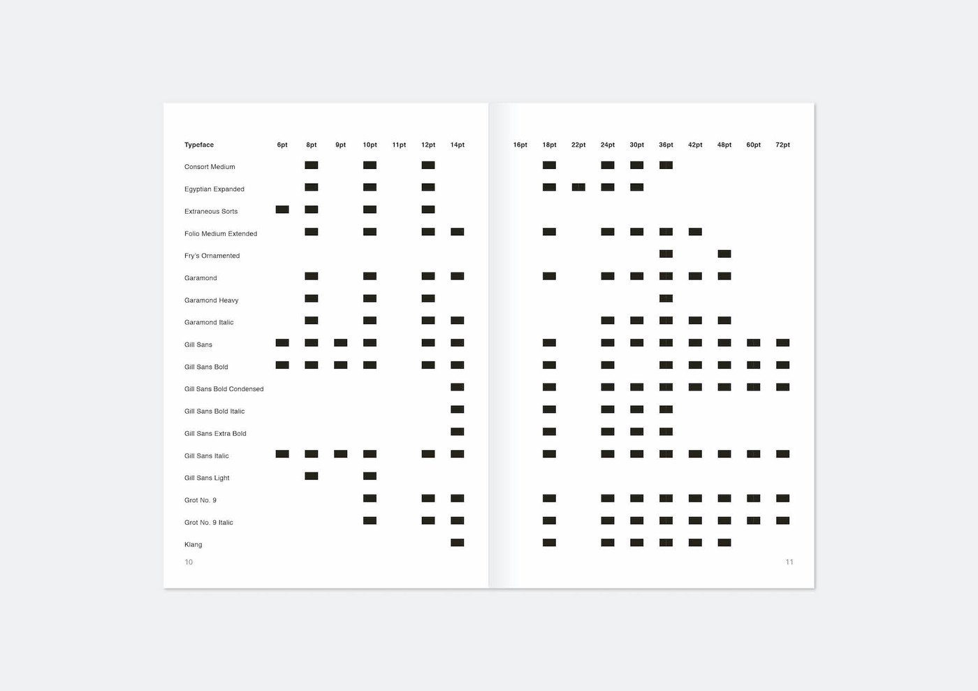
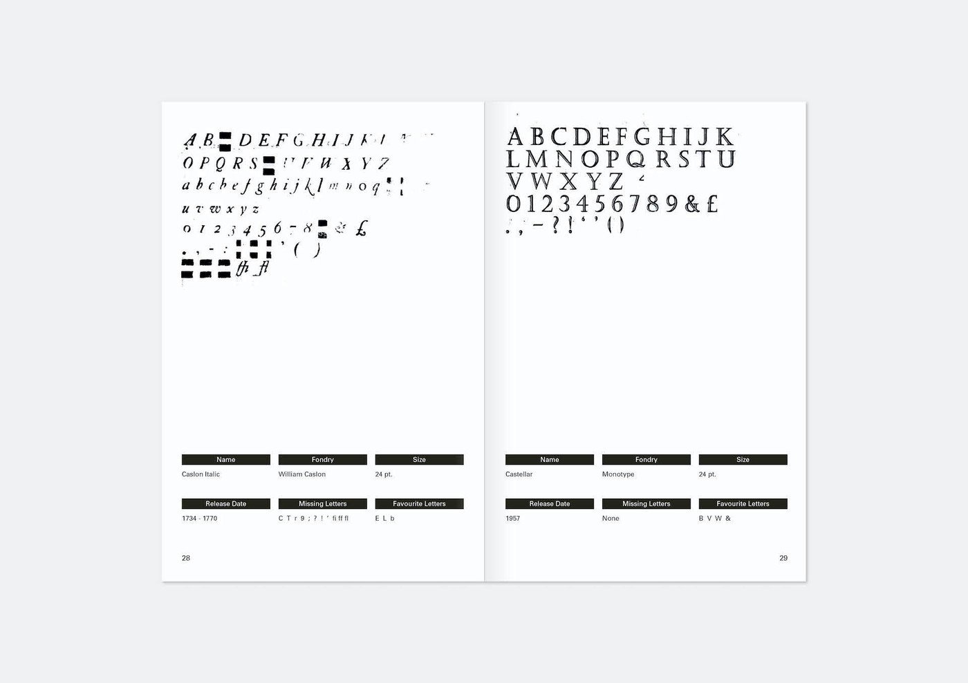
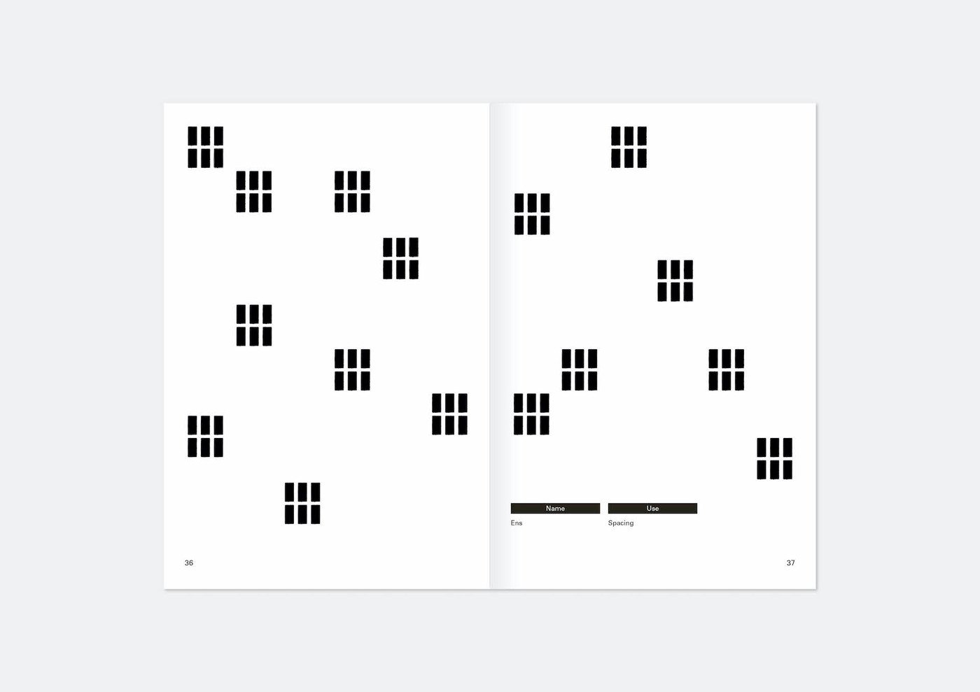
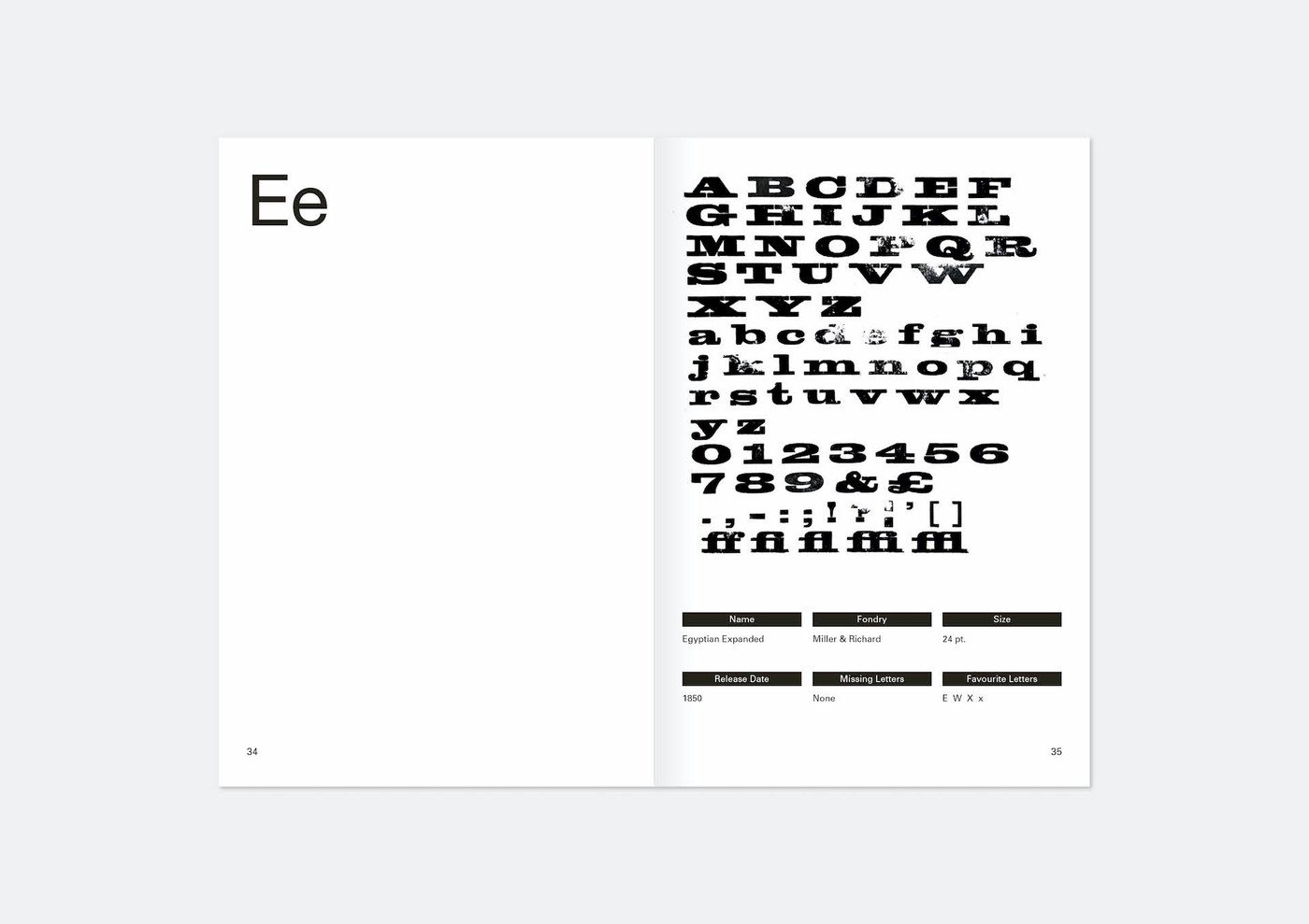
This publication explores all the lead typography, spacing, furniture and leading in the LCC letterpress workshop at 24 point. The LCC letterpress workshop is one of the most substantial collections in the UK. The lead type used in the workshop pre-dates to when the college was formally the London College of Printing, descended from the St Bride's Foundation Institute Printing School, established in 1894. The collection has missing letters, numbers and punctuation as the workshop has moved space over the years. In a few years LCC will be moving to a new building. With this comes the fear that the letterpress collection will not make the transition to the new building, with the university opting to focus its resources more on digital design, rather than traditional forms of printmaking. This publication captures the letterpress workshop in a moment of time and aims to catalogue this in the event that printing methods such as this are lost over the coming decades.
Women in Publishing (WiP)
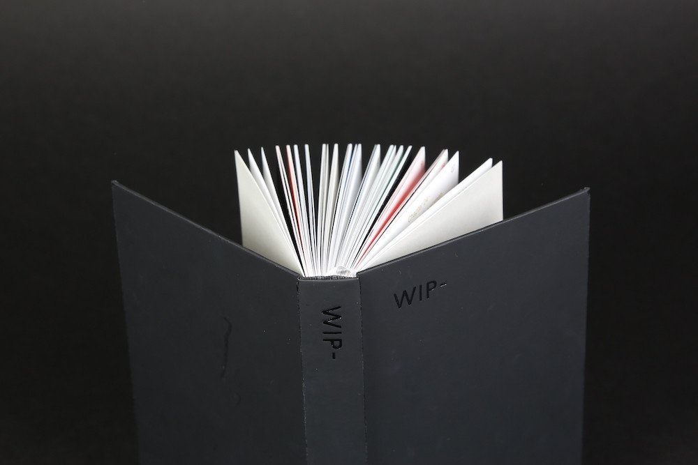
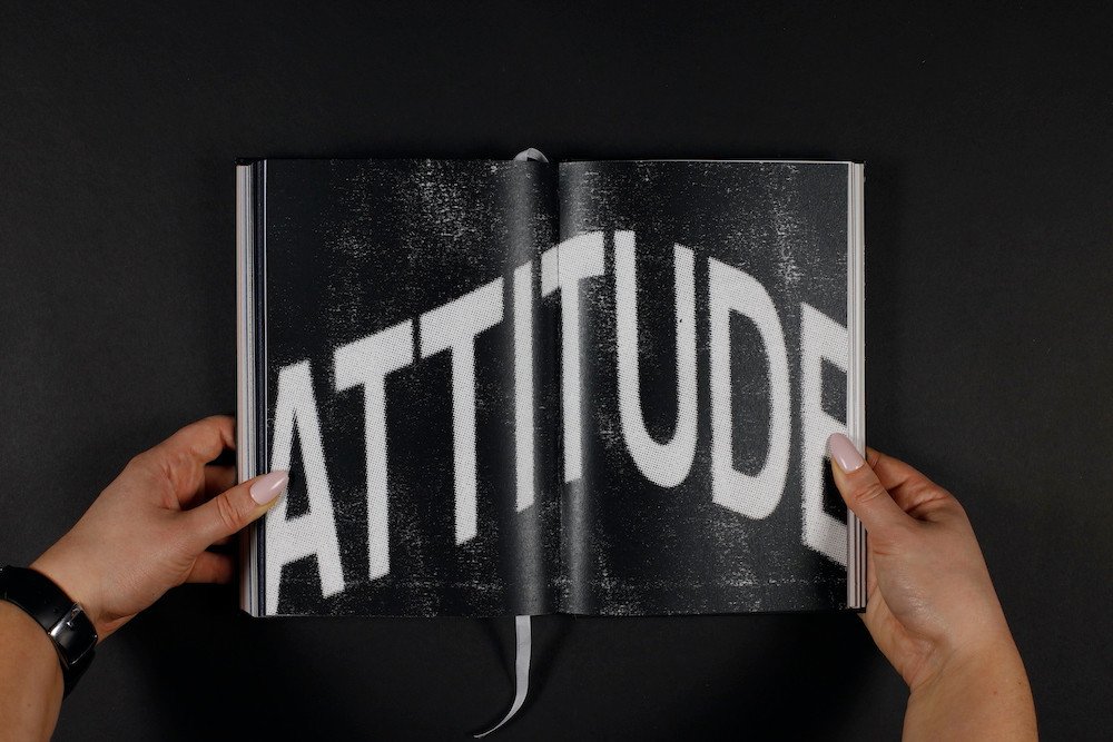
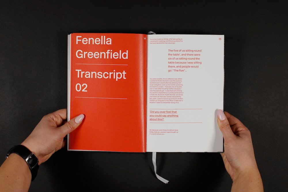
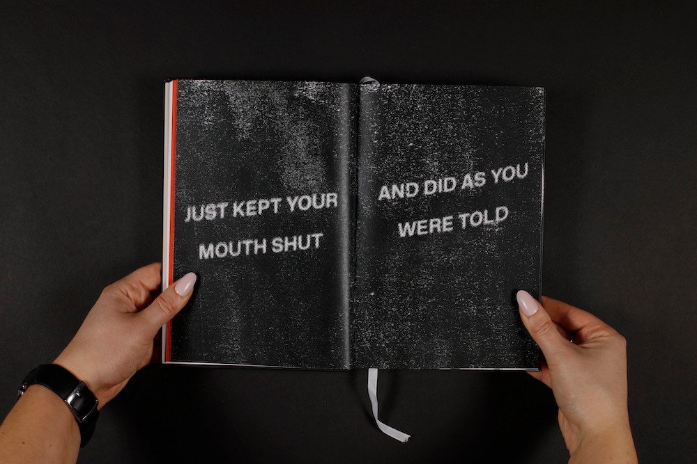
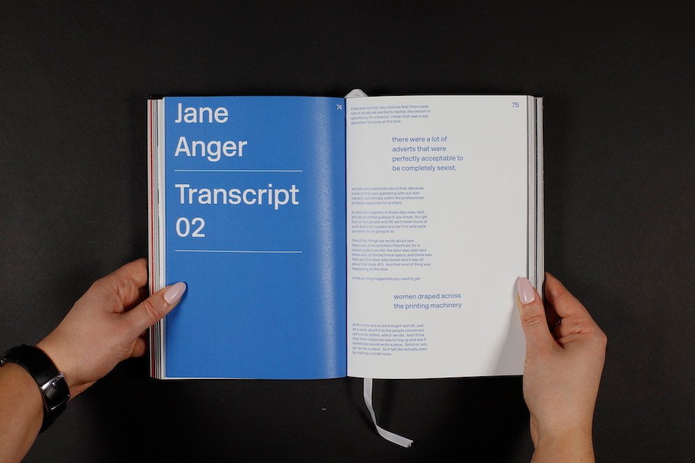
This publication worked to give a typographic representation to what was an oral history of the protest group Women in Publishing. The group aimed to change the publishing industry to improve working conditions, pay and more for women in the industry.
The Women in Publishing oral history aimed to create a permanent record of women who worked in publishing in the 1970s, 80's and 90's. Surviving records of WiP and women's experiences during this period have been lost or are non-existent. The project, found at https://www.womeninpublishinghistory.org.uk/ formed the basis of my project, in which I listened to the recordings and archival material about the movement, which led me to transcribe and design a typographic response to what I found, an incredibly moving movement. I would like to acknowledge all the women who campaigned for greater working rights in publishing, the WiP history website in which all of the interviews have been sourced, and the interviewees that have been used in the creation of this publication.
