Binling Lim
Email address
moc.liamg@mil0gnilnibWeb Portfolio
binling-lim.squarespace.comBiography
Hi, I'm Binling! I'm a Malaysian multi-disciplinary designer, specialising in graphic design and illustration. I have a particular love for visual communication and storytelling. I have an interest in exploring digital interactivity and the ways in which design practices create meaningful and immersive visual experiences. My work is driven by colours and a love for creating visualisations of imaginative worlds. I am currently based in London.
Portfolio
Convenience Store Woman
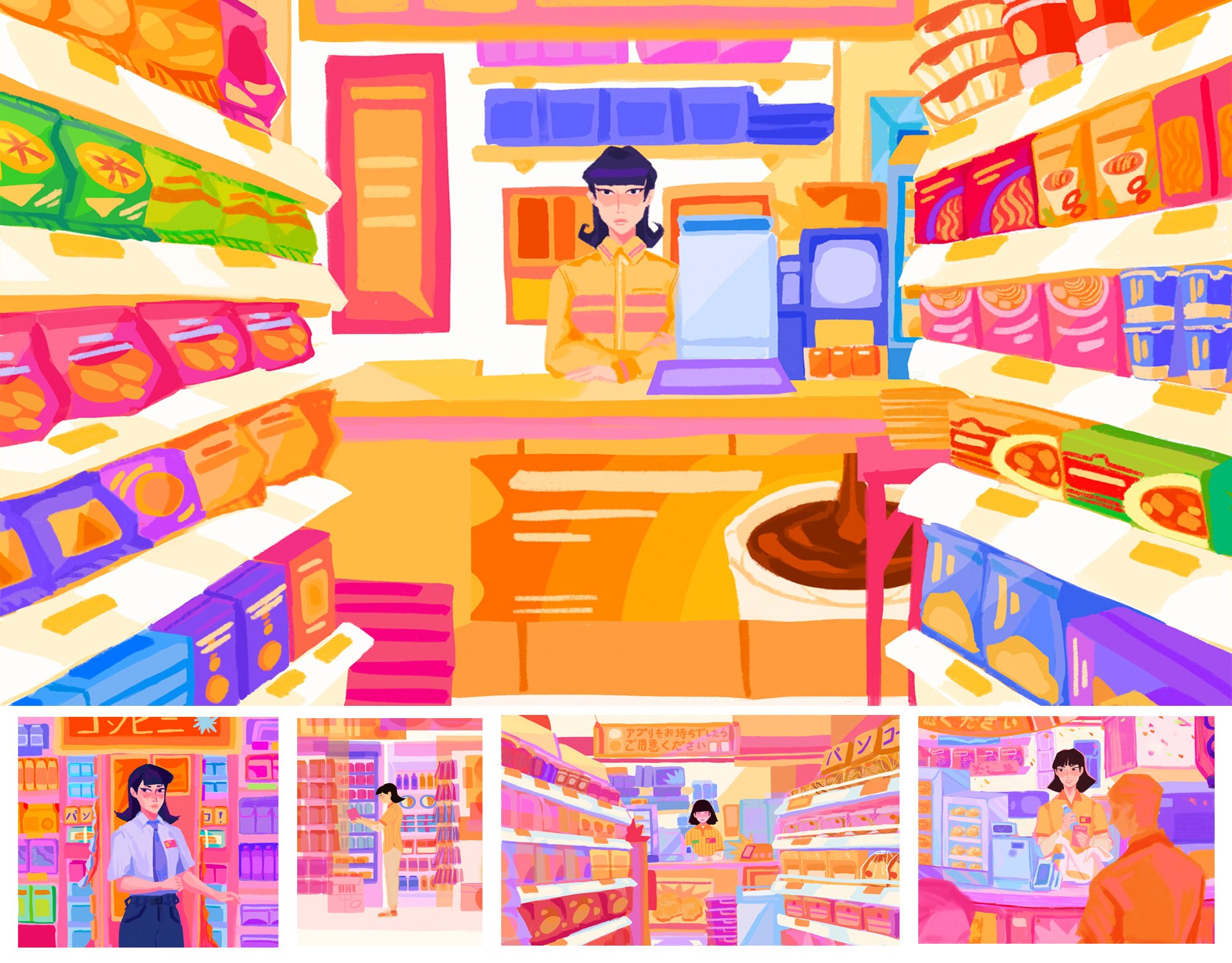
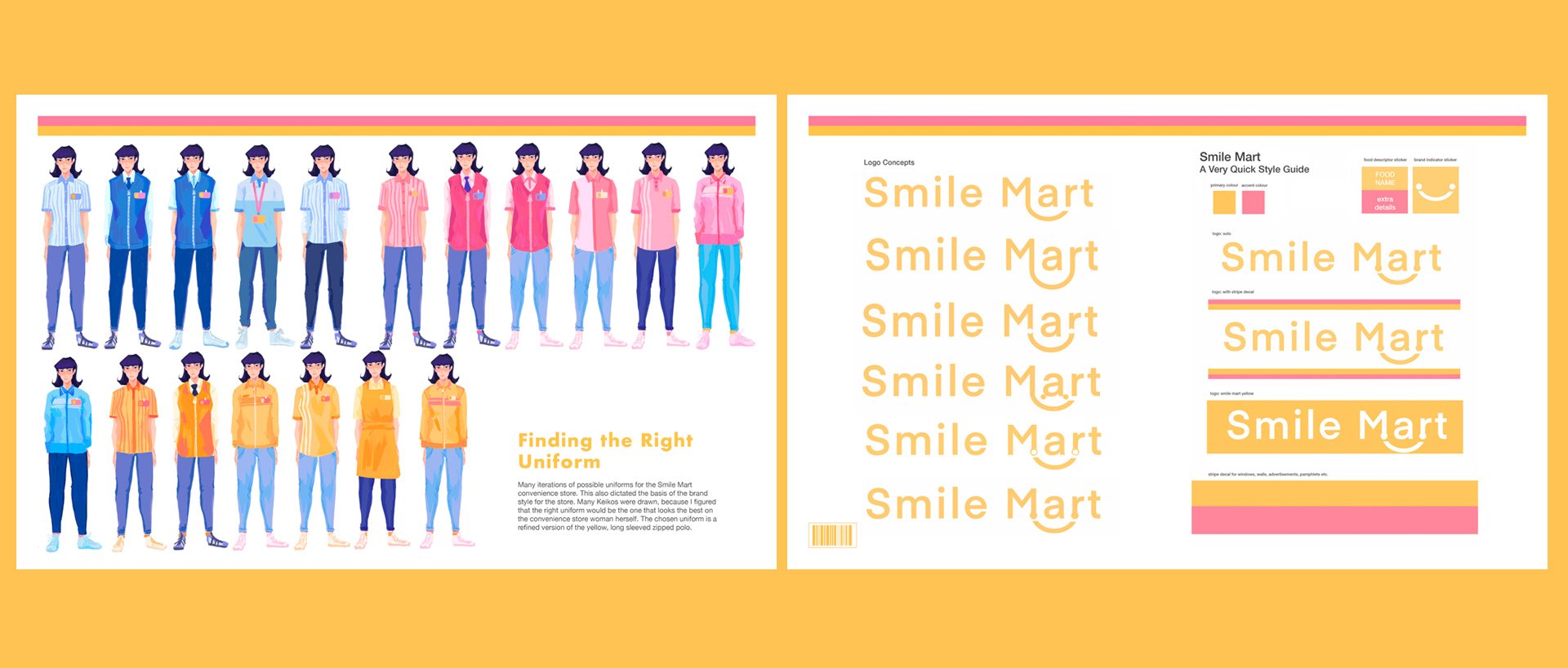
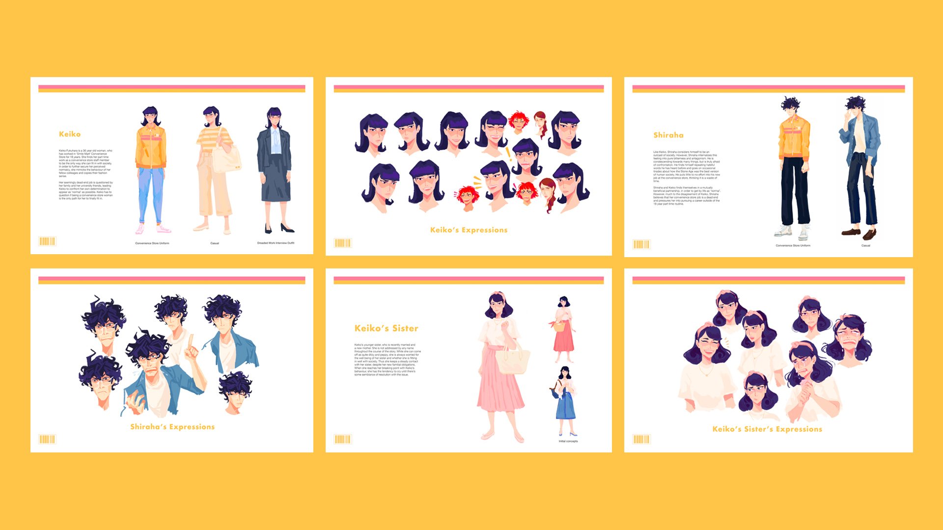
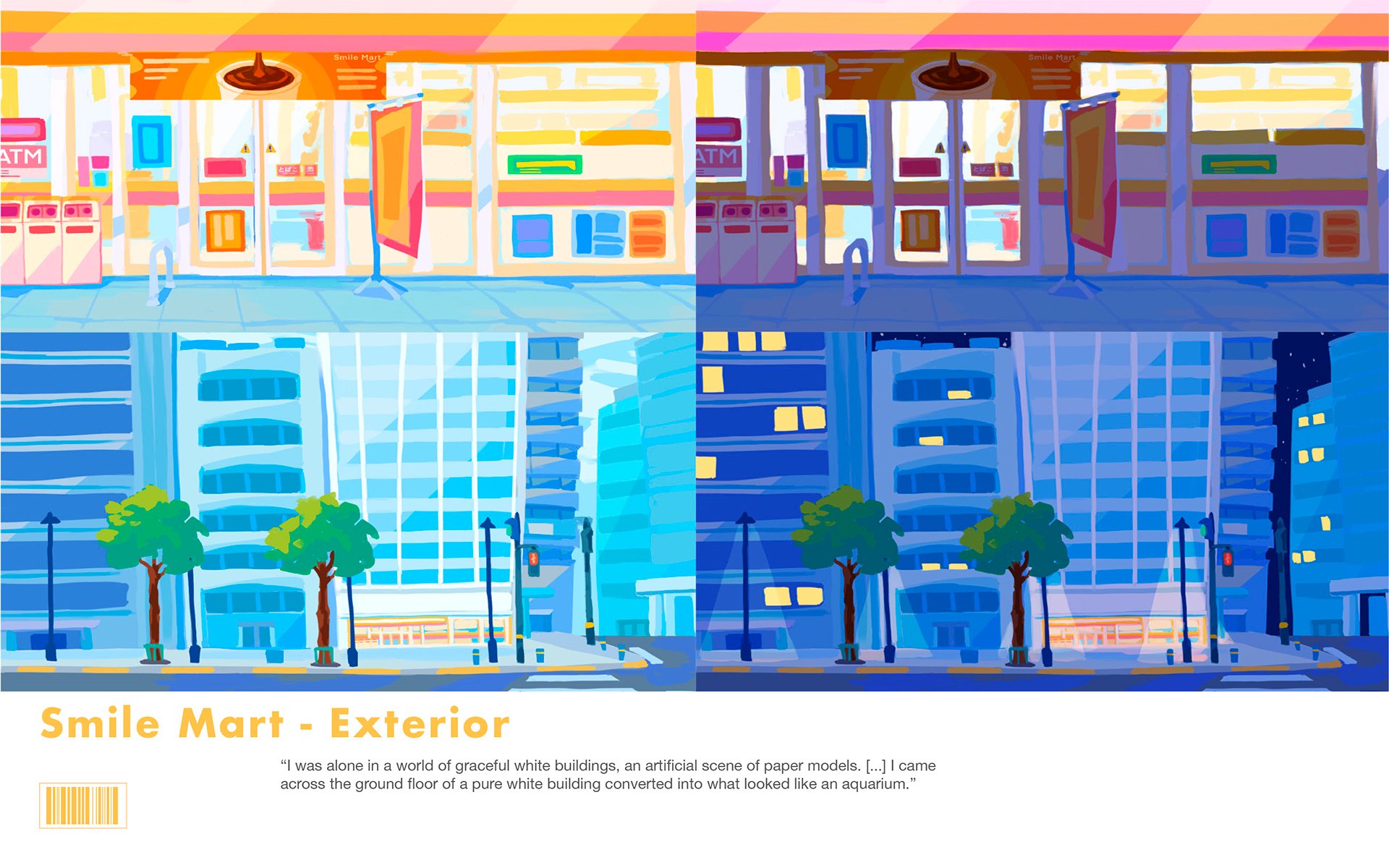
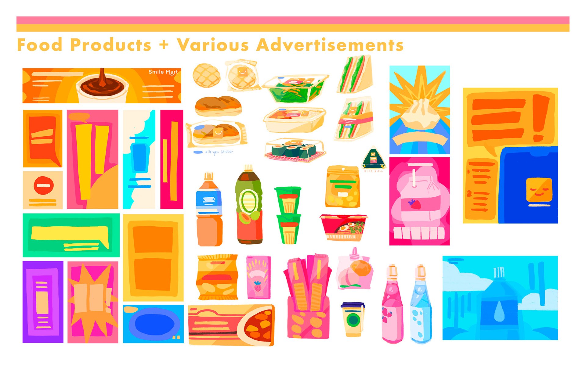
A visual development project based on the 2016 novel by Sayaka Murata of the same name. Through a blend of illustration and graphic design, I created a set of visuals for this book that are meant to act as the visual direction for a proposed animation production. These visuals include concept visuals, character design, brand identity and background/setting design.
To view the project in its entirety, please visit: http://binling-lim.squarespace.com/convenience-store-woman
orbital
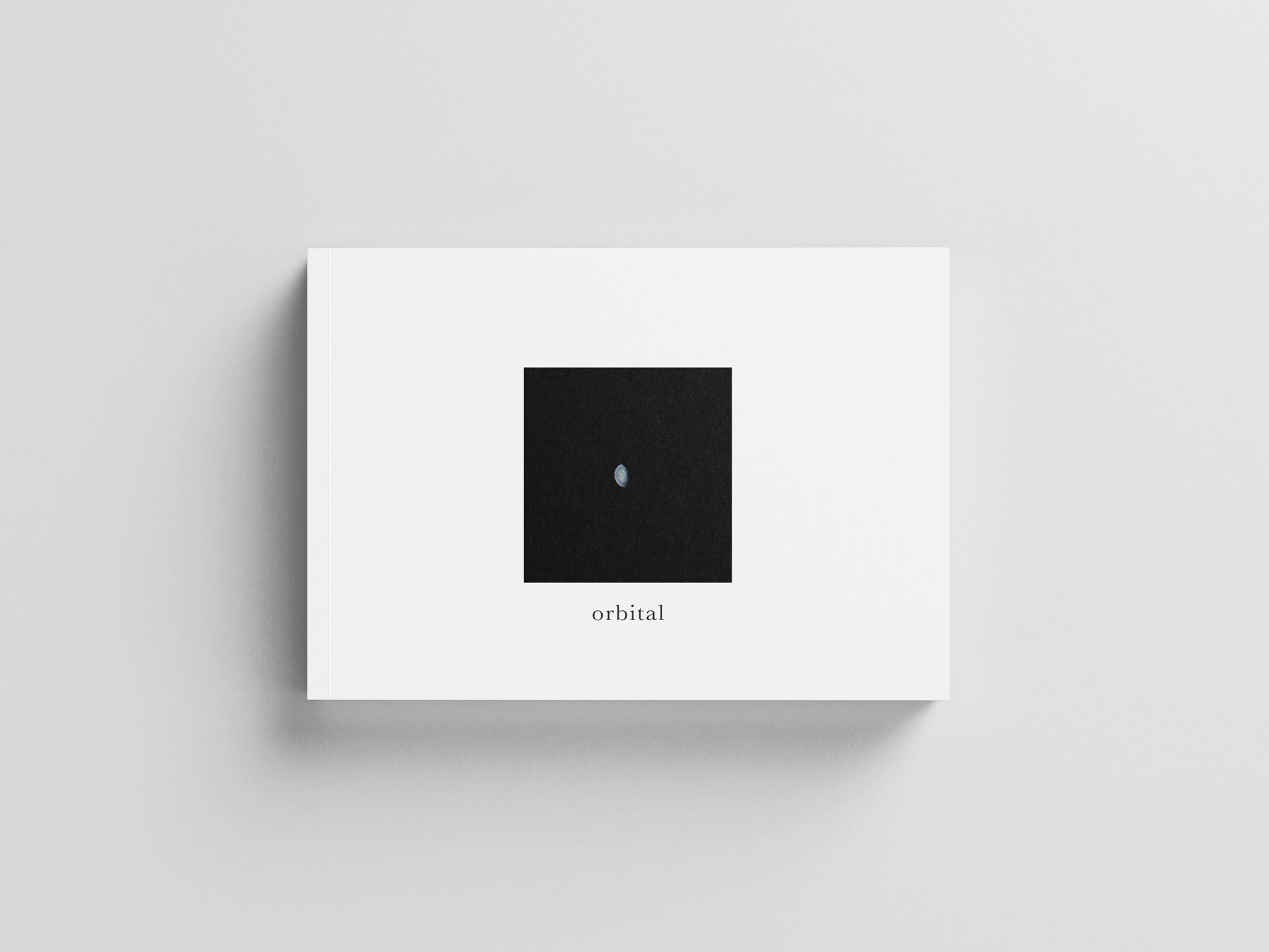
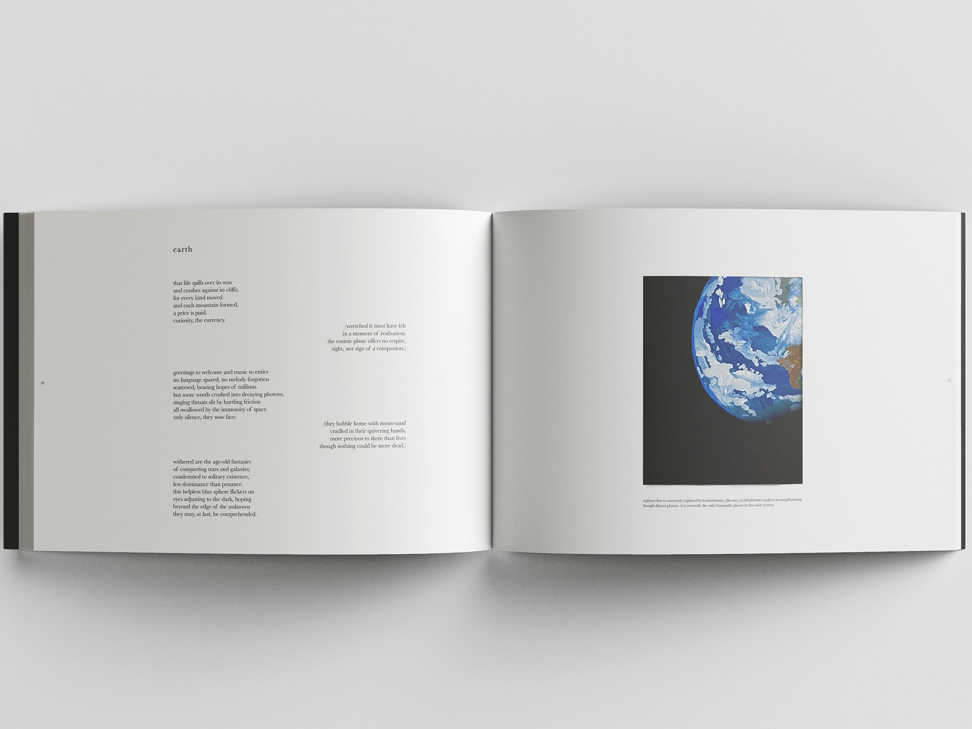
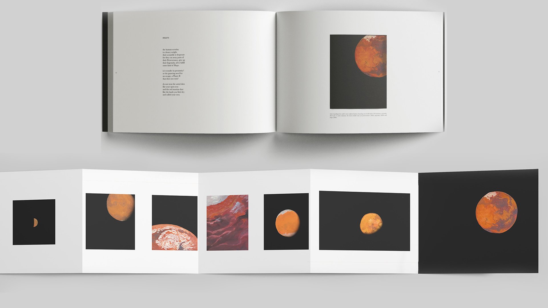
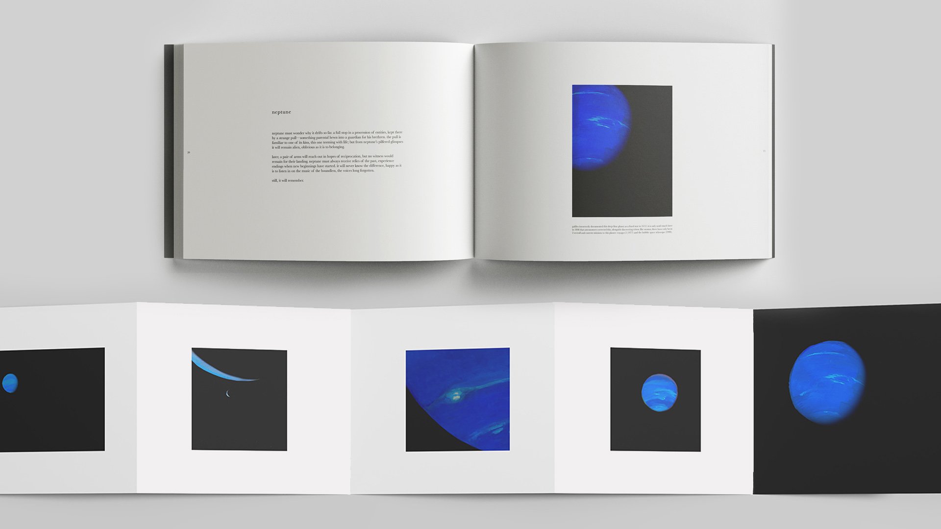
A B1 sized publication, exploring the ancient solitude of the Solar System’s Planets. Though the planets are icons of modern astronomical discovery, they have existed longer than us. This publication acts as an experience of lonely wandering and the oddity of stumbling upon the grandiosity of a planet, in the vast darkness of space.
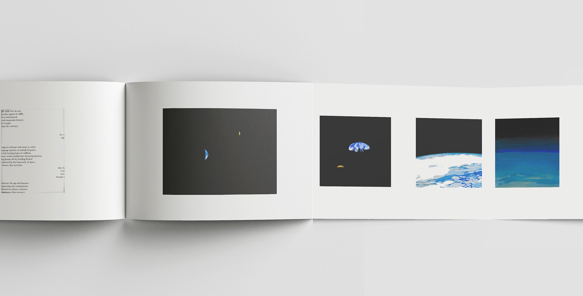
In order to establish the publication’s atmosphere, I utilised traditional gouache paintings to represent the planets’ ancient nature and poems (by my friend, Rania Putri) and to convey the musings of planets’ solitude. A sense of loneliness was further established through the number of illustrations available for each planet, to illustrate a lack of exploration. Each feature on a planet reveals a cutout and a concertina fold out.
Pocky – Going Places
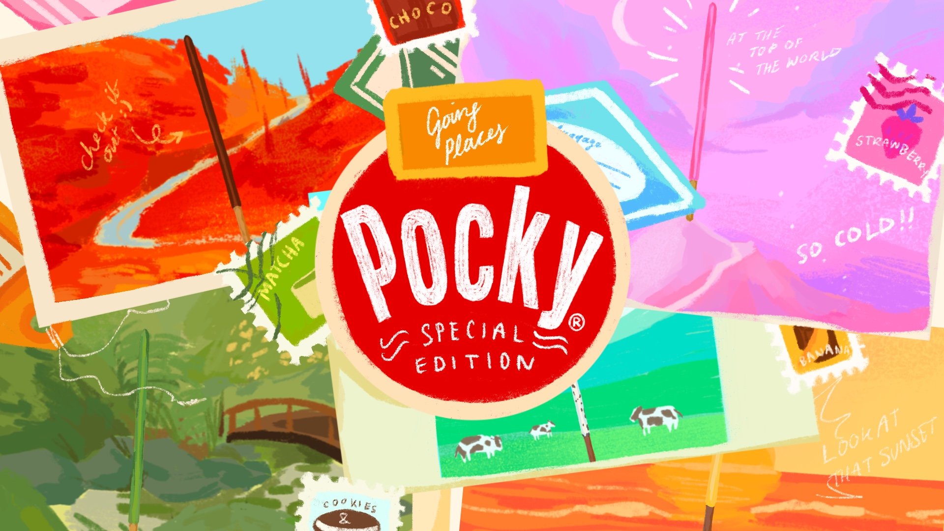
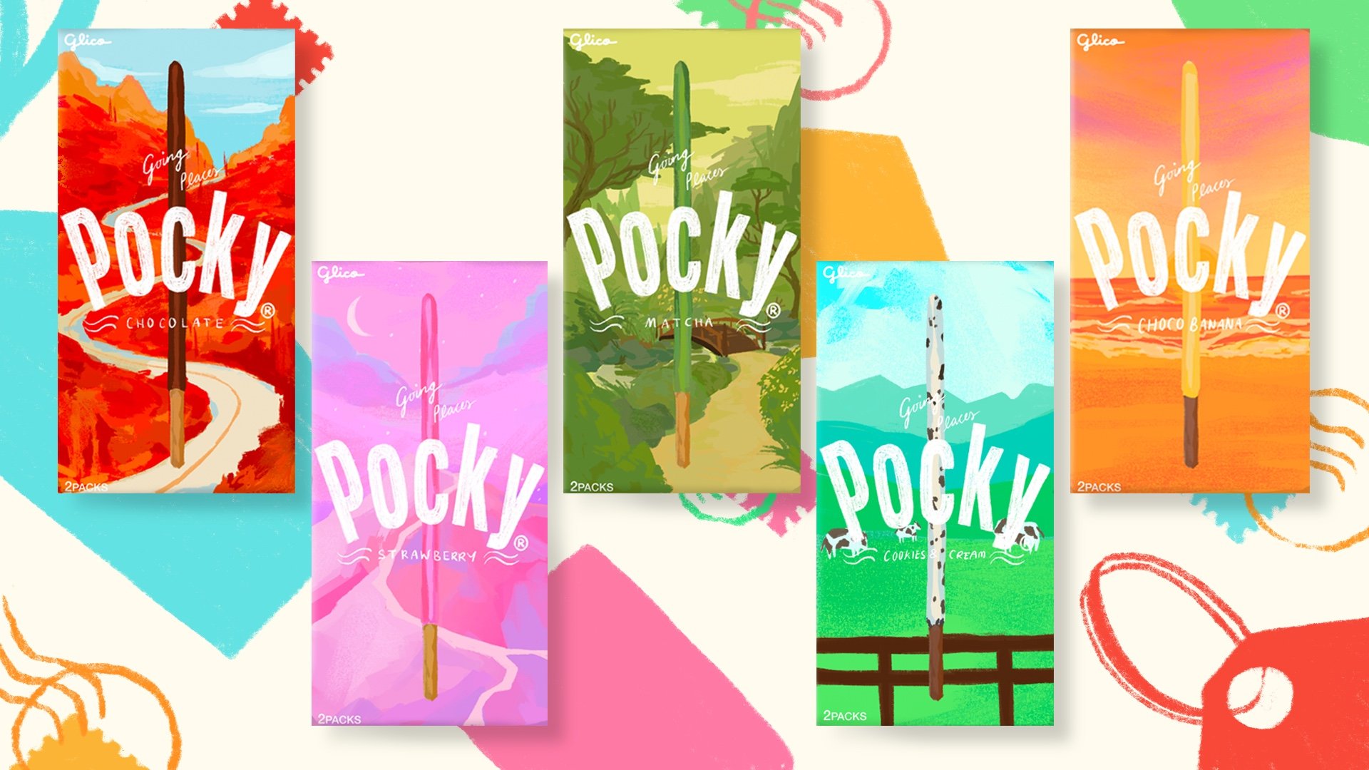
'Pocky – Going Places' is a special branding campaign proposal for the Japanese snack 'Pocky'. Its convenient eating style and portable packaging makes it the prime traveling snack. This campaign hones in on its travel friendly nature and advocates the idea of taking 'Pocky' along for your travels. To elevate the packaging and separate it from potential competitors, I utilised illustration for the main graphics of the new packaging and employed hand-drawn text to feed into the campaign's adventurous theme.
