Emma Vukman
Email address
moc.kooltuo@namkuvammeWeb Portfolio
www.emmavukman.myportfolio.comBiography
Emma Vukman is an aspiring bookbinder and branding and identity designer for creatives. She is currently working with entrepreneurs in the film and music industry, art directing and designing their brand identities and staging. She hopes to find an internship in one of London’s older bookbinding companies where she can develop her skills within traditional bookbinding and learn about the conservation of old books.
Portfolio
Satellite – The Feminist Bible
The Satellite brief was one of two Major Project briefs that would finalise our time at BA Graphic and Media Design. They both aimed to work as strong portfolio pieces that would express our visual identity as artists and designers.
Satellite was an editorial brief which asked us to choose a topic of interest that we would like to communicate visually through our personal choice of editorial design. I decided to focus on the topic of Feminism and Sexism, which is something I spend a lot of time with through activism and volunteering at The Feminist Library in my spare time.
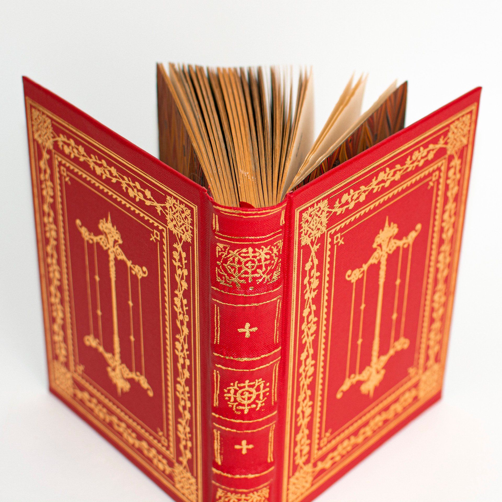
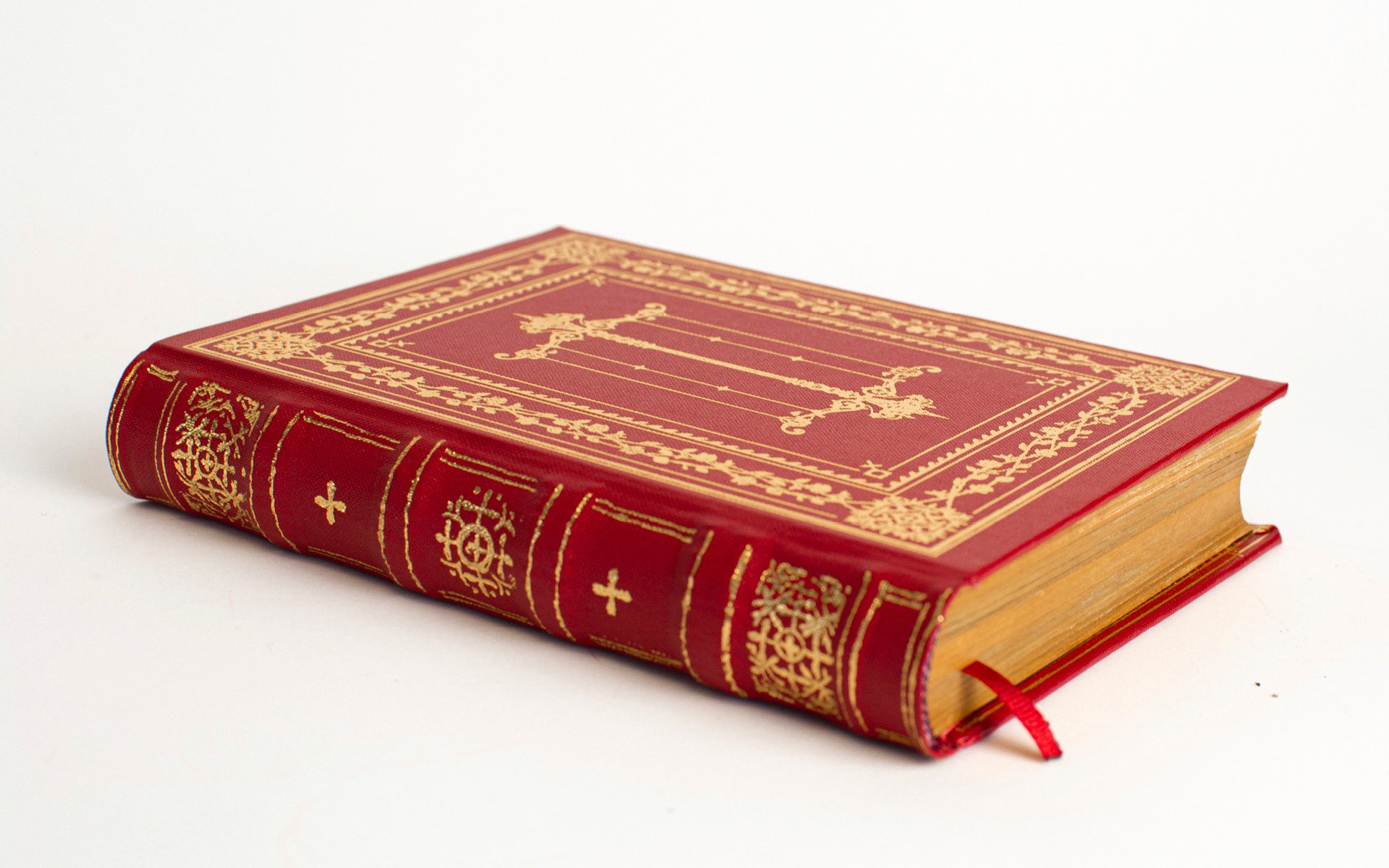
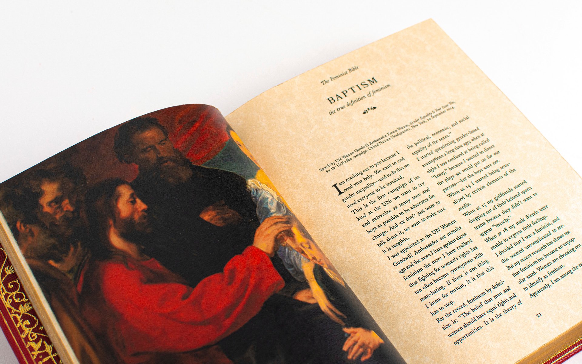
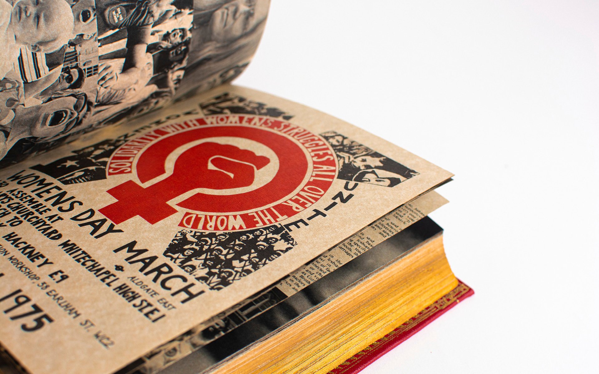
The primary outcome is a Feminist Bible, a collection of selected speeches, poetry, prose, and journal articles, as well as historical images and artwork, all relating to the topic of feminism from a variety of societal perspectives in order to redefine feminism and abolish the negative connotations it has adopted.
The aim behind the work is to redefine the term ‘Feminism’ and remind society of the true meaning and purpose behind our battles as women – for it is a battle that is the responsibility of all of us. It hopes to educate and inspire, as well as encourage the inclusion of several groups in society who tend to be neglected by modern-day western feminism.
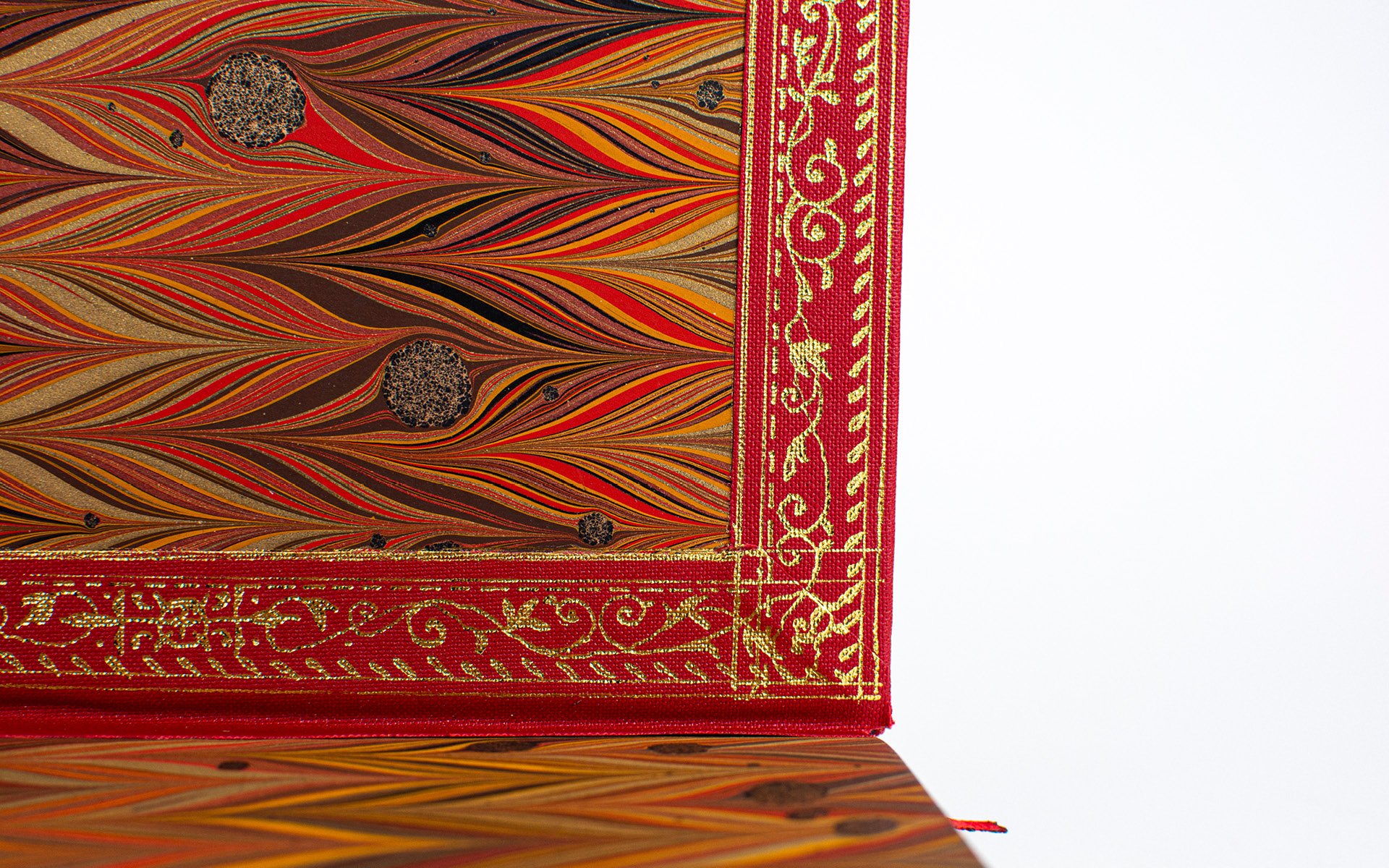
The book was hand bound using traditional bookbinding methods and techniques, inspired by regal bibles from the 1500s to 1800s, cased in a bright red book cloth to depict the collective frustration and fury that we are bound to carry under the surface every day. I decided to bring the truth to the surface.
Satellite – The Scroll
The Satellite brief was one of two Major Project briefs that would finalise our time at BA Graphic and Media Design. They both aimed to work as strong portfolio pieces that would express our visual identity as artists and designers.
Satellite was an editorial brief which asked us to choose a topic of interest that we would like to communicate visually through our personal choice of editorial design. I decided to focus on the topic of Feminism and Sexism, which is something I spend a lot of time with through activism and volunteering at The Feminist Library in my spare time.
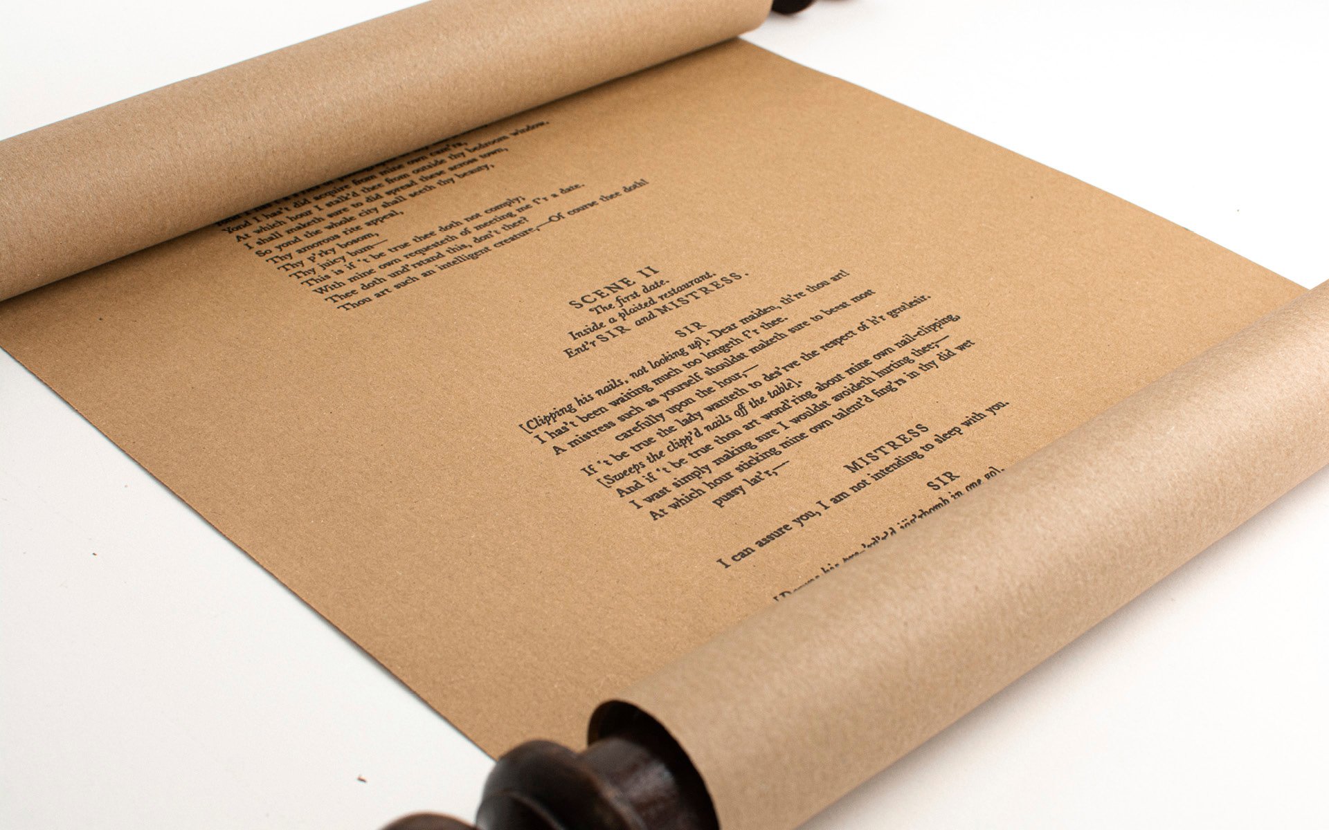
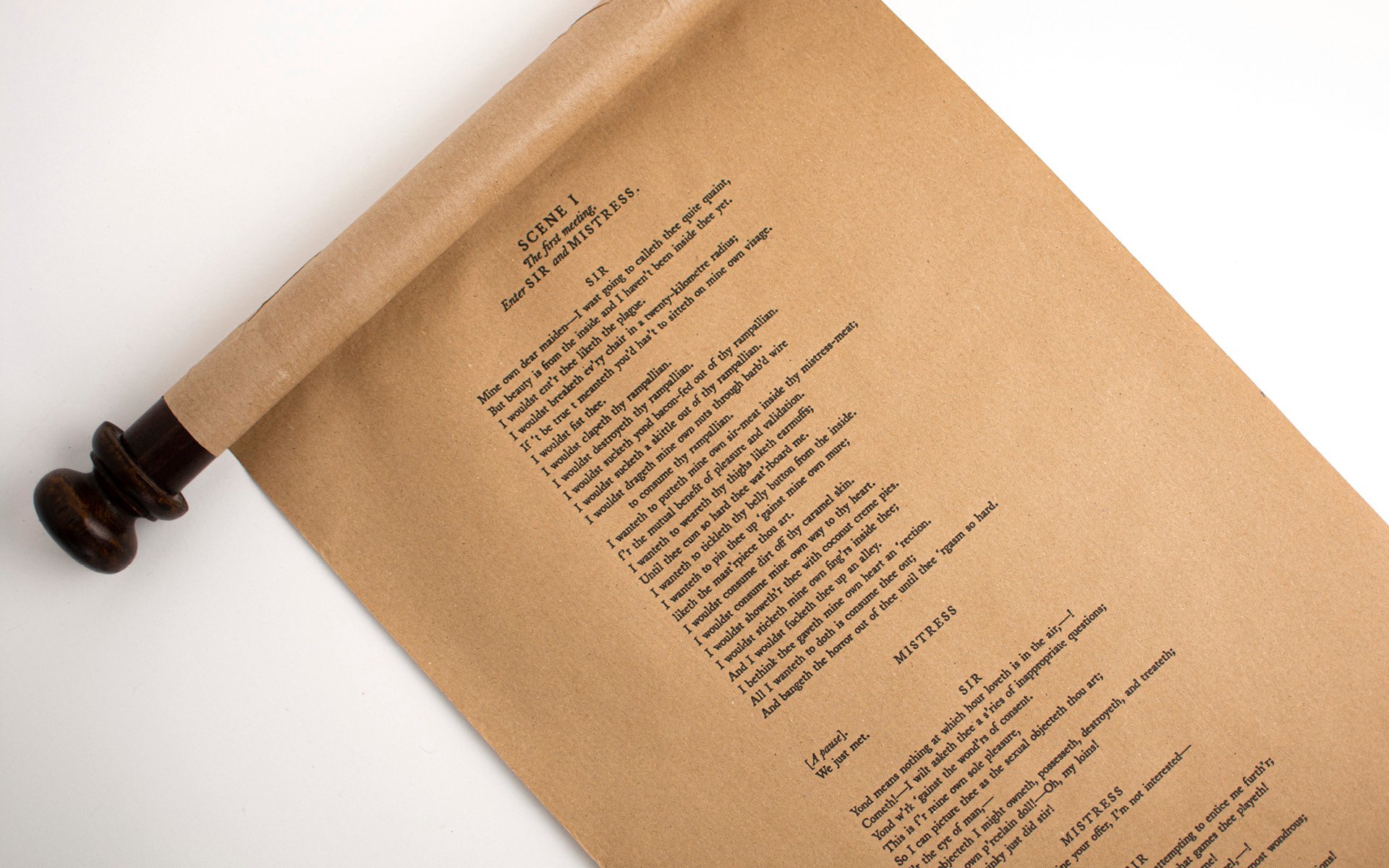
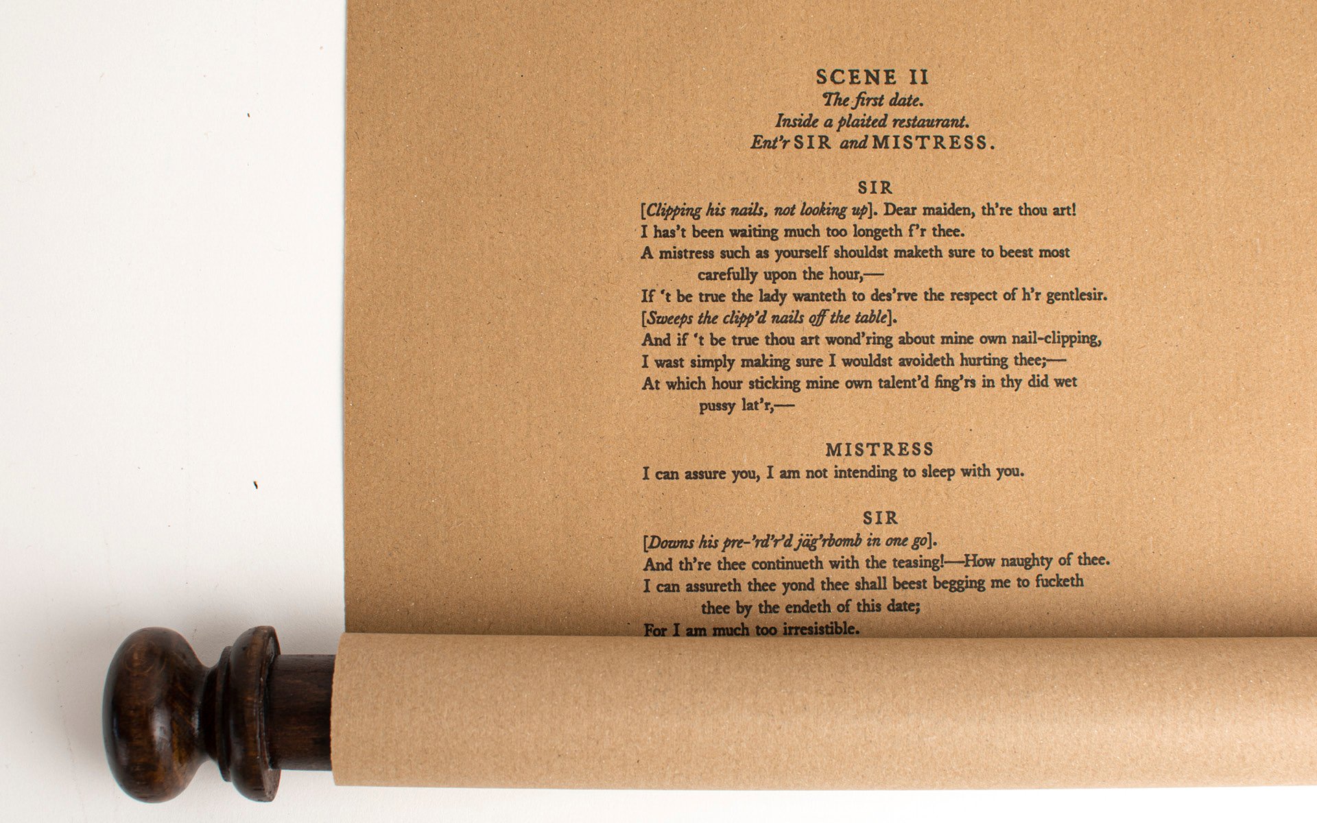
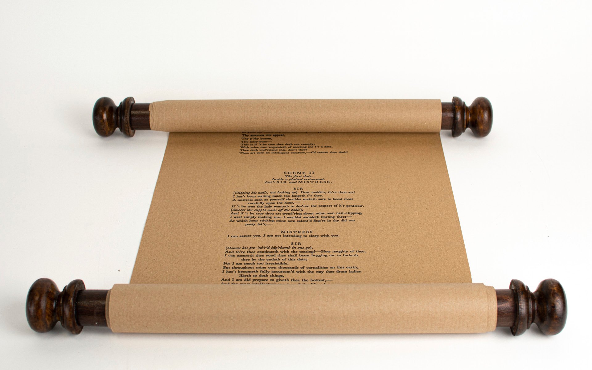
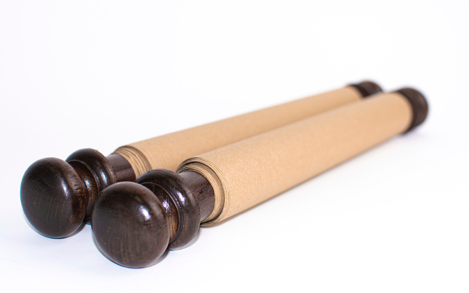
The secondary outcome is a medieval-inspired scroll. The written work is a tragicomedy I wrote in exaggerated Shakespearean English based on real conversations between men and women. The play takes us through the meeting, date, and aftermath of two people, and shows us how poorly yet typical the woman is treated by the man in 3 acts.
The scroll is 4 metres long and was printed on an inkjet printer on one long scroll of recycled kraft paper to give it that old look. The handles were made from wood-stained dowels and four vintage wooden door knobs.
