2024

Holly Ford-Hunt

Biography

I am an ambitious and goal orientated person who works well both on my own and as a team. I have great motivational skills and a great awareness that learning doesn’t solely happen in an educational environment which is why I’ve dedicated so much external time to my skills set and have no plan in stopping any time soon.

These skills include: Strategy, Social Media and Branding; all of which I excelled at and improved during my 2 years working for a Theatre and Arts company as a Marketing Assistant.

Portfolio

Desire To Waste

A branding brief for the V&A with the topic of sustainability and our Desire To Waste. This project opened my eyes in many ways from discovering the vast amount of waste that just goes unseen to thinking about how everyone perceives the takeover of waste in a mutual language.

My angle on this project was exactly that. Through using a well known symbol (our planet) and drowning it in pollution, a visual is created that everyone understands. By going down the art direction route I believe there is more to be said and opinions to be had in order to draw in more people to this event.

I chose a simple colour palette representing earth with blue and green, once again to draw as many people in as possible to such an important event. We are the ones who decided on blue and green as the main symbol of the world so that is why the ‘mother nature’-like hands are polluting the earth with those colours.

The main over arching idea for me was to get people to realise what we have done. And whilst there are many positives to how fruitful we have made this world, it is important to reflect on the bad and move forward in action to what we can do to make it better. To stop our Desire To Waste.
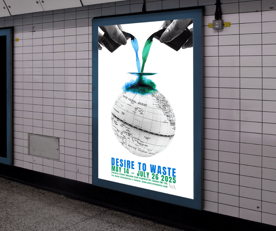
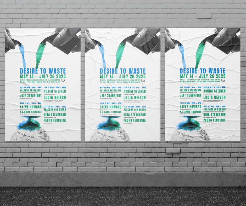
An underground poster to catch the attention of the passing public. With a focus on the ‘mother nature’-like hands being in shot and key information, the content is open to interpretation and creates intrigue about consumers’ Desire To Waste.
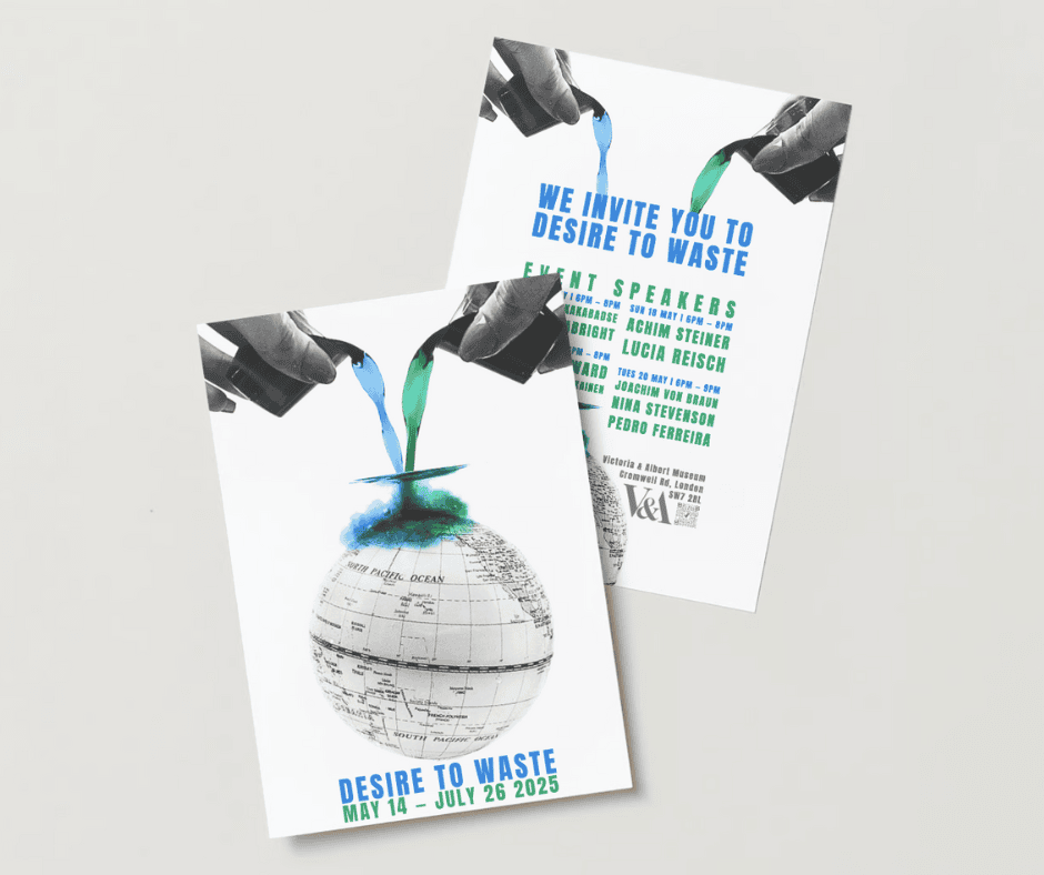
The listings posters include more information in particular on the event speakers  – a key piece of content for this event and a huge selling point for those wanting to come to the exhibition. Through a set layout in the centre, all content can be digested in a simple glance.
The listings posters include more information in particular on the event speakers – a key piece of content for this event and a huge selling point for those wanting to come to the exhibition. Through a set layout in the centre, all content can be digested in a simple glance.
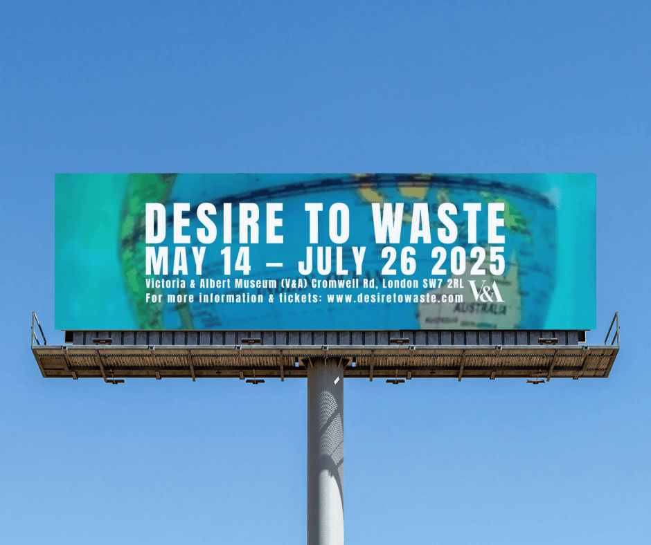
I zoomed in on the globe for the billboard outcome as it gave a close up and more personal opportunity to engage with the content and the globe. Making all content white allowed for consumers to see through this and have focus on the polluted world being taken over.
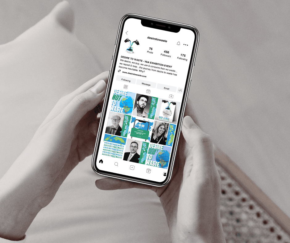
Social media content in the lead up to the event, all of which is on brand with the posters and includes them in the content, allows for intriguing and informative communication. It is an extension of the website and offers a different audience to engage in content.
The invitations are printed on eco paper. This allows consumers to see the V&A practise what they are informing. By having this immediate idea of a simple change to reduce our Desire To Waste gets audiences thinking and engage with the content.

Open Conversation (Mind X UAL) – Let’s Glow

A collaborative project with Open, on a mission to help Gen Z with their mental health, in collaboration with Mind, and encourage conversations. For my outcome I focused on Seasonal Affective Disorder, also known as S.A.D.

My first thought with this was that it is something so subtle but so obvious too. We always have conversations about the weather like it’s nothing but what about if we get to the real issue lying beneath that? What if the conversation took a different approach and actually discussed mental health with friends and family?

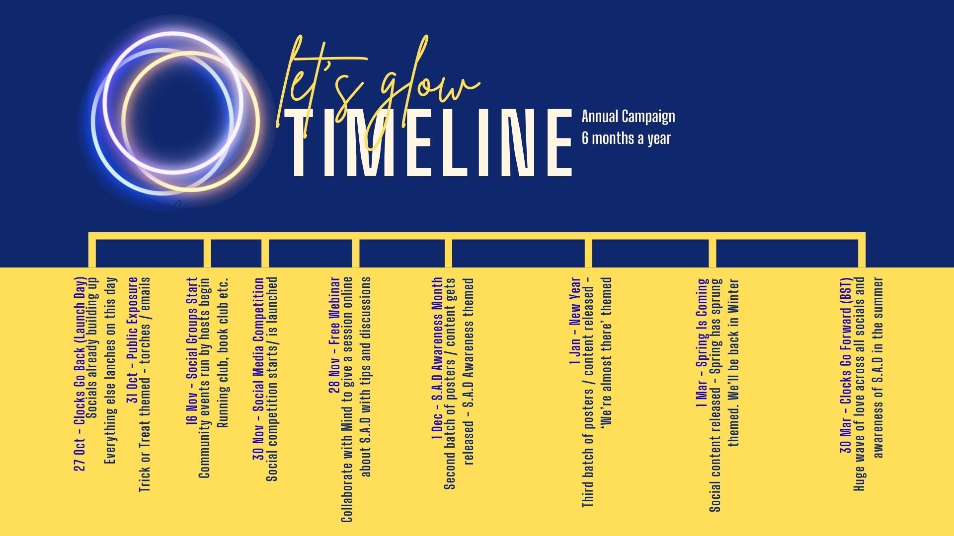
I focused on strategy and created a campaign spanning the whole of the winter/ dark months, meaning that there is support and cover through the whole time when S.A.D is heightened. By the campaign having a start and end date it means that there is an awareness of progress and a timeline through the winter, with knowledge of things to look forward to as the months go on.

Through using the iconography of glow sticks there is a familiar symbol representing this campaign. The glow is the light that this campaign brings to those suffering with S.A.D – the more glow bands the brighter the light. This is about Mind being the leader (light in the darkness) and encouraging people to help one another and make it through the winter by managing their S.A.D.
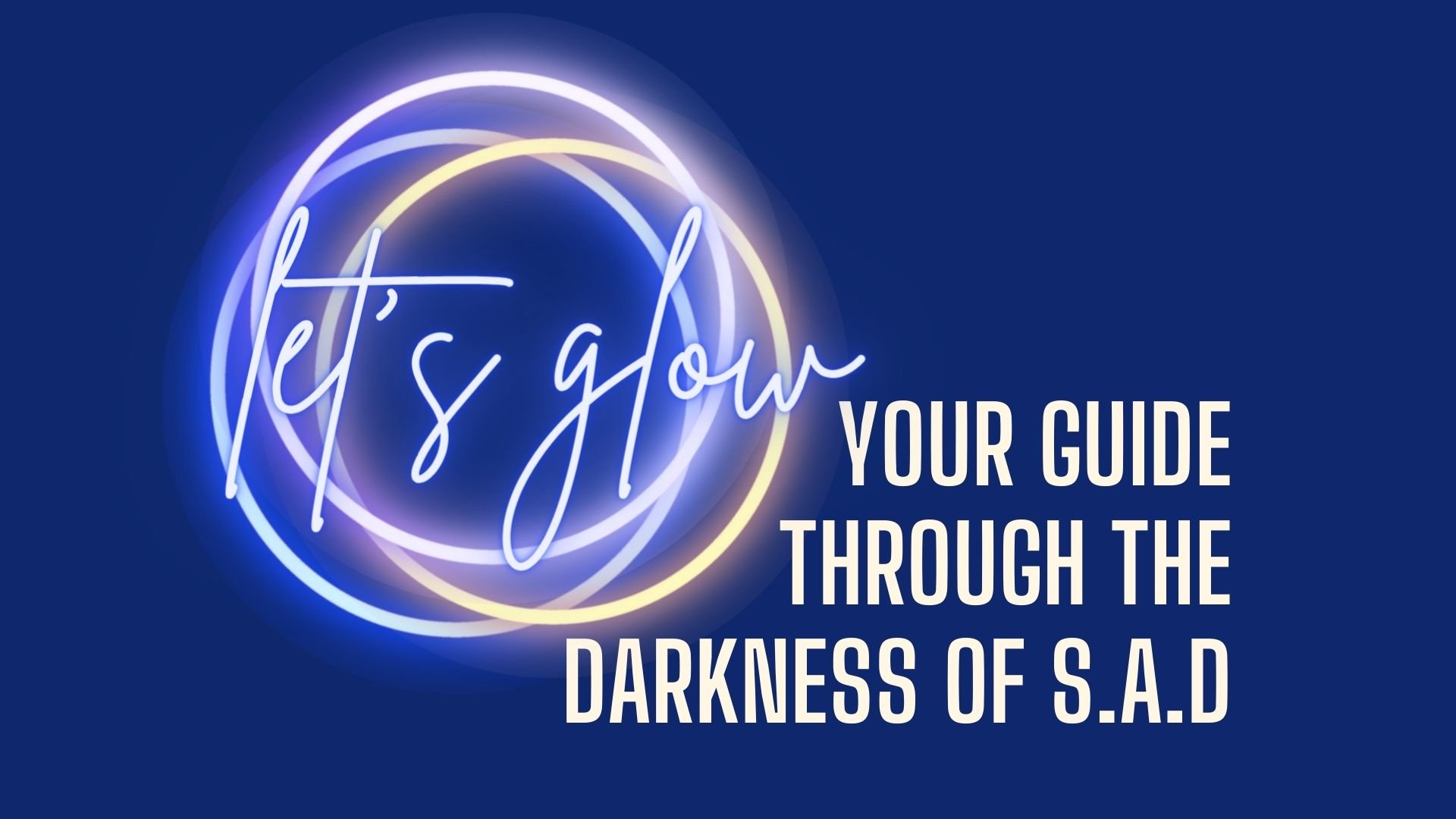
Having an identity allowed for this project to show its purpose in a simple way. With a topic so serious it was key to easily identifying how to get help and where, including what it was related to. This symbol physically guides you through the content of Mind and Let’s Glow.
The timeline for the campaign includes a set of posters that change through the months in response to different needs, social media and launch events. Having it clearly structured keeps engagement with the campaign up through such a long period of time.
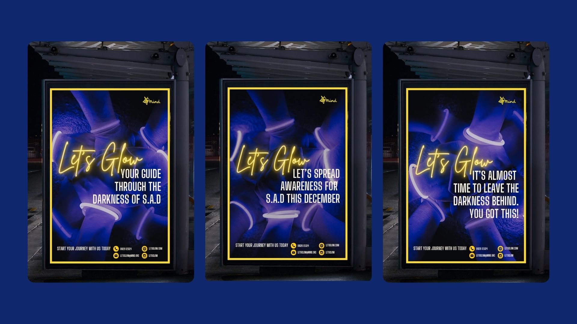
Three posters that change every few months throughout this campaign. By having different attitudes and takes as the seasons go on there is greater appeal to the audiences. Someone may not be struggling in September, but may struggle with S.A.D as it is getting lighter.
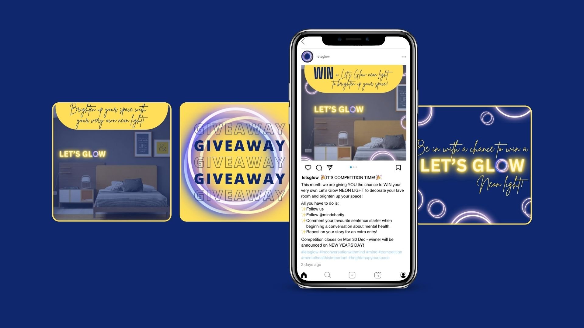
A giveaway engages Gen Z as it is a common thing seen on feeds via social media. Having an incentive encourages people to take a minute to apply for free and engage with Let’s Glow content. It also allows conversation in the comments where discussion is automatically happening.

Down at the Farm – Activity Pack

During my DPS (Diploma in Professional Studies) year I wrote and illustrated a children's book inspired by the place I worked – a Theatre and Arts Centre as a Marketing Assistant. It was when the school holidays came around and I was in awe of the children reading endless stories and it bringing such joy to them. I knew at that moment that I wanted to create that happiness one day so it was in this time out that I wrote my first book inspired by my work.

As an extension of the initial book, I designed and illustrated an activity pack to sell along side. By doing this there was a larger appeal to the book and the world in which it has created. I then turned this into a deliverable pack to make sure it was accessible to all, with the branding for recognition and consistency.
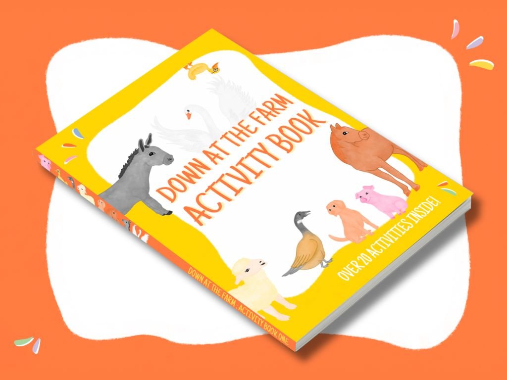
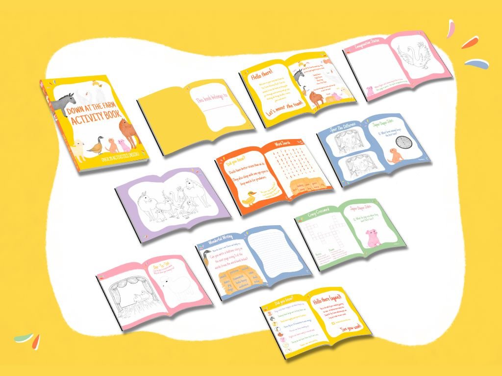
Down at the Farm – Activity Pack
An activity pack with a purpose of educating as well as creating. With bold colours and consistency in the participation of familiar characters, the engagement is heightened. This is all about the journey and has a core value of teamwork.
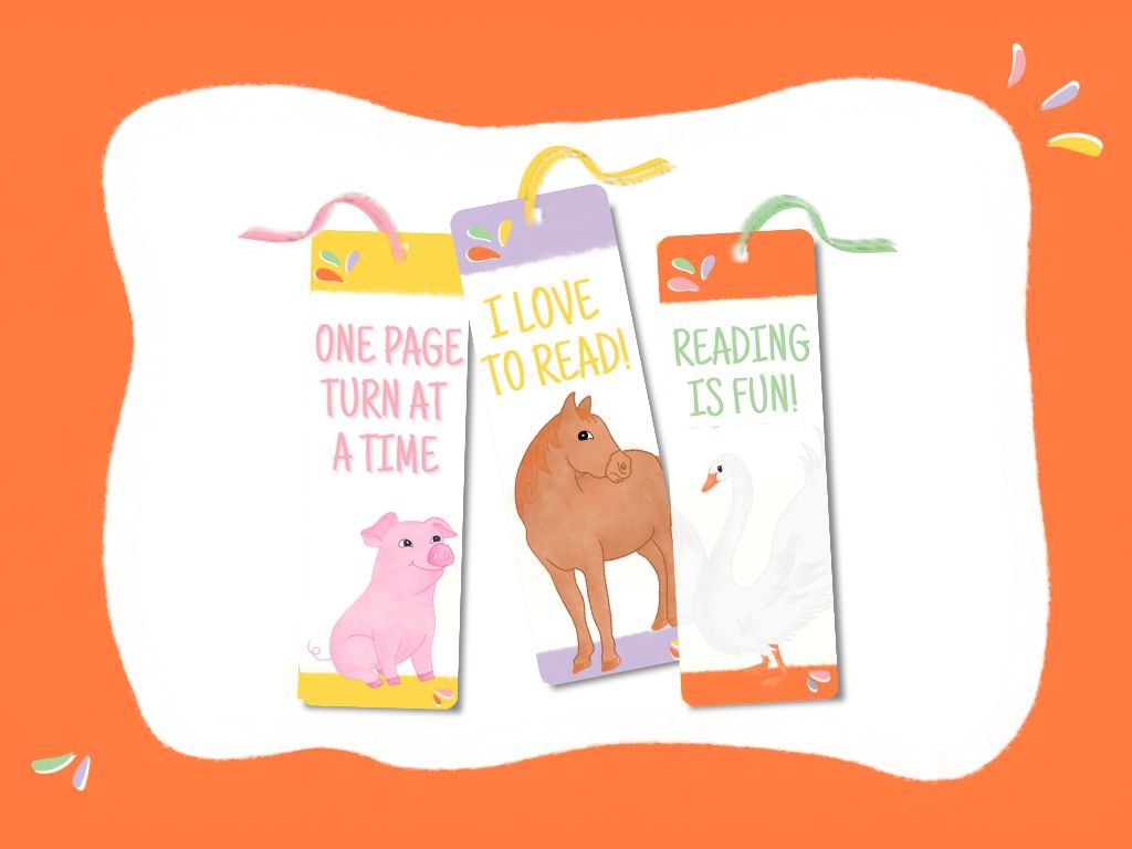
Encouraging education to stretch further beyond schools, I have also designed bookmarks for the pack. Having three to collect encourages engagement and following of this brand and content.
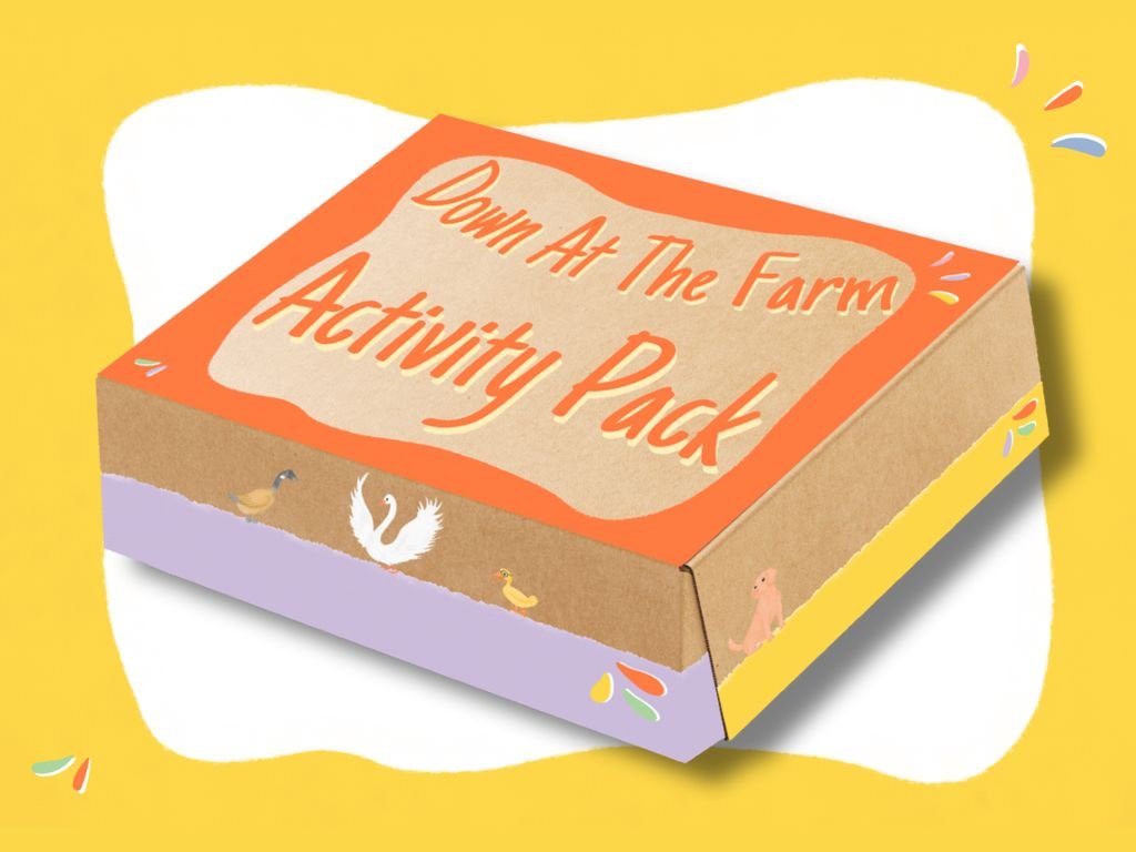
The experience of a product starts with what it looks like. By having the branding covering this it brings the content alive and starts familiarity with the characters in the book from the get go!