Ishbel Amyatt-Leir
Email address
moc.liamg@rielttaymaWeb Portfolio
amyattleir.comBiography
My preference for analogue and hand-made methods of production and interest in vintage and period design, particularly 19th and 20th century British Design, led me to a career as a graphic designer for film and television. The resources at LCC also enabled me to explore and develop my book arts, screen printing and letterpress skills.
During a year in industry I was lucky enough to work on a range of productions including Wes Anderson’s The French Dispatch, Series 2 of Amazon Prime’s Hanna, and Coronation Street.
Themes in my work revolve around queer representation in media and fan culture. My thesis on fan responses to queer representation was the perfect outcome for someone whose teens were embedded in fan communities and binging nerdy TV shows.
I bring conceptual thinking, good crafting skills and a strong design sensibility, along with a solid academic and theoretical background.
If you are interested you can find more of my work on my Instagram, @amyattleir or on my website.
Portfolio
Victorian Inspired Graphic Props
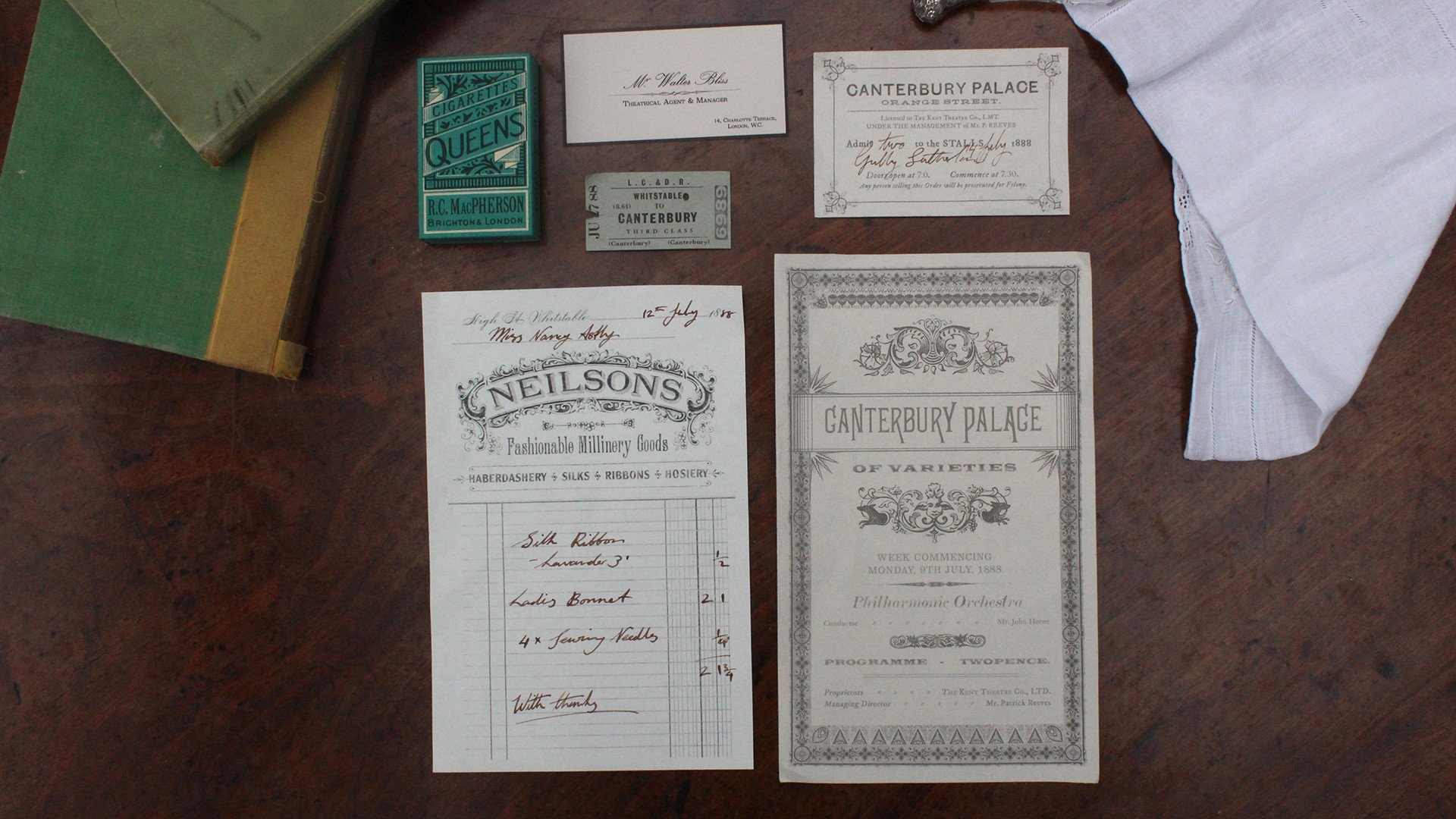
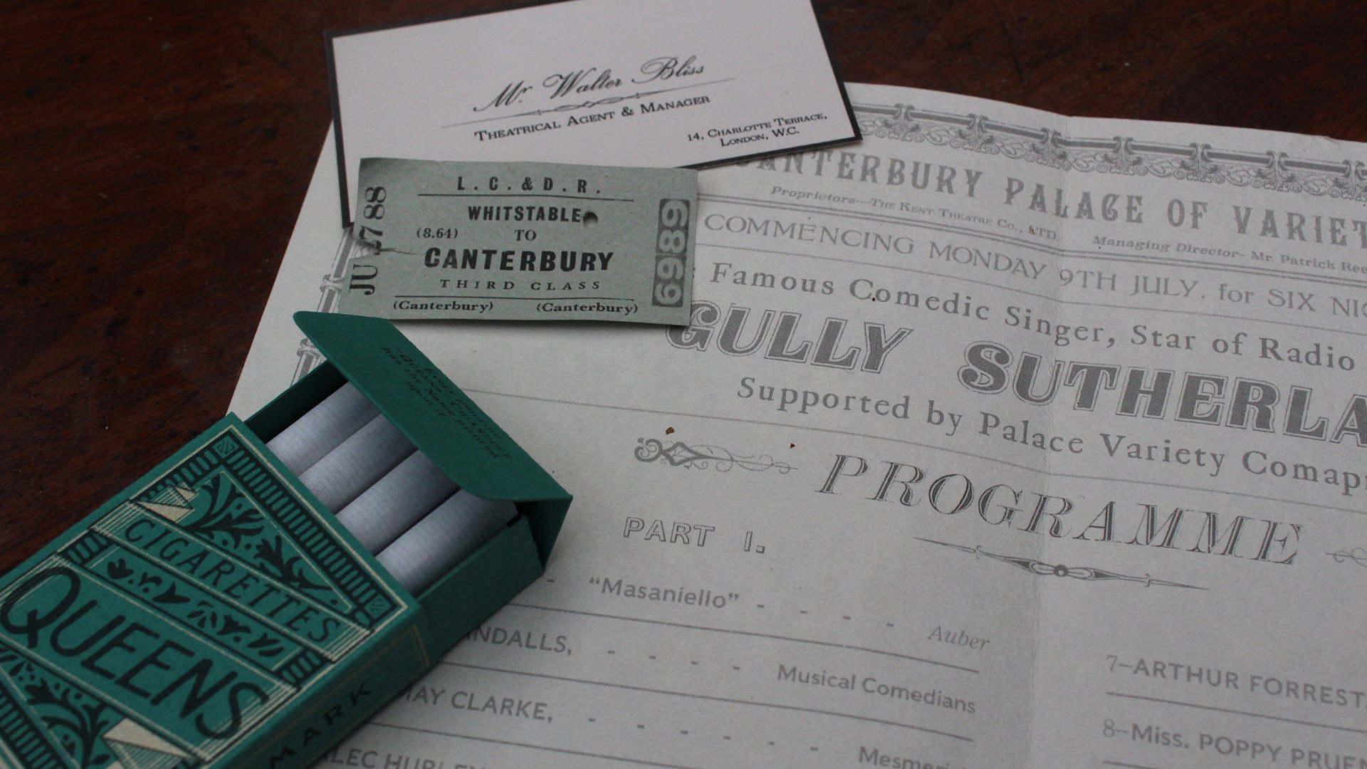
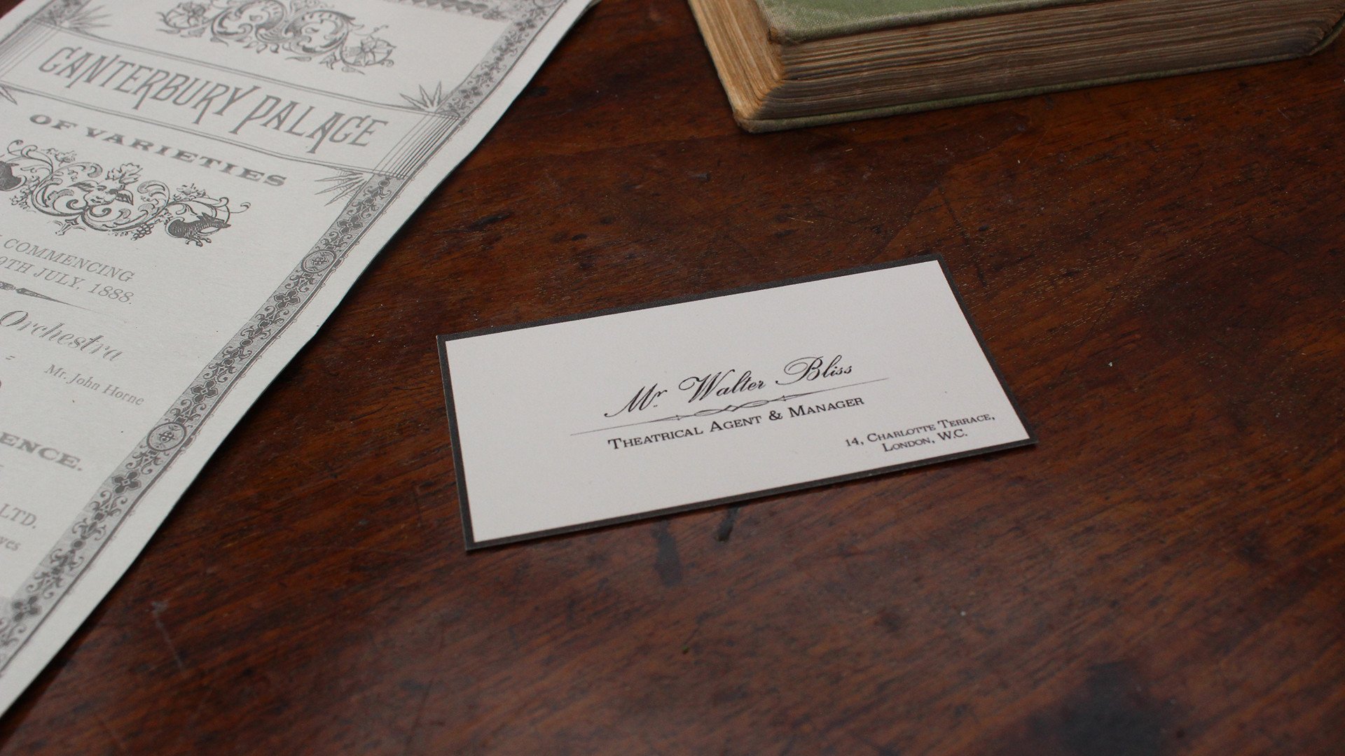
This is a series of graphic props for a potential TV or film adaptation of Sarah Waters’ novel ‘Tipping the Velvet’.
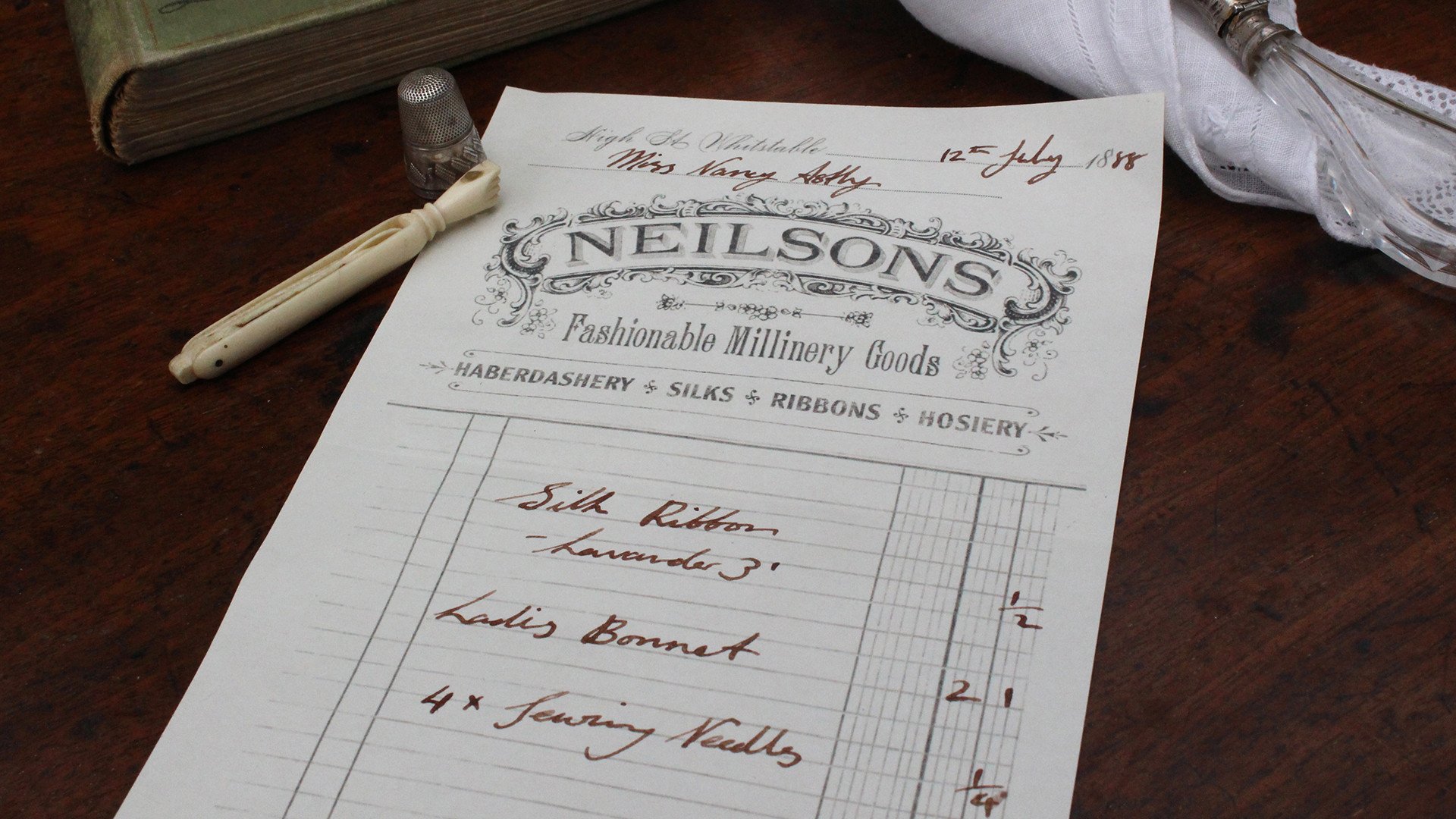
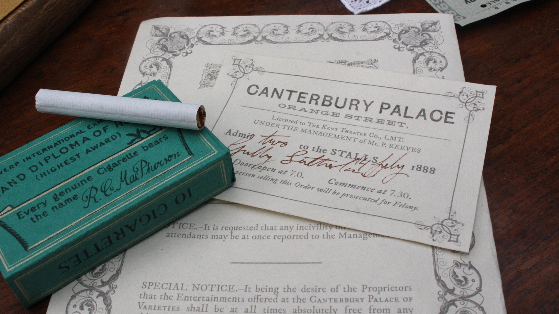
The protagonist is Nan Astley, an oyster girl from Whitstable, Kent. I created six props which told the story of her trips to Canterbury’s Music Halls where she fell in love with male impersonator, Kitty Butler in the summer of 1888.
The six props are a theatre programme, a theatre ticket, a train ticket, a cigarette packet, a calling card and a receipt from a millinery shop.
Rebranding Fringe!
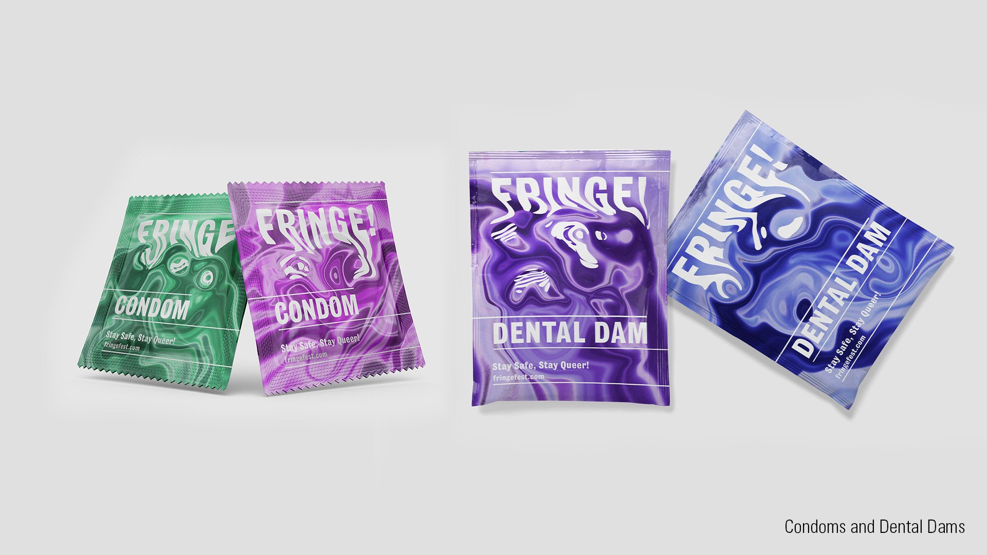
Rebranding Fringe!
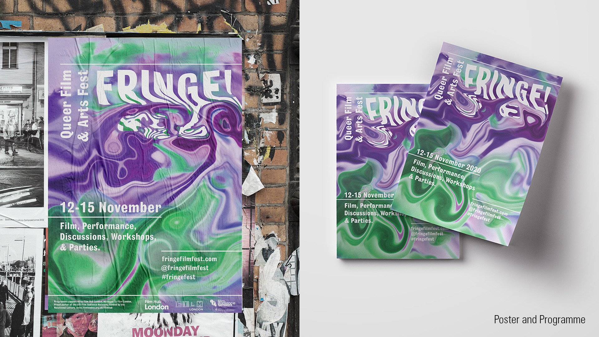
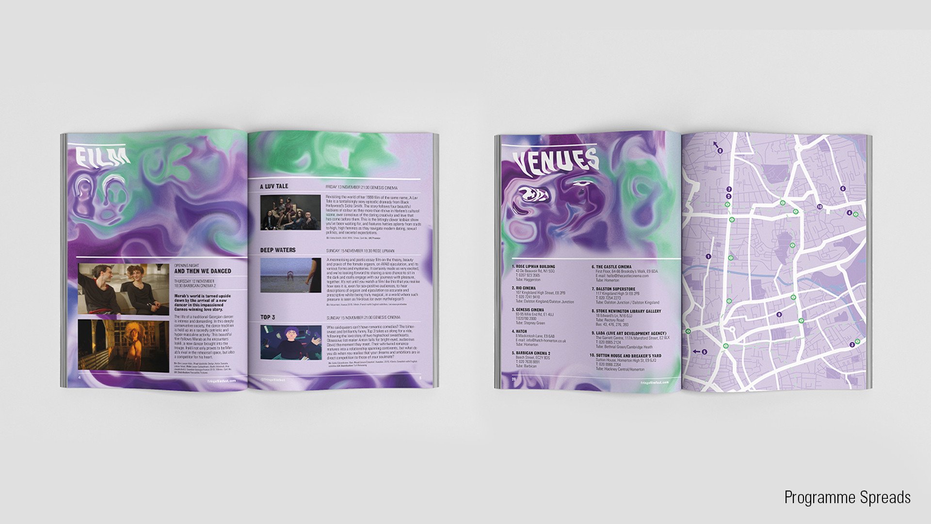
Fringe! is a queer film and arts festival showcasing a diverse, inclusive and provocative range of queer produced visual arts. While the festival has expanded over the years, the main ethos remains the same: creating an accessible, affordable and inter-sectional space. The festival is constantly looking at ways to include new voices and ideas.
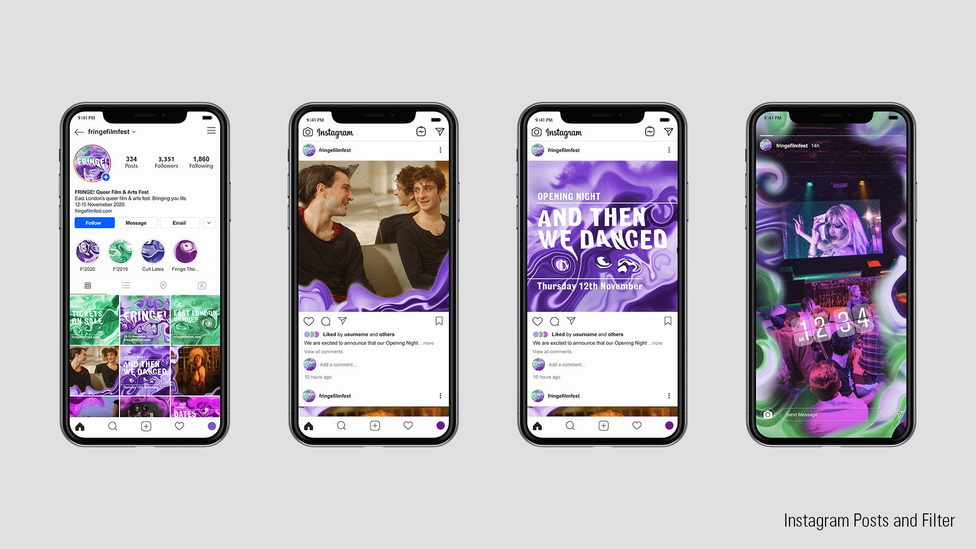
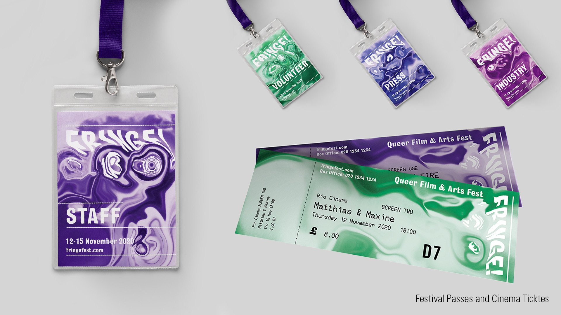
Instead of one logo there is a distinctive typographic treatment to the festival’s name, Fringe! representing the fluid and ever changing nature of gender, sexuality and the queer community.
The branding is androgynous without ignoring male and female identities. Lavender is historically linked to the queer community, with purple representing a mix of male and female in queer pride flags and green the non-binary identities. Pink and blue are used in equal amounts to avoid gender connotations.
