Ishi Nake
Email address
moc.liamg@ekanihsiWeb Portfolio
www.behance.net/ishinakeBiography
I am a multidisciplinary designer. My work is focused on brave simplicity, typography, and exploring the personality of colour. I believe clarity is essential to stay relevant in a sustainable world. My practice touches on branding, art direction, digital, product, and packaging design. I emphasize strategy-driven design thinking to deliver soulful creative solutions, identifying smarter and more beautiful ways to interact with the world. Heavily influenced by my time spent in India, Ibiza, and London, I draw on the aesthetic and cultural references of these locations to inspire my projects.
Portfolio
Ibicenca Festival | Brand Identity
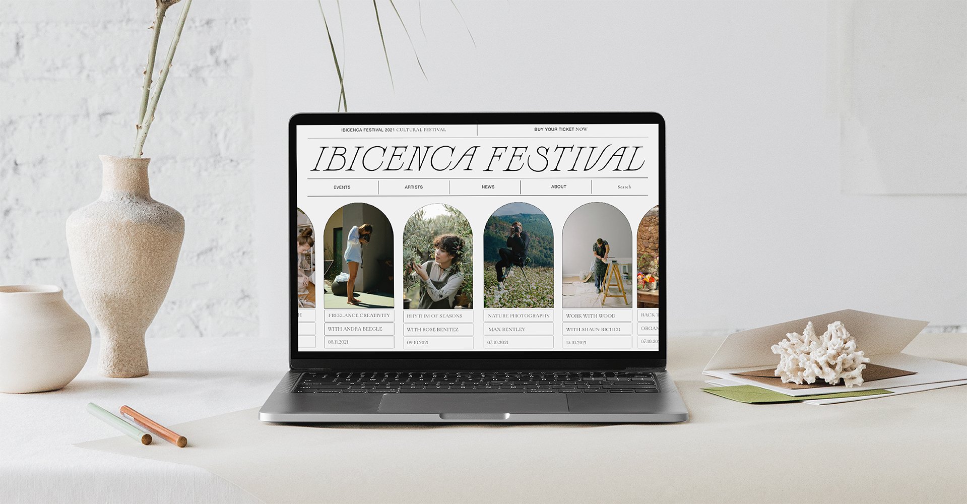
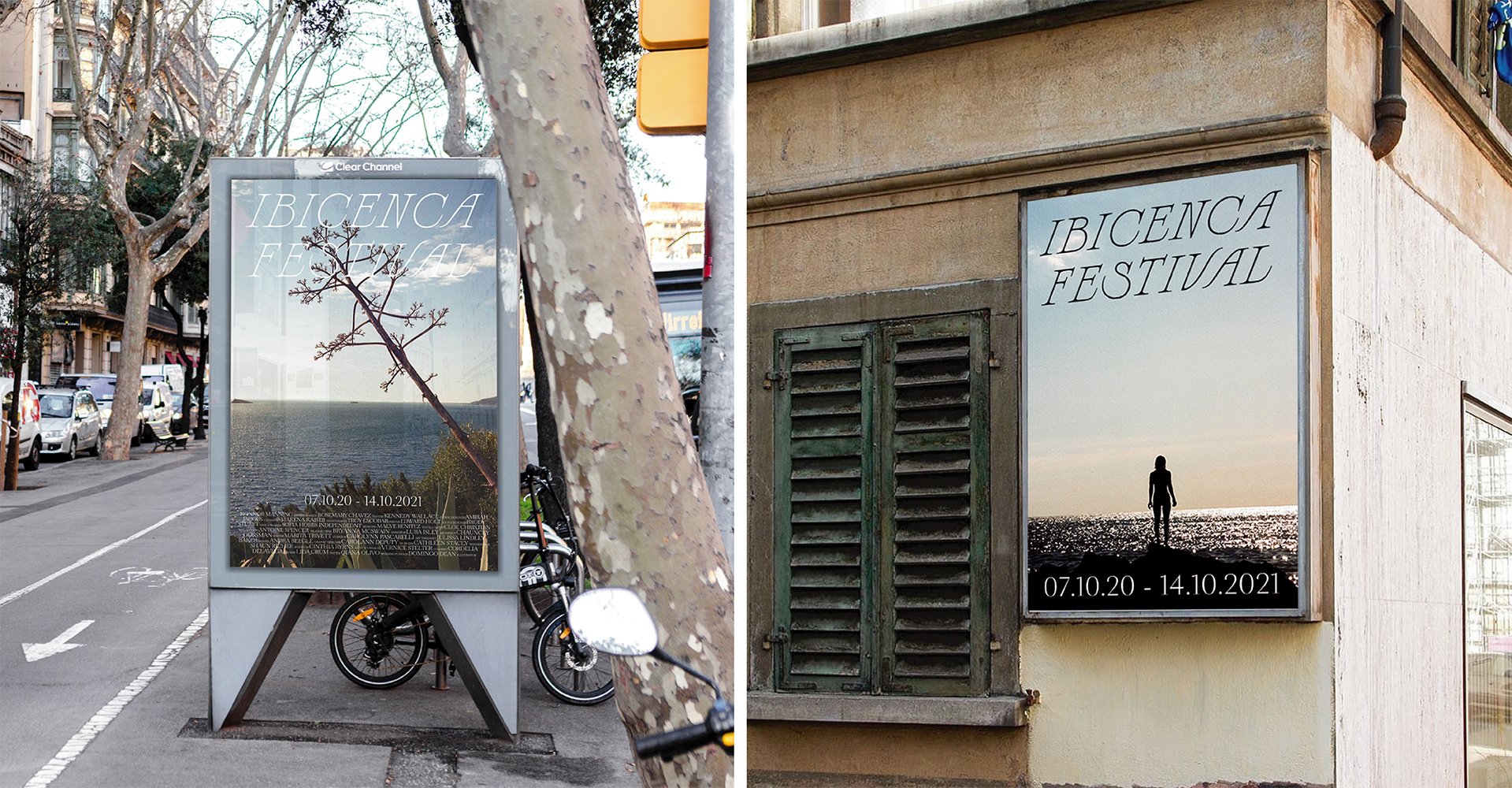
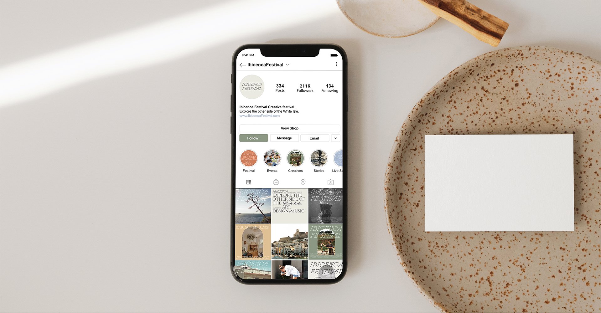
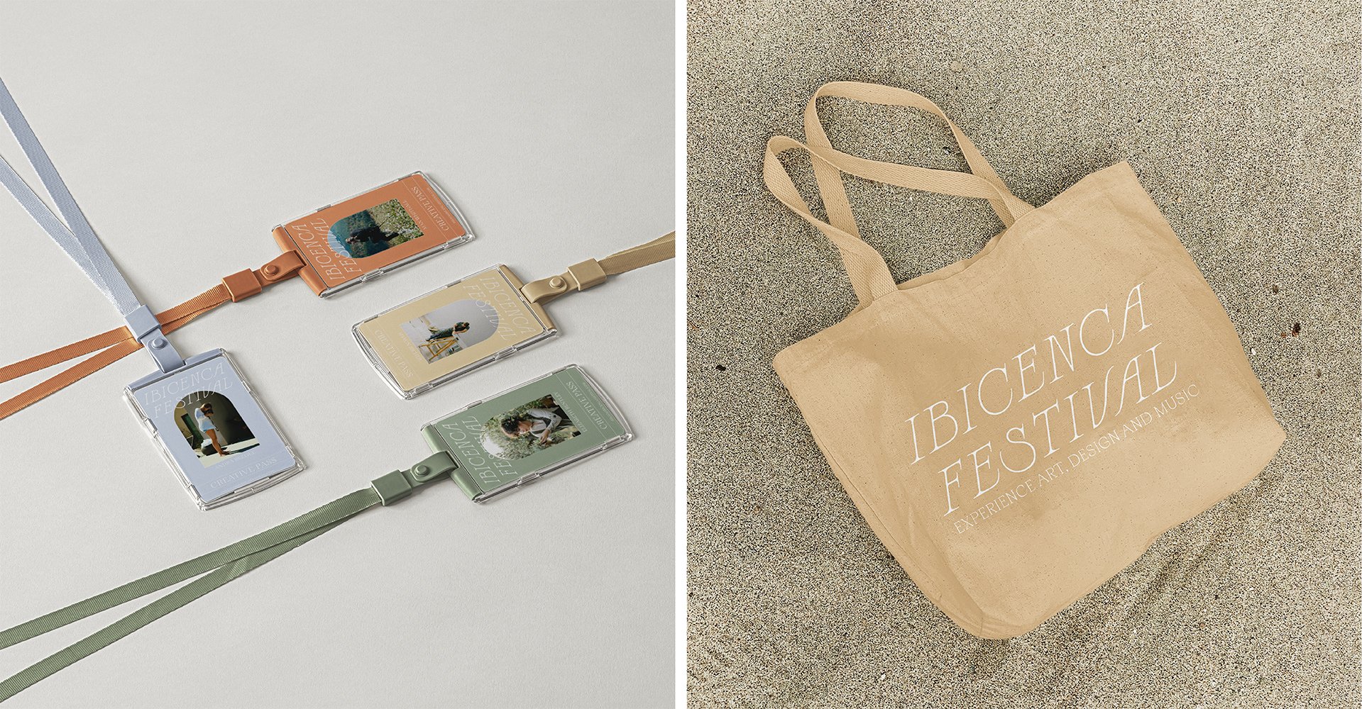
An immersive new festival for creatives, finding inspiration and gratification from the natural beauty and the simple, spiritually enriching, Ibicenco way of life. Drawing on the island's rich history as a hub for artists and eccentrics through the ages, Ibicenca festival will question how our surroundings impact our creativity. It will also explore a new way of working in the digital age, away from the confines of cities.
Designing the brand identity for the ‘Ibicenca festival’ was the project I had always wanted to do. Rooted in my own cultural identity, the conceptual language and visual references of this body of work were inspired by my childhood growing up in Ibiza. Communicating this sense of place through branding was a process I found immensely gratifying, as it allowed me to articulate my own unique perspective on a place that is often misunderstood.
Espasso | Mid-century modern Brazilian furniture store rebrand
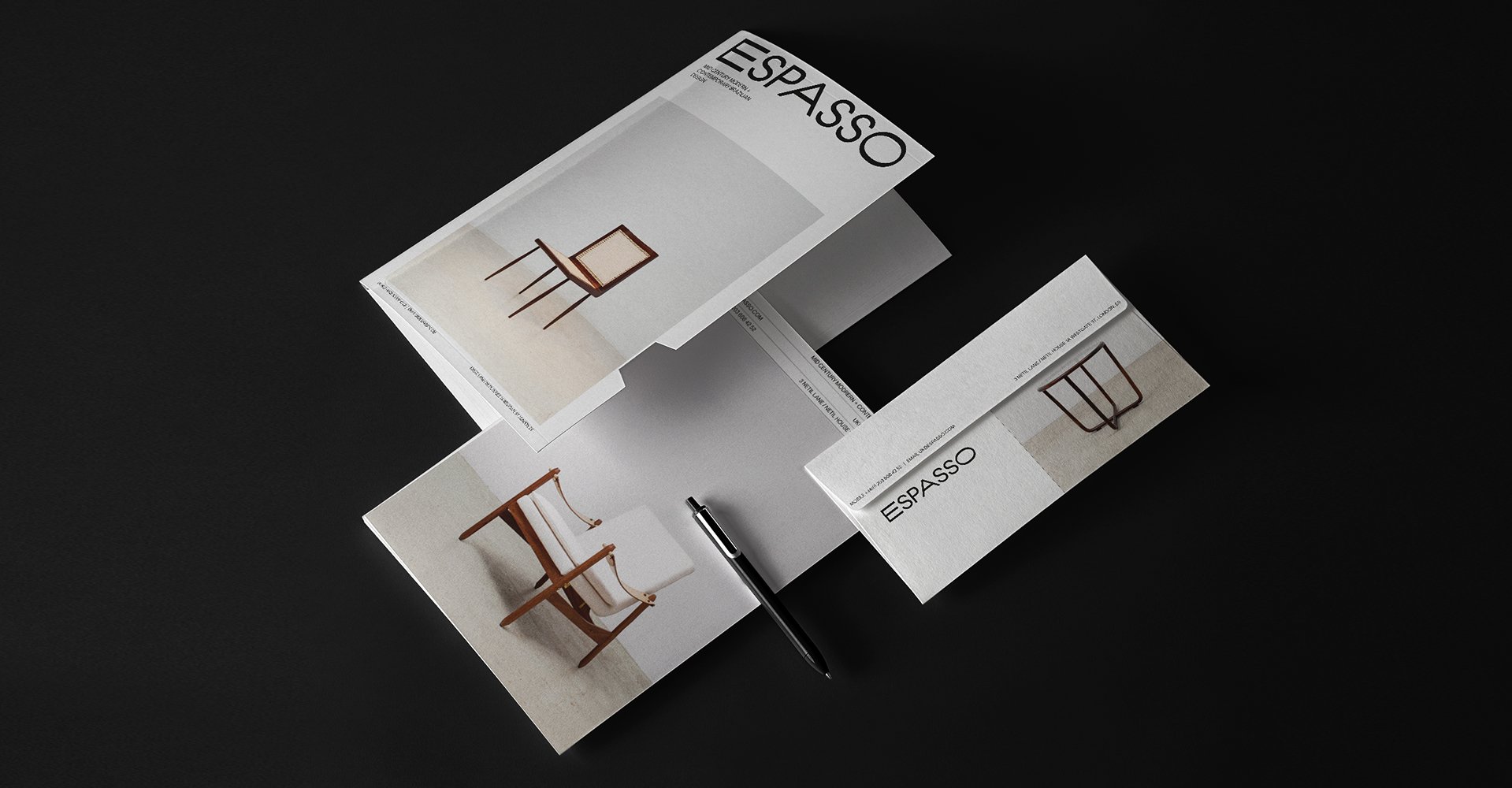
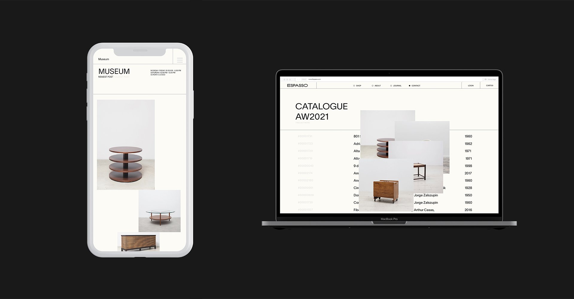
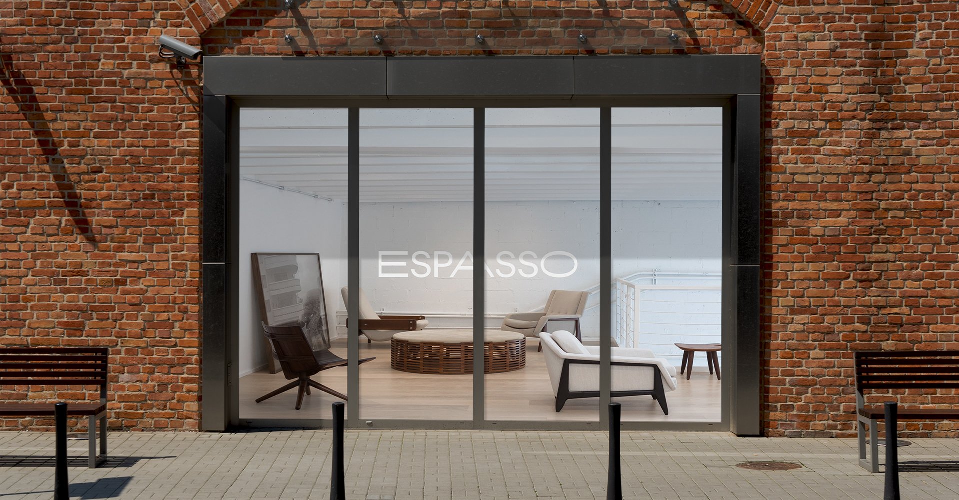
I am constantly looking for ways I can develop both personally and professionally. Espasso was a self-initiated project in which I challenged myself creatively to take a more modernist approach led by my learning of typography. I briefed myself to design a refreshed brand identity for Espasso, a premier resource for mid-century modern Brazilian furniture based at Netil house London. My aim was to bring the strong visual language of the products and photography to all aspects of the brand through a coherent set of brand guidelines across all printed and digital applications.
The new Espasso branding explores modernist aesthetics through minimal design. Layouts populate a 12 column grid across all collateral, resulting in consistency across channels. Warm colours are used in tonal variations, with greys, beiges and off-white textured Colorplan stock giving a human touch. The logotype has been crafted by merging two existing fonts, cleverly nodding to the two aspects of the Espasso business. I represented the functionality of midcentury furniture by using the consonants and punctuation in Suisse Intl Regular, while the more artistic side is represented through Ace Regular, using the vowels and numbers, the most creative part of the alphabet learnt in childhood. The strength of the identity lies in the pairing of an esoteric, midcentury-inspired logo with slick, minimal art direction.
More beautiful things for everyday life | Exhibition Design
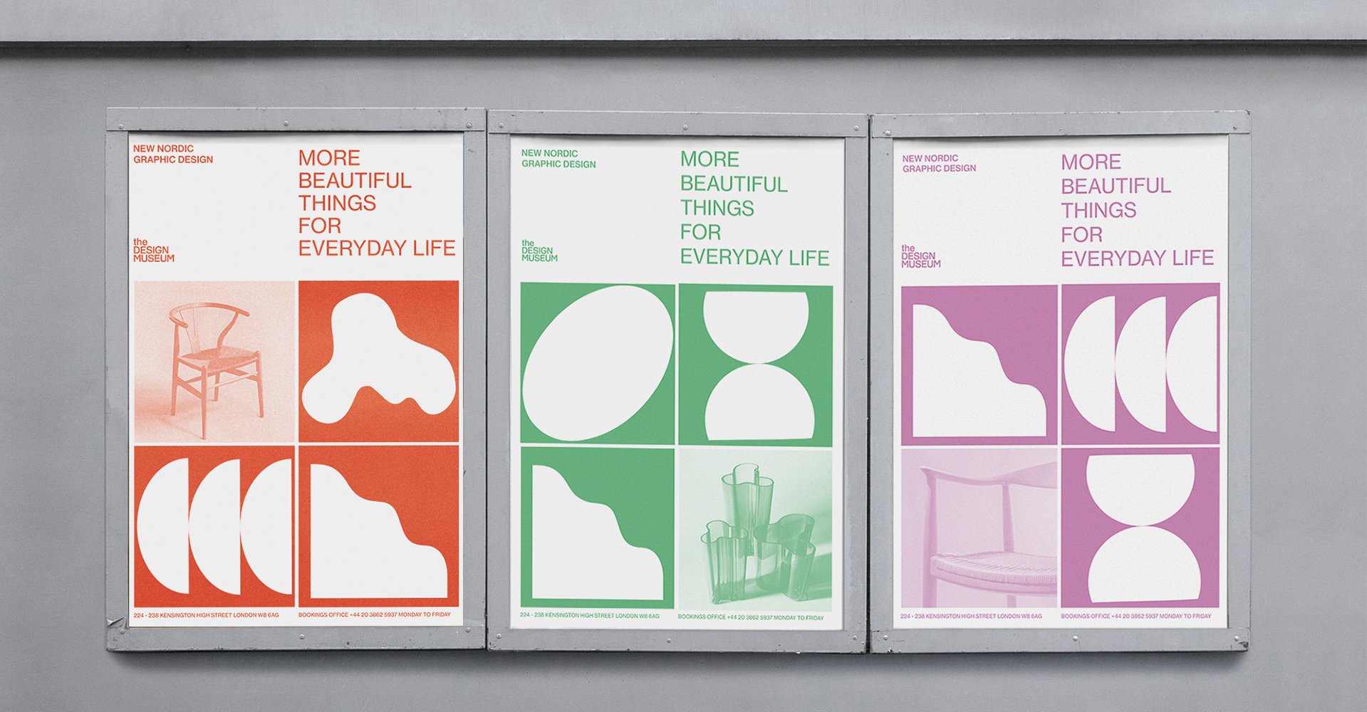
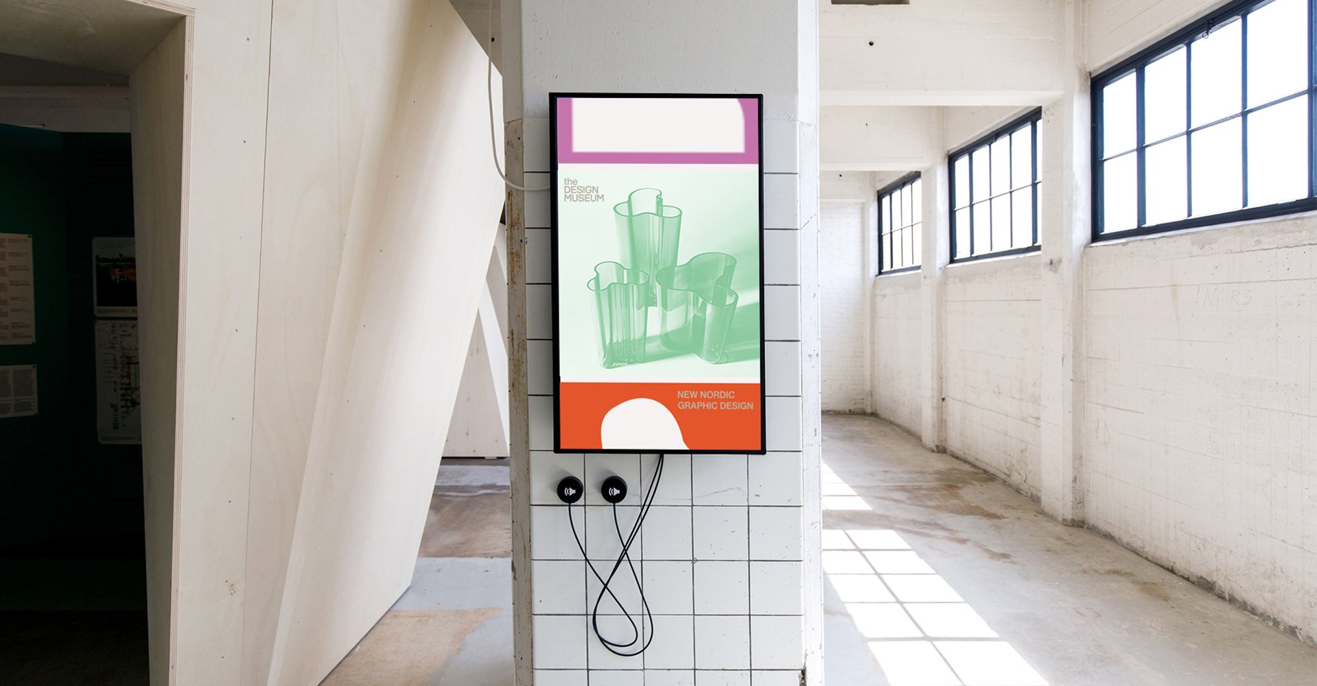
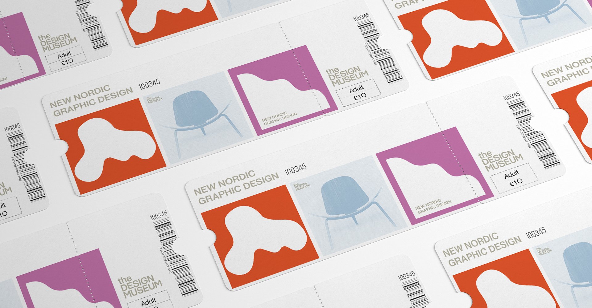
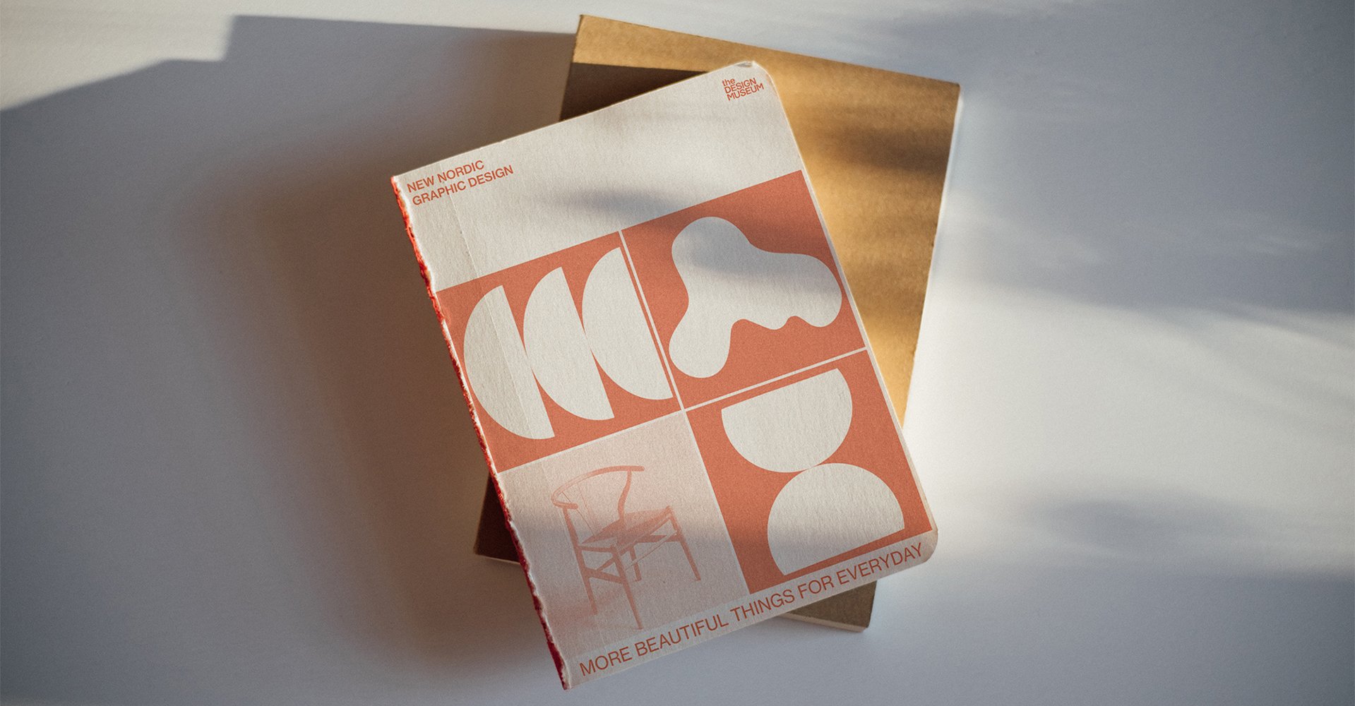
As an extension of the concepts discussed in my dissertation, I designed the visual identity for a hypothetical exhibition on New Nordic graphic design held at The Design Museum. Titled 'More beautiful things for everyday life' after Gregor Paulsson’s 1919 iconic propaganda publication. Informed by the research, the exhibition design is centred around the then and now correlation between the Scandinavian design movement and contemporary New Nordic graphic design.
To this effect, the visual identity draws on classic modernist imagery and typography (Neue Haas Grotesk) but reimagines it in bold and bright colours. Divided according to the five features of the movement identified by the dissertation: Functionalism, Craftsmanship, Democratic ideals, Respect for nature, and a drive for Visual beauty and Simplicity. Five symbols represent the five features, their shapes inspired by the graphic profiles of Scandinavian design classics such as the Alvar Aalto Savoy vase. The primary font across all applications of the identity is Neue Haas Grotesk, a refined digital version of Helvetica. This rich visual heritage and renewed refinement make it the perfect vehicle to translate the conclusions of my dissertation; that by learning from our design heritage and re-defining it, we are able to continue to innovate whilst incorporating the theoretical and philosophical values of our design history.
