Jaweria Maryam
Email address
moc.liamg@dgmayramairewajBiography
I'm Jaweria, a Pakistani-British Graphic designer with a keen focus on problem solving. My work is primarily based in the realms of editorial design, branding and innovation, I'm constantly adapting and finding solutions to new problems. My way of working is unconventional, I'm always experimenting and learning new skills.
So, the two projects are addressing problems faced by Pakistanis around the world and because of lack of Pakistani representation, these issues go unnoticed. On the surface these might be seen as small or irrelevant issues by us, but these solutions could make a massive difference for Pakistani communities.
Portfolio
Connect
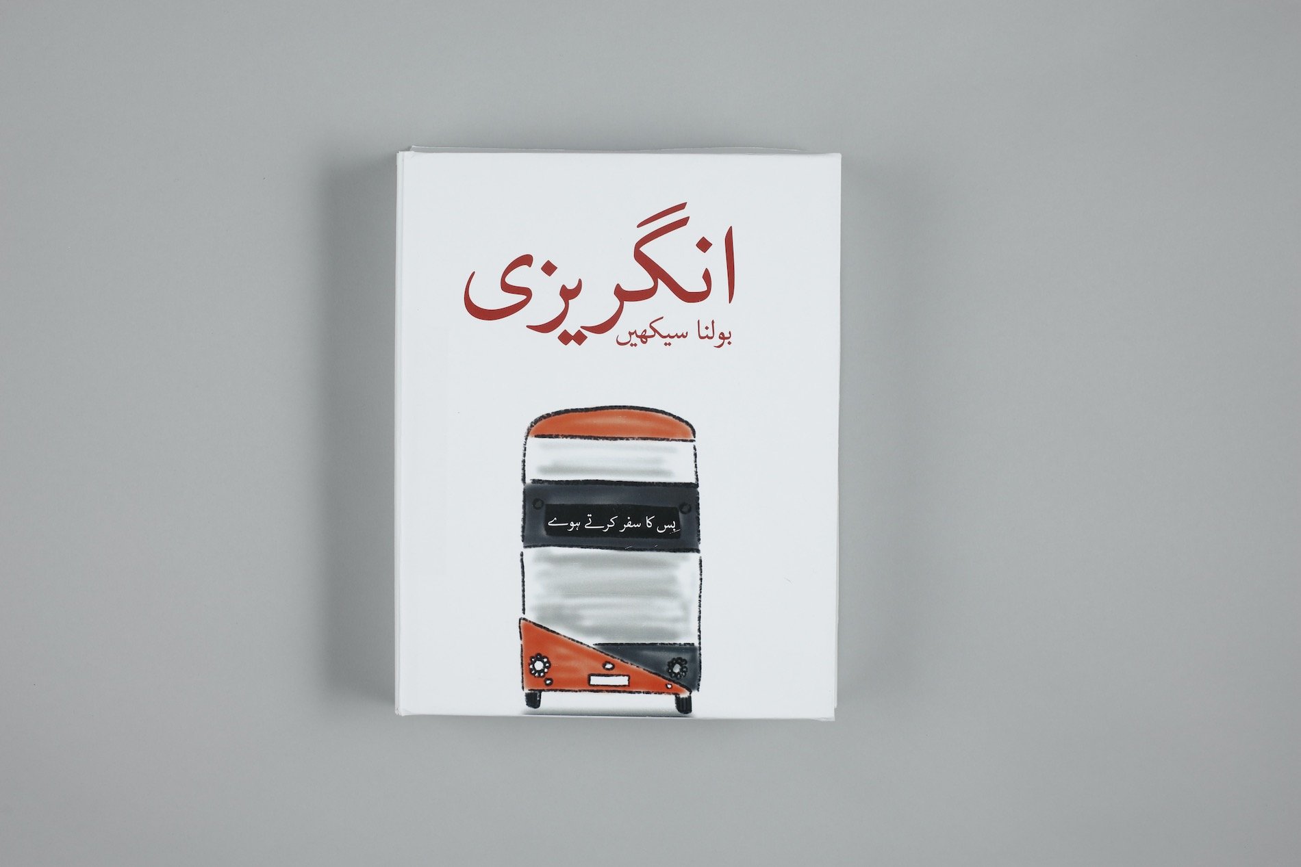
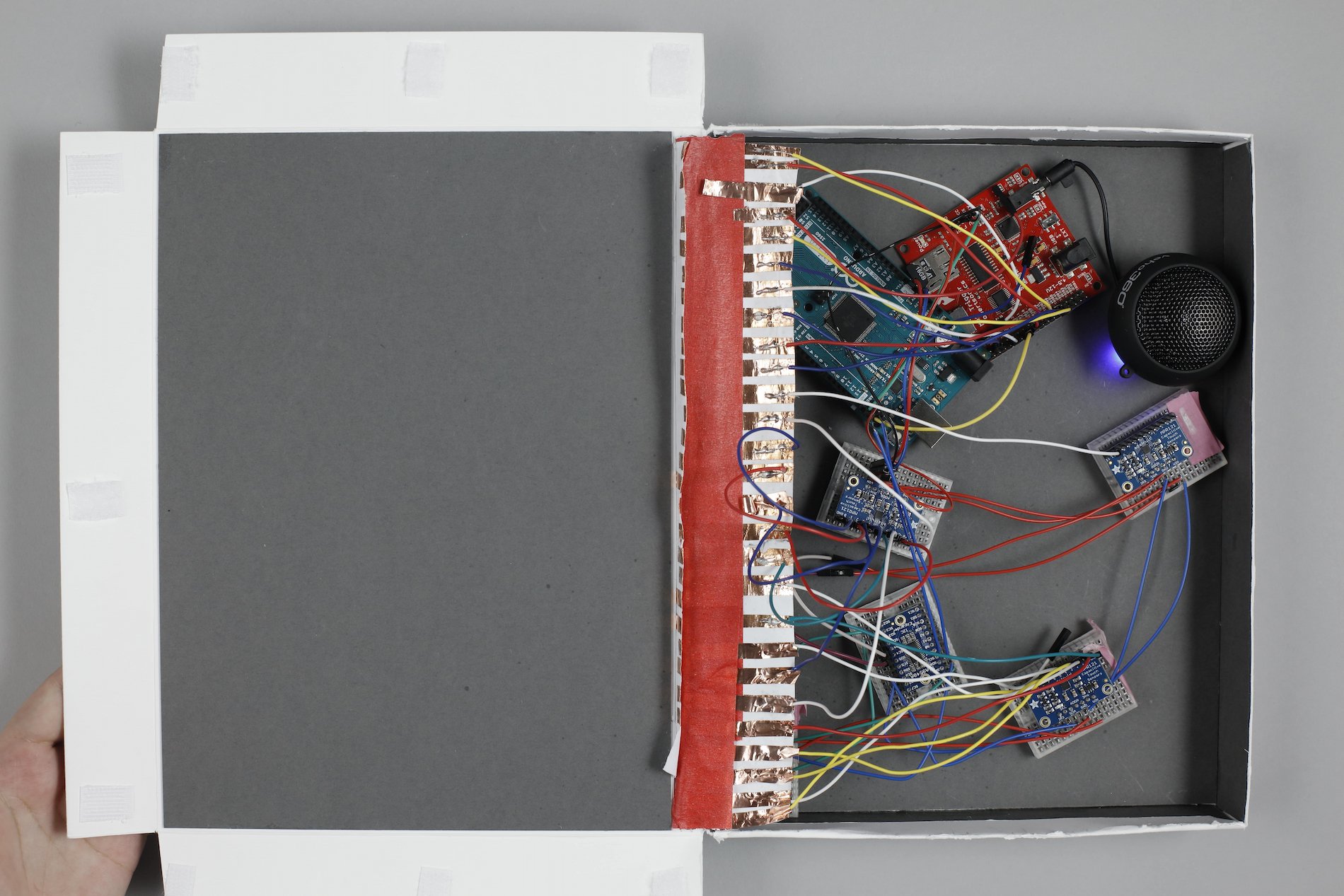
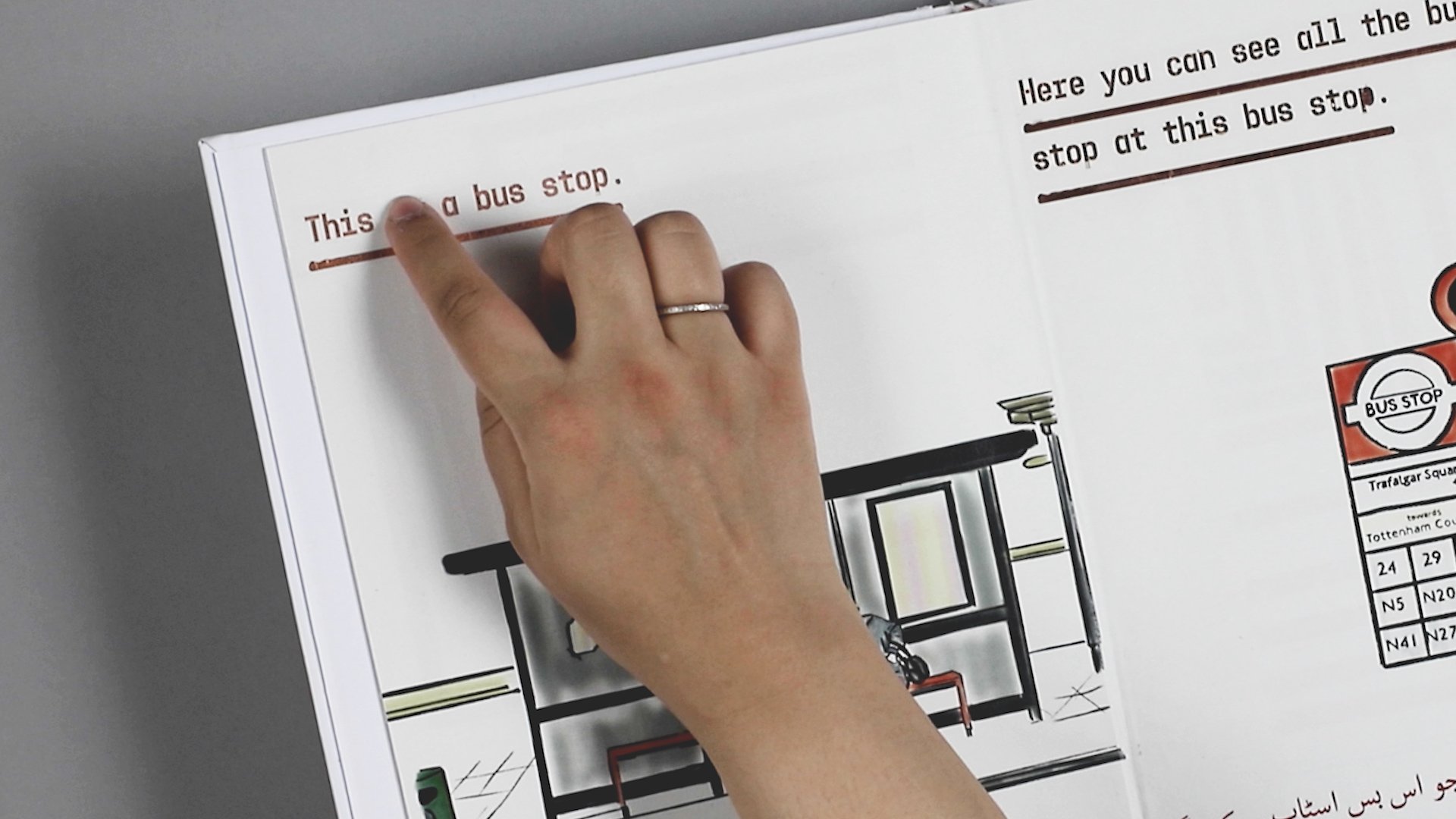
This project tackles the issue of illiteracy in a foreign language, specifically for migrants and digital immigrants. The three key elements – reading, writing and speaking, were integrated into a book. This combination of visual, touch and sound are a perfect solution to tackle illiteracy for my target audience, ensuring a mother of 2 can learn how to speak, read and write from the comfort of her home.
During my research I uncovered that there are no good sources available for Urdu speakers to learn English, even with all the technological advances. Therefore this book is designed for Urdu speakers to learn English.
Manifest – Jhumka 47
Jhumka 47 is an Indo-Pakistani jhumka brand that will bridge the gap between Indians and Pakistanis living in the UK.
Jhumkas are bell-shaped earrings, traditional to India and Pakistan. Despite them being two different countries with different traditions and religions, jhumkas hold a sacred value for both.
But unfortunately, these factors have significantly impacted the demand for jhumkas in UK.
Jhumkas are expensive
Availability is limited
Heavy to wear
Limited to 3-4 colours
To solve these issues, 47 will be using Acrylic as the main material of choice to manufacture the Jhumkas. The reason being, Acrylic is:
Lightweight
Inexpensive
Durable
Extensive colour range
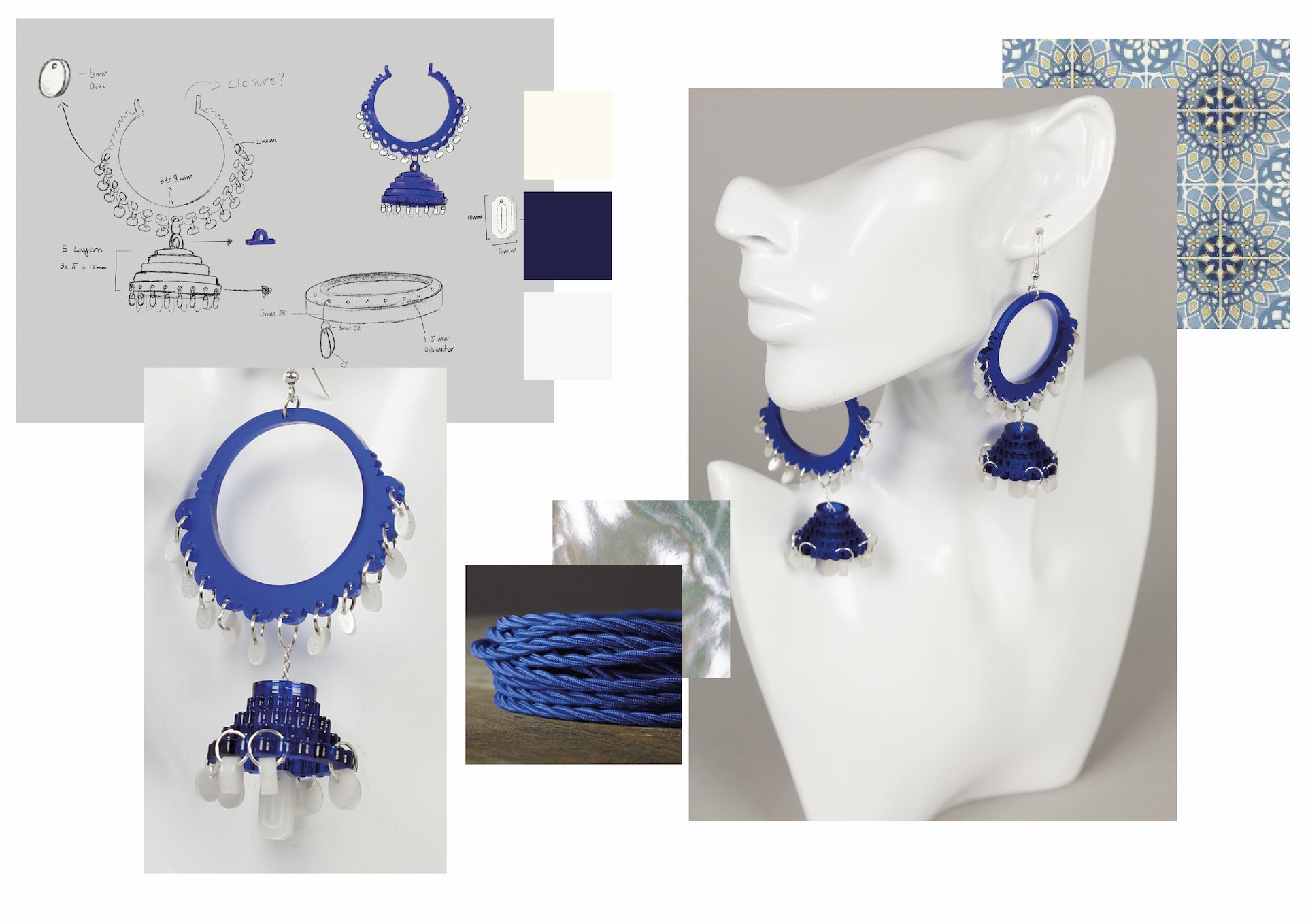
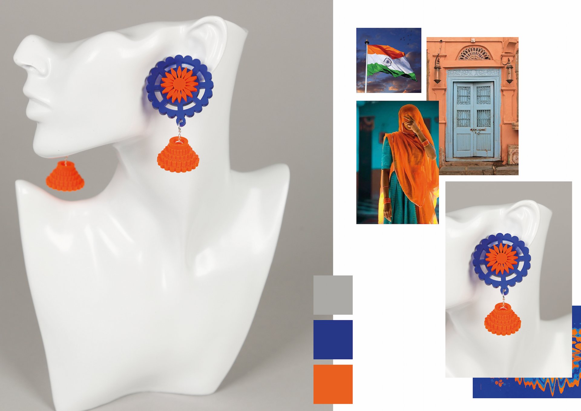
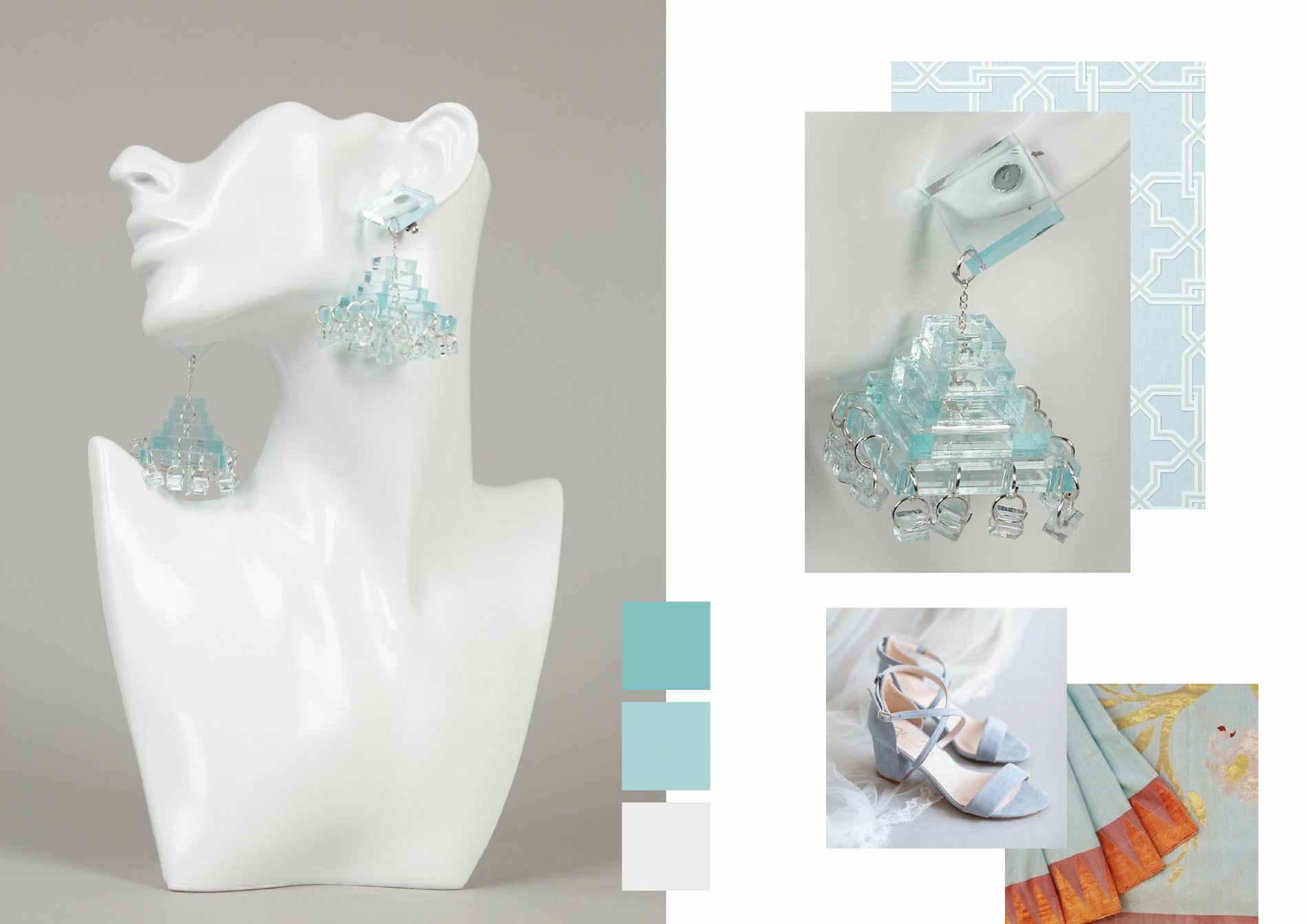
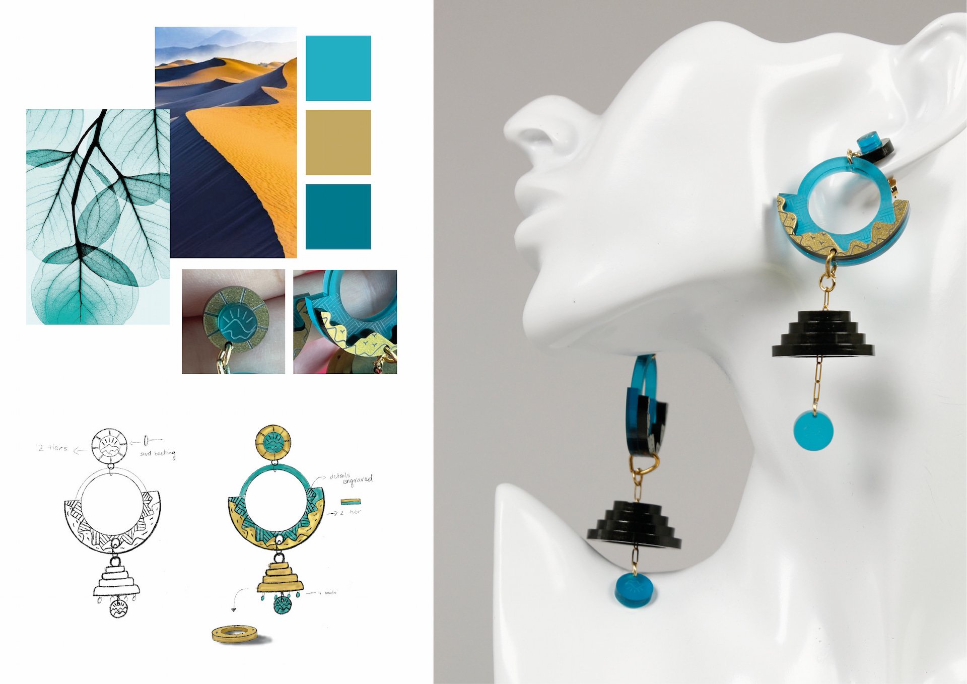
47’s mission is to provide responsibly-produced beautiful statement Jhumkas. Our products will be a fusion of traditional Indo-Pakistani patterns and western materials/techniques. 47 will be an embodiment of creativity and craftsmanship, that will provide high quality Acrylic Jhumkas. Now you can see few of the Jhumkas that I created for 47.
Support me to launch Jhumka 47: https://www.crowdfunder.co.uk/jhumka-47-1
Thank you
