Jessica Mumby-Price
Email address
ku.oc.liamtoh@ecirp-ybmum.acissejWeb Portfolio
www.jessicamumbyprice.comBiography
Hi, I’m Jessica!
I craft exciting visual identities and digital experiences, using a range of tools in typography design, 3D and 2D motion, illustration, coding and AR. Play and experimentation is central to my way of working and often leads to my most creative outcomes. For my final year projects, I’ve focused on topics that explore our connection to the world around us and how we might live in the future. Upon graduating, I’d love to work for a multi-disciplinary and collaborative design studio.
Portfolio
OpenWater Typeface
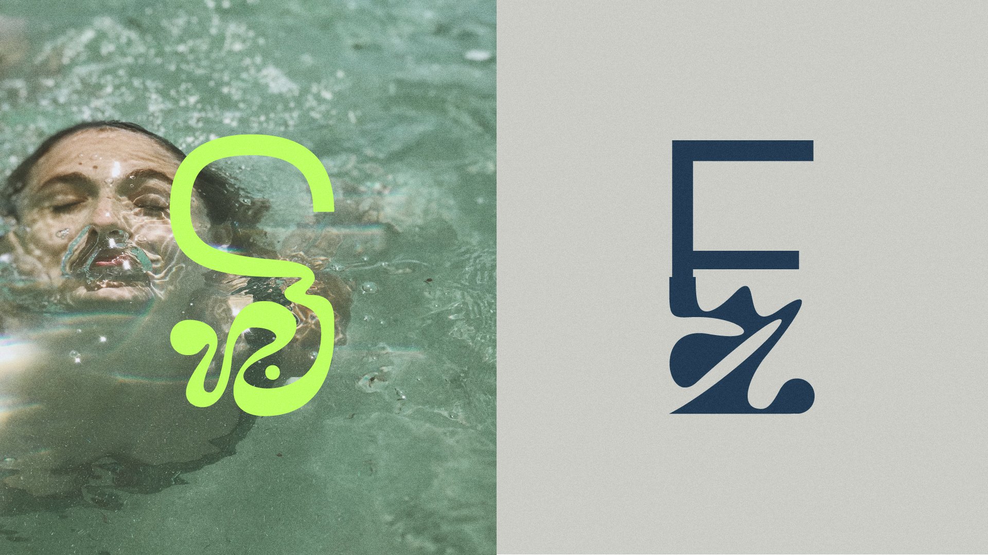
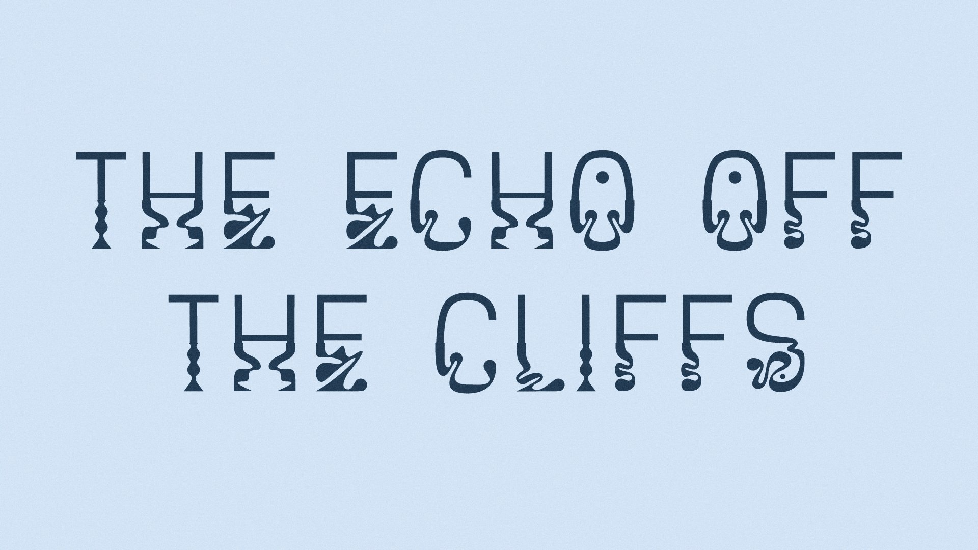
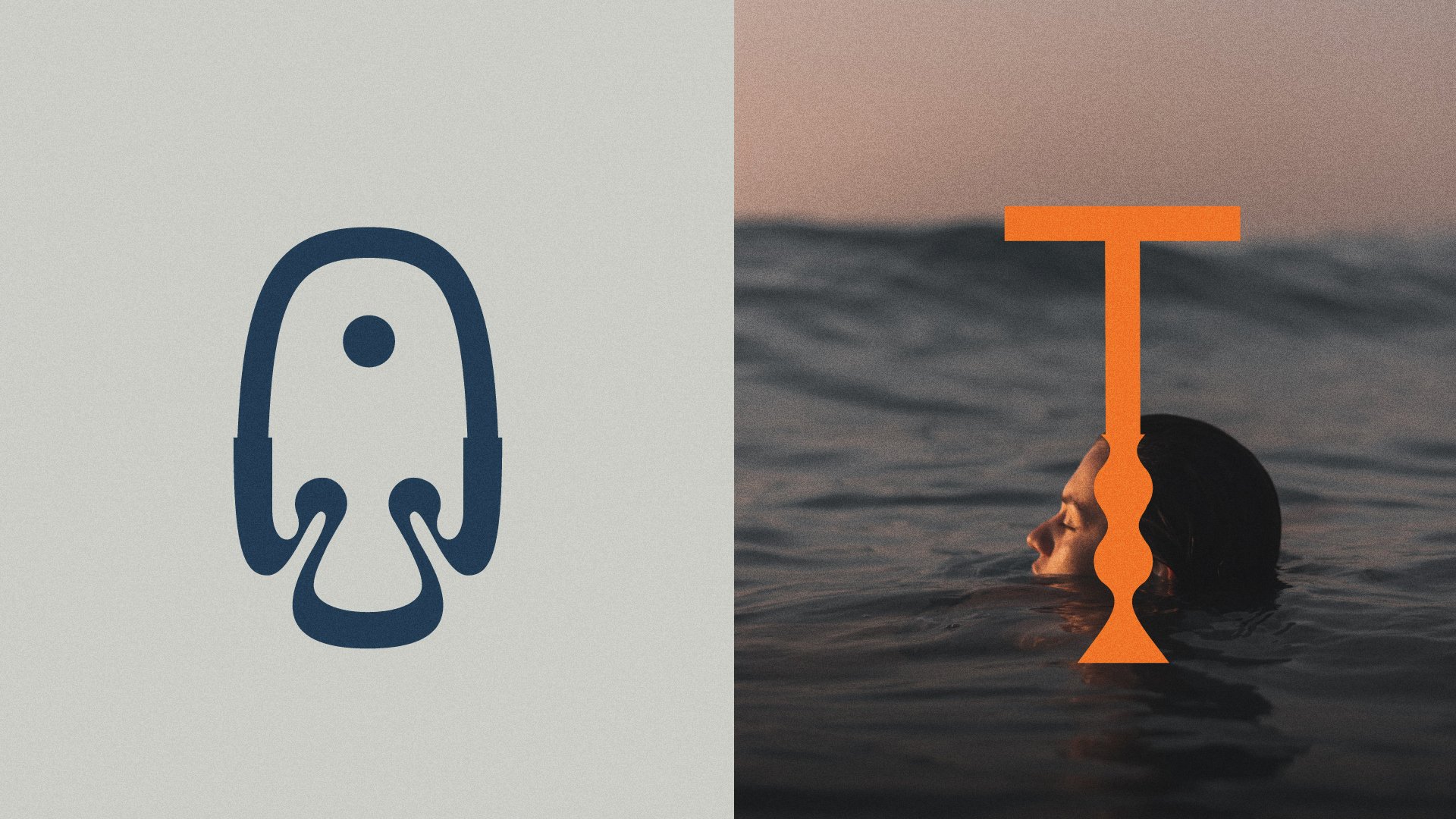
Taking inspiration from swimming in the great outdoors, OpenWater is a display typeface of duality. It speaks to the feelings associated with submerging into a body of water by imagining the water’s surface as a metaphor for a mood-altering experience.
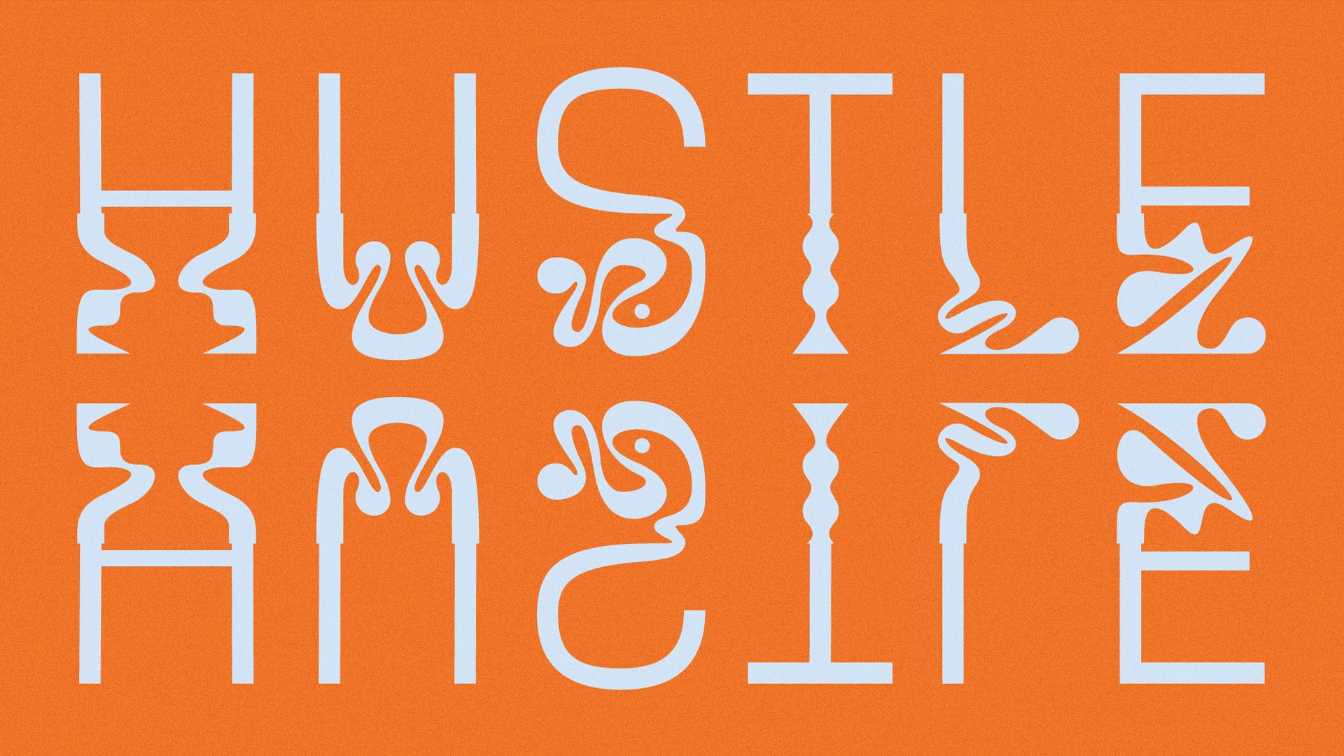
The upper half floats above the surface of the water in a blissful state of contentment. The lower half speaks a different story: looping shapes reminiscent of seaweed and movement in water, unexpected sharp vertexes and circular droplets come together to create a frantic, yet fluid form.
Along with the typeface, I designed a variable type tool which enables the user to choose how much they want to ‘submerge’ or ‘float’ the letterforms.
Roof Bloom
“Because power lies not only in what comes out of your mouth, but what you put into it”. Linyee Yuan for MOLD Magazine, 'Your Mouth Has Power' (2019)
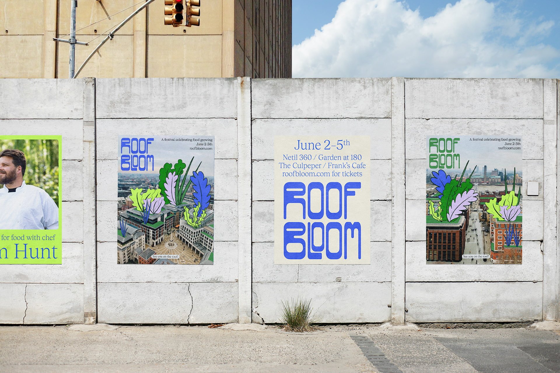
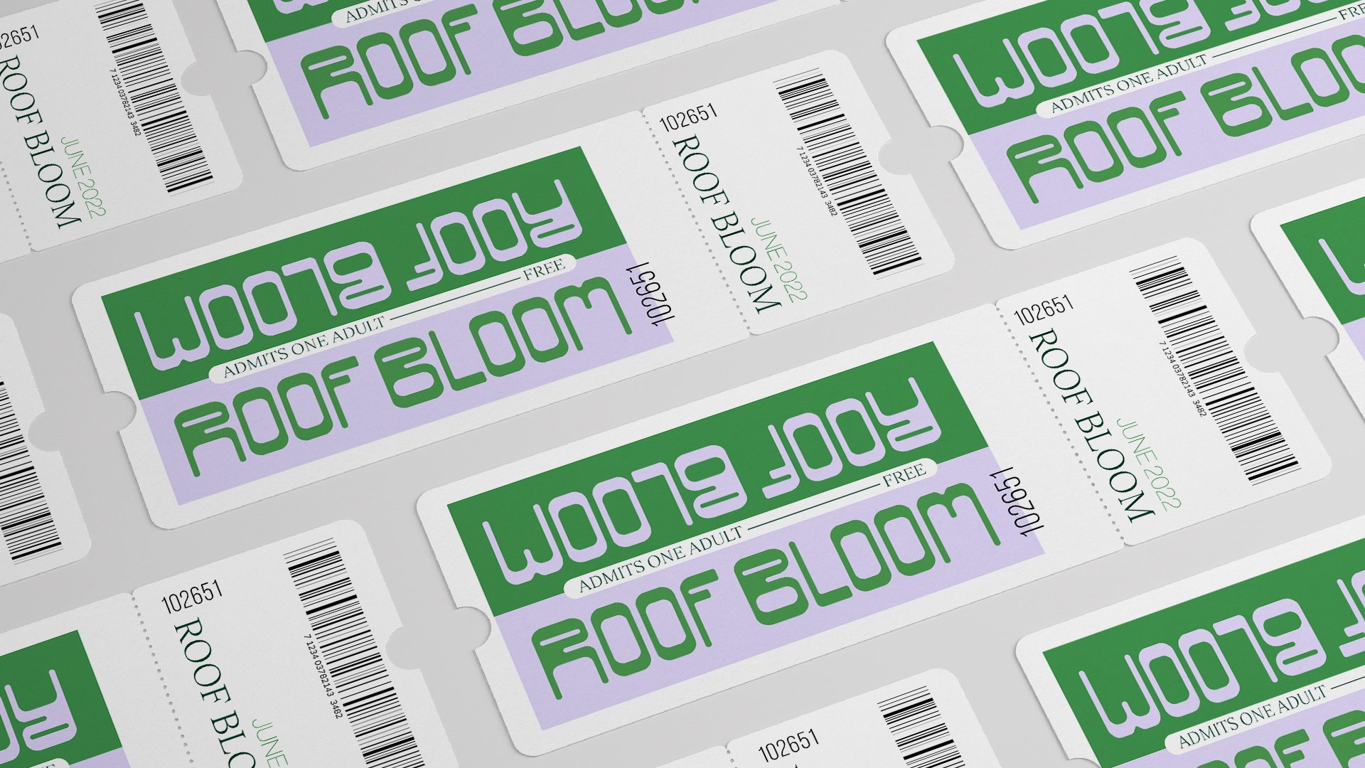
The food we eat daily is a choice we make and connects to a global food system, which benefits certain living beings and disadvantages others. I designed the brand identity, concept and merchandise for a festival, whose core purpose is to engage people living in cities with the origins of the food they consume and to encourage them to grow their own. Taking place at four unique rooftop locations across London, Roof Bloom demonstrates how unexpected urban areas can become the perfect spot for growing food.
The blocky letterforms of the logotype originate from the rectangular shape of the physical spaces where food is typically grown (fields, allotments, veg patches, window-boxes, herb gardens, seed trays, etc.). I shot the brand photography at the Growing Communities market garden at Springfield Park, which influenced the bold colour palette.
Pastures New
What if we could grow our own meat?
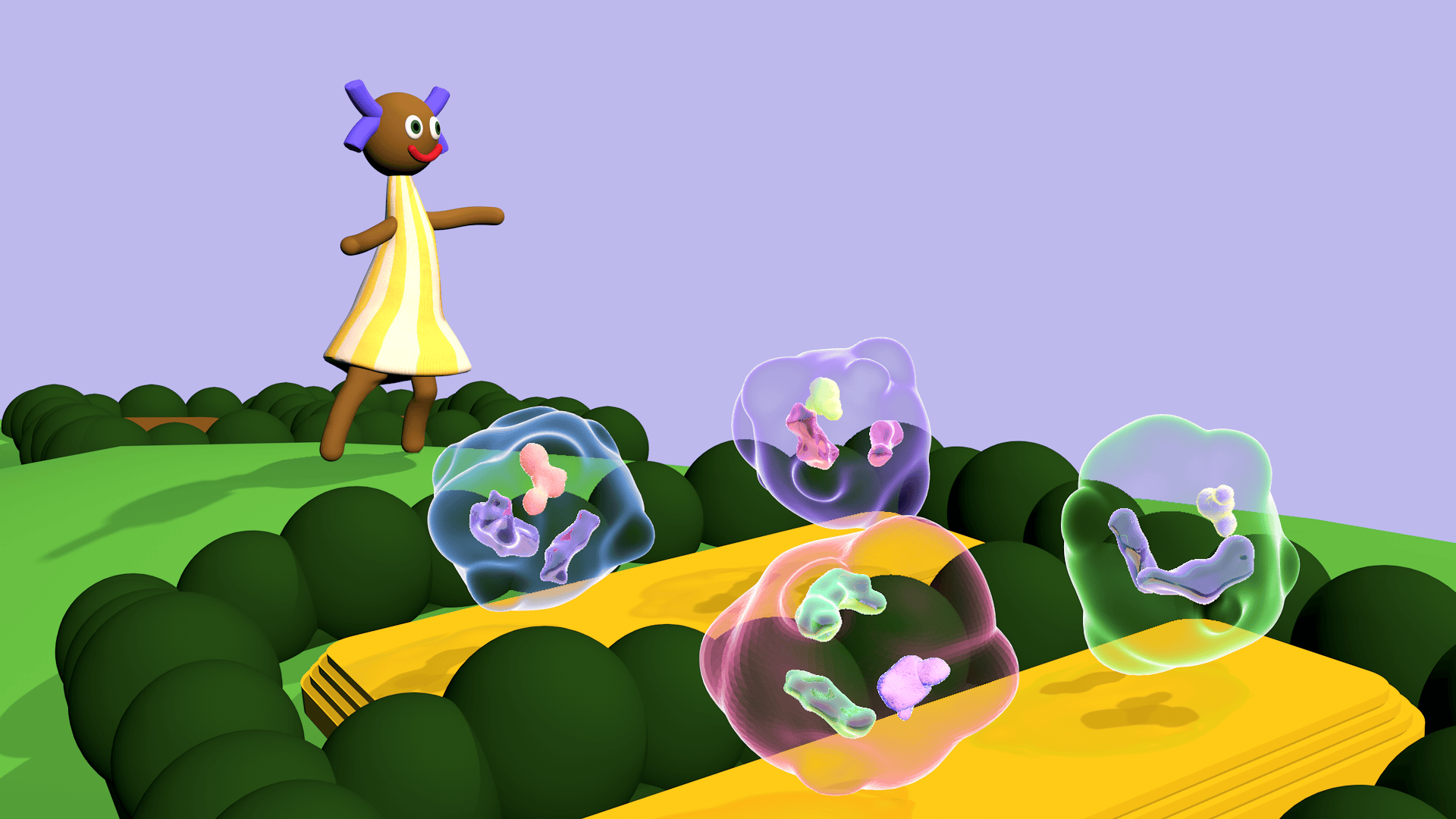
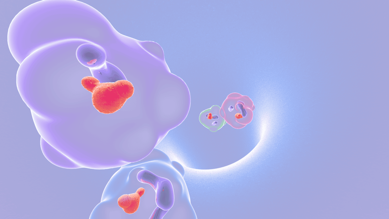
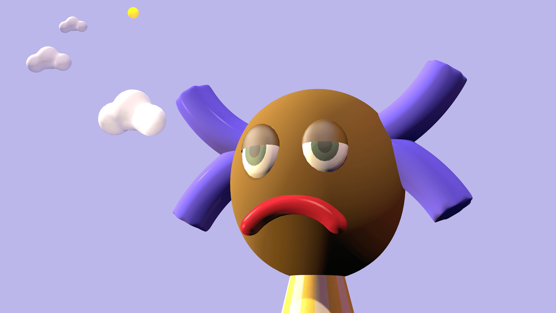
This project proposes a future scenario in 15 years time, where cultured meat is widely-eaten and socially acceptable. I designed a 3D game (for web) which explores the connection between cultured meat and the environment, by subverting the idea of a digital pet. The player must extract cells from animals, respond to their survival needs and nurture them into ready-to-eat meat products, in order to satisfy a growing population and maintain the fragile ecosystem.
