Joanna Krystyna Nowicka
Email address
moc.liamg@ngised.enitsirhcenajWeb Portfolio
janechristine.coBiography
Hi, I’m Jane! (she/they)
I’m a Polish multimedia designer with a passion for storytelling through visuals. My creative practice focuses on different styles of illustration, digital design and motion. I am an avid activist and feminist and I adore working on projects of similar topics, as well as on projects about games and virtual reality. My goal is to immerse people with the message the visuals are conveying, and move them to action.
Throughout my work experiences I gained a lot of knowledge in design for social media and for sustainability, as well as design in health & IT sectors. I love working on diverse projects and challenging myself creatively everyday.
Portfolio
GAMIFICATION OF THE PINK BOB
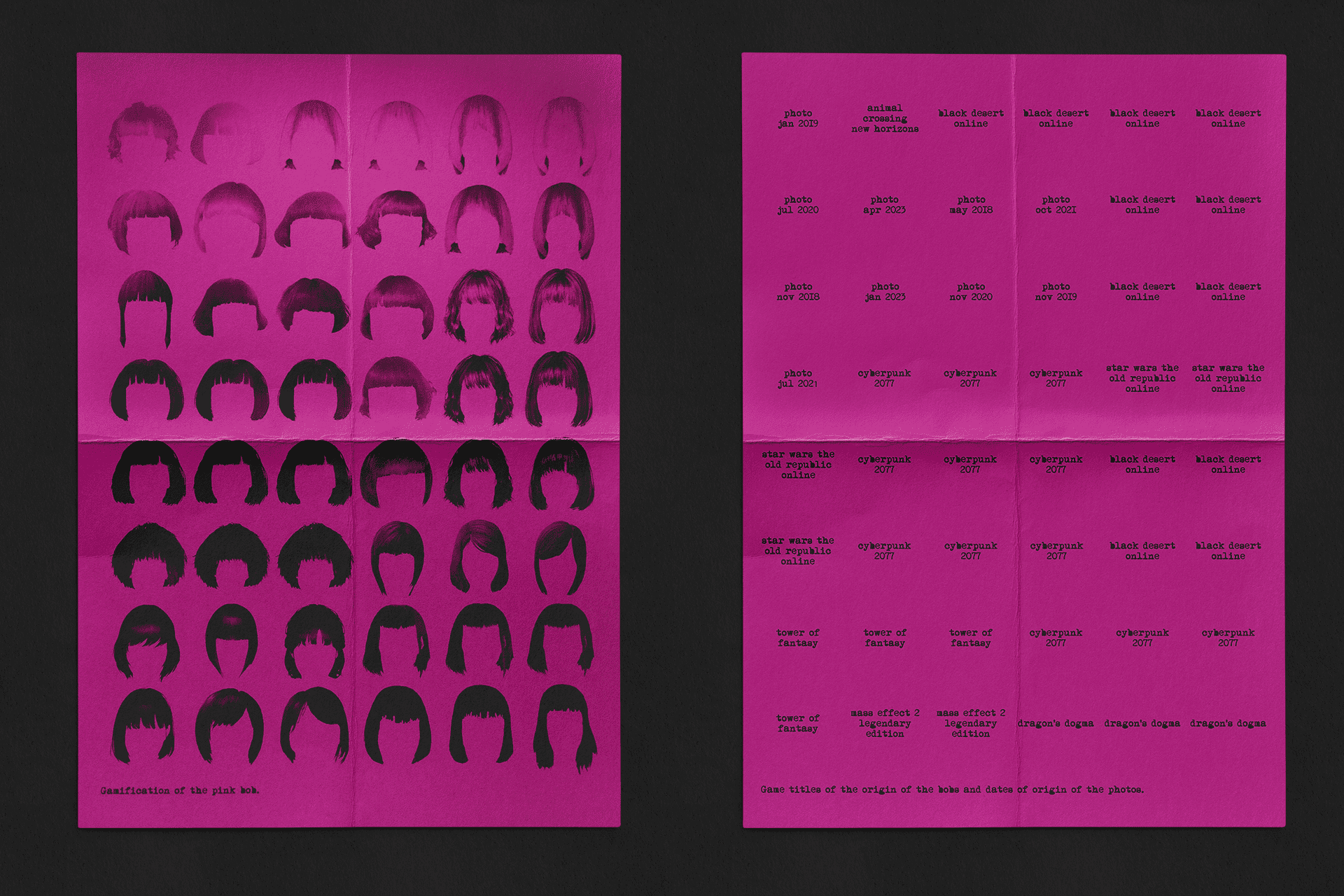
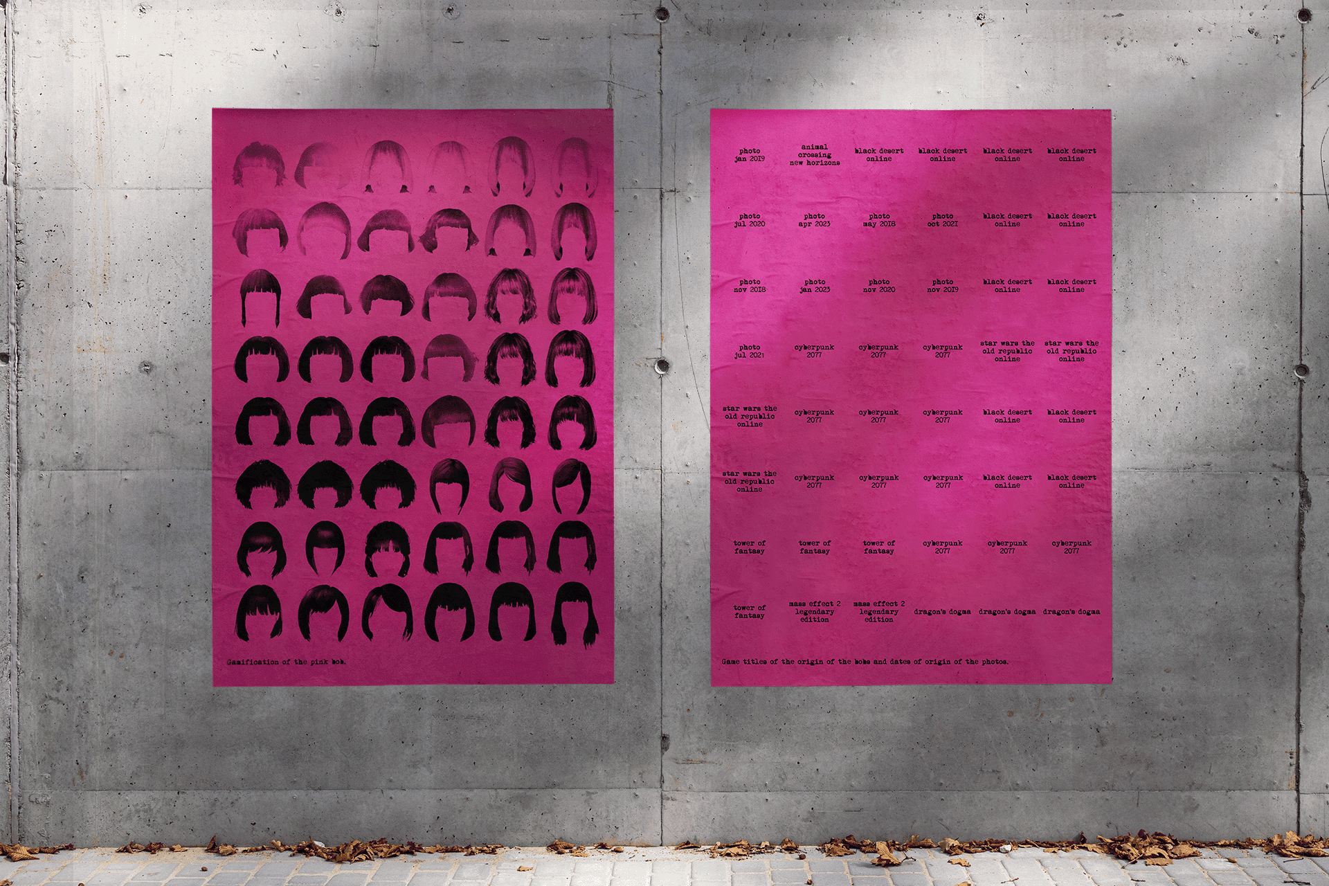
An exploration of gamification of life – the blurred lines between the physical world and the virtual reality of video games. These two posters focus on the physical aspect of themselves a person inserts into a character creator within a game – a scar, makeup style, or, like in this case, a hairstyle.
The pink bob is a summary of the author, and an authentic measure for the gamification. The hairstyles included come from games played and loved, as well as her real hair from photos. The comparison is conducted on a grid determined by length of the hairstyle, as well as the darkness of its pink colour.
SOPLICA VODKA
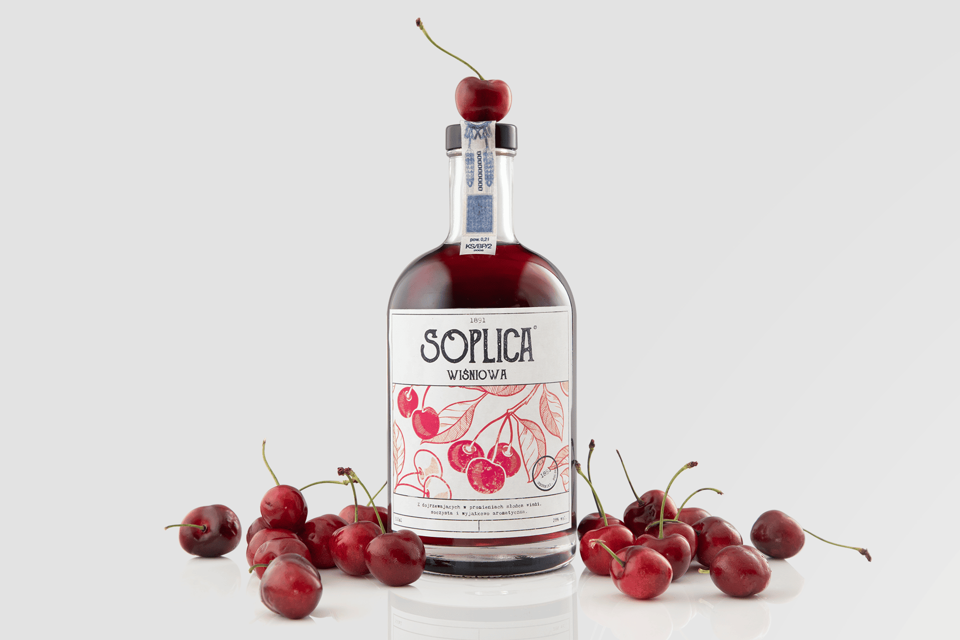
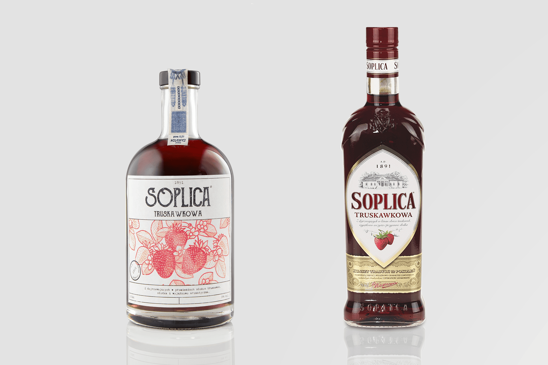
A brand identity redesign for a well-known and loved, traditional Polish vodka brand – Soplica. It is most popular for its syrup-like flavoured vodkas that are a staple at any Polish gathering.
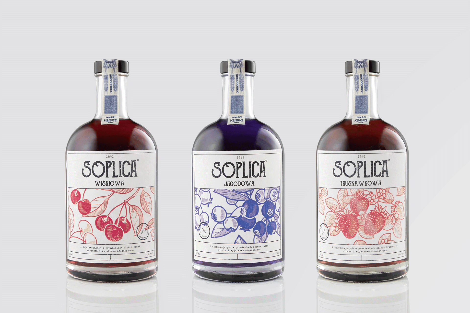
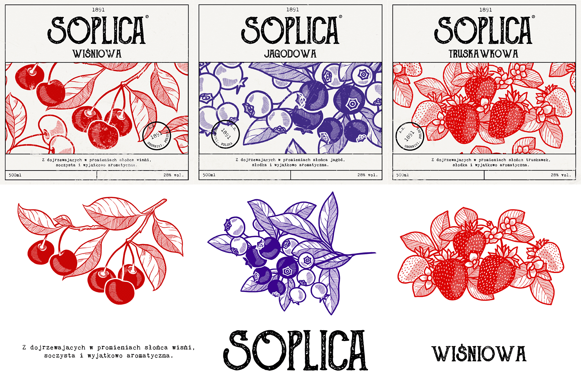
The redesign was made with love for the original, traditional feel with a 130 year old heritage, while wanting to add a modern twist. It focuses on woodcut-like illustration style, traditional fonts as well as pushing out the mesmerising colour of the liquor, while simplifying the overall the design. The redesign features three flavours – cherry, blueberry and strawberry, as well as a back label.
POLISHED FUTURE
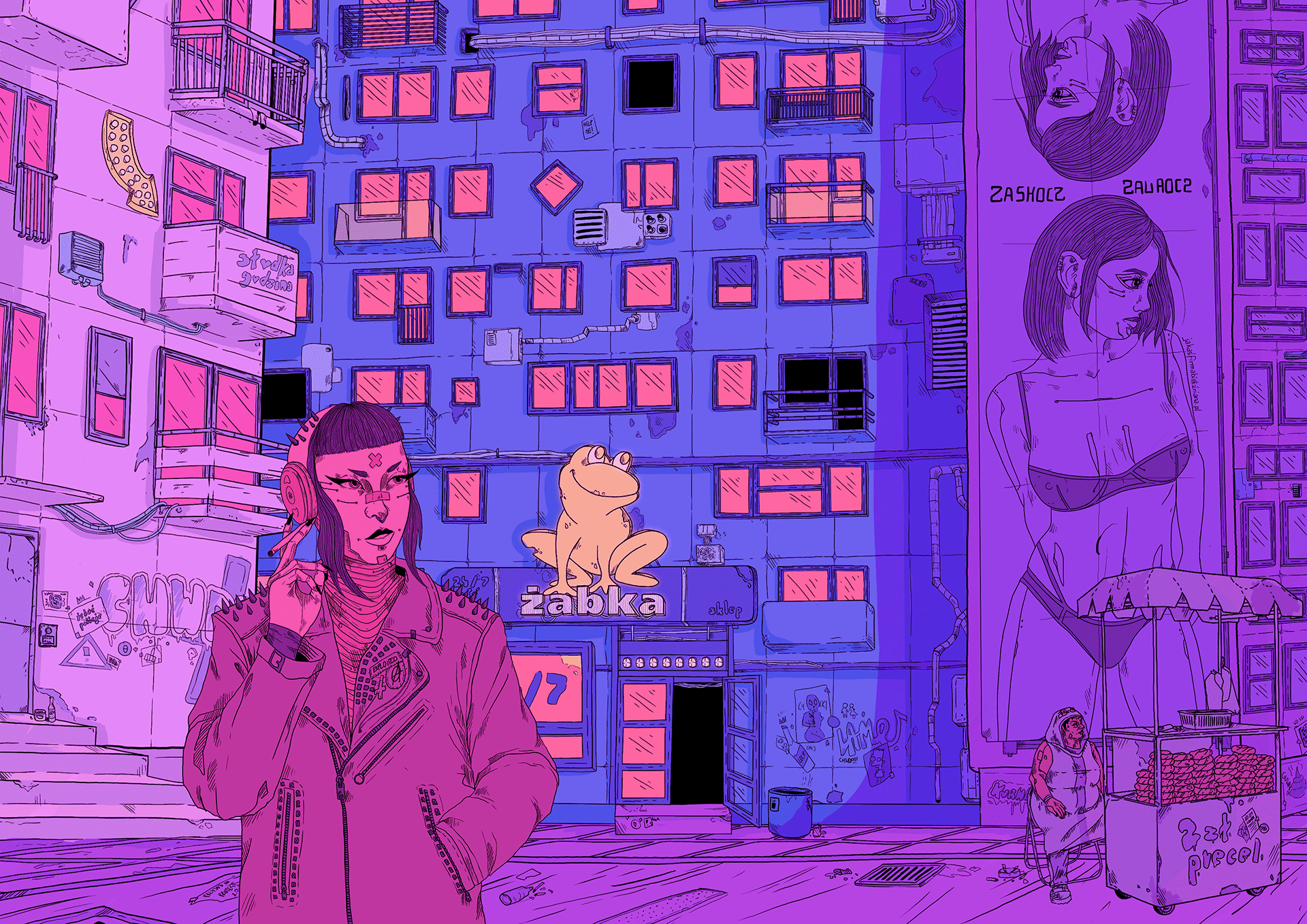
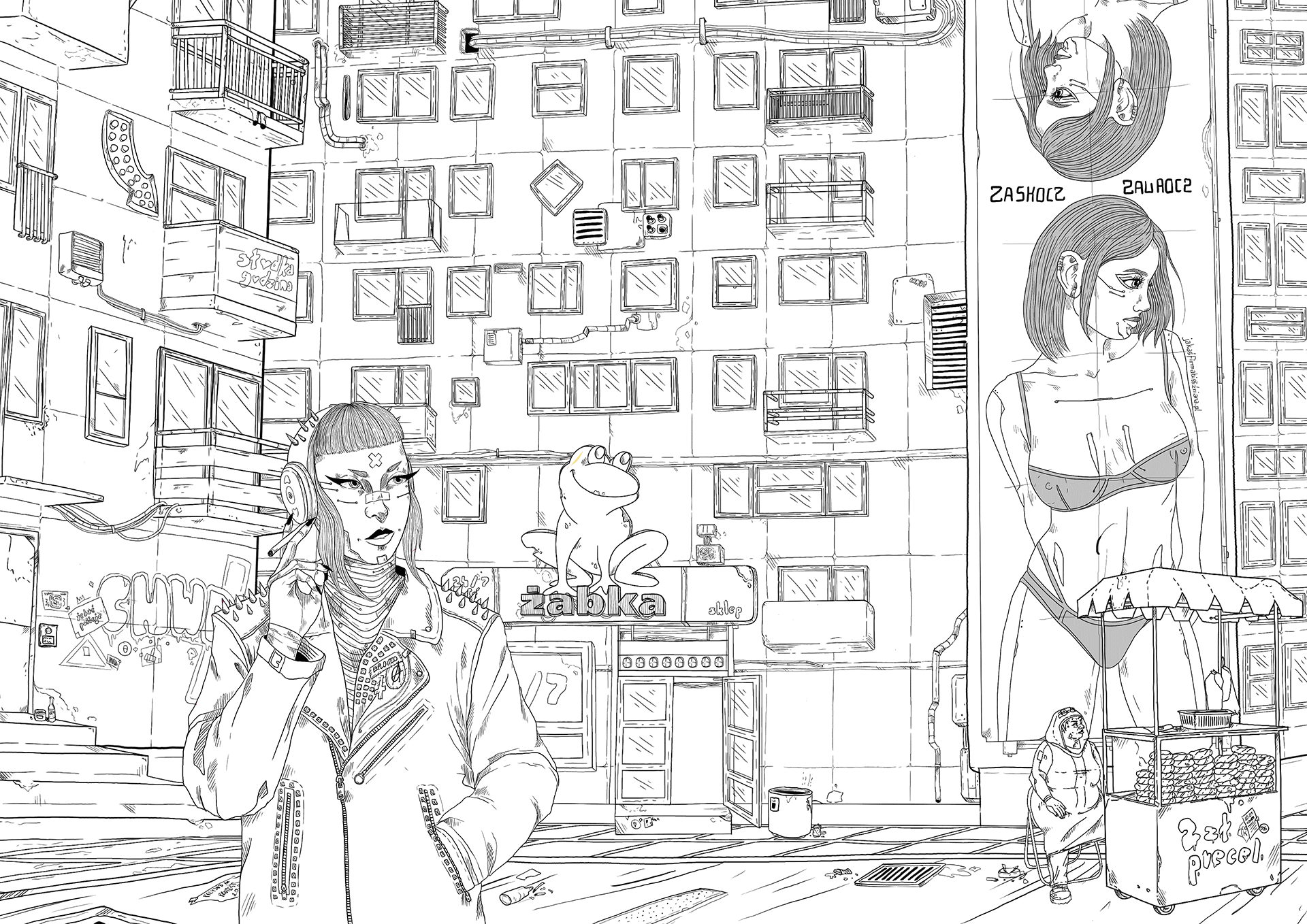
An exploration of a dystopian future with cyberpunk aesthetics. The project focuses on displaying the genre of cyberpunk while taking away its most harmful part – orientalism and appropriation of Asian cultures for aesthetics. Instead, it focuses on Polish heritage and culture and how it fits within the cyberpunk theme.
