Ketevani Katamadze
Email address
moc.oohay@ezdamatak_kWeb Portfolio
www.behance.net/ketikatamadzeBiography
Hi! I am Ketevani Katamadze, Kate for short, from the small country, Georgia. My area of focus is editorial design and branding. I am a perfectionist with close attention to detail and passionate about new challenges and possibilities. This past year I started working on myself as a professional and combined various passions of mine to produce outcomes.
Portfolio
Abstract Magazine
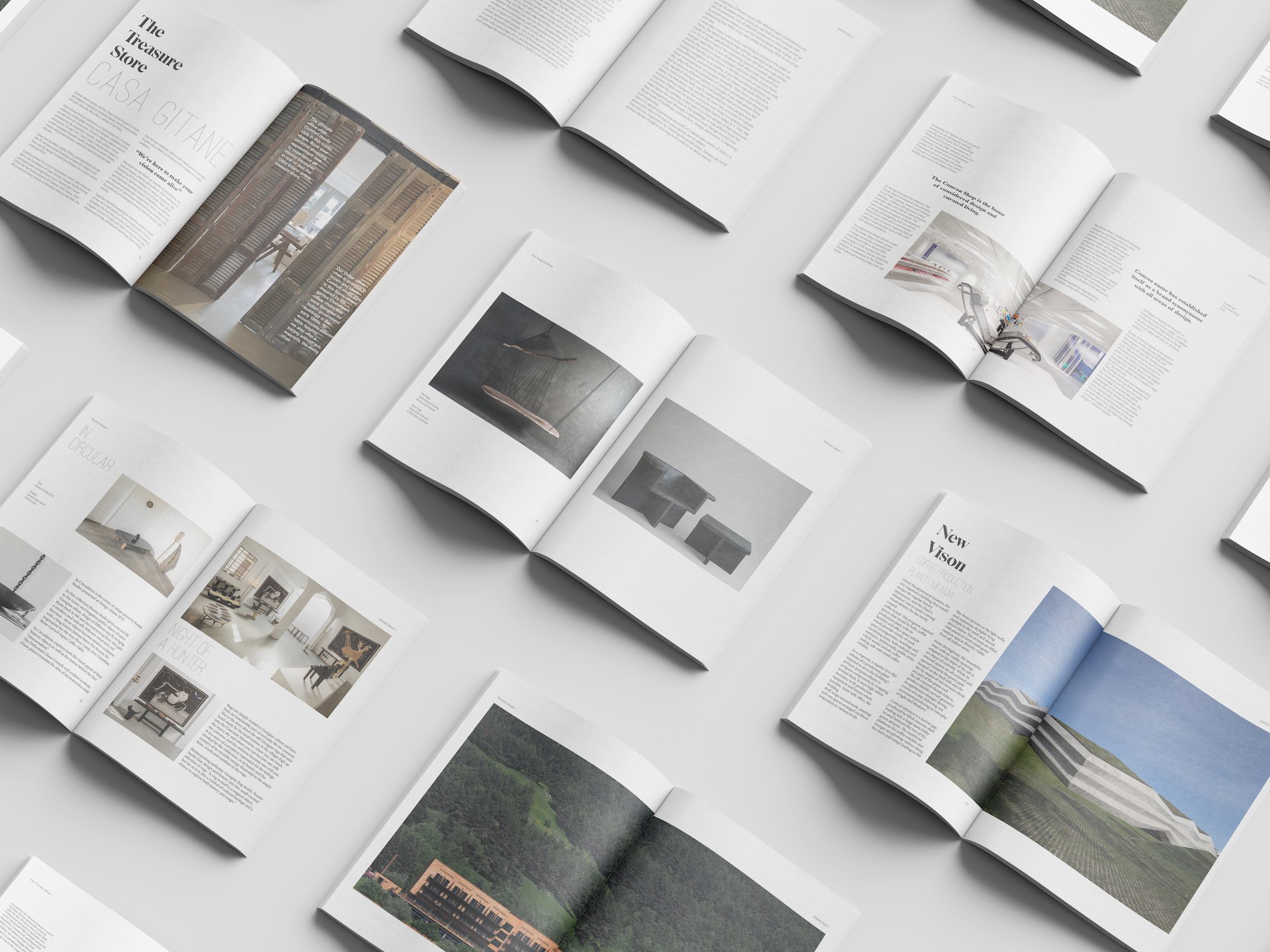
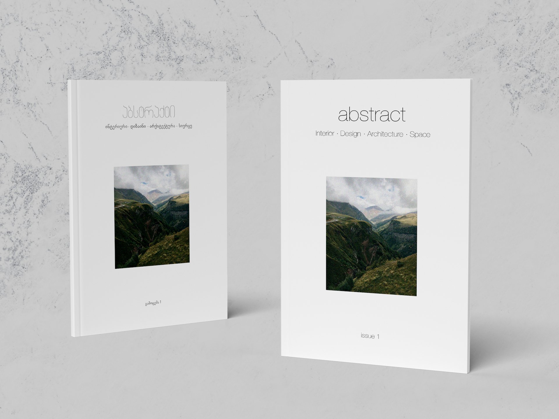
Abstract Magazine is an editorial publication for interior design using bilingual captions for both English and Georgian readers, along with its online edition to follow a strong technological bond with the audience. Interior design is another design discipline that I am enthusiastic about and I always wanted to incorporate it into my work. Editorial design and interior design have quite similar approach to designing space, which I always wanted to combine. Abstract Magazine is a celebration of both, editorial and interior design.

Georgian Font Specimen
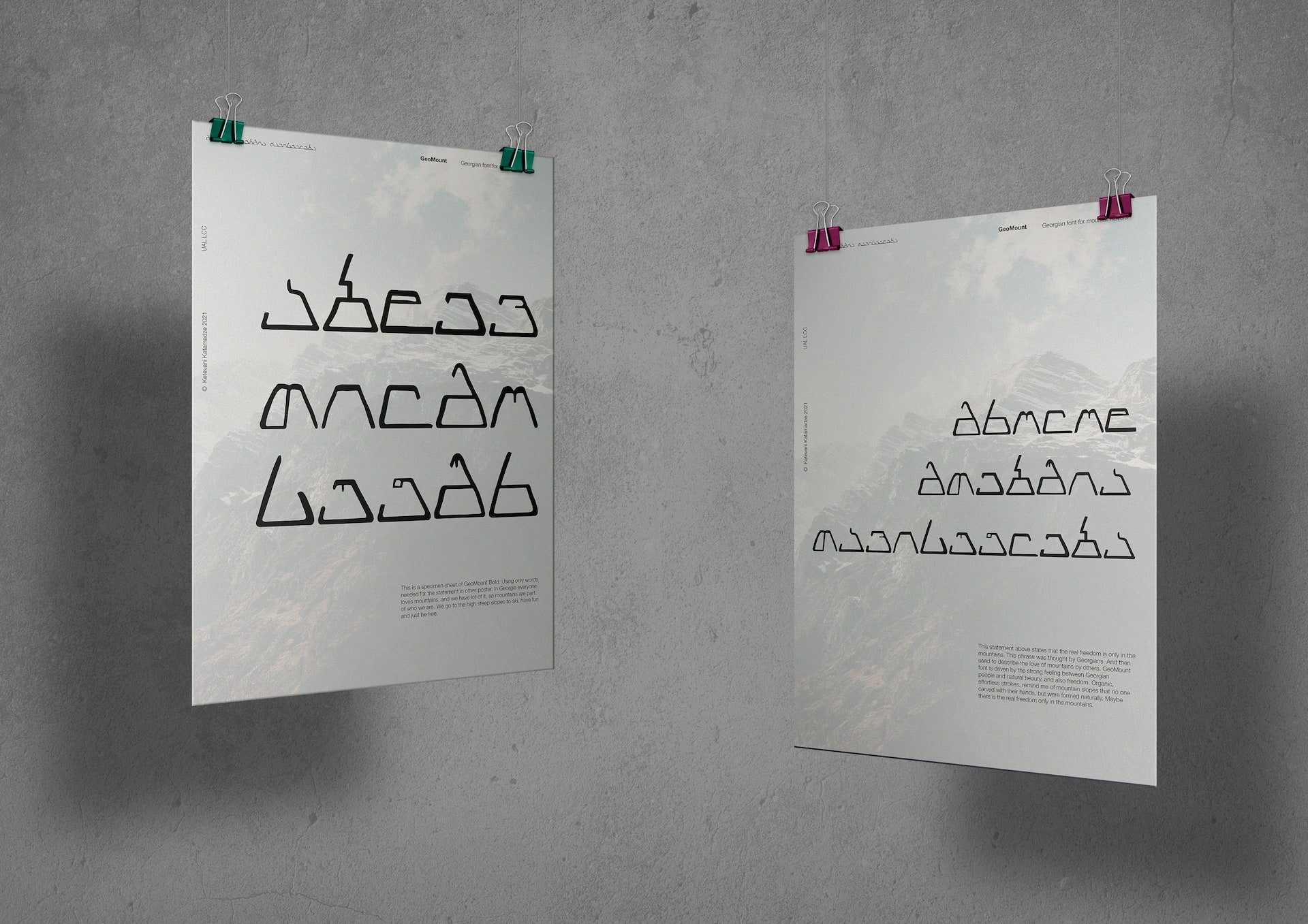
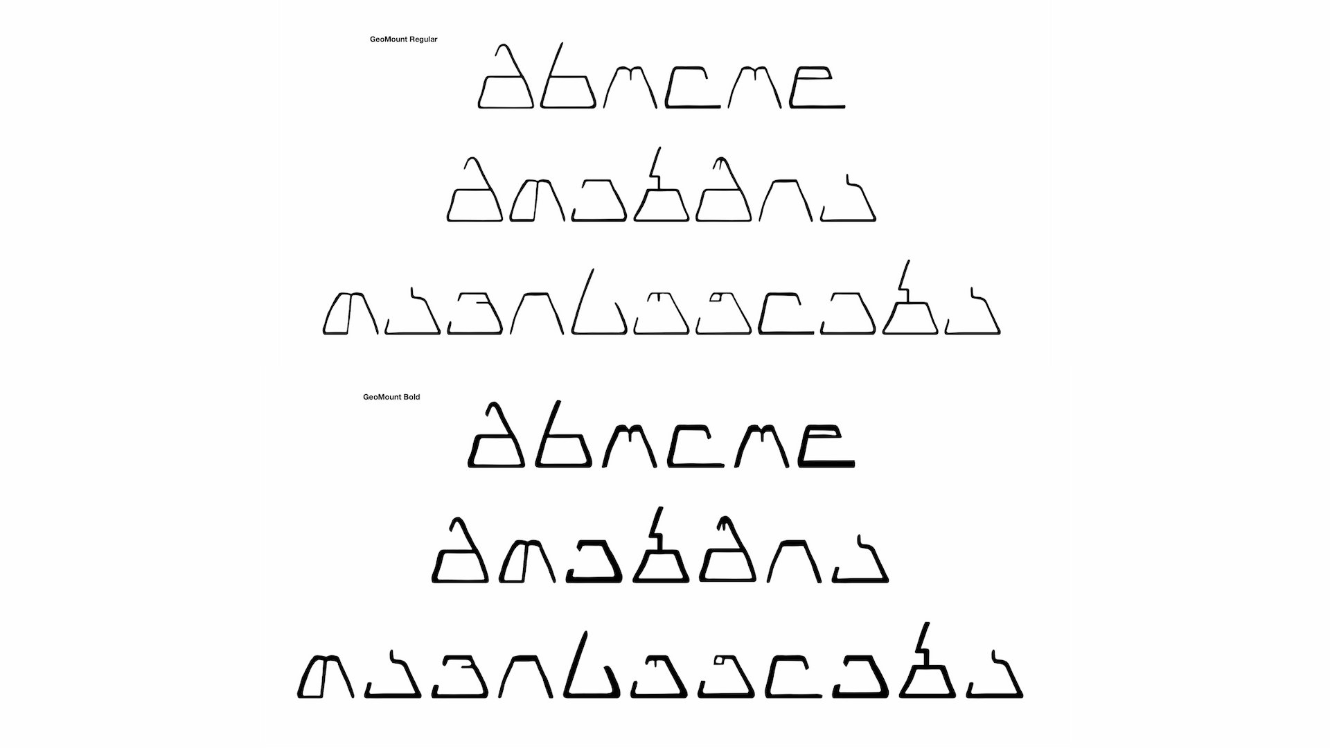
GeoMount is a modernist typeface for the Georgian alphabet driven by Georgian culture. As I am from Georgia, I always try to support my country and enhance its heritage. One of the country's treasures is its own language and script. Throughout my university years I would often try and incorporate my culture into projects or different studies, but when it came to choosing fonts, it always came to a difficult path. There are not many variations of digital Georgian fonts, and I wanted to challenge myself to help digitise Georgian alphabets, as well as trying something I haven't done before (produce a typeface). I wanted the typeface to reflect on the culture. Mountains. Georgia is located in Caucasus mountains and we are proud of it. I used the shape of mountains to sketch out different letters, narrow on top, really wide on the bottom. So, having given little time for the project I decided to choose a specific phrase that would be inspired by Georgian culture and the typeface would be a reflection of it. 'Freedom is only in the mountains' – one of the most popular Georgian phrases. Free spirit and love of freedom is shown in that sentence.
I made specimens that would best show the typeface. As well as poster specimens, I also wanted to try something new and gain skills. So I also made a moving specimen, where letters drawn by me form a mountain.
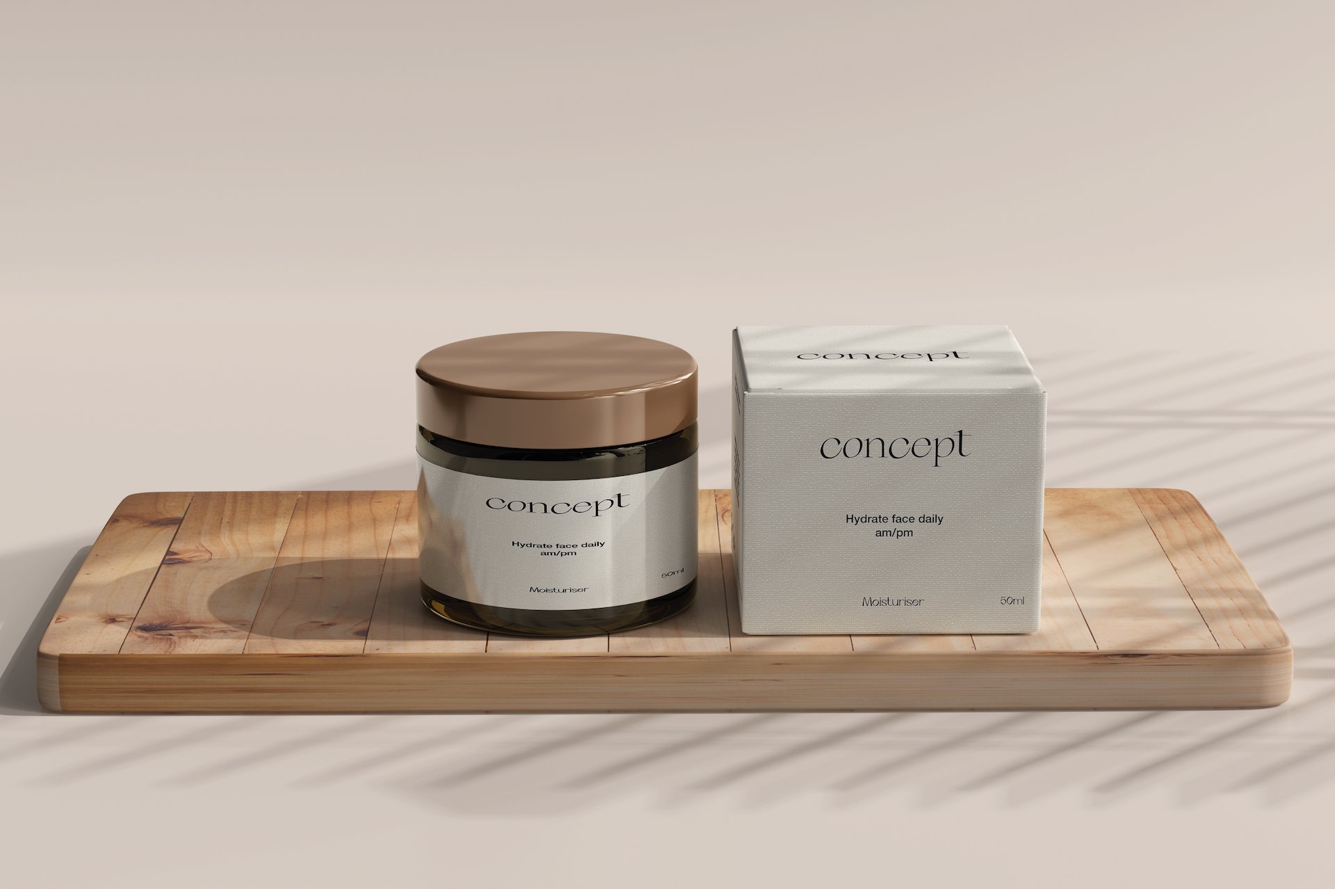
Concept – organic skincare
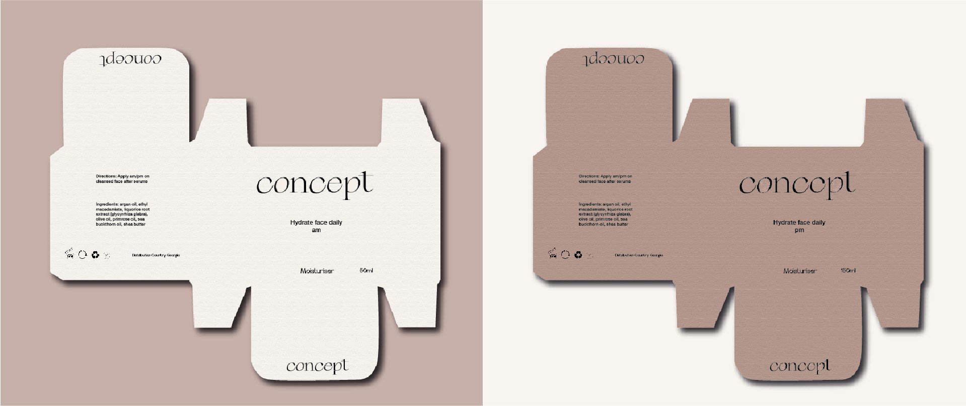
Concept is an organic skincare brand venture. Using natural ingredients, Concept is the first local skincare brand that focuses on the environment and only uses sustainable materials for packaging, giving the customers the option for refill to reduce waste.
