Lucie Walmsley
Email address
moc.kooltuo@yelsmlaw_eiculBiography
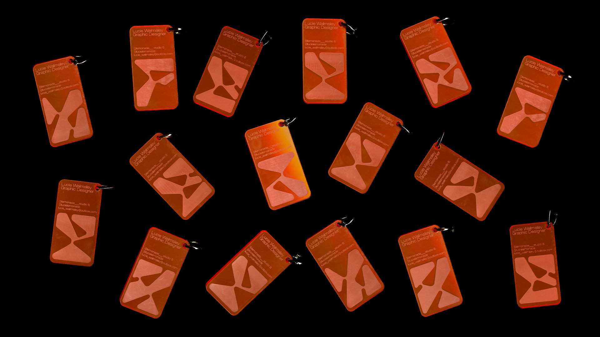
As a multidisciplinary designer from Manchester (currently based in London), with over a year's experience working within the design and fashion sector across Europe, my focus involves exploring materiality through editorial and typography for digital and print. Recently I have been learning new elements within design such as animation and UX/UI during my internship at CONVOY, Any Studio & Semiotik. My concept-driven approach emphasises the design process, being research-based, hands-on and collaborative. My graphic identity aims to be goofy and playful, focusing on the social issues that matter to me. In my final year of studies, I developed my interest in typography by creating my own daringly flamboyant typeface ‘Gender Bender’, a typeface that embraces being queer. During this time I also developed my skills within branding, by creating a bold and playful identity for community driven club night ‘TranscenDance’.
Portfolio
Gender Bender
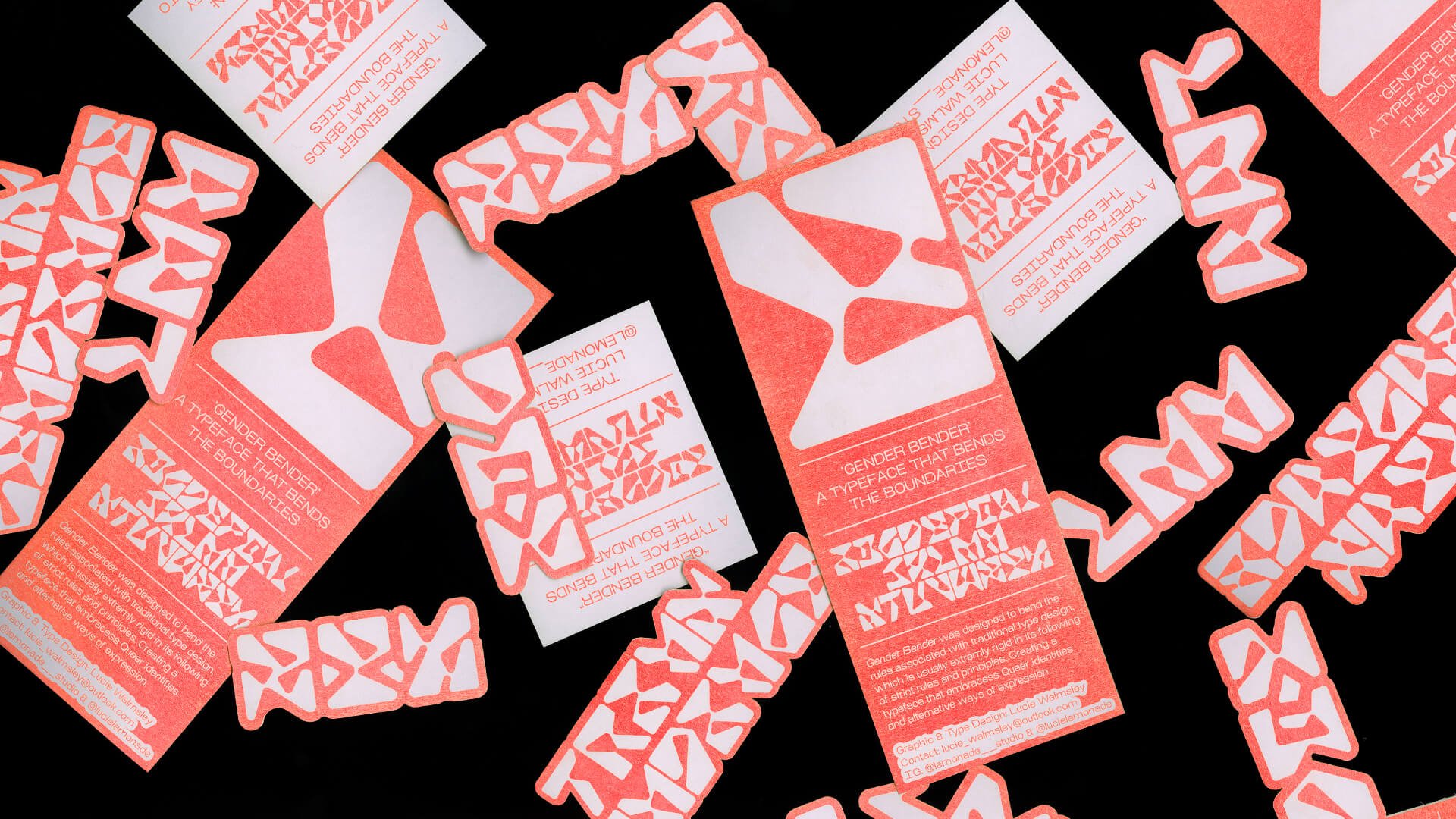
Gender Bender was designed to bend the rules associated with traditional type design, which is usually extremely rigid in its following of strict rules and principles, creating a typeface that embraces being Queer.
This display typeface is designed to push the boundaries of legibility with its experimental and ambiguous letterforms meaning this typeface can be interpreted in different ways by different people. The alphabet was designed from a series of irregular shapes that were viewed from different perspectives and through reflection. These forms are intended to represent a variety of queer identities and alternative ways of expression to convey the wide spectrum of fags, dykes, pansies and anyone who bends the rules associated with gender binaries. Gender Bender was designed using a system of circles, which were used to build all the smaller shapes that make up the letter. This typeface doesn't have any letters with closed counter space, such as the ‘A’, ’B’ and ‘D’. All these counter spaces are communicated through the use of triangles at different scales and angles.
Gender Bender is a daringly flamboyant typeface with a complementary contrast between exaggerated bulges and thin delicate elements. This contrast between thick and thin, straight and curved creates an array of experimental letterforms that work together as a free flowing family. The diversity of different shapes used is to showcase the diversity of queer culture. This typeface is flamboyant, they bend all the way.
This bold and goofy typeface is intended for garish titles, custom logo type and wherever the frick you want.
Gender Bender a Typeface that Bends the Boundaries.
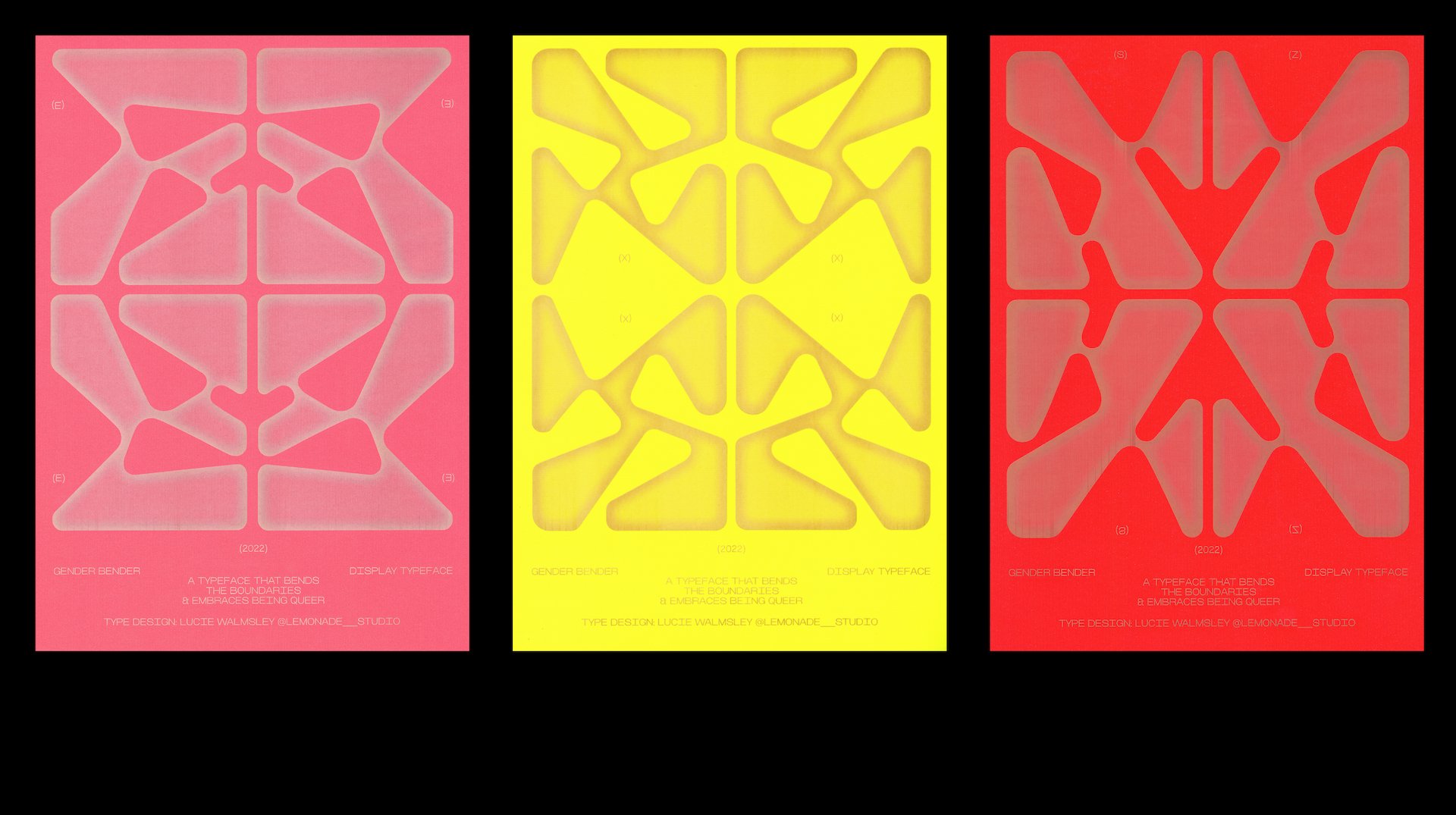
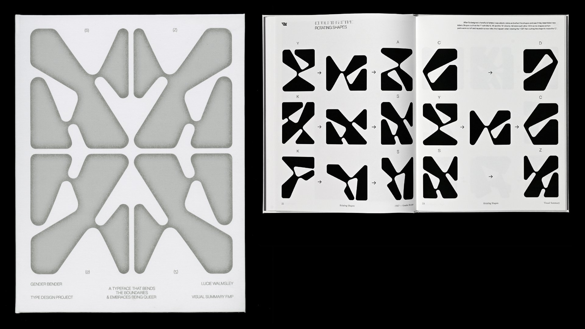
For this project I created a type specimen and array of stickers all printed using Riso. I also designed an array of posters showcasing the mirroring of letters that were engraved into neon paper. To conclude the birth of Gender Bender I printed and bound the visual summary for the project, this publication shows how and why the typeface was made.

TranscenDance
TranscenDance is a London based arts platform which celebrates gender queer/ femme and non binary DJ’s, creating a fun and playful space for underrepresented artists who can thrive and get silly behind the decks. A space where people can dance, get goofy and socialise, we want our queer raves to be sex positive and pioneer consent above all else, to create an ever-evolving clubbing experience that responds to feedback from the community. Let’s positively reshape clubbing culture. We’re sick of all the gatekeeping that happens within DJing circles, which is why at every event we host and encourage people to bring a USB with a few tracks and spin a few songs during our Open Decks Hour. This is an opportunity to learn how to mix, get to know other people and get into the spirit of the night. See you on the dance floor.
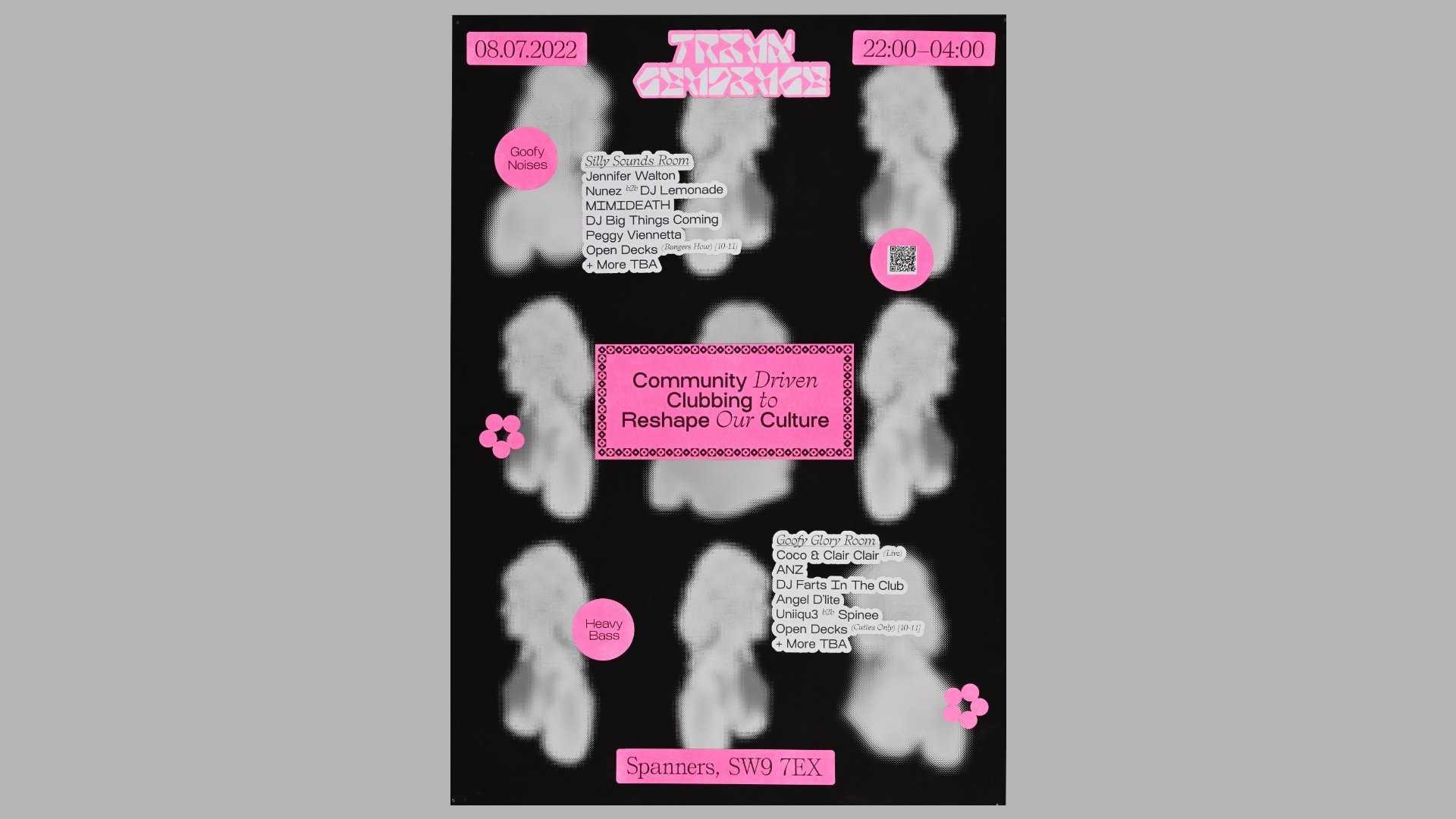
Community Driven Clubbing to Reshape Our Culture.
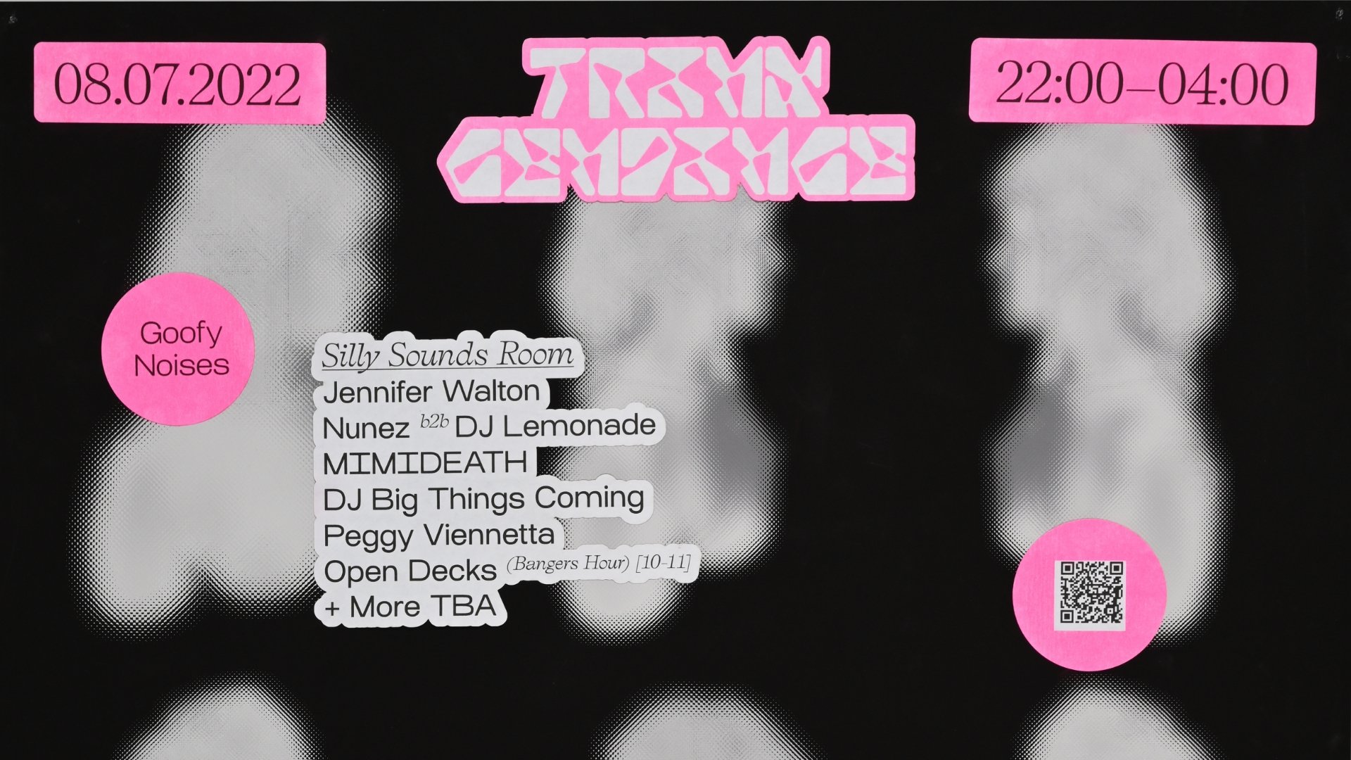
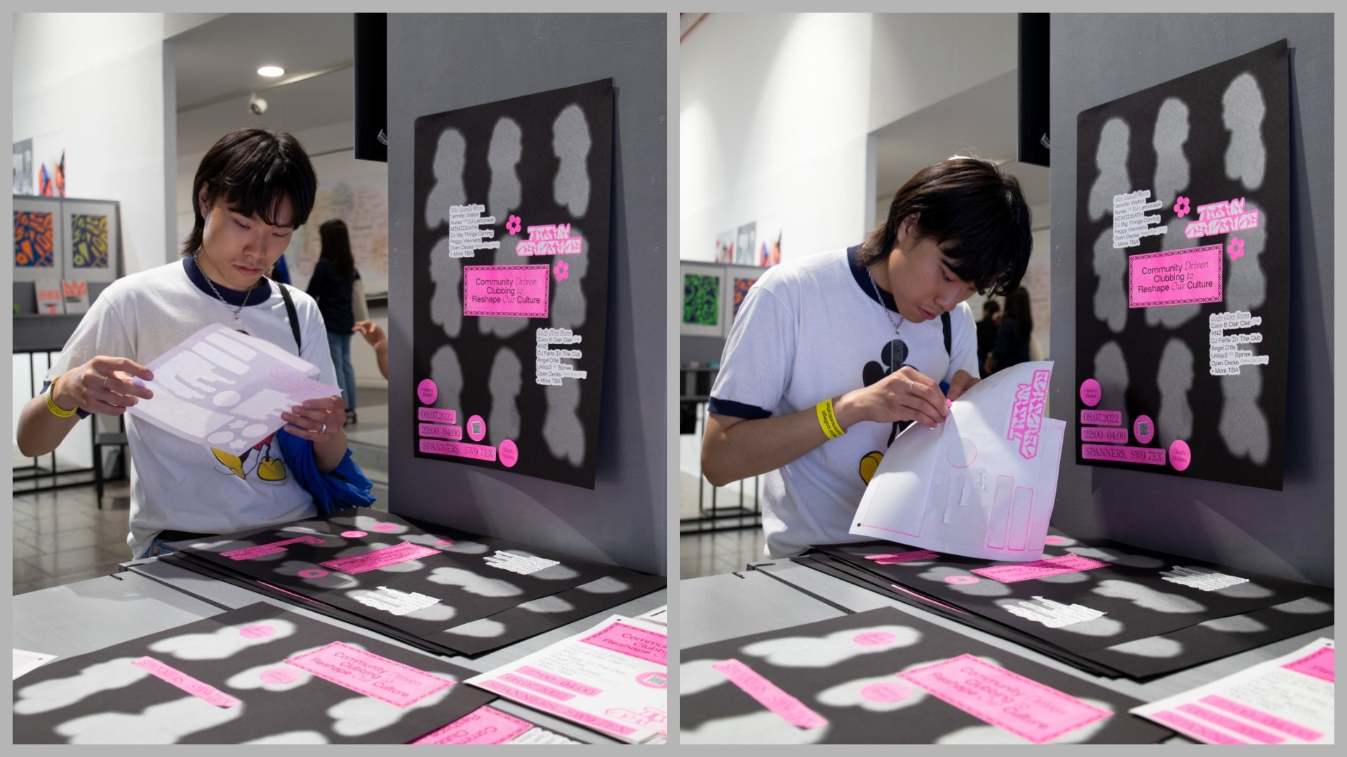
For this project I created an interactive poster where people could use risograph stickers to create their own poster. As this was a community based project I wanted people to be involved in the marking by using stickers which is a fun and playful way to make your own composition. The silver background silhouettes on the poster (printed using lithography) are images to represent the club name 'TranscenDance' which shows a person at different angles transcending from the body. I used my typeface 'Gender Bender' to create the custom logotype for the collective.

