Meng Xia (Tiffany)
Email address
moc.liamg@17590ynaffitWeb Portfolio
tiffany09571.wixsite.com/my-site-11Biography
My name is Meng Xia, also known as Tiffany. I am a Graphic Design student with a strong interest in exploring innovative ways to express traditional culture within contemporary design contexts. My design practice spans across typography, branding and packaging, 3D modelling, animation, and interactive design.
In my creative work, I place particular emphasis on emotional expression, aiming to use design as a means to reflect individual emotions and connect them with broader social and cultural narratives. In recent years, I have experimented with incorporating traditional Chinese motifs—such as paper-cutting, blue-and-white porcelain, and ancient artefacts—into modern visual language, reinterpreting them through typography and visual systems.
I am also deeply interested in the potential of emotional design, exploring how visual storytelling can offer psychological comfort and support personal expression. For instance, in my emotion project—SentimentShell, I created a series of works combining text, illustration, and interactive elements to provide a space for emotional release and connection.
Portfolio
Self Directed Project—Branding Design
This project is inspired by my personal experiences—I am someone who has long struggled with depression and severe anxiety. When I feel sad or anxious, I often find it extremely difficult to cope. Like many others, I tend to bottle up negative emotions rather than express them. Based on these deep personal experiences, I chose ‘anxiety’ as the central theme of my design.
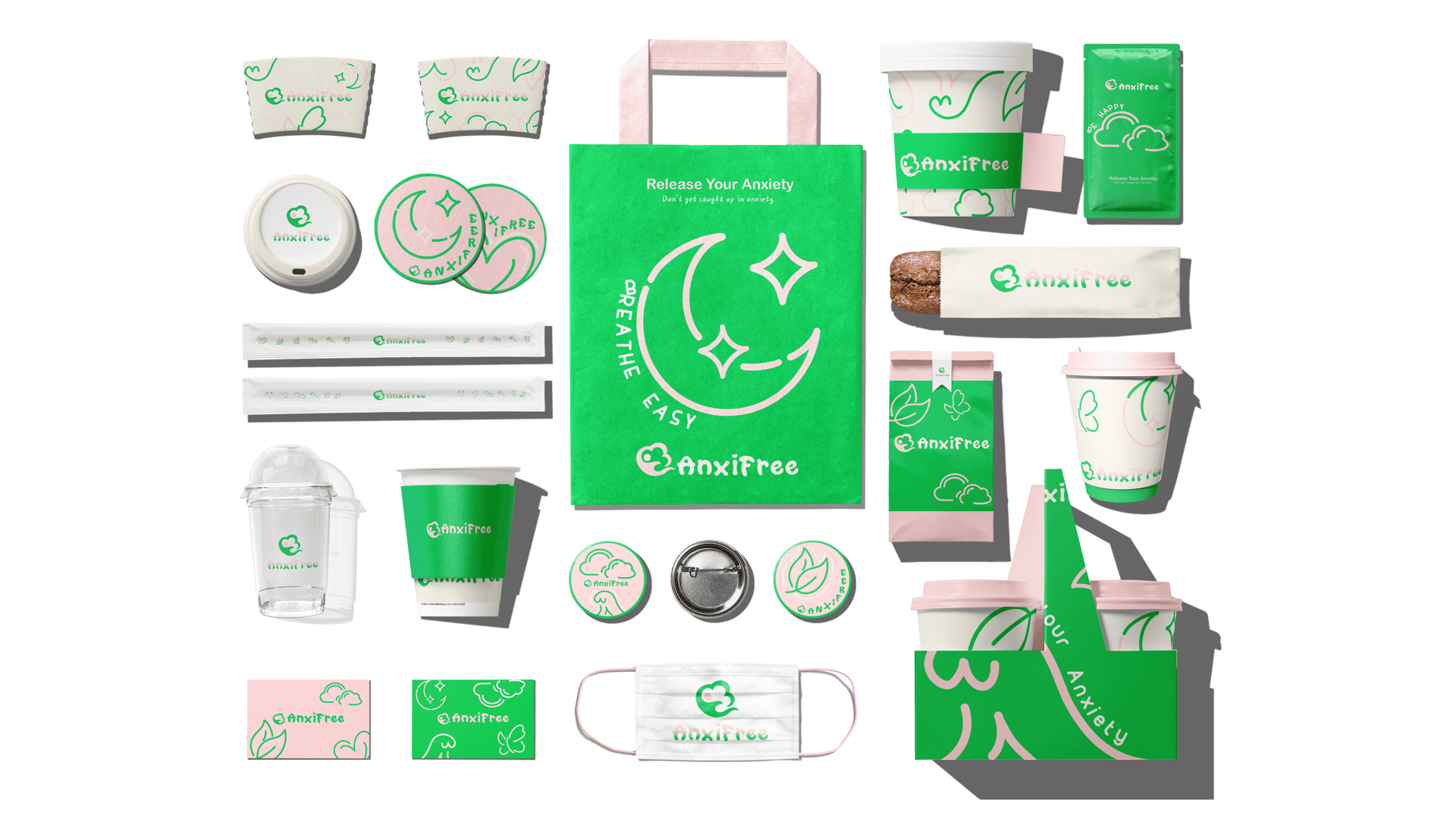
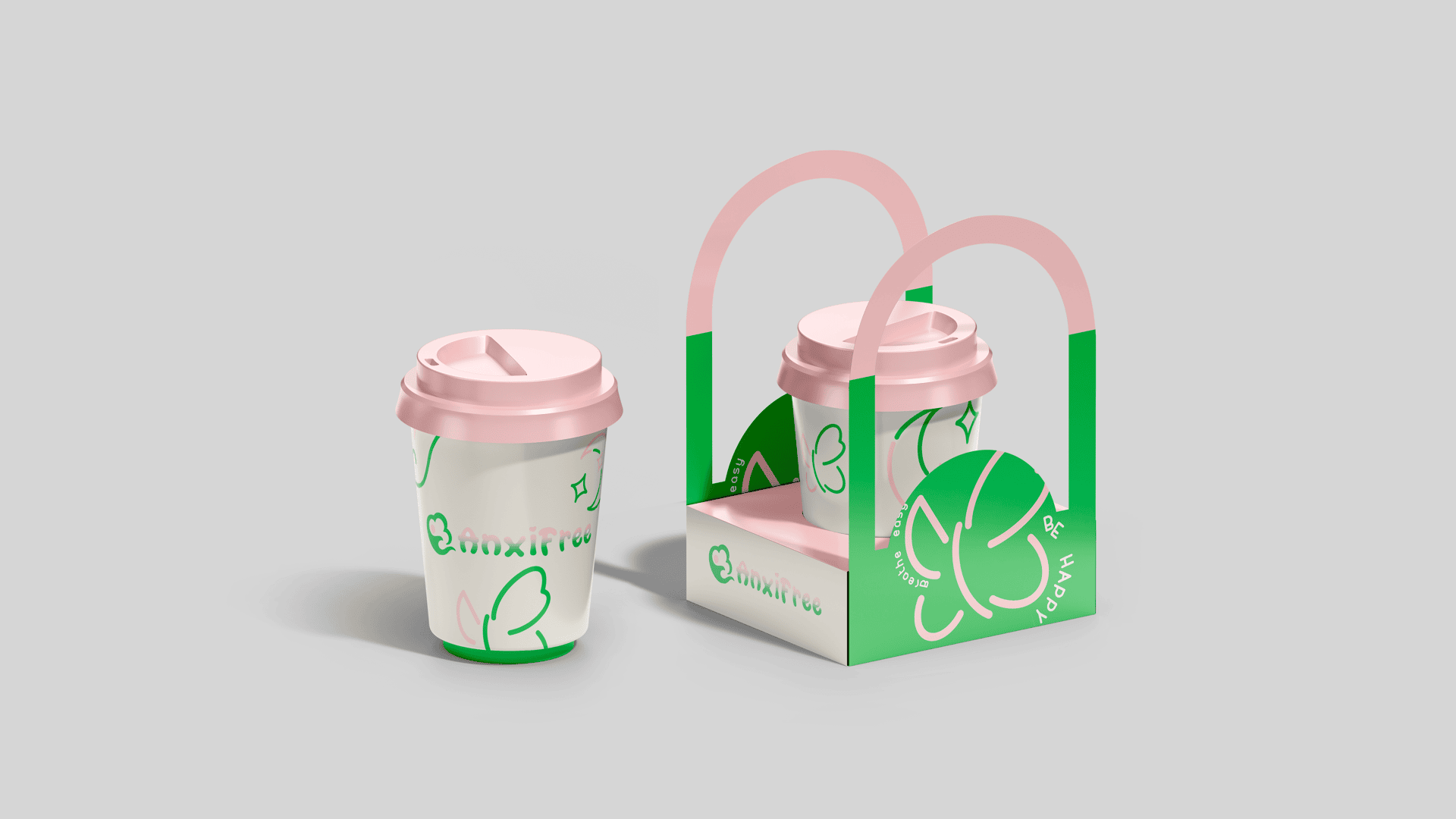
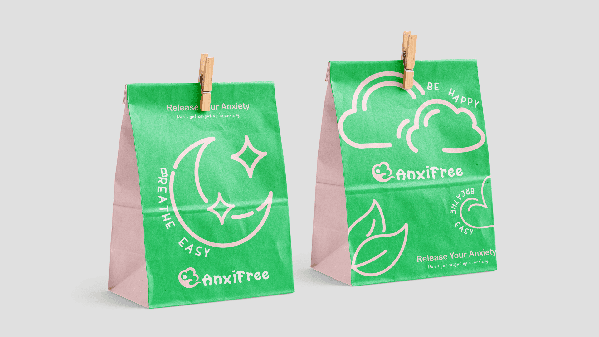
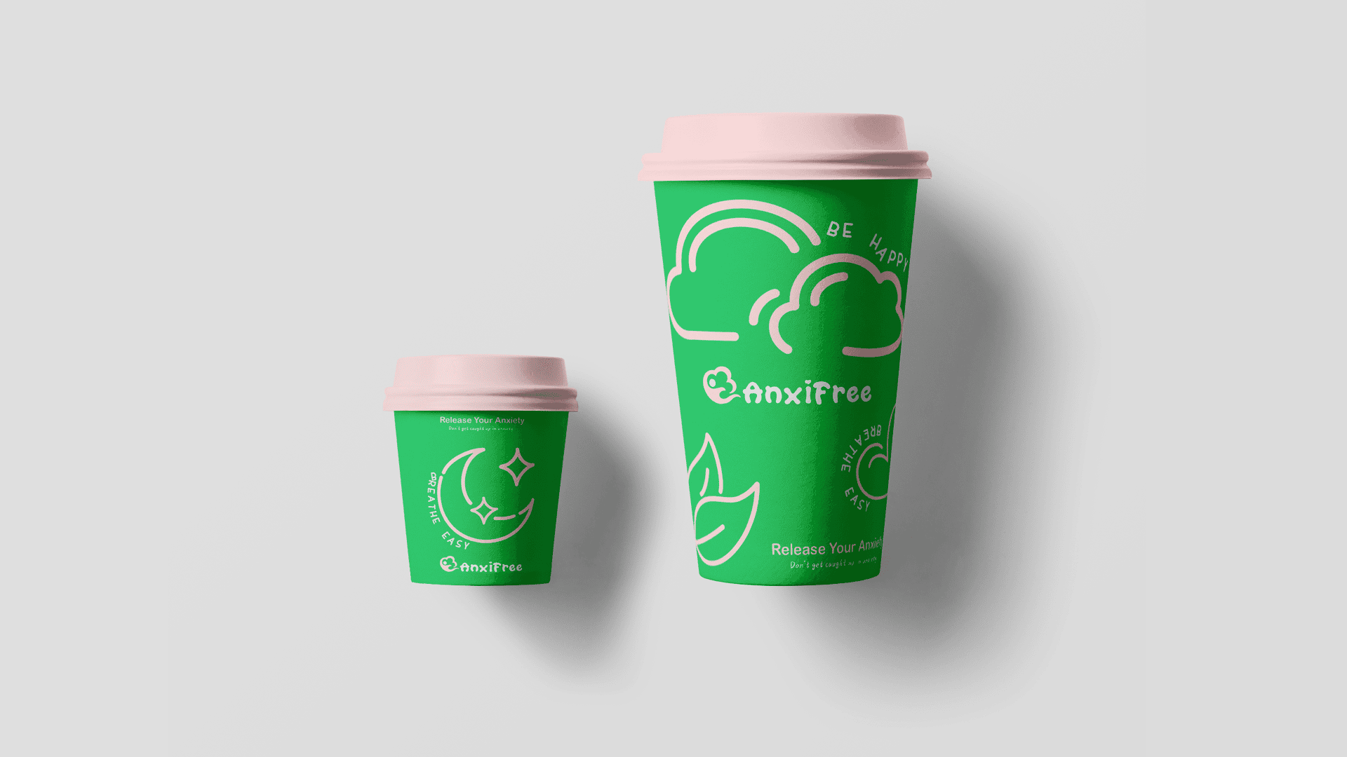
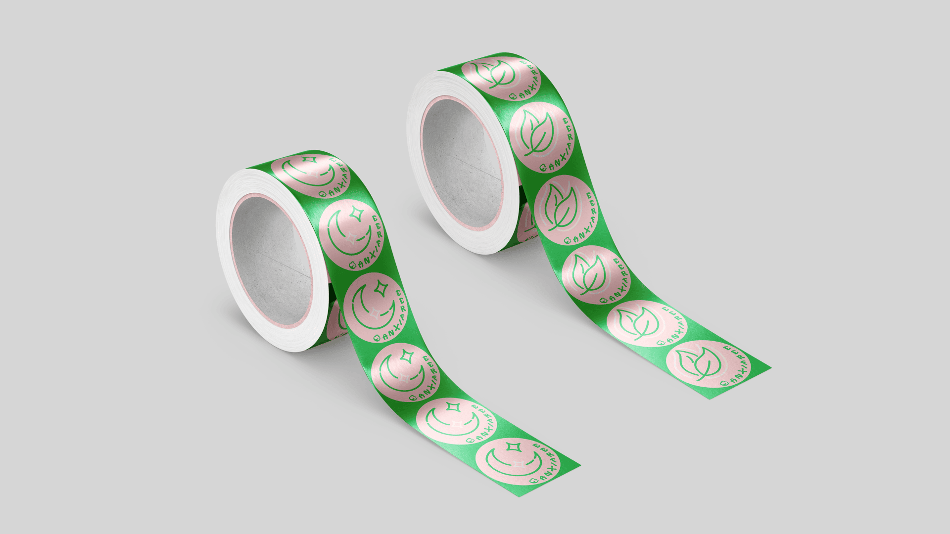
AnxiFree is a coffee brand design project aimed at visualising and externalising feelings of anxiety. My goal is to create a way to express and release these emotions, ultimately helping people regain strength and positivity, while also raising awareness of mental health.
The brand includes a full set of designed items such as coffee packaging bags, tote bags, coffee cup sleeves, cups, and coasters. The overall colour palette features anxiety-relieving tones like bright blue, light pink, mint green, and forest green to create a warm and calming atmosphere. In addition, I incorporated patterns and graphics associated with relaxation and healing to enhance the emotional experience of the brand.
AnxiFree is not just a coffee brand design—it is an emotional healing attempt, a visual narrative about anxiety and hope.
Exhibition Identity Design–Original Machines
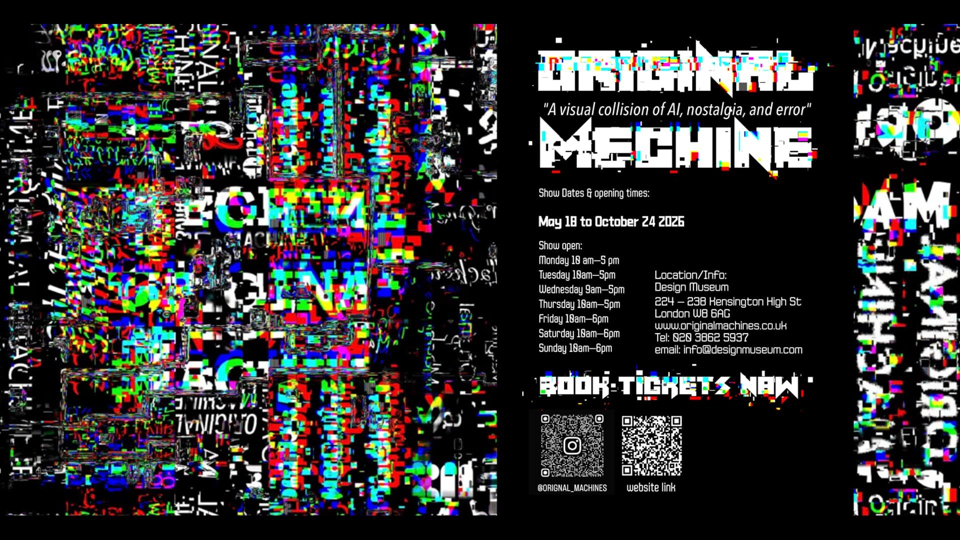
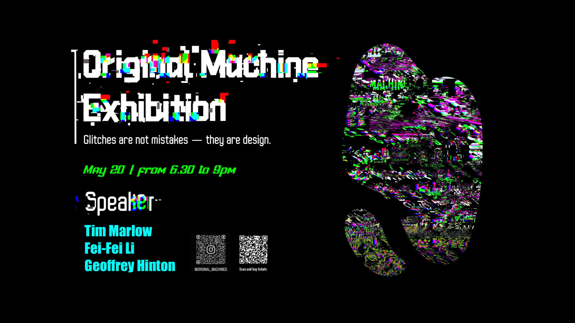
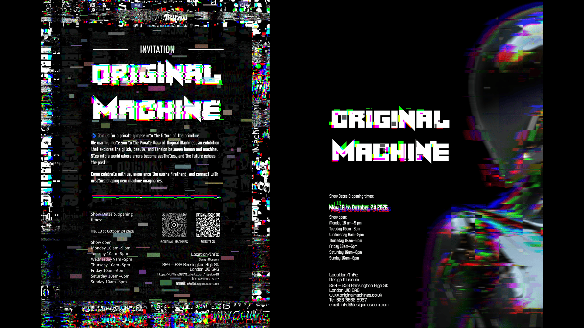
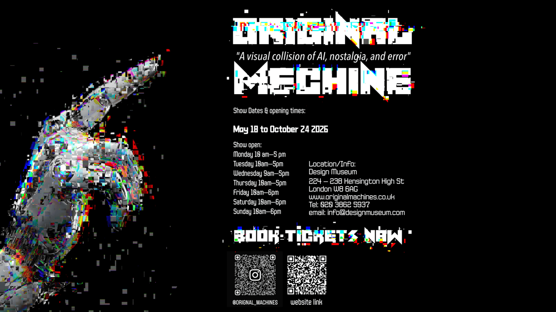
Original Machines is a conceptual visual identity project developed for an imagined exhibition series at the Design Museum. The theme centres around machine aesthetics, early digital culture, and human-machine relationships, with a focus on embracing digital errors and AI-generated glitches as a new visual language. Inspired by the idea of a future primitive’, the project reflects how technology, imperfection, and instinct collide to form a raw and compelling visual world.
Design Content
This project consists of a comprehensive brand identity system for the exhibition, including both print and digital deliverables:
A1 printed exhibition poster (portrait)
Digital poster for train station (portrait format)
Digital billboard (landscape 30×10 ft ratio)
Animated speaker stings for event screens (max 6 seconds each)
Web homepage concept design
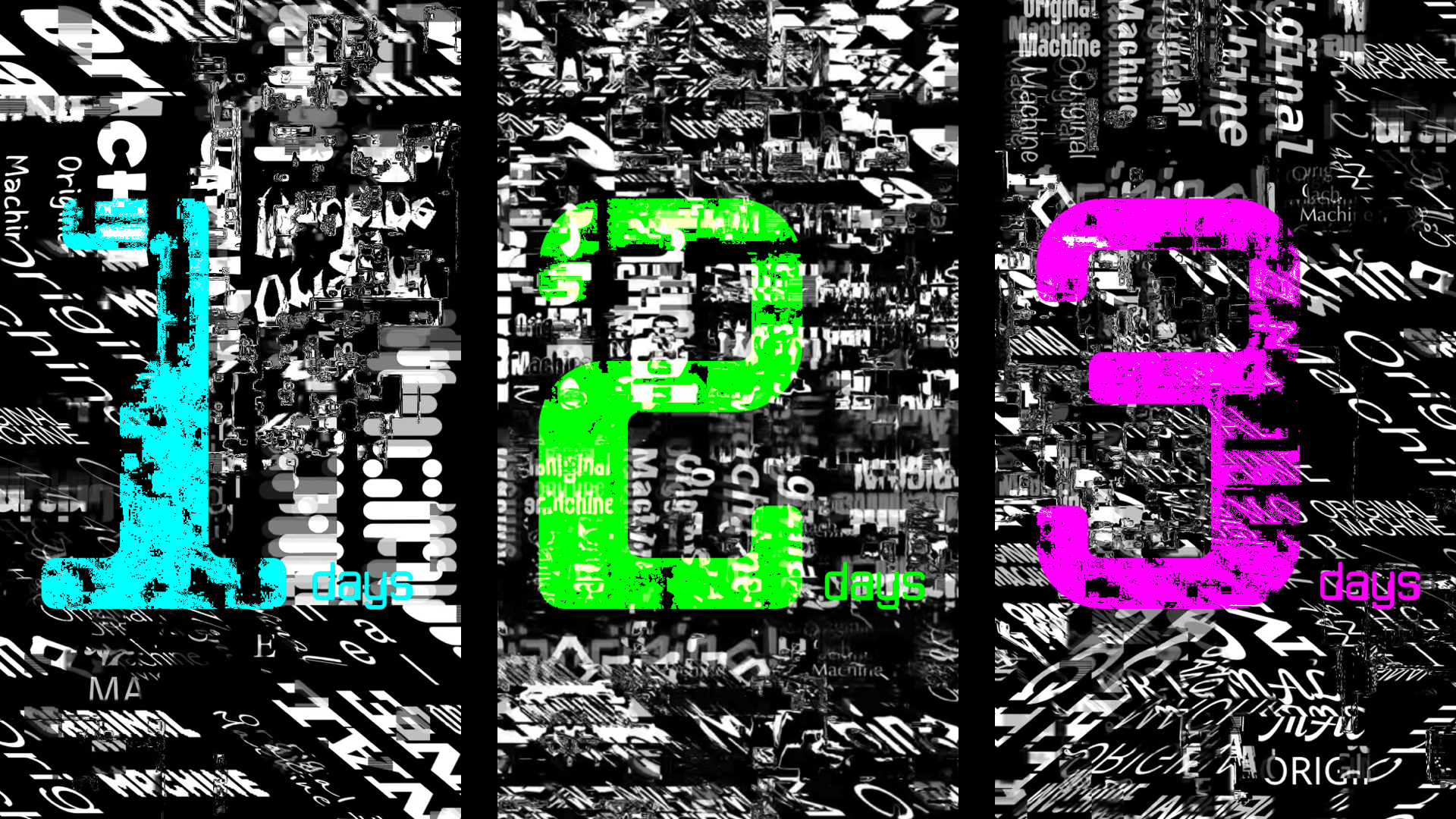
Instagram launch series (static posts, carousel, Reels, Stories, Threads)
Digital and print versions of private view invitation
The visual system incorporates glitch textures, distorted typography, layered imagery, and a controlled colour palette to communicate the themes of algorithmic error and mechanical beauty. Layouts are adapted across multiple formats and screen sizes while maintaining a strong, unified identity.
Self Directed Project—Record Packaging Design
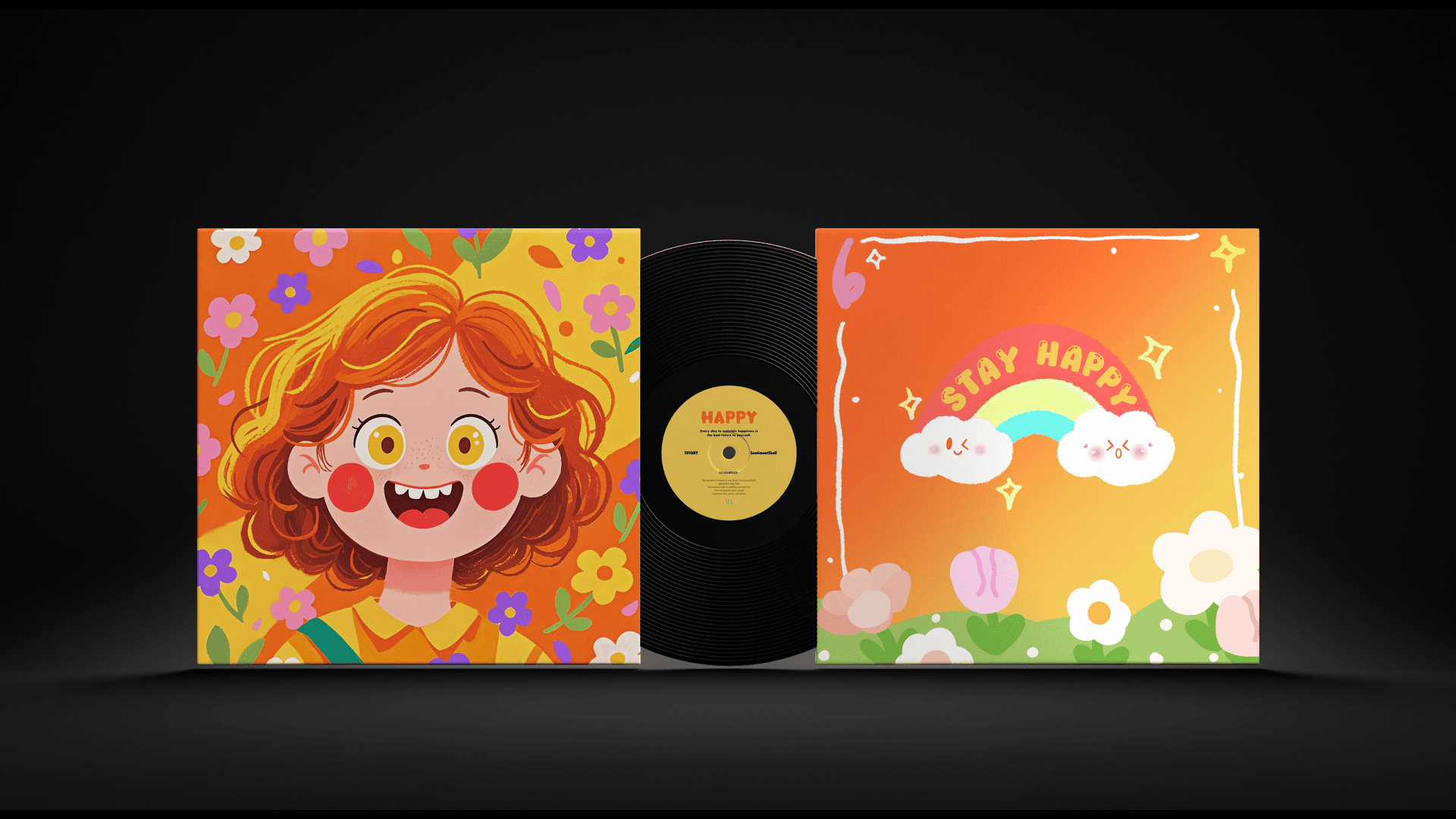
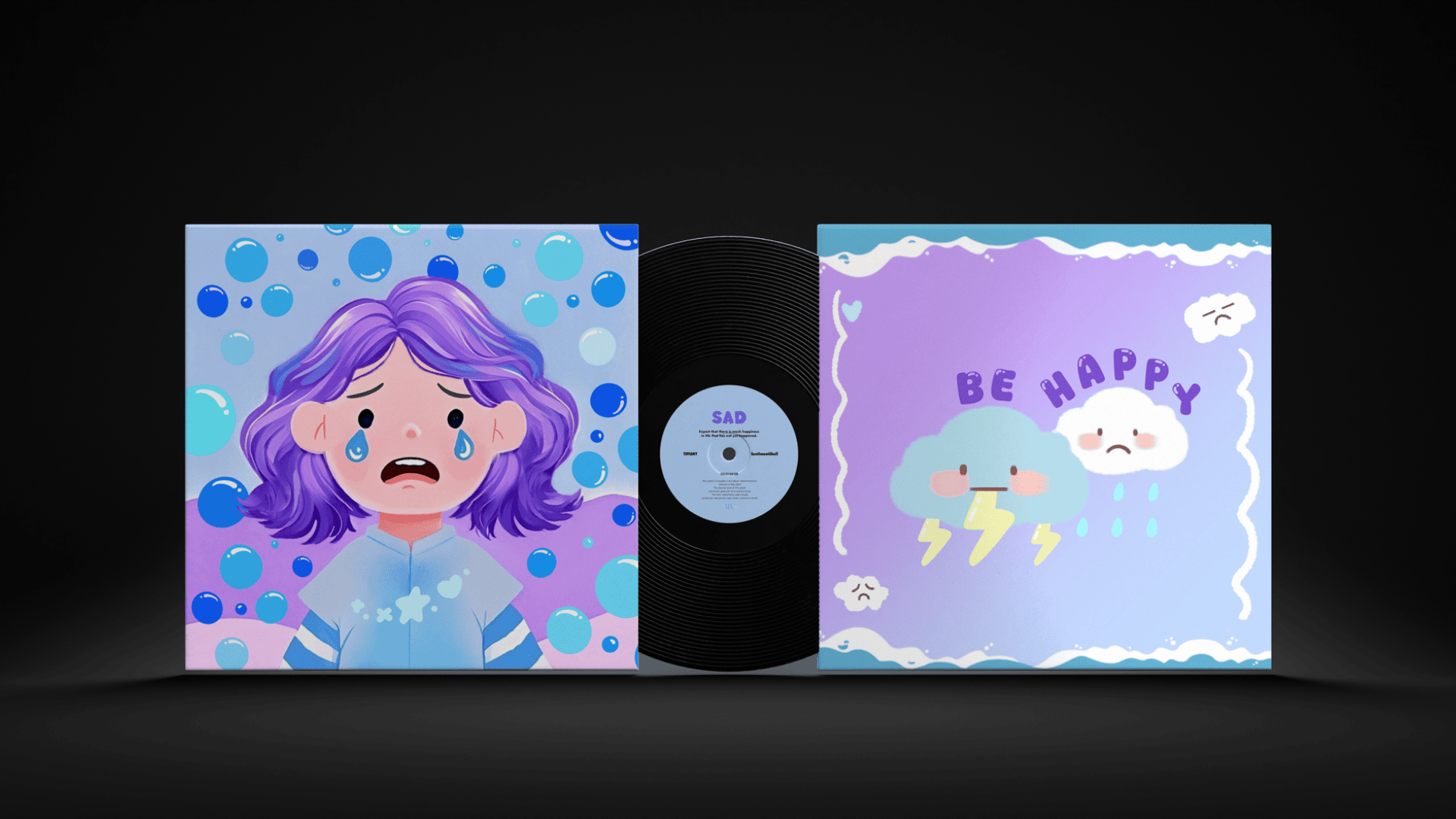
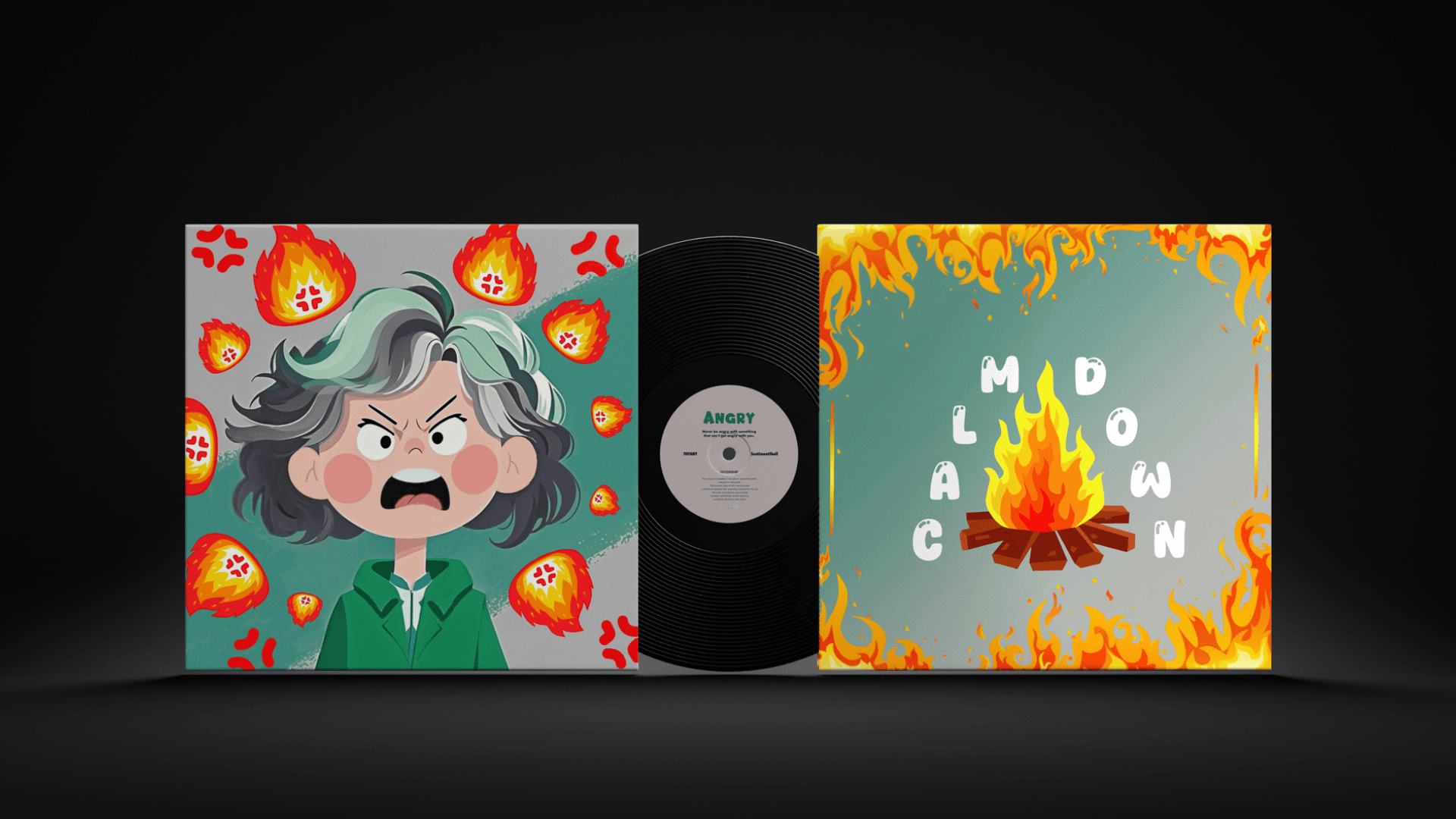
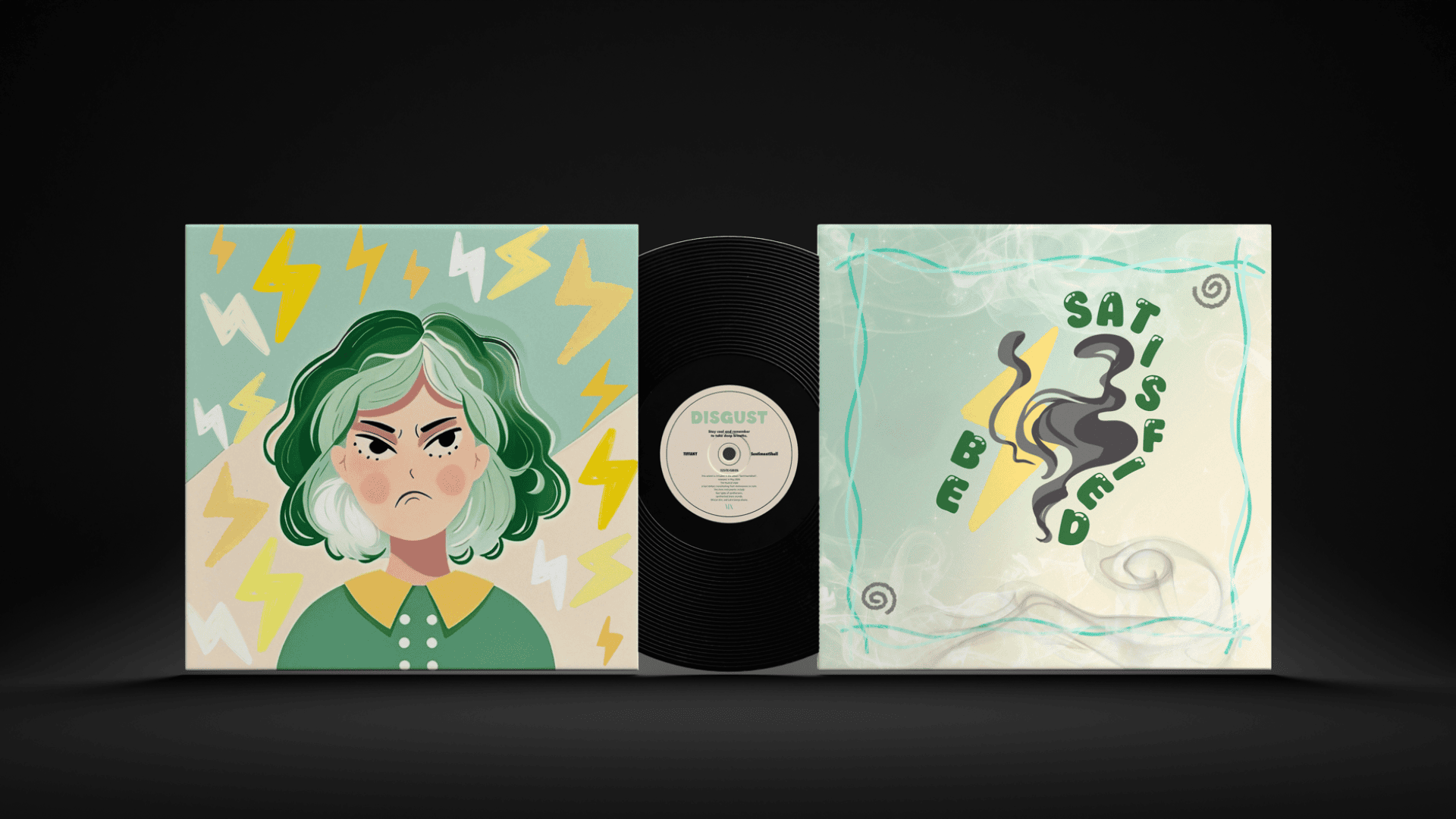
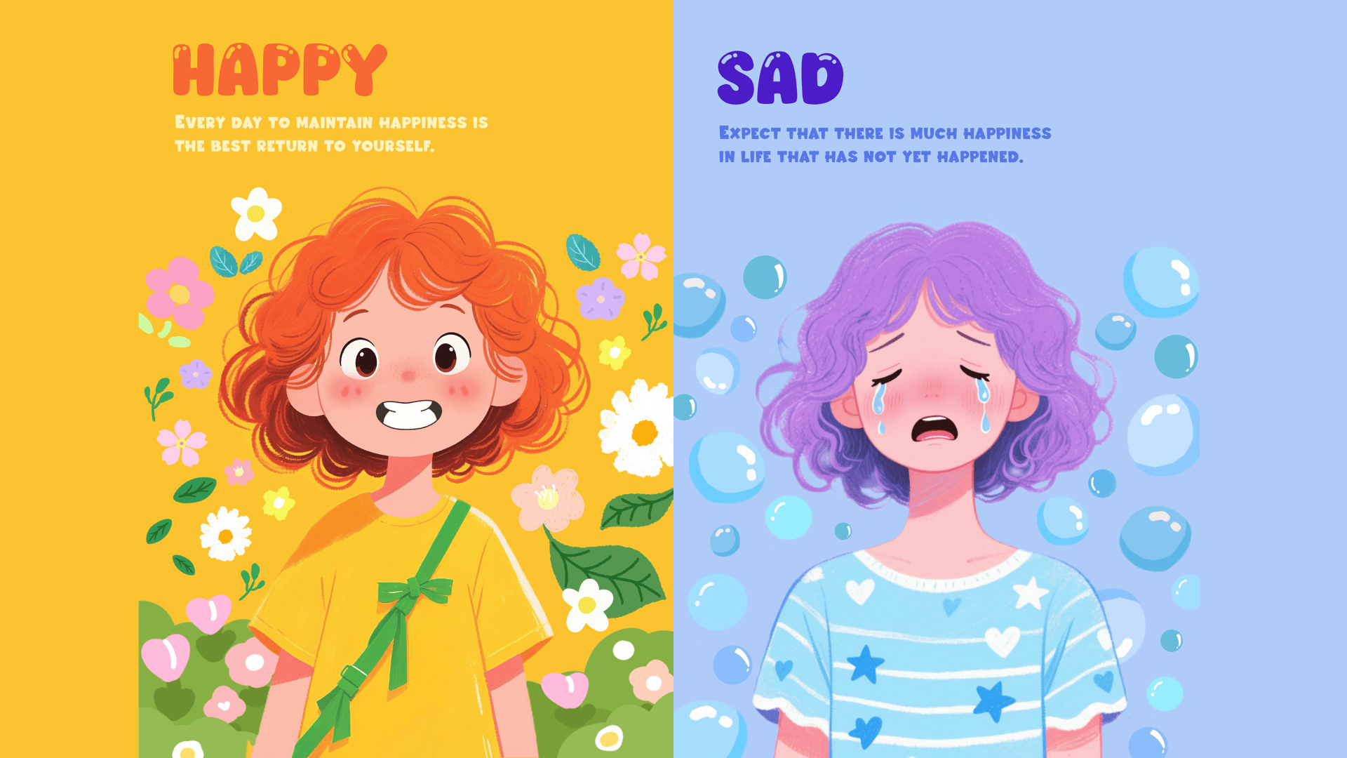
SentimentShell is a design project centred on the concept of emotional visualisation, aiming to explore how the combination of colour psychology, facial expressions, and sound design can intuitively and vividly present human emotions through vinyl record packaging. The project focuses on four basic emotions—happiness, sadness, anger, and disgust—and creates a unique visual and auditory experience for each through distinct colour palettes, graphic language, and music.
Through this series, viewers are not only able to see the shape of emotions, but also hear their sounds, achieving a deeper sense of emotional interaction and immersion. This project is not only concerned with visual aesthetics but also emphasises emotional expression and psychological resonance, attempting to provide an outlet for emotions through design.
In the visual aspect, I designed a dedicated colour scheme and expressive illustrations for each emotion, such as:
The Happy album features bright yellow and orange tones, accompanied by smiley face graphics and lively lines to convey a relaxed and vibrant atmosphere.
Sadness is expressed through soft blues and purples, paired with imagery of teardrops and downward gazes to reflect introspection and emotional depth.
Anger uses deep red contrasted with grey-green, combined with motifs of tearing and explosions to amplify emotional intensity.
Disgust employs mint green and ivory white, creating a fresh and balanced visual environment to ease emotional rejection.
On the auditory side, I composed original emotion-themed music tracks for each album. These soundtracks align with the visual style, together forming a complete multi-sensory experience. The rhythms and melodies are carefully designed to reflect the emotional tone, allowing the audience to resonate with the emotions through both sight and sound.
This project is not only a cross-disciplinary experiment in visual and auditory design, but also a deep exploration of how design can influence and communicate human emotions. Through this series, I hope viewers will not only perceive different emotions but also reflect on their own emotional states, finding resonance, healing, and understanding in the process.
