Michael Chen
Email address
moc.liamg@6991nehc.cimWeb Portfolio
www.instagram.com/milkhellBiography
I'm Michael, a London based Graphic Designer. My approach is grounded in research alongside experimentation and iterative design. Branding and identity, visual systems, editorial design and fictional narratives are my key interests. However, I'm always willing to learn and try something new. I have previously dabbled in a flashier design style, using Photoshop effects and unusual typefaces. Now, my style has evolved into clean and ordered design, with a focus on core design elements.
Portfolio
Save Our Soil
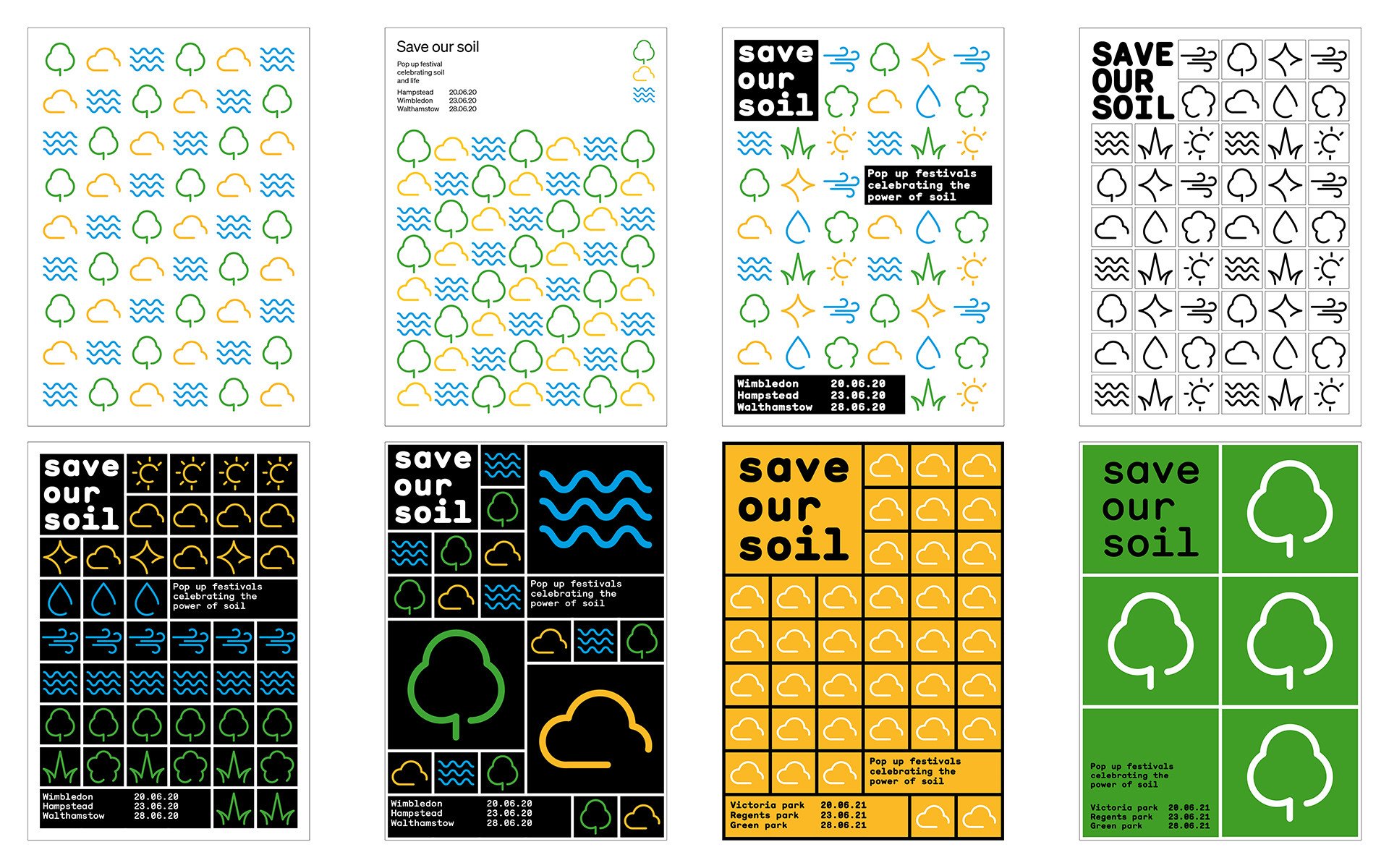
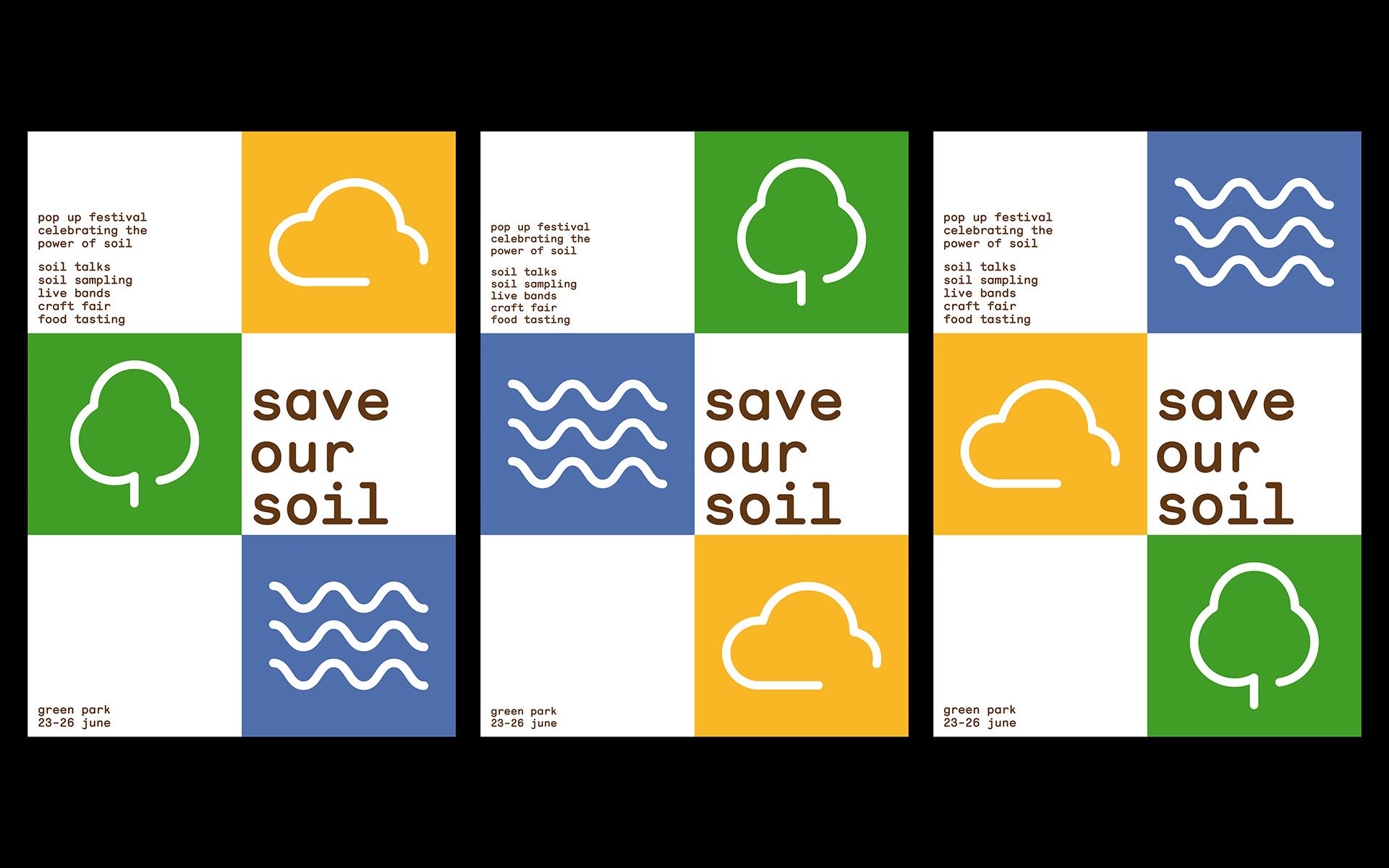
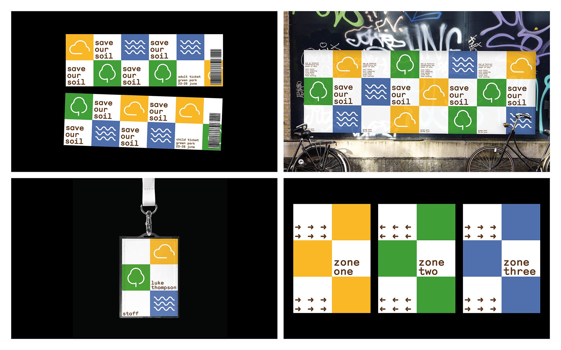
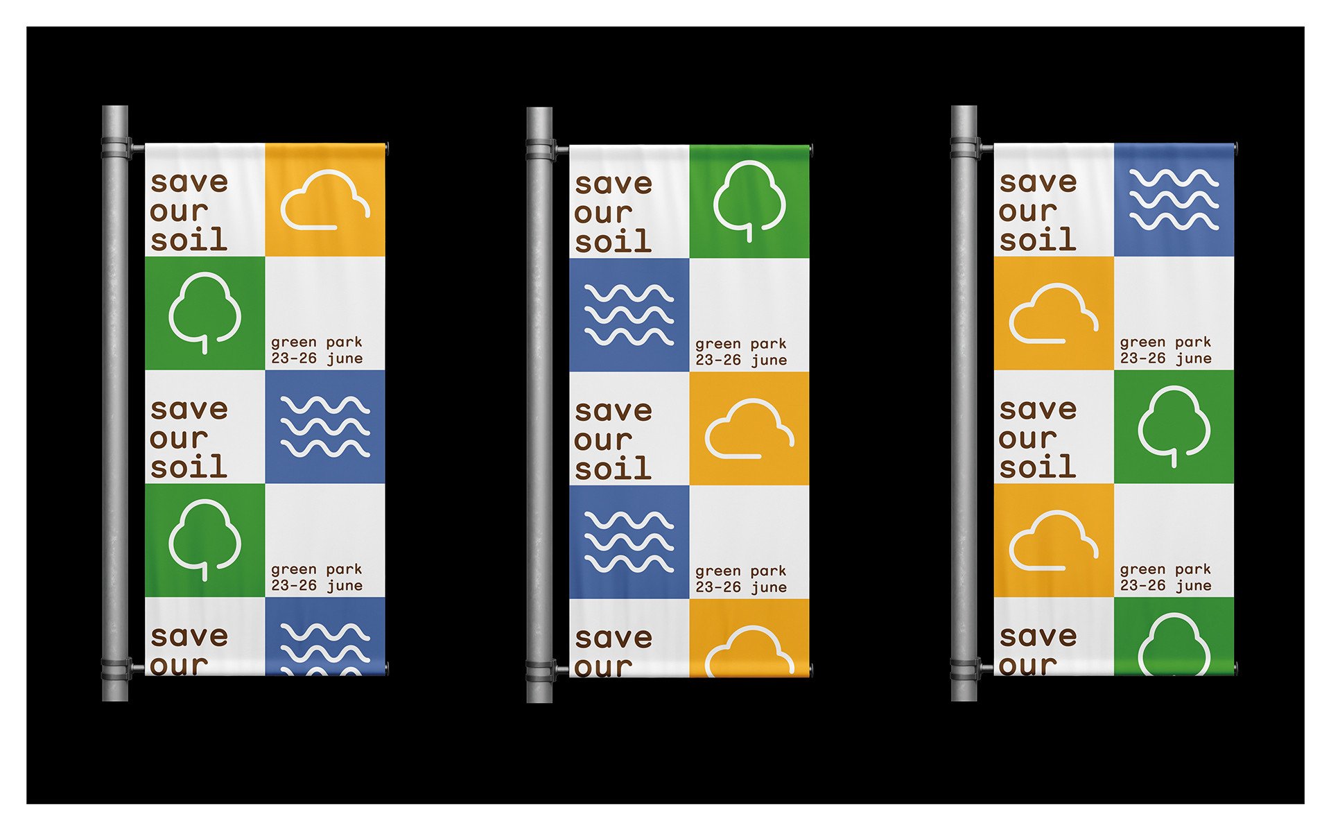
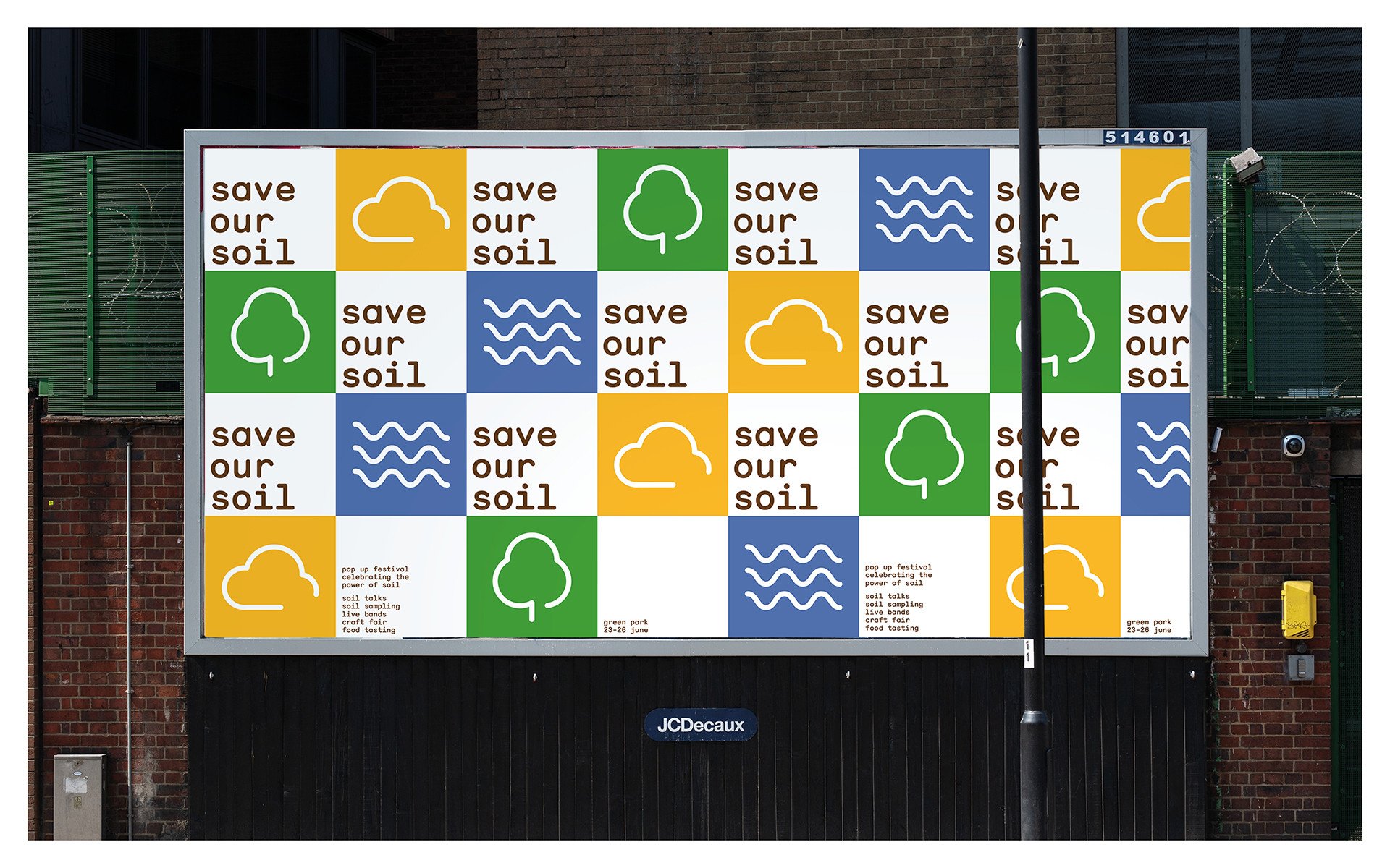
Save Our Soil is a festival that celebrates soil, in terms of sustainability and fighting the climate crisis. It has the intent to educate and bring awareness of the power of soil. The main identity elements of Save Our Soil are not directly related to soil itself, but focuses on environmental elements soil can save. The three symbols are: cloud (sky), tree (nature) and waves (sea). These are the three main categories of the environment that soil can protect/ save. This is a modular system, which means it’s easily repeatable, therefore scalable for many different formats.
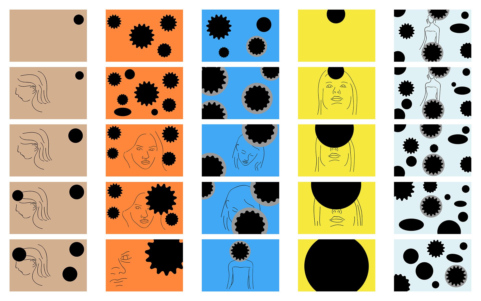
The first picture documents the iterative design process, shown in promotional posters, representing the evolution of my visual development.
Edge Of Vision
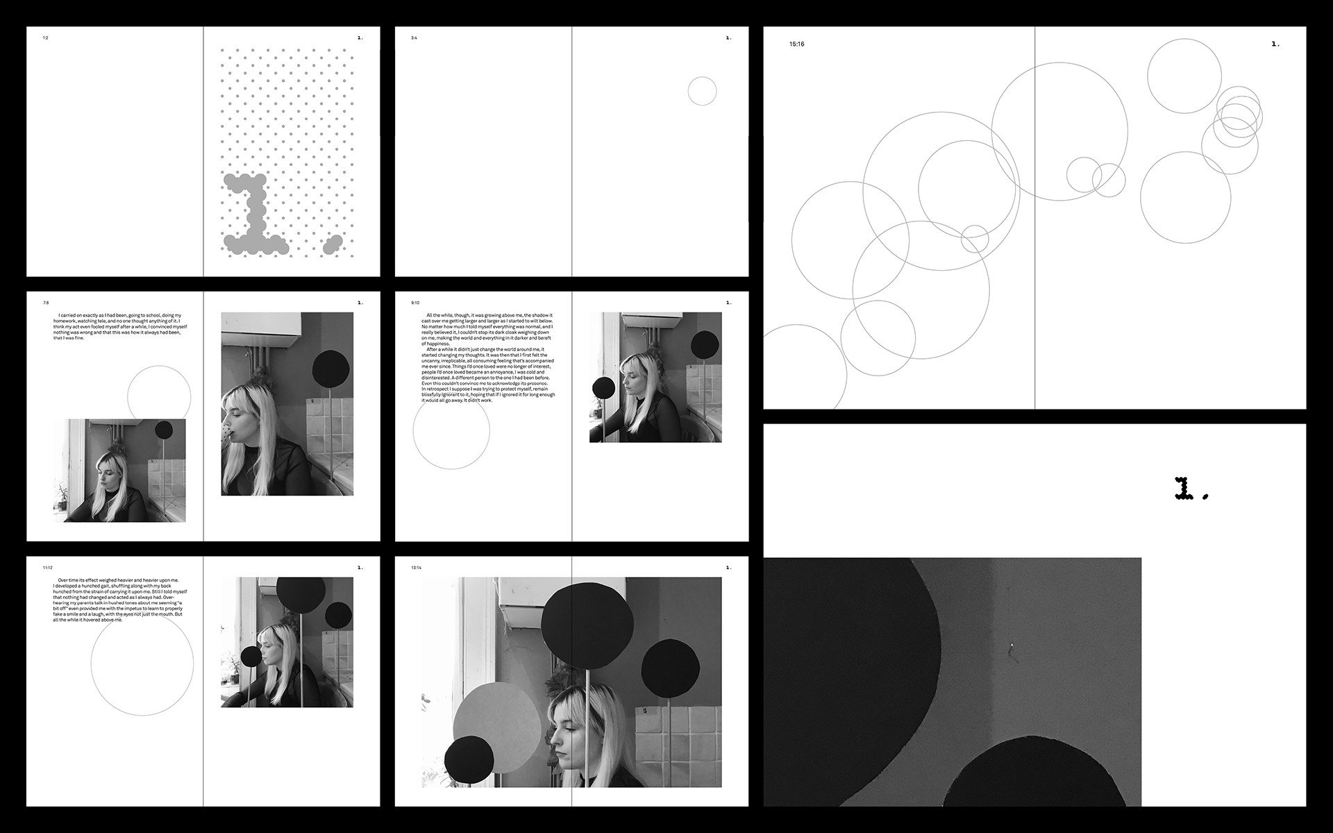
Edge Of Vision is a designed artefact, showcasing a dark story centred around change and the stages of grief, alongside accompanying photographs acting as a visual narrative. The photography features large dots that represents change, inspired by cue dots (small holes in 35mm film to signify the transitioning of film reels). A recurring theme throughout the design is simple graphical dots, representing the cue dots featured in the photography/story, as well as giving the book a consistent identity. The style is also minimalist and constrained, reflecting the bleak theme of the story.
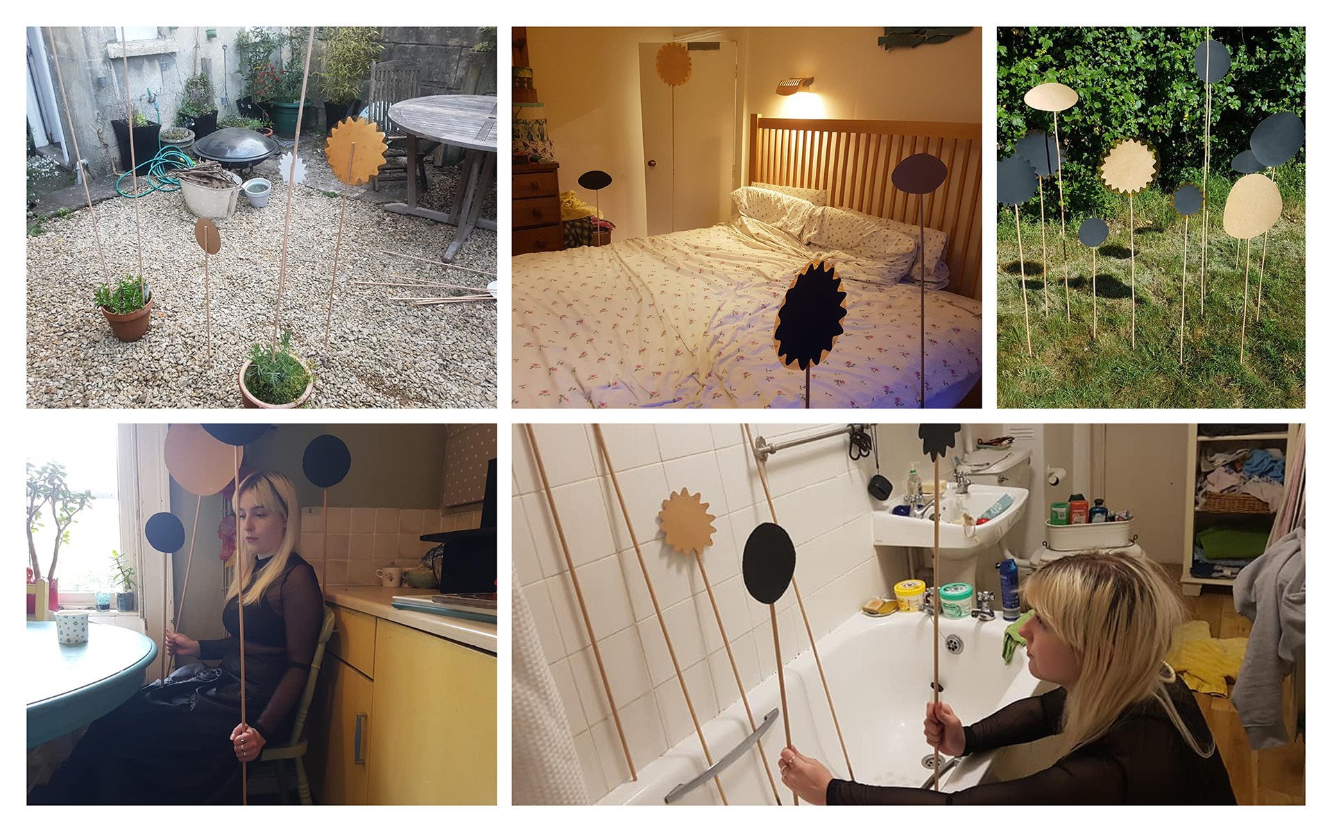
Due to the Coronavirus pandemic, I no longer had access to the photography equipment and the already made lasercut physical cue dots. In order to adapt to the situation, I recreated the cue dots out of card and paint, as well as now using an iPhone camera for the photography.
Please Order Here
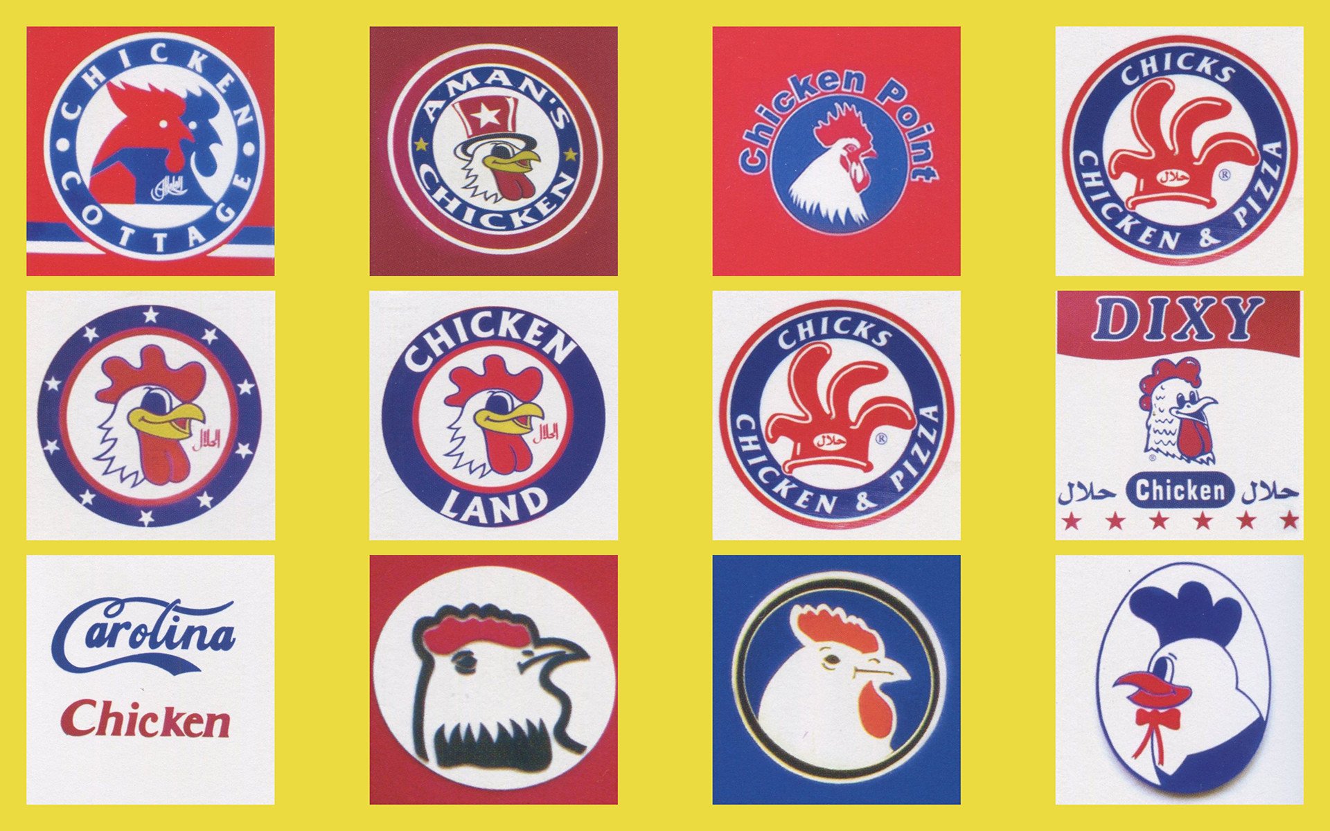
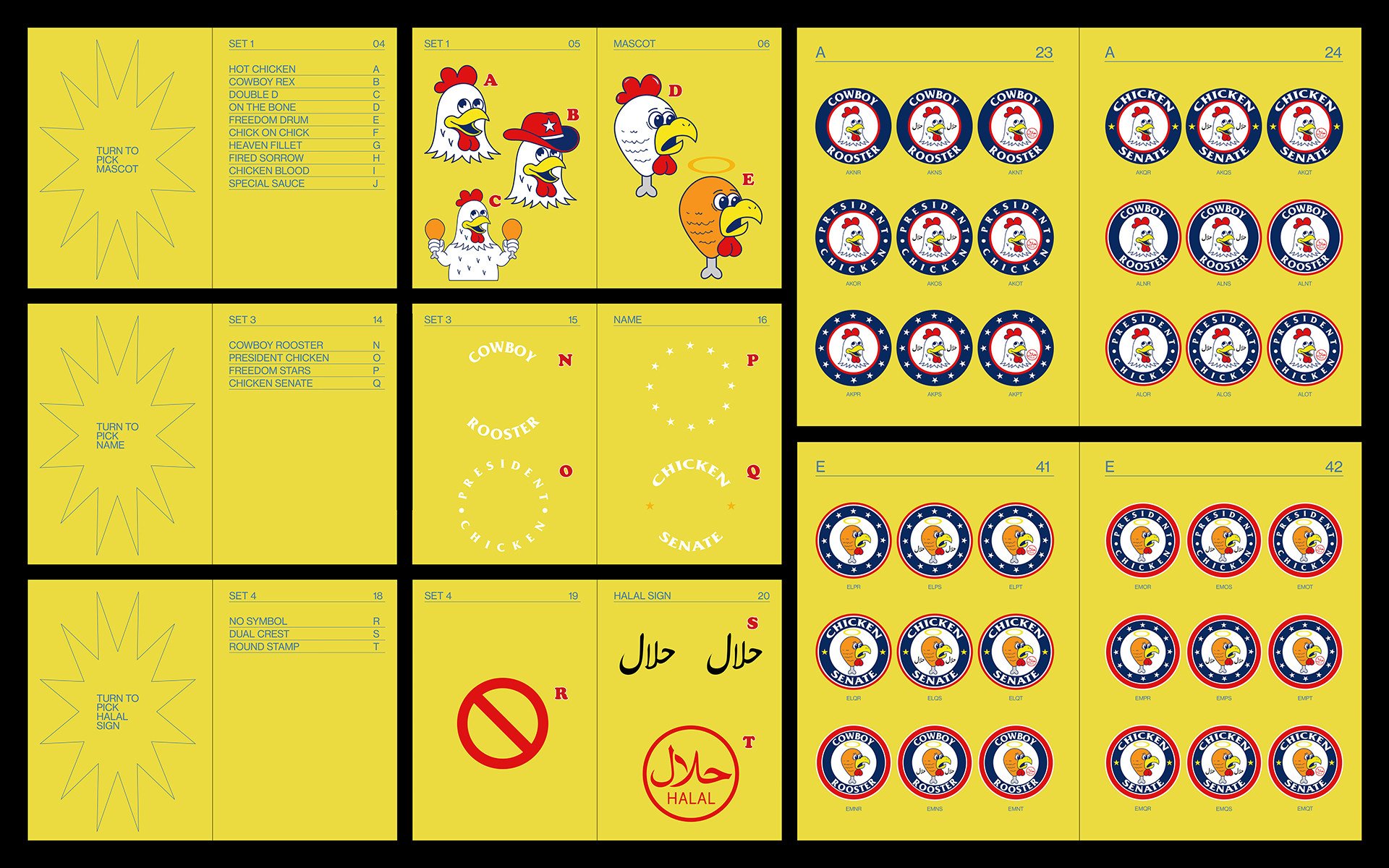
The goal of this project was to create an outcome inspired by a studio/designer. After research into my favourite studios, I stumbled upon Morris Cassanova, the ‘designer’ who is responsible for 90% of chicken shop logos in London. This book deconstructs and reconstructs the crucial elements that give Cassanova’s designs their charm, giving the reader the opportunity to construct their own chicken shop logo, emphasising the comical elements that make Cassanova’s work so extraordinary. The design is a simplification of popular designs found in chicken shop menus and interiors.
Extensive research was conducted on various London based chicken shops, looking at the similarities and differences in their mascots, typography and halal symbols.
