Milena Georgieva
Email address
moc.liamg@nsdg.anelimWeb Portfolio
milenageorgieva.comBiography
Hey! I’m Milena, a visual communicator with a passion for editorial, print, bookbinding and everything book design. Apart from that, art direction, branding and motion are also in my area of work. This multidisciplinarity is due to the different nature of each project which requires a unique approach every time. The concept that sits at the core is what drives the process and directs the mediums used.
Below are my two major projects realised during my final year at GMD. One of them is the visual identity for an architectural festival, while the other one explores and documents my sentiment towards the Book Arts workshop space at LCC that was reduced in half during my last term at the university.
Portfolio
(HALF OF) BOOK ARTS
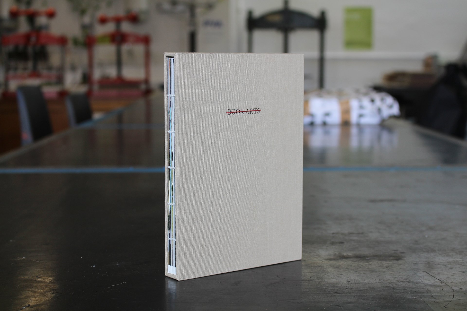
This book is a reaction, documentation and a homage to the Book Arts workshop space at London College of Communication.
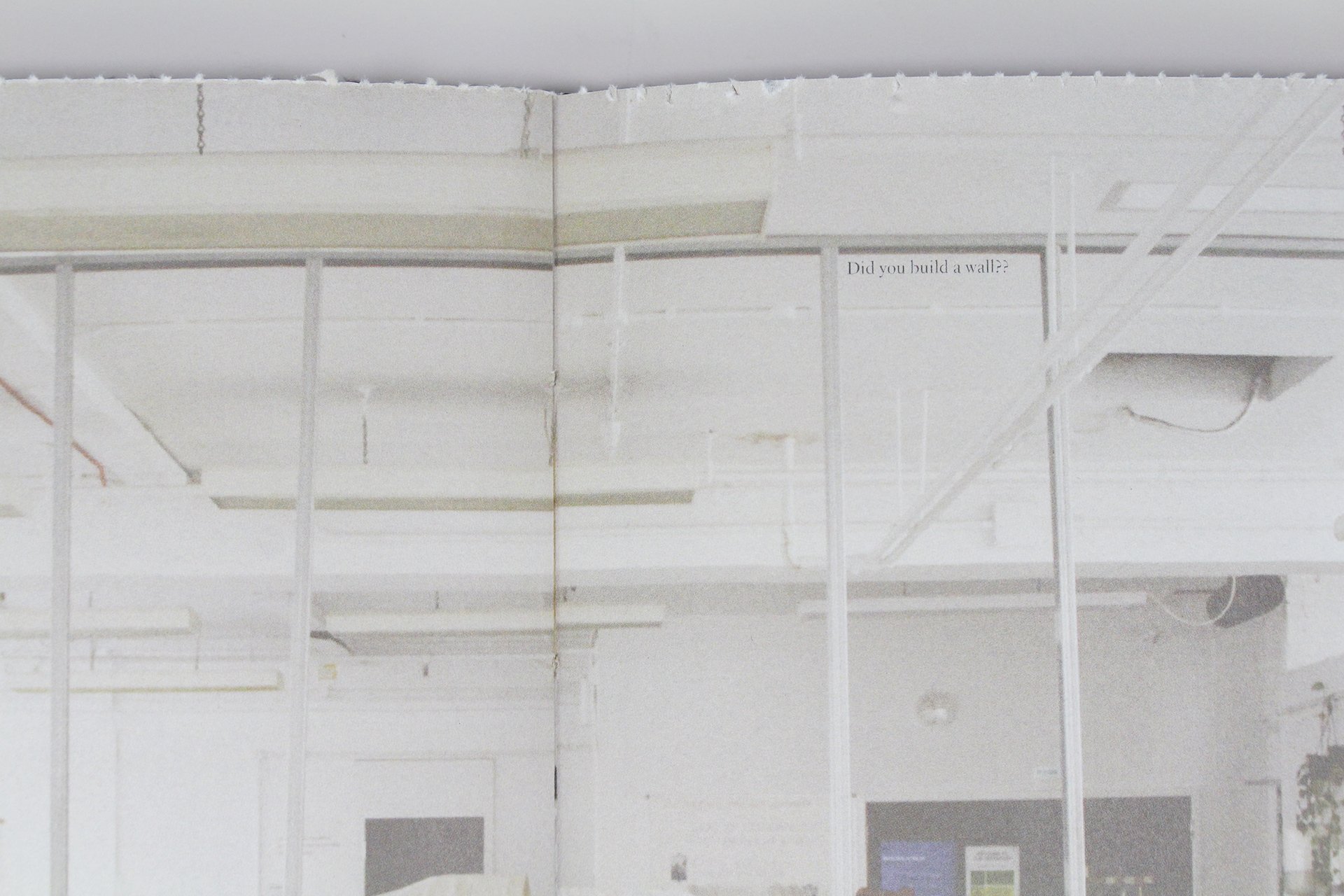
During the Spring Break the workshop was reduced in half by constructing a wall in the middle of the room and no students were consulted about or informed of this construction in advance. Therefore, I wanted to document what happened and include it in a book that can tell the story for the future visitors of the workshop.
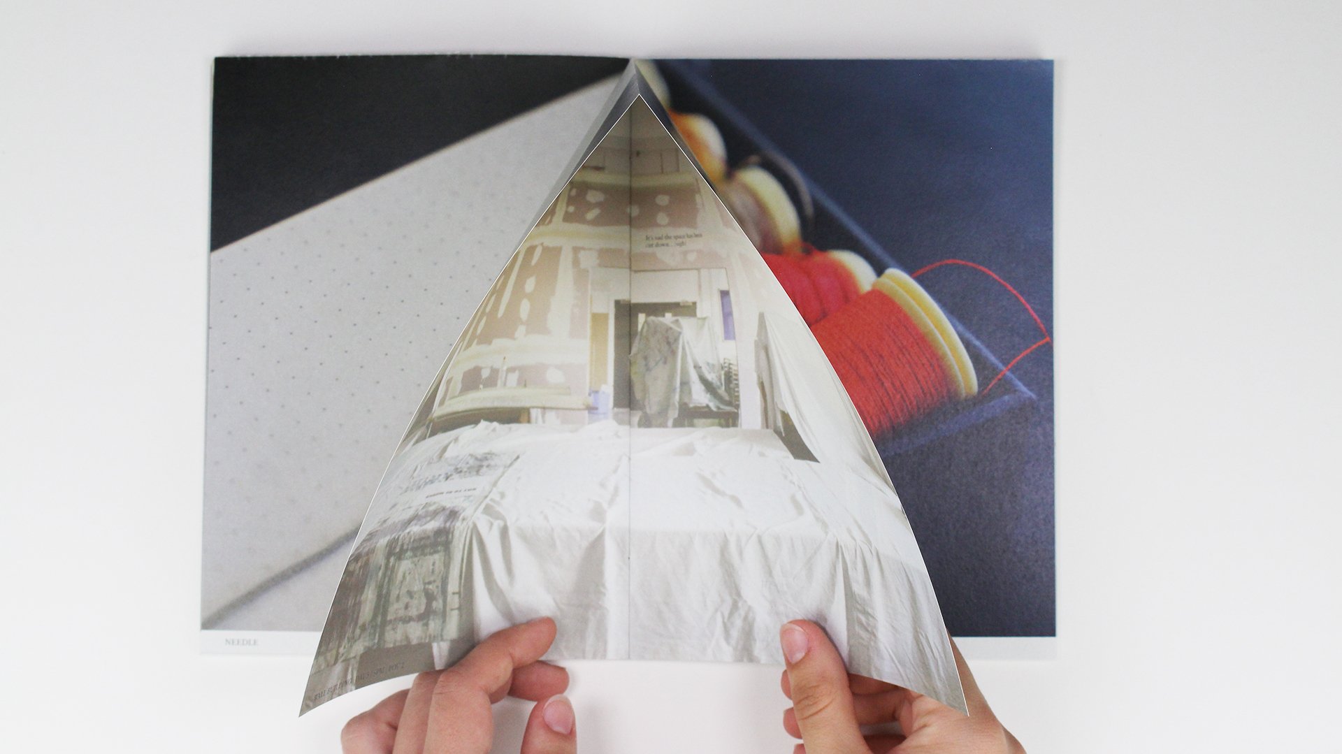
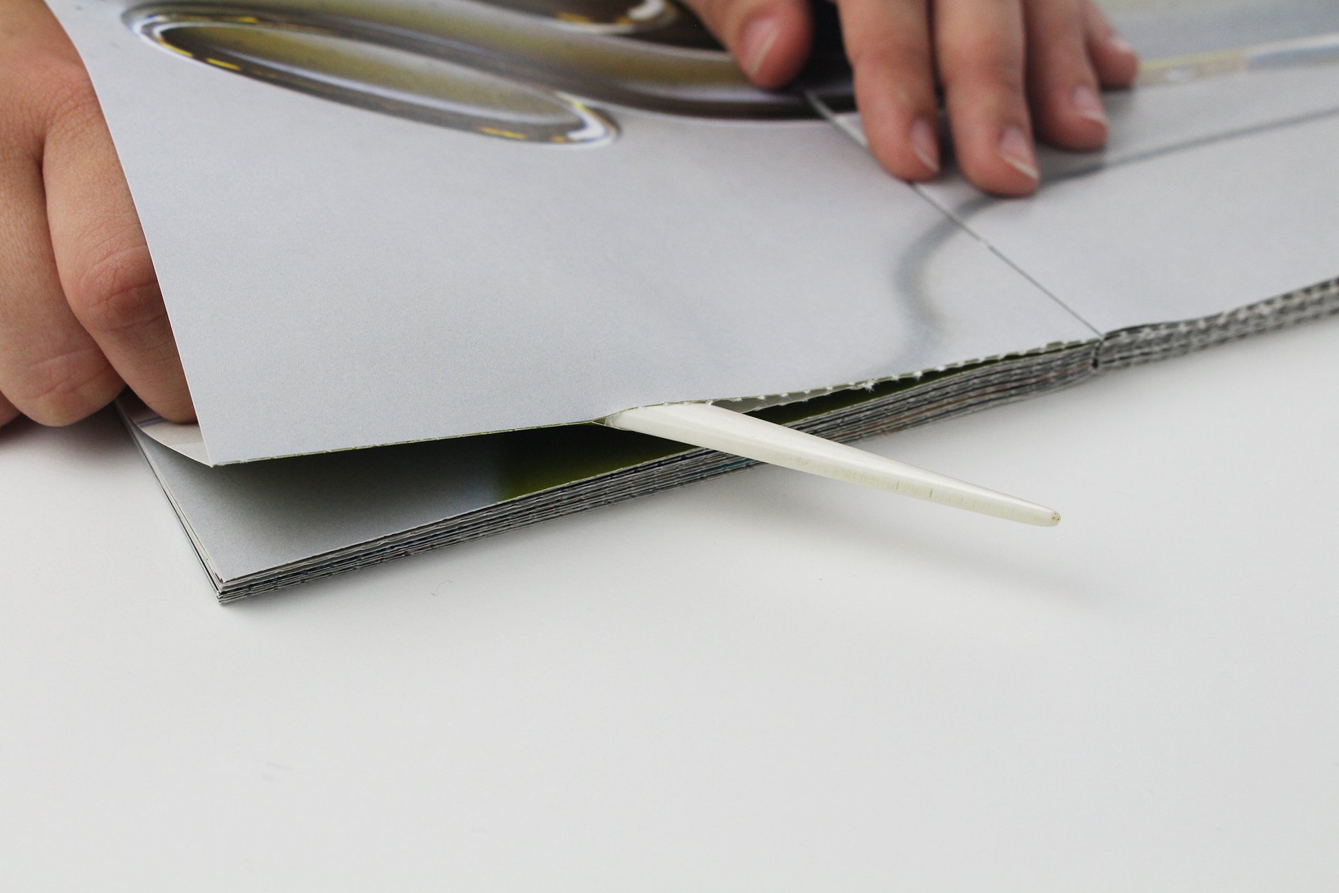
The book has an exposed coptic bound back and goes inside a slip case in order to be best preserved. Inside, it uses a reverse french fold that keeps half of the pages hidden. All of the outside visible spreads are dedicated to the beautiful tools, pieces of equipment and materials that can be used in the workshop. At the same time, on the inside pages is the documentation of the wall construction that took place. It also contains anonymous reactions of students upon their first entry to the workshop after the Spring Break. The two visible and invisible stories intertwine and the reader is prompted to tear open the inside pages in order to fully engage with the story.
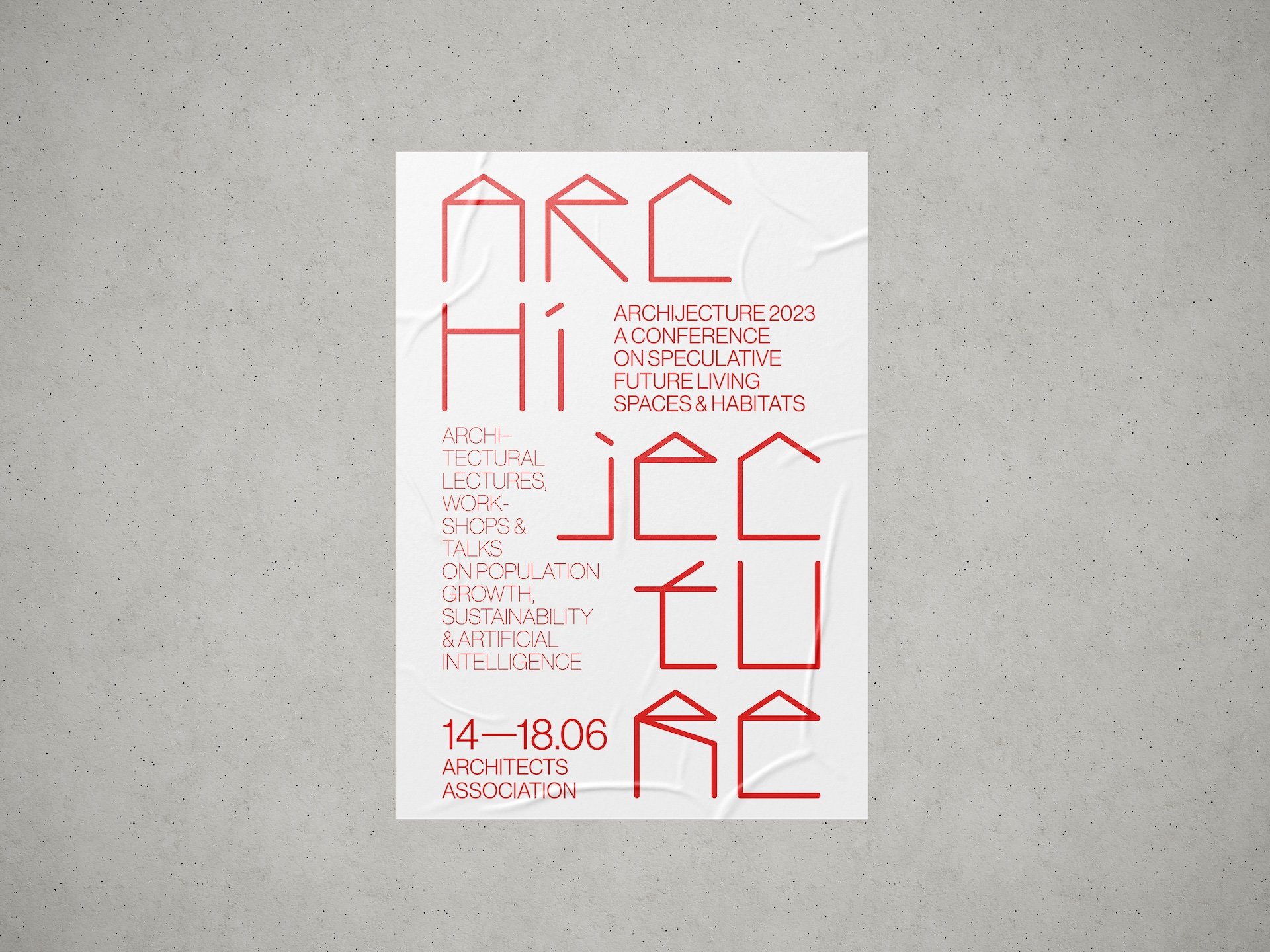
Archijecture 2023
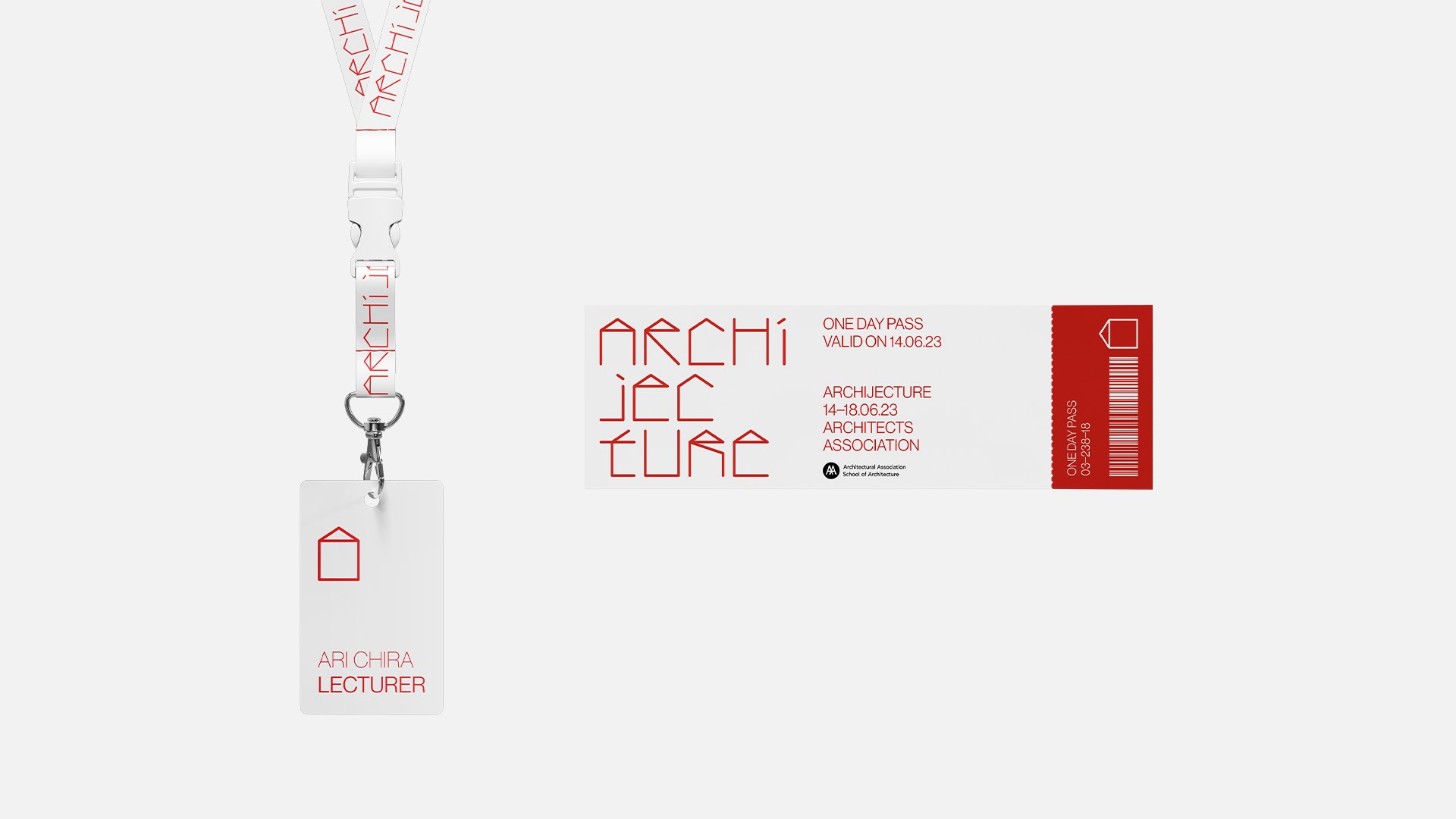
Archijecture is an architectural conference that explores speculative future living spaces and global habitats with focus on population growth, sustainability and the built environment.
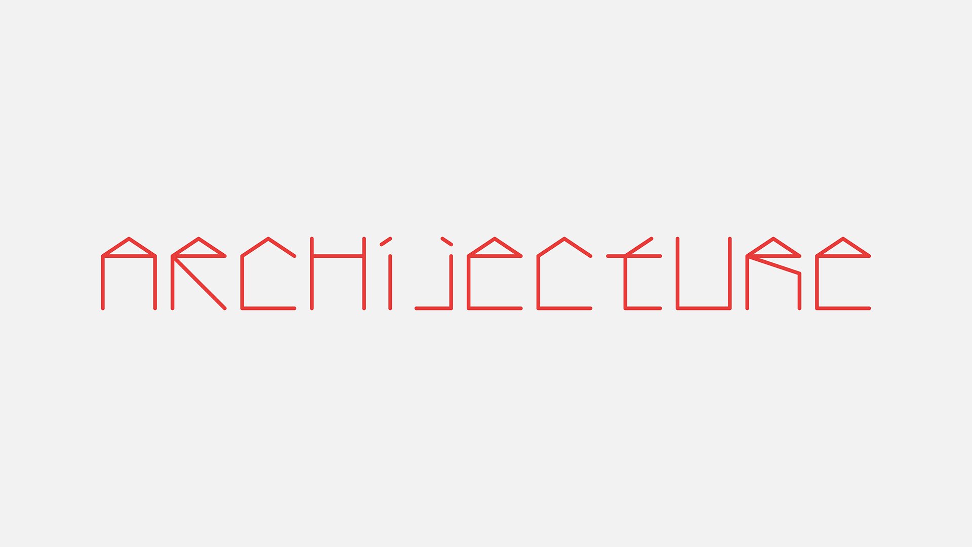
The concept behind the conference’s visual identity is based on two key inspirations. Both of them revolve around the theory that to speculate about the future, we have to look into the past. The fist one is Marc-Antoine Laugier’s theory on ‘The Primitive Hut’ (from 1753). It is an explanation of the fundamental origins of architecture and states that ‘man wants nothing but shade from the sun and shelter from storms’. The second inspiration is the way children draw houses. The way that every architect’s first drawing of a building looked. The simple illustration of a house, when used repetitively, also helps to convey the population growth concept and the red colour used throughout the identity helps set the tone of the urgency for humans to deal with this problem architecturally.
The simple graphic of a house inspired the creation of a typeface which became the identity’s primary asset.
Pixel Flow
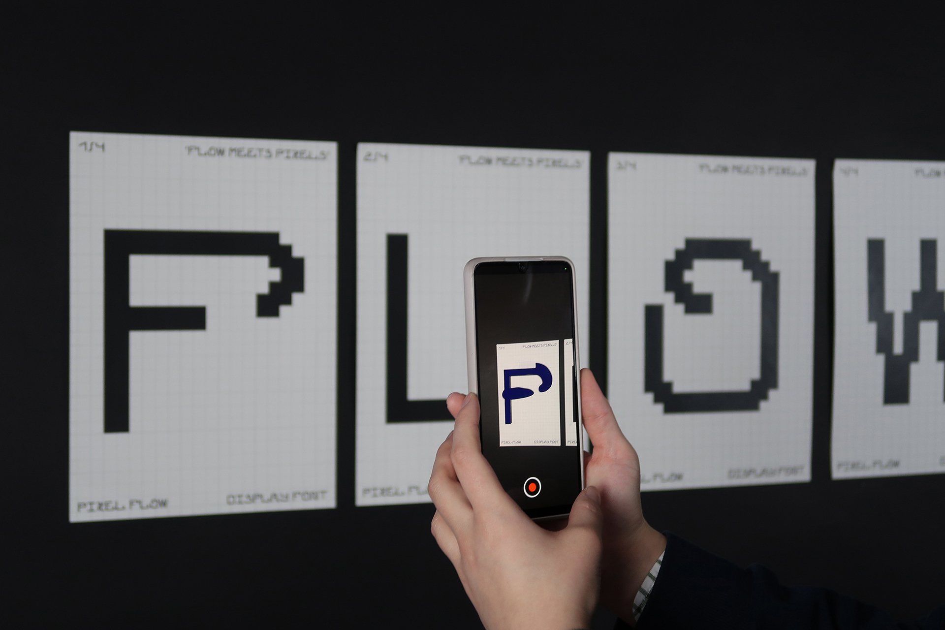
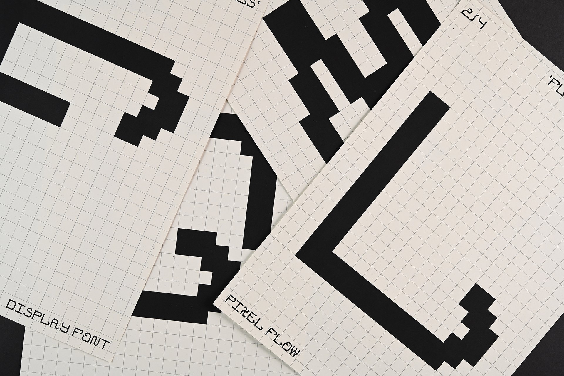
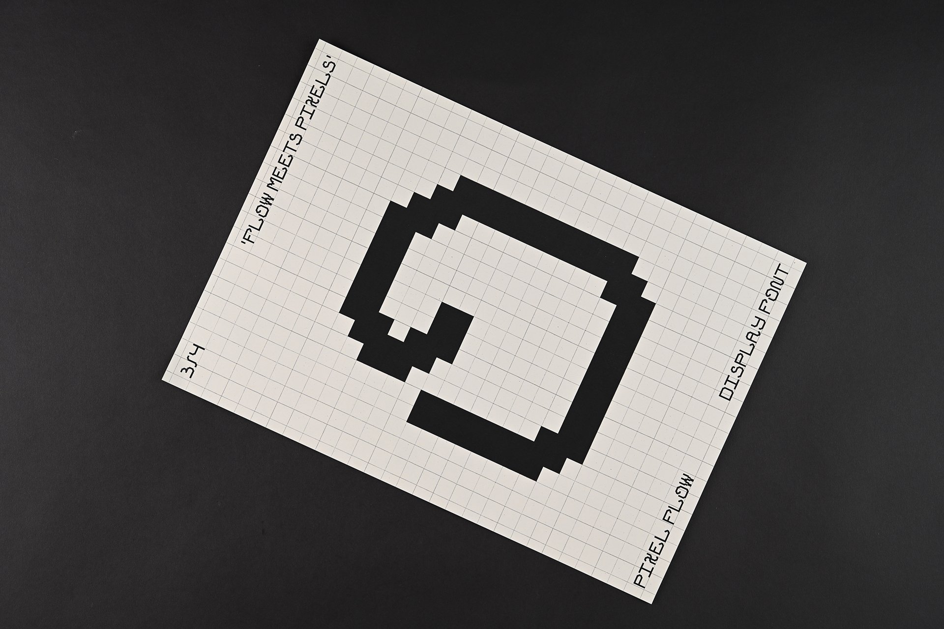
Pixel Flow is a display font based on the concept of mixing the (handwriting) flow with the (digital) pixels. The merge between those opposites is not only the core for the font, but also for its promotional posters. They are printed posters with an added AR motion dimension. The animations show through movement how the flowy handwriting turns into rigid pixels.
