Nick Zerman-Parr
Email address
ku.oc.liamtoh@pzn-salohcinWeb Portfolio
nicholasnzpfcae.myportfolio.com/workBiography
I’m Nick Zerman-Parr, an English / Swedish designer with an interest in branding, typography & visual communication.
I have always been creatively minded and totally fascinated by the design industry. I work well independently, interpreting a brief and using research and contextual understanding to support the development of ideas. I have learnt how to work through a design process using and combining traditional as well as digital methods and I have further developed my knowledge of professional design software such as Adobe Photoshop, Illustrator and InDesign.
I hope you enjoy some of the designs I have worked on throughout my last year of university at London College of Communication!
Portfolio
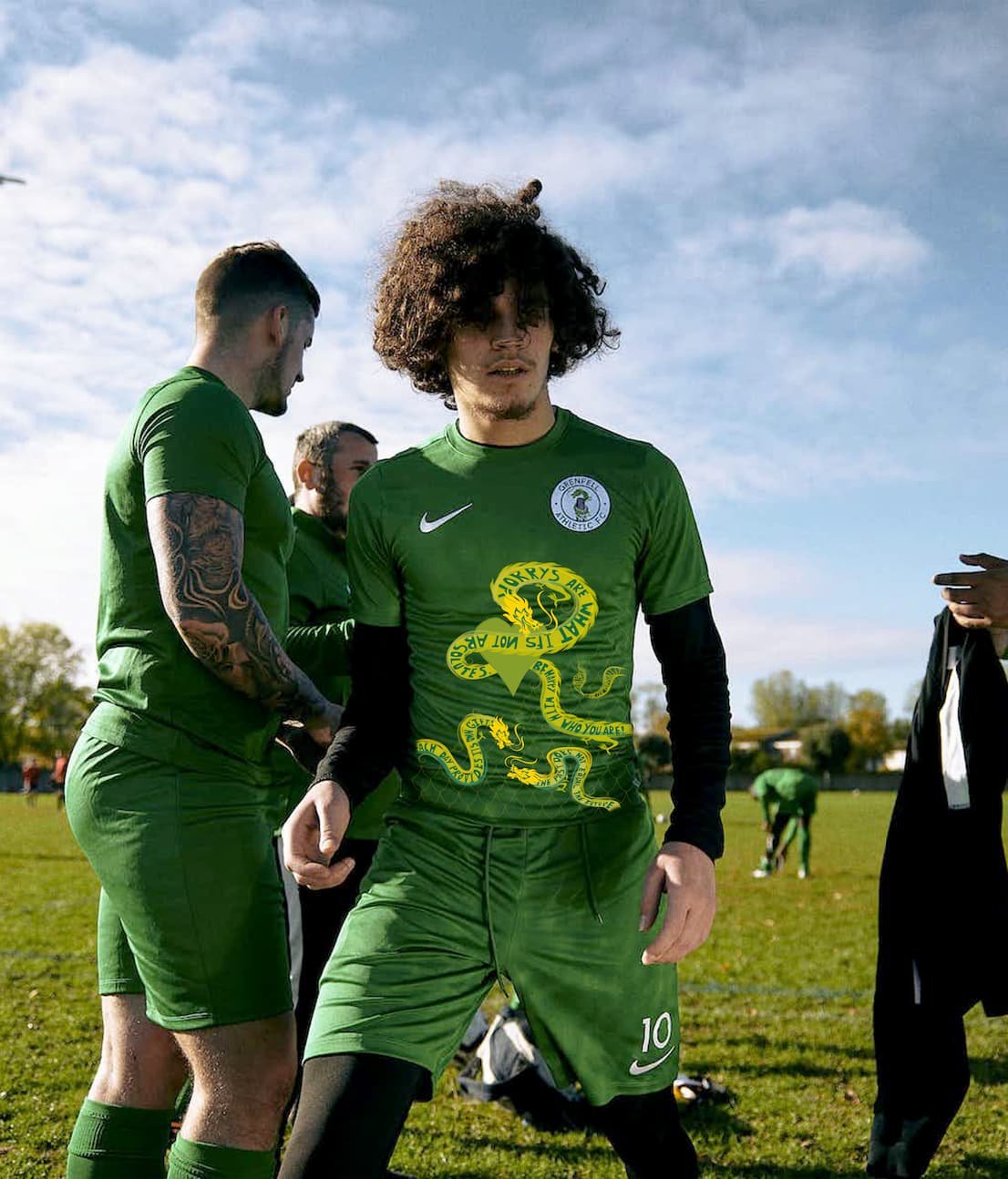
GRENFELL ATHLETIC FC X NIKE / BROTHERS & SISTERS (Live Brief)
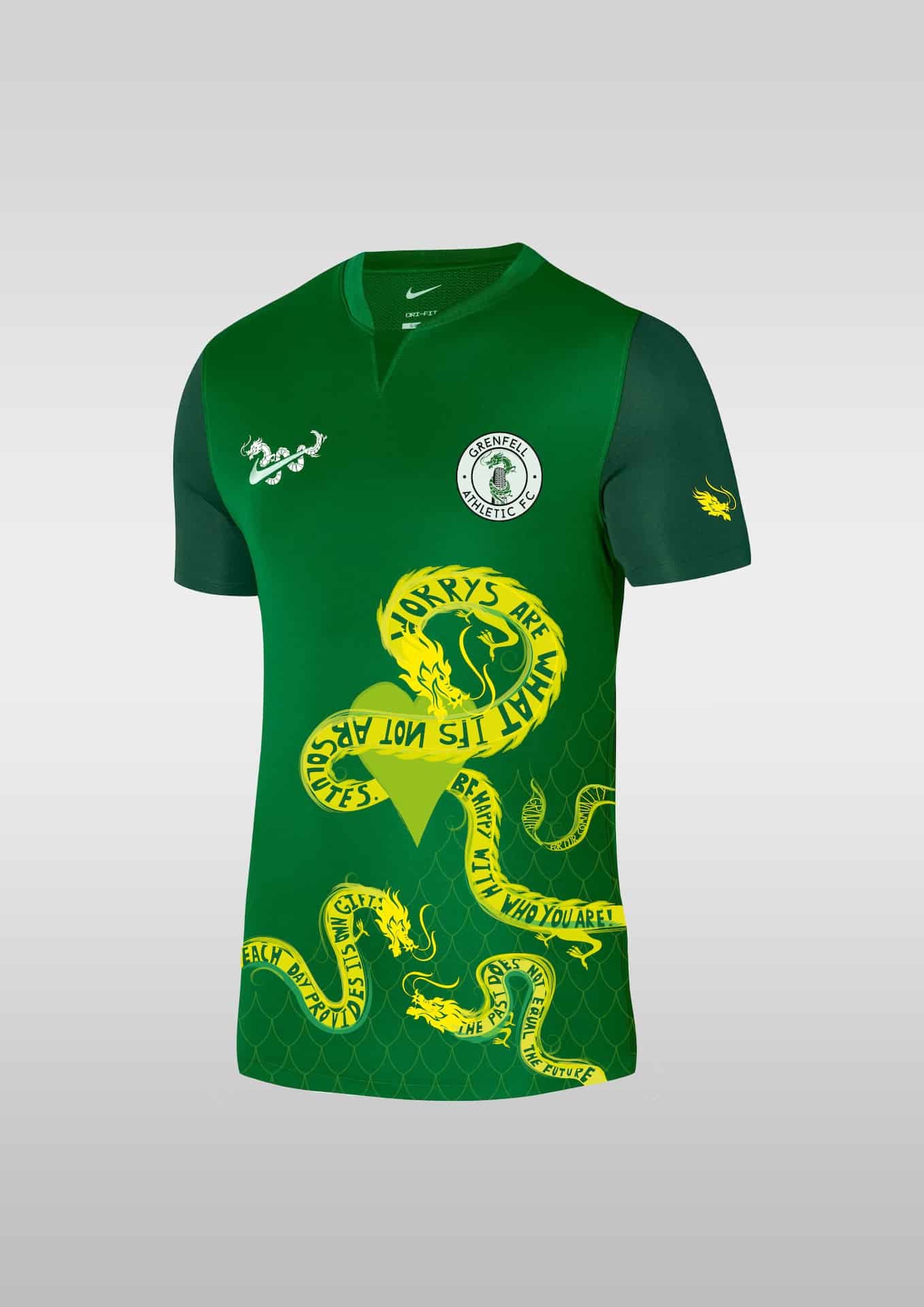
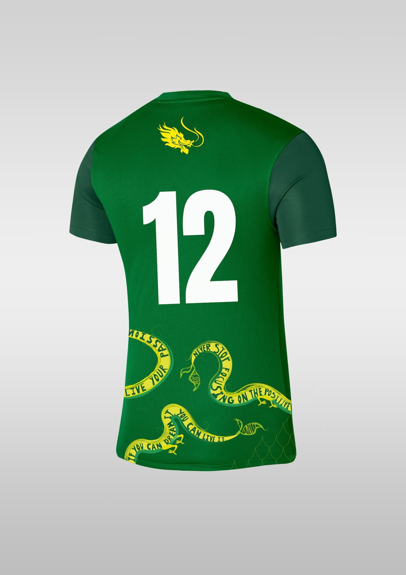
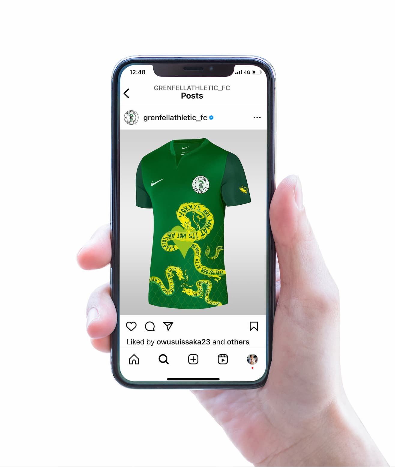
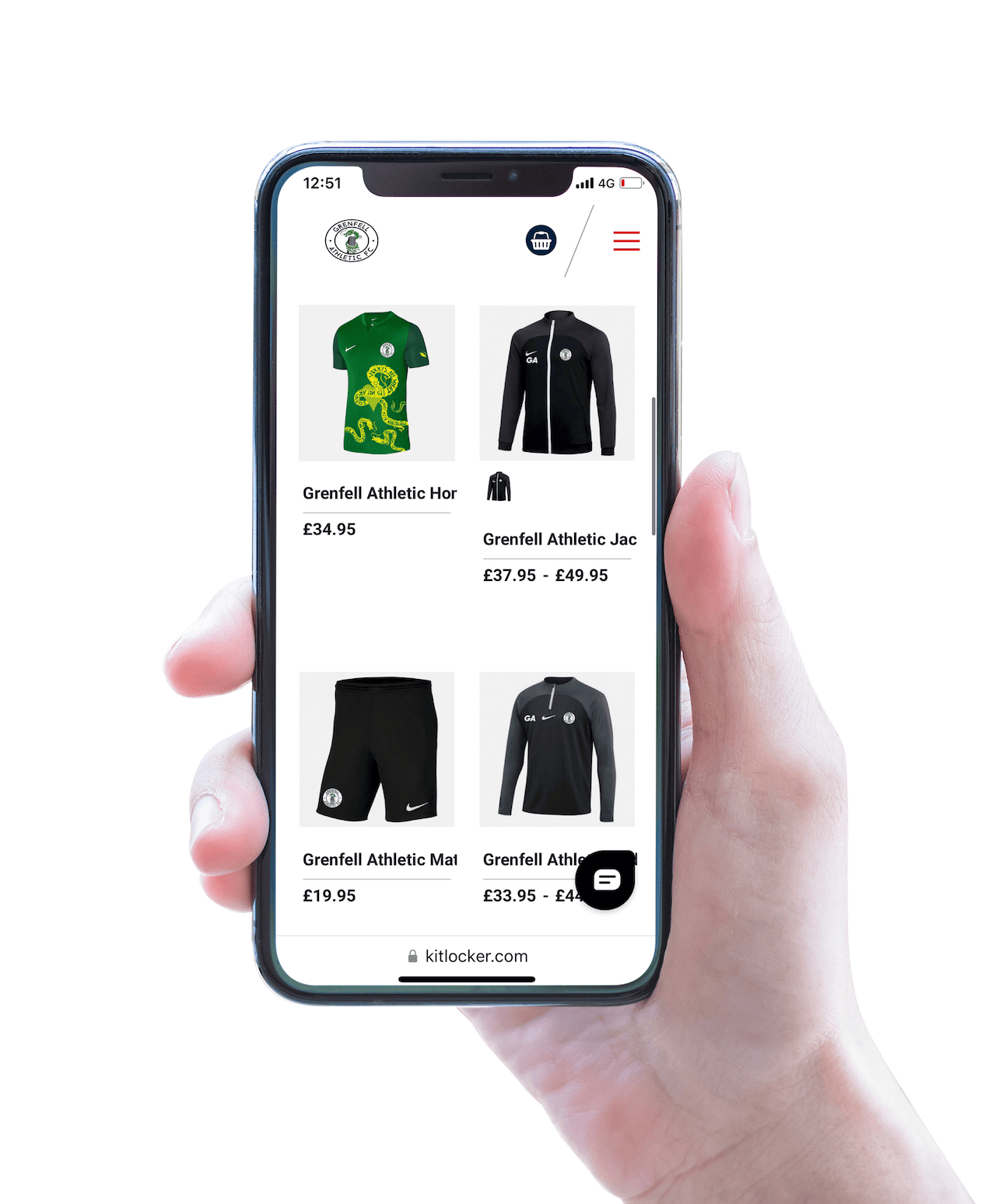
The outline of this project was: To develop a concept for the new Grenfell Athletic x Nike home football shirt for season 2023/24. Design the kit and a creative strategy/campaign for its launch.
For this project I decided to design around the idea of wisdom, I chose to go with wisdom after researching and understanding the origin of the dragon which is displayed on the Grenfell FC football shirt. I found there was an instant connection to wisdom and specifically the yellow dragon which is often portrayed attributes like warmth, wisdom and wealth.
I also decided to head in the direction of using words of wisdom as I feel wisdom is a crucial part of growth and understanding. I feel wisdom can help individuals with their mental health as well as give encouragement to the youth that are struggling after the Grenfell tragedy.
The idea of this campaign was to build off the relationships with high profile supporters already made through the club. Grenfell will then collaborate by using their words of wisdom which will be presented on the shirt. The words on the shirt would be words of encouragement and wisdom to target self-doubt and mental health. The idea is to encourage the youth and people in and outside the community, as by reading and listening to the words of wisdom individuals will feel driven and motivated to tackle any difficult situations that they’re faced with.
Using my research to inform my direction, I tried to find a way to place words of wisdom on the shirt so it would both work physically and work well as a concept overall. My main source of inspiration was from designers Si Scott, Wes Wilson
and Bonnie Mclean that have used illustration and words to create strong visuals.
Overall I am happy with this direction I had taken the project in and felt it really pushed me out my comfort zone as a designer, as I haven’t illustrated before like I have for this project and the interactions with the client have made me more confident in how I interact with clients in the future.
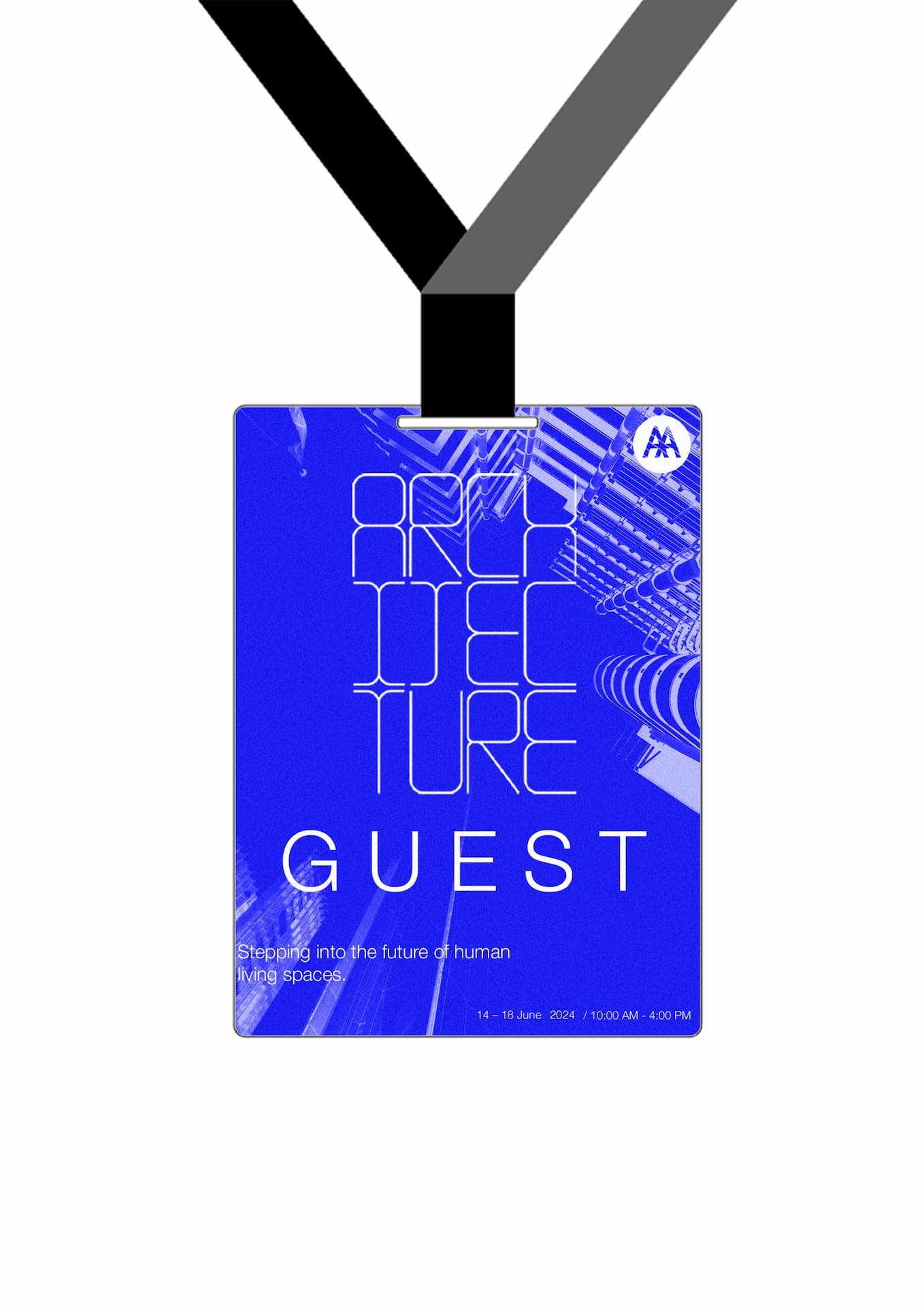
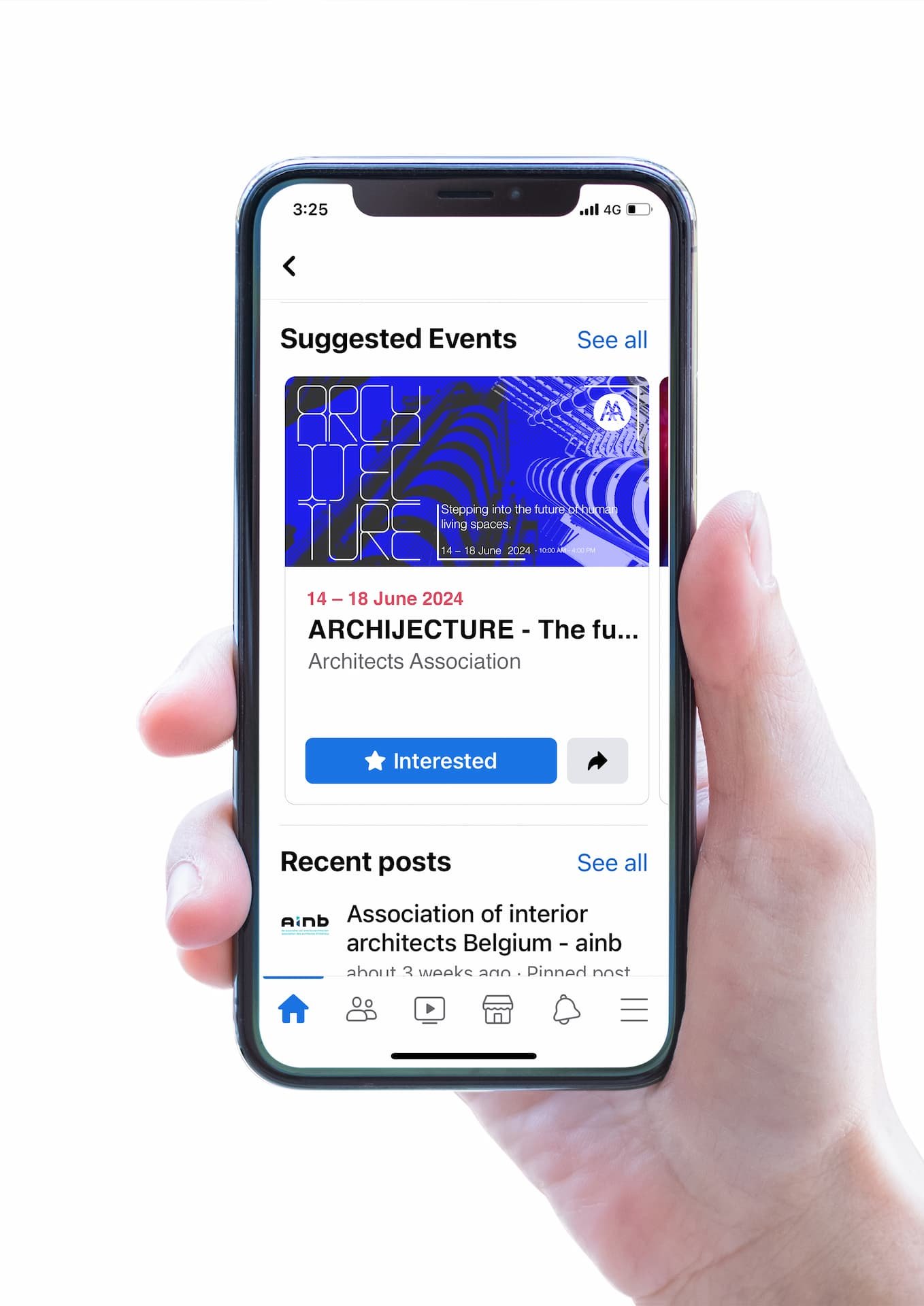
(Archijecture) – at the Architects Association
Create a visual identity as part of the overall branding for a culturally orientated Time-Based Event.
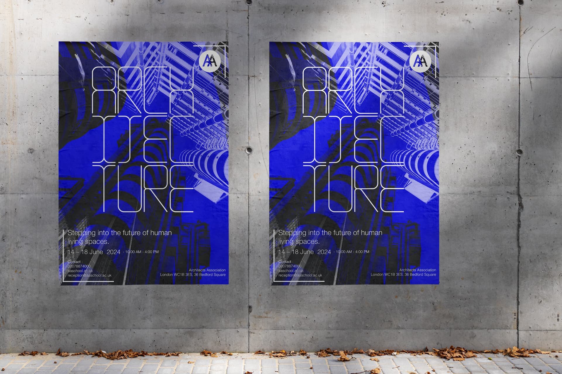
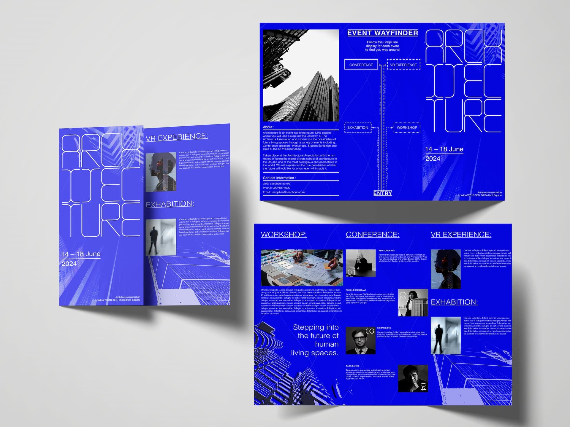
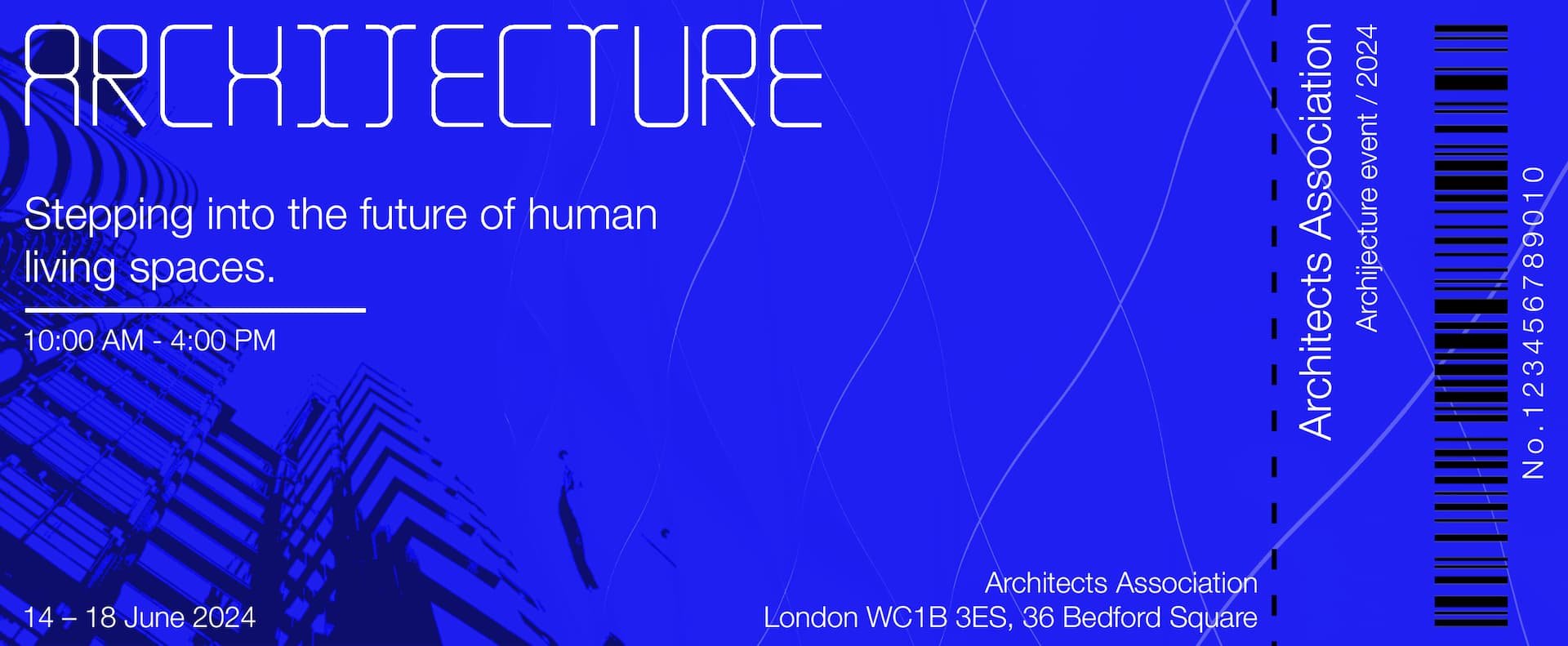
Within this project I designed for an event which explores speculative future living spaces & global habitats, held at the Architects Association. Within this project I have used my own photography and typeface to communicate to my target audience as well as exploring ways to communicate future living spaces for the people interacting with the branding of the event.
Within this project I have used Illustrator to create a dense typeface to communicate the idea of future human living spaces as being dense due to the rise in human population. Alongside using Illustrator I have used Photoshop to manipulate my photography and Indesign to create the layout within my brochure.
For the colour palette I had decided to use blue and off-white to communicate and link my design to blueprints that are commonly found when constructing a building or future living spaces.
Overall I enjoyed this project as I was able to design my own typeface and play around with imagery to better help connect to my target audience as well as responding and understanding feedback, helping me move this project in the right direction – creating multiple outcomes such as tickets, posters, social media mockups, lanyards and a brochure.
Self Directed Project (SDP)
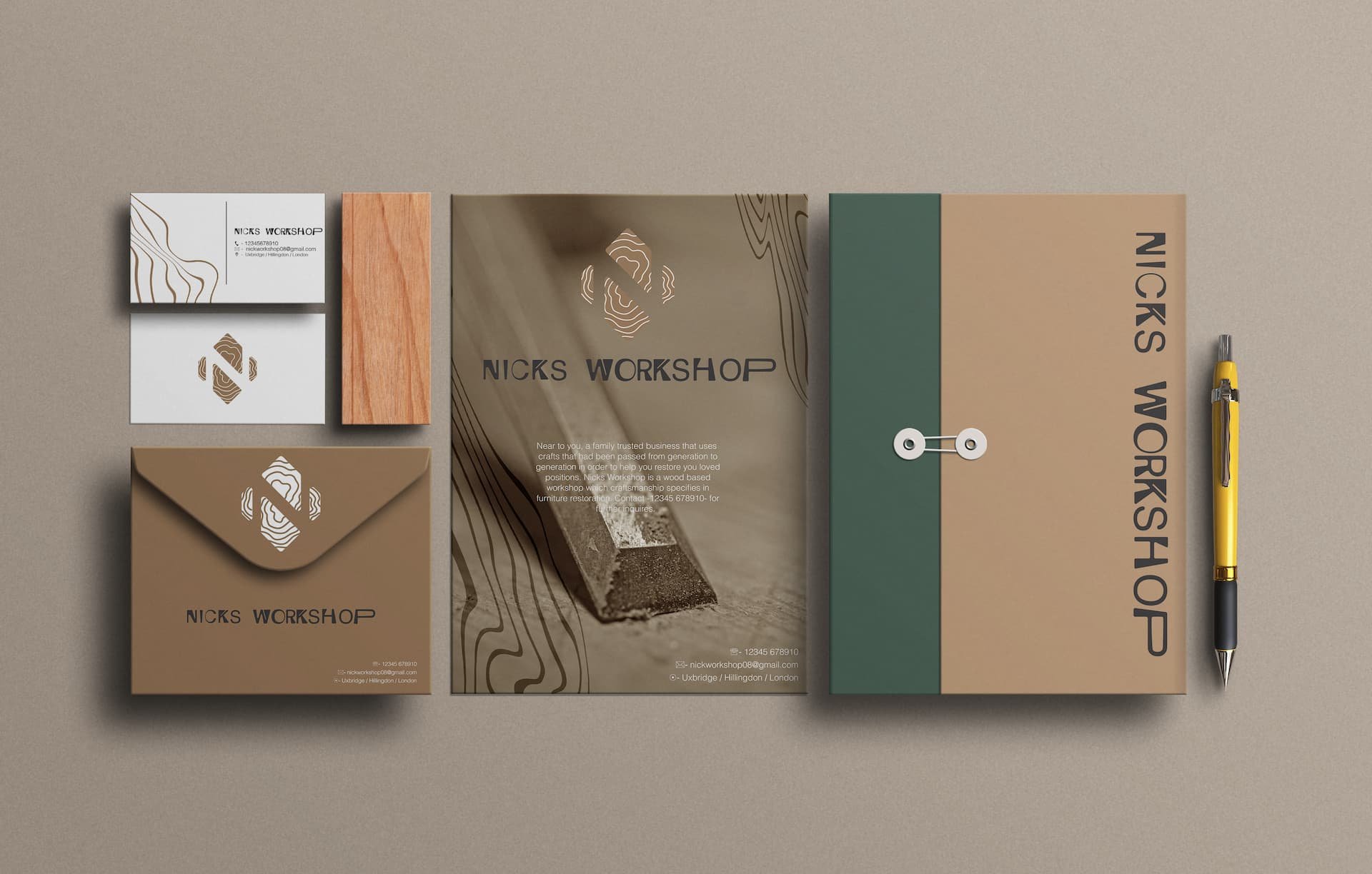
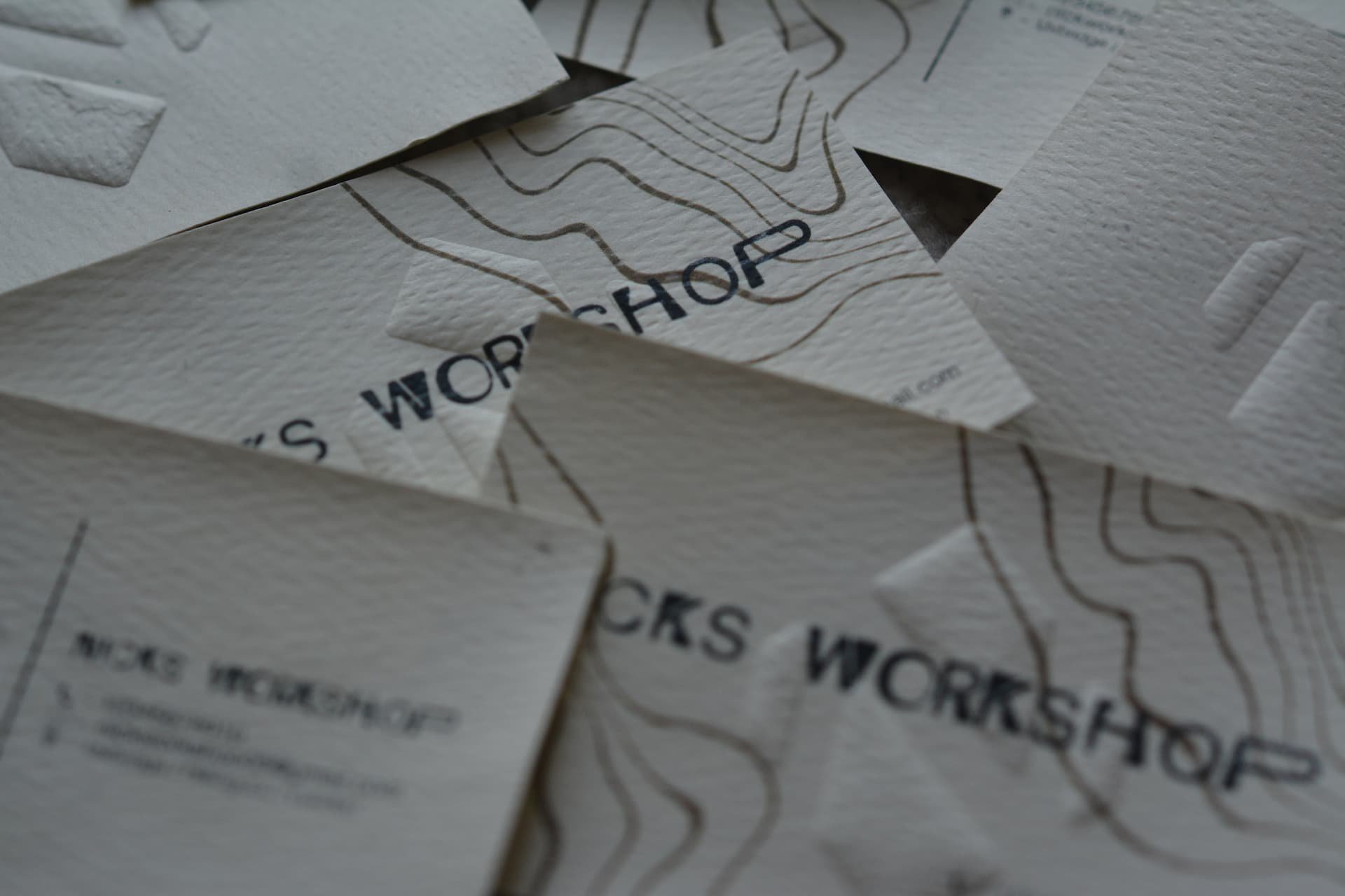
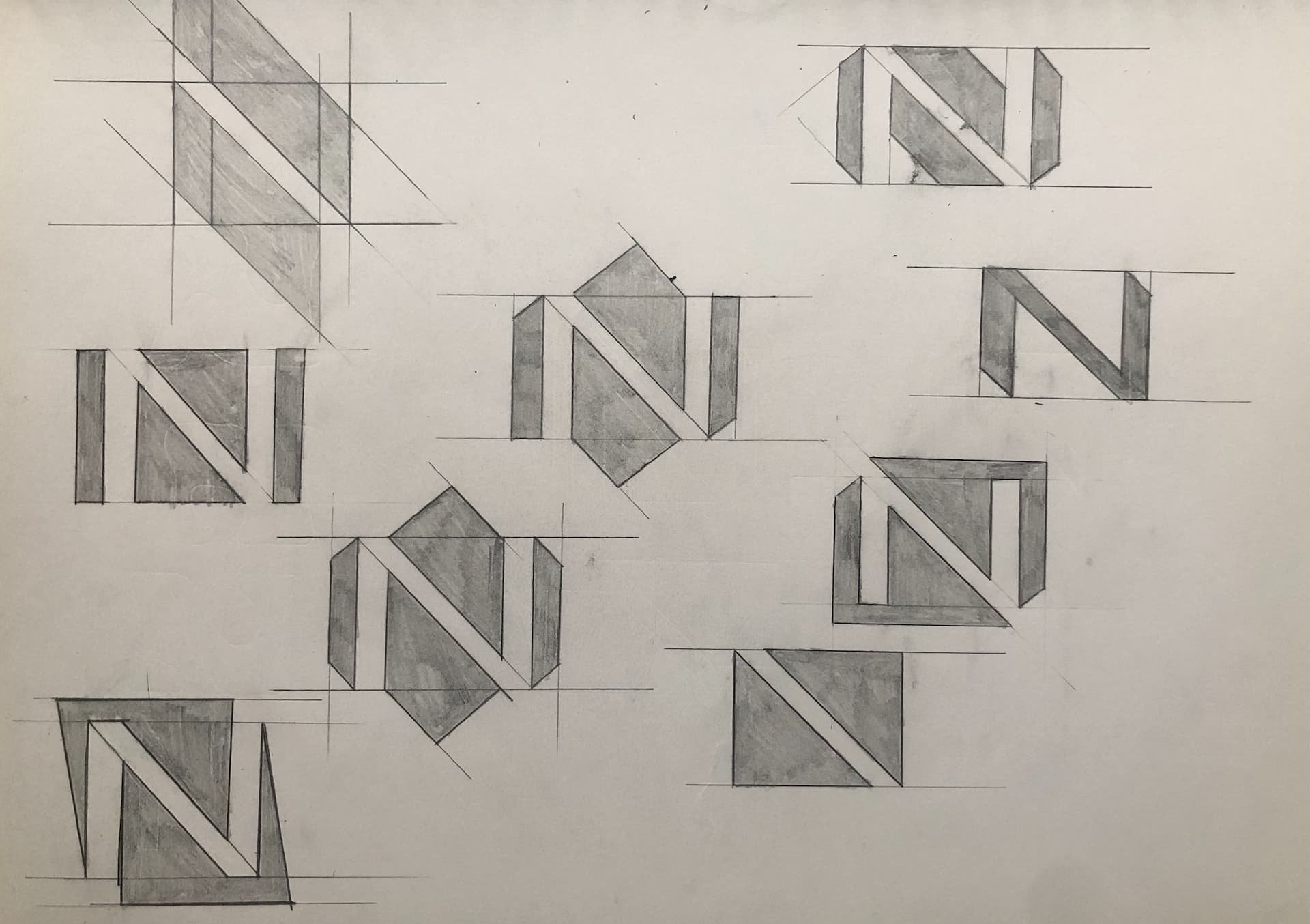
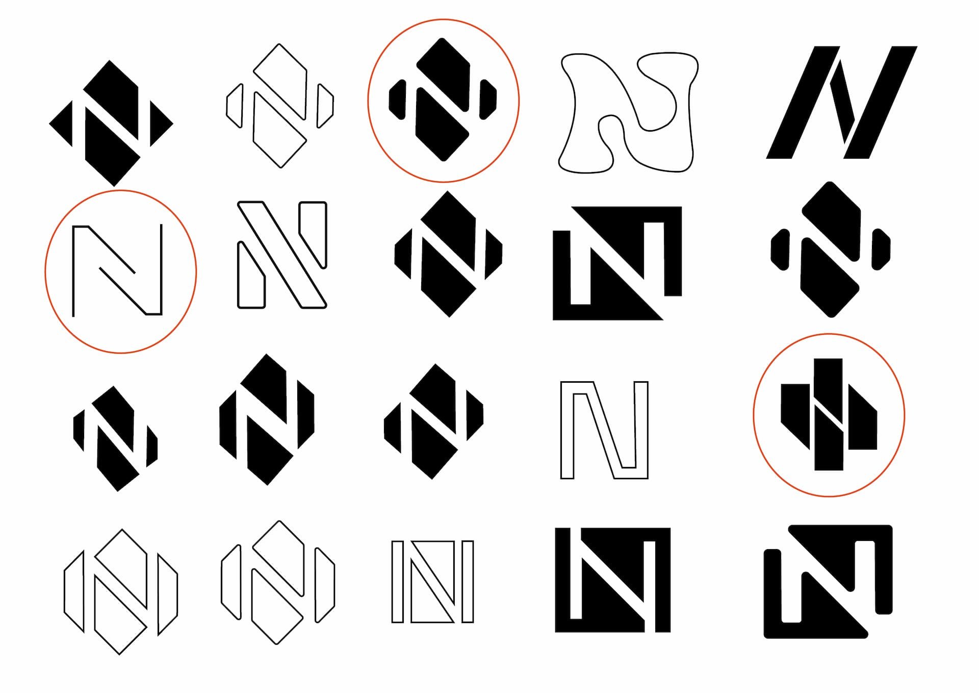
Within this project I had the freedom to design anything. This is where I decided to focus on creating my own brand for a wood-based restoration and craft business. I chose to do wood restoration as my focal point as I felt it is something I enjoy. Having always enjoyed the craftsmanship I decided to do a brand and identity. Within this project I explored creating my own typeface representing the wood joints and wood works in general, along with exploring outcomes such as embossing, laser cut and intaglio print.
