Saumya Mittal
Email address
moc.liamg@82lattimaymuasWeb Portfolio
www.saumyamittal.comBiography
I am a graphic designer from India with a keen focus on data visualization and information design. My work involves infographics, illustration, photography and editorial design. I believe in conveying complexity and meaning through abstract forms and patterns. My body of work aims to humanize data and numbers through graphic design. I am generally inspired by books on politics, culture and data. I aim to explore information design through my practice and move beyond traditional bar graphs and pie charts, converting statistics into stories.
Portfolio
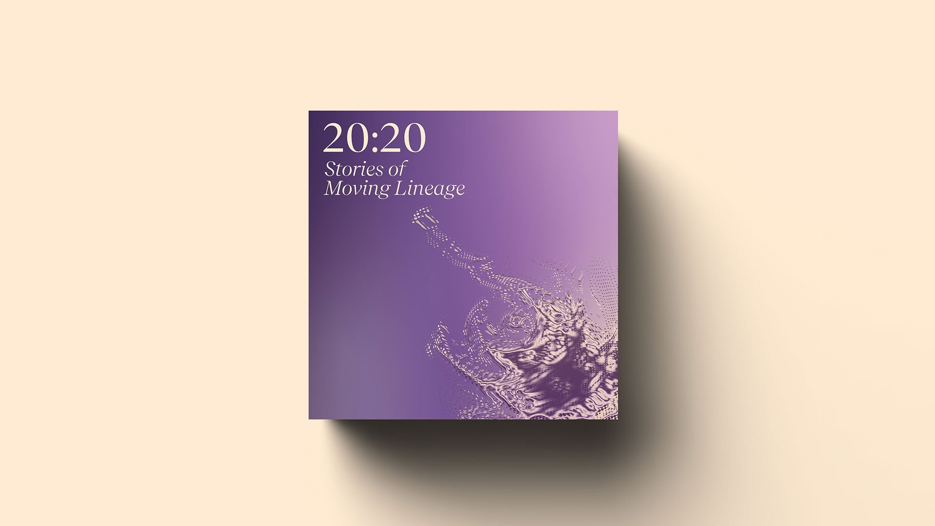
20:20 Stories of Moving Lineage
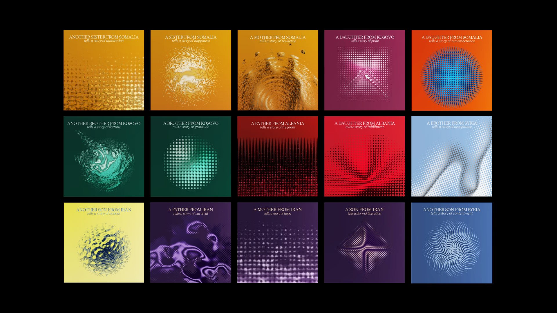
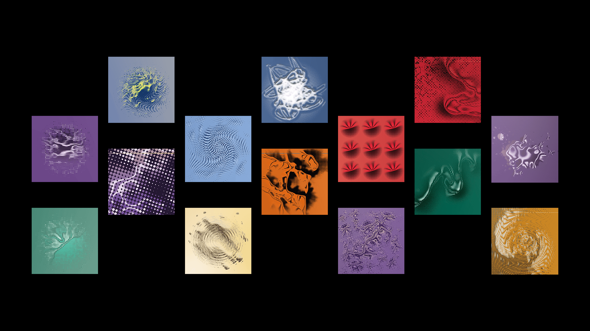
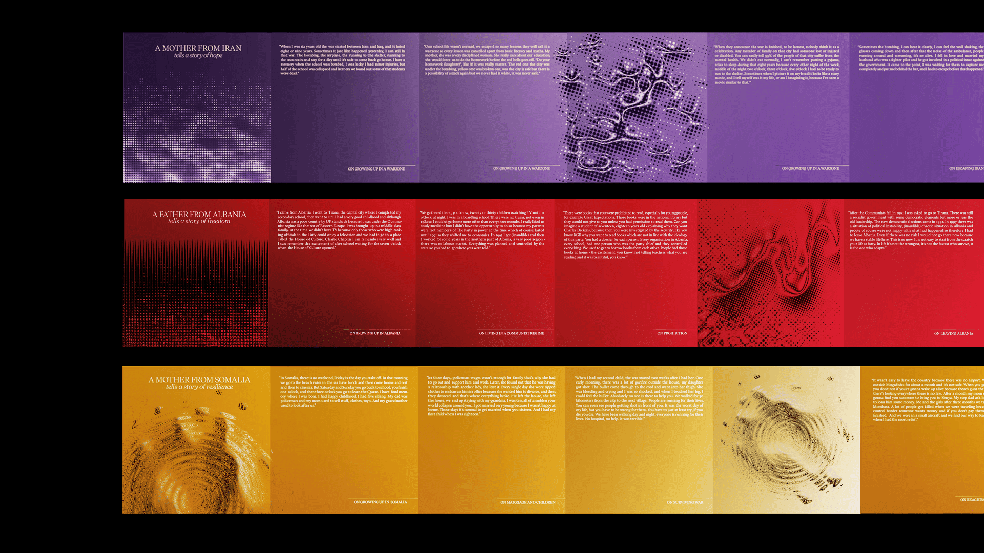
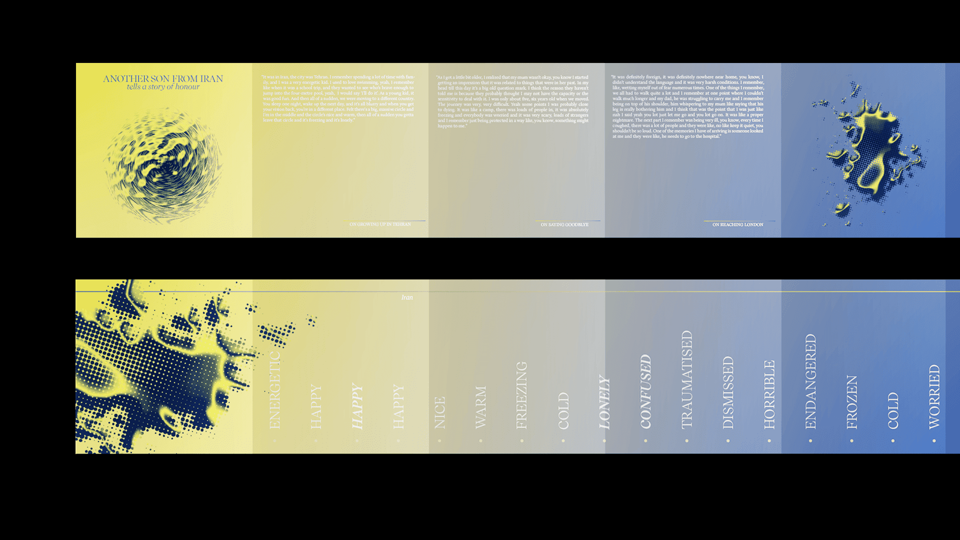
My final major project was a set of fifteen publications created for Salusbury World, an NGO based in London. The publications document the emotional journeys of 15 refugees from Iran, Syria, Kosovo, and Somalia. What started as feelings of horror and fear ultimately culminated into feelings of pride and triumph. The accordion fold pages aim to document this change visually using an infographic timeline of emotions felt at each stage of the journey. The stories focus on memories of homeland and agile adaptations to exile, exploring resilience, polyglotism and celebrating transnational culture in the UK.
Colours
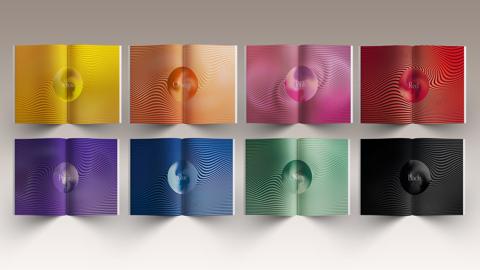
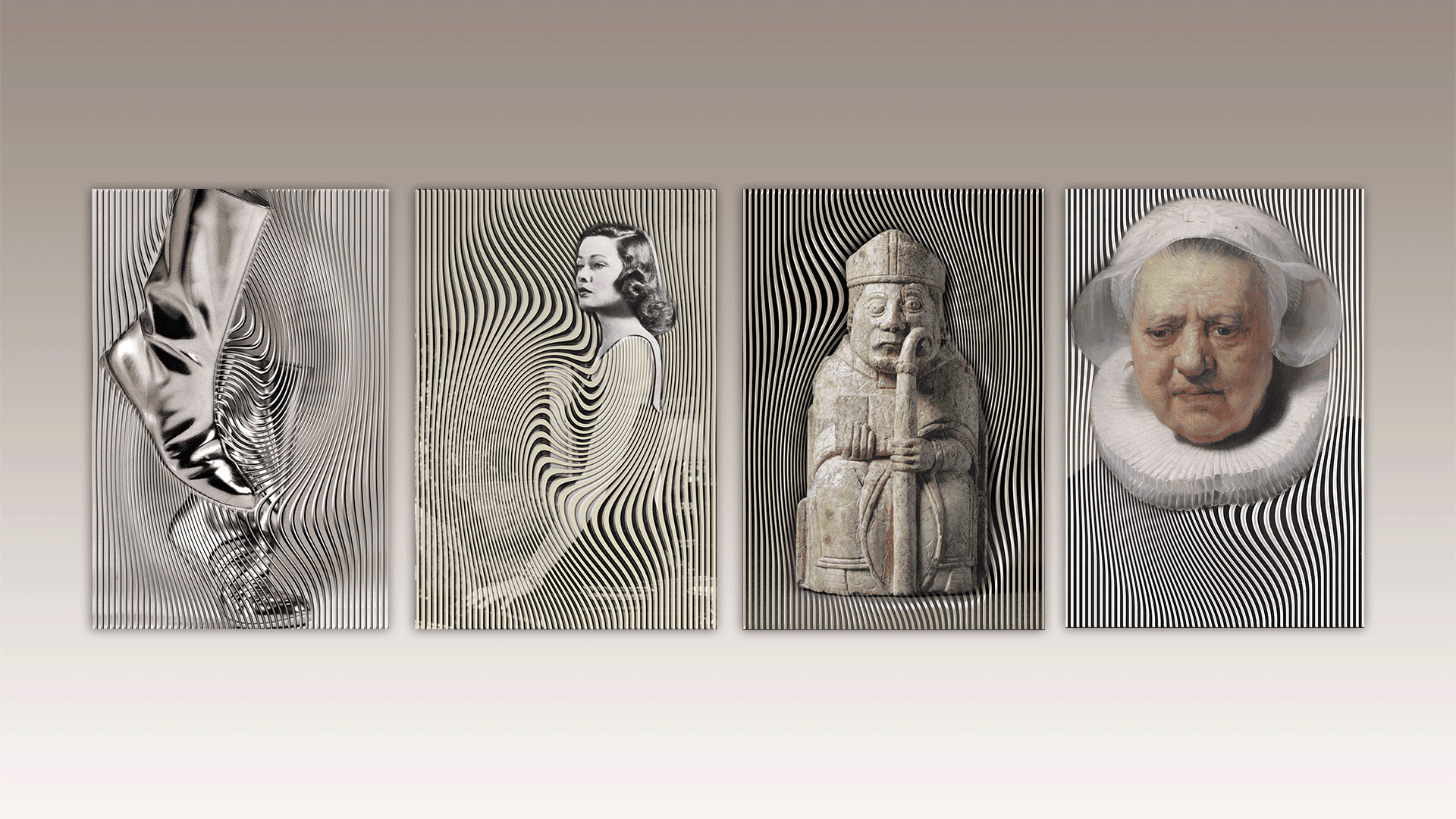
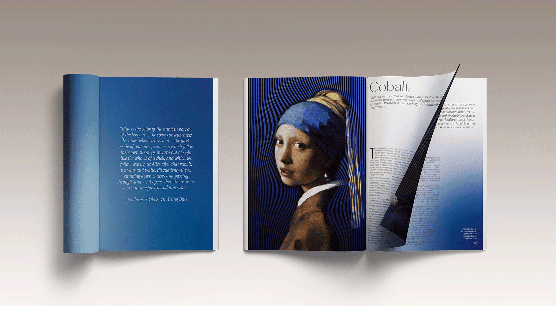
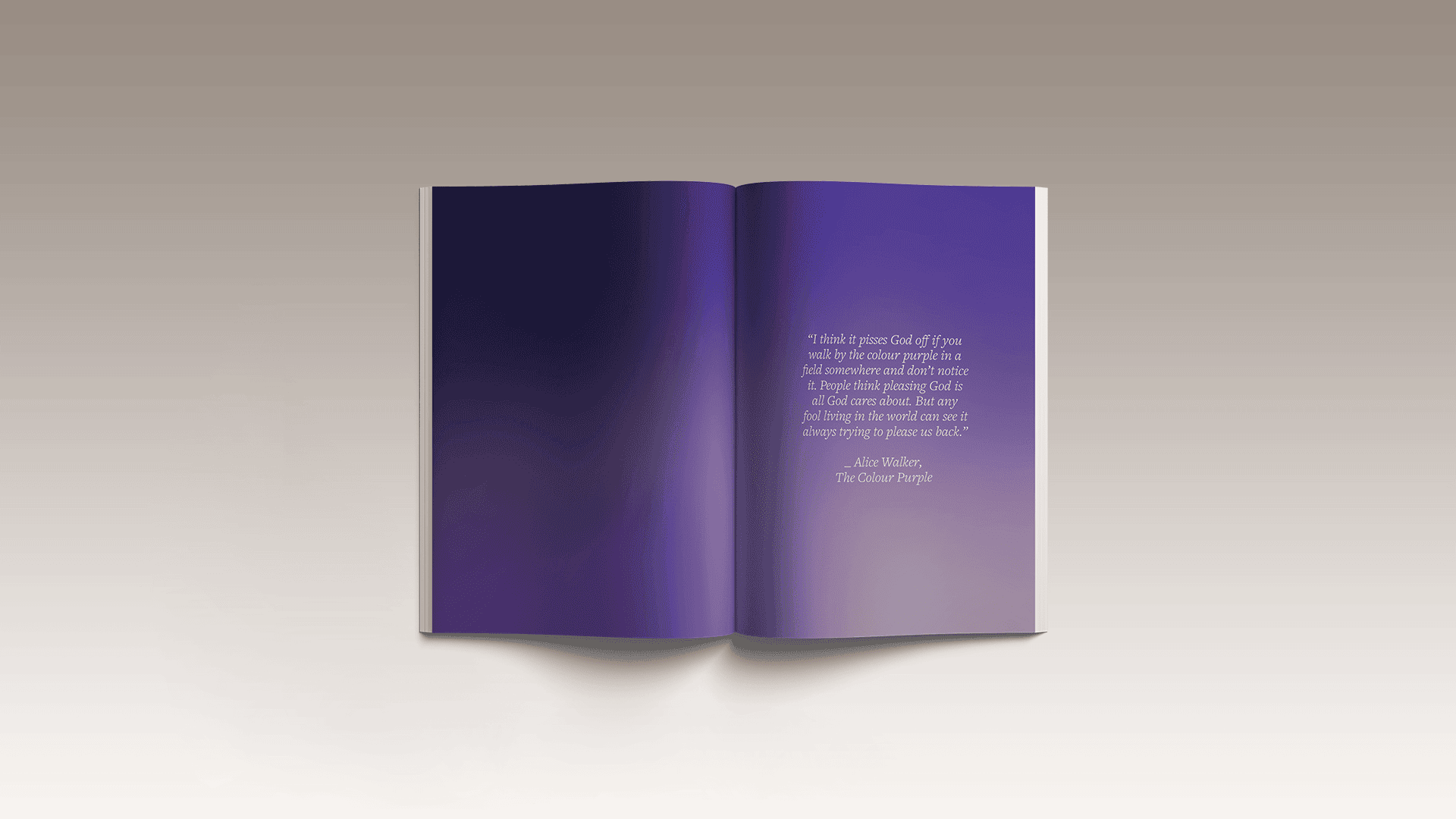
This book is an attempt to capture the visual essence of colours. I consider it to be a visual adaptation of The Secret Lives of Colour by Kassia St Clair. It takes you through the whole spectrum of colours beginning from white and ending in black, much like everything else in the universe. Each colour has been divided into different shades and captures a narrative of that shade. The book is largely divided into white, yellow, orange, pink, red, purple, green and black. The goal is to bring out the persona of each colour and celebrate a moment in its lifetime. Every spread speaks about the significance and symbolism of a particular colour. It highlights its use, its reputation and interpretations in society, some of which are often quite ironic. Together all these stories have shaped our world and this book aims to offer the reader a little glimpse into it.

From Statistics to Stories
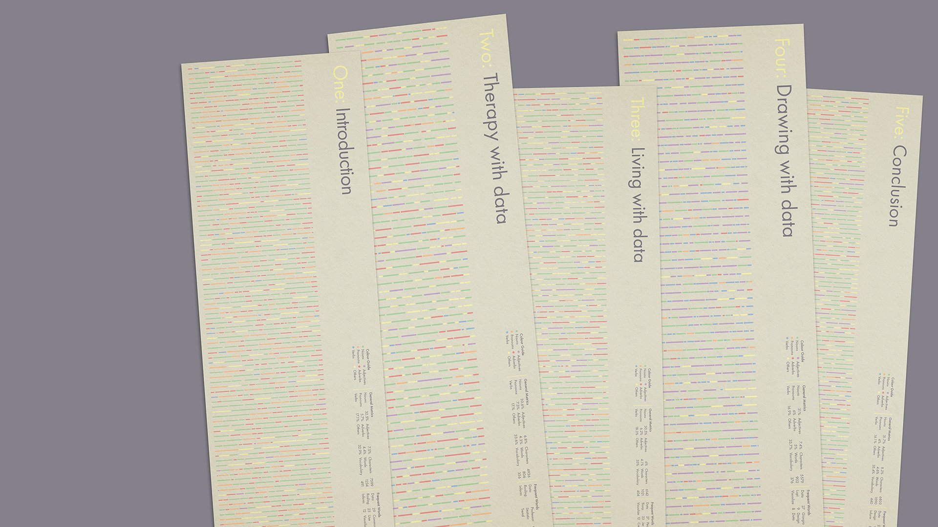
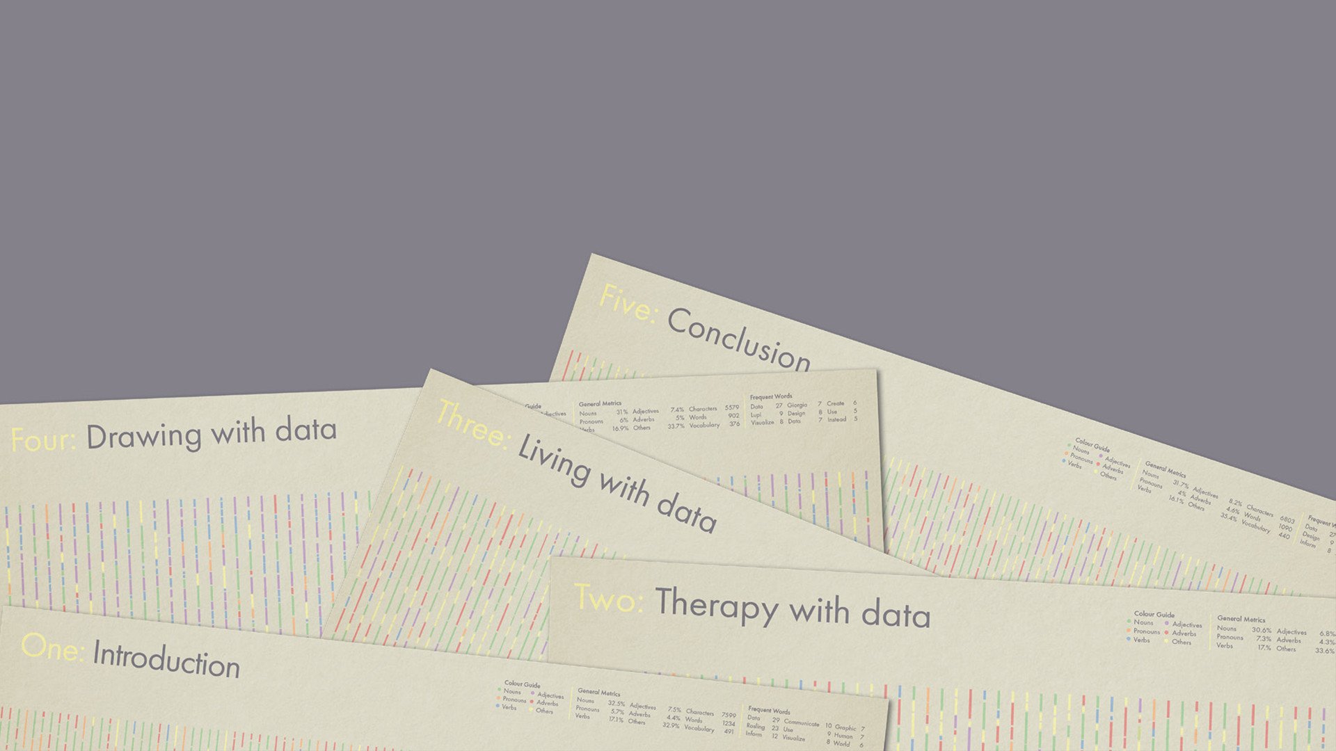
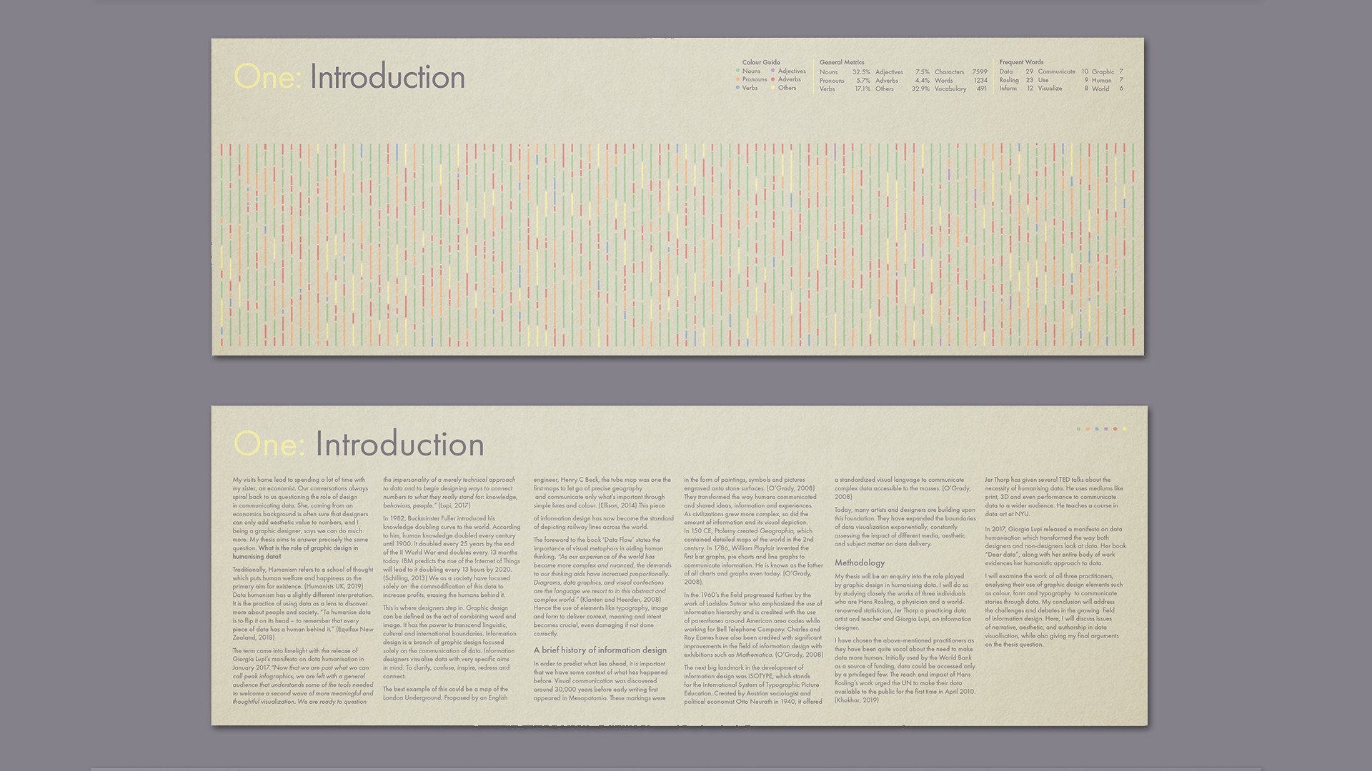
My thesis questions the role of graphic design in humanizing data. I begin by explaining the concepts of data humanism and graphic design, focusing specifically on information design.
I give a brief history of it and explain it’s relevance today.
While some believe design can only add aesthetic value to data, I argue that it can do much more. I analyze the practices of Giorgia Lupi, Hans Rosling, and Jer Thorp as they have been quite vocal about the merits of making data more human and have proven the same through their work. I mention some debates within the design community about the role of the designer in deciding the narrative, goal and aesthetic of any data visualization. I conclude by reiterating the importance of good design in effective data delivery and how the world may benefit from it.
In this age of data explosion, data humanization is a much-needed coping mechanism. I firmly believe that designers will glue the gap between data and the audiences it caters to. They will be indispensable in turning data into information, information into knowledge and knowledge into wisdom.
