2021

Theo Hersey

Biography

Hey, I'm Theo!

A designer & graphic artist who has a love for type design and printing, particularly letterpress. I find that there is a great beauty in the process of design, focusing on the finer details as I produce my work. My practice often draws on influences taken from my own observations of the way society functions, or the natural world.

I also have my prints for sale over at: https://theohersey.bigcartel.com/

Portfolio

DIY Protest Poster Kit

The ‘DIY Protest Poster Kit’ aims to give people accessibility to protesting through the medium of posters and a platform that people can use to speak their minds which isn’t social media. Each ‘DIY Protest Poster Kit’ contains 324 characters, each in varying quantities relative to letterpress type casting, with interleaving sheets between each character. The alphabet is taken from letterpress wood letter and then reproduced in offset-litho, printed on Munken Pure Rough 120gsm in Pantone Black.

‘Speak Up!’ Is an accompanying publication which showcases the messages pasted-up by users of the DIY Protest Poster Kit across Europe. Each message included is captioned with a typed version of the message, alongside the name of the creator and the location in which they pasted-up their message.
A quick look at the contents of the DIY Protest Poster Kit, which were used by individuals towards the Speak Up! publication. The video showcases one of each glyph included in the kit and the interleaving sheets.
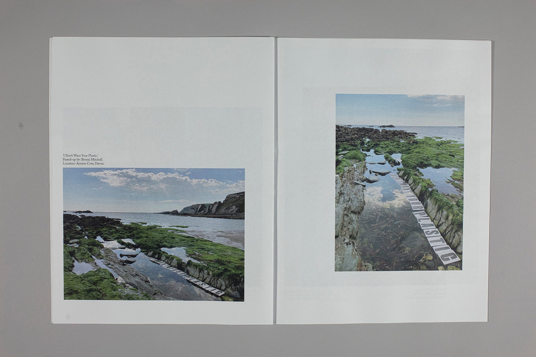
‘I Don’t Want Your Plastic.’
Pasted-up by: Bronia Mitchell.
Location: Ayrmer Cove, Devon.
‘I Don’t Want Your Plastic.’ Pasted-up by: Bronia Mitchell. Location: Ayrmer Cove, Devon.
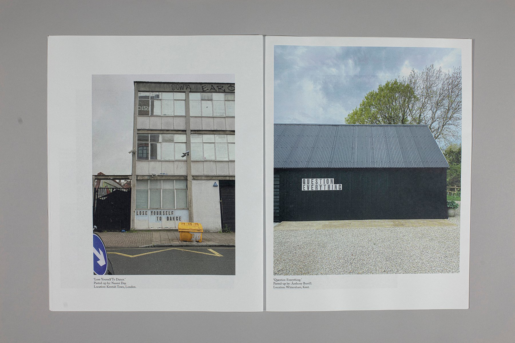
‘Lose Yourself To Dance.’
Pasted-up by: Naomi Day.
Location: Kentish Town, London. 

&

‘Question Everything.’
Pasted-up by: Anthony Burrill.
Location: Wittersham, Kent.
‘Lose Yourself To Dance.’ Pasted-up by: Naomi Day. Location: Kentish Town, London. & ‘Question Everything.’ Pasted-up by: Anthony Burrill. Location: Wittersham, Kent.
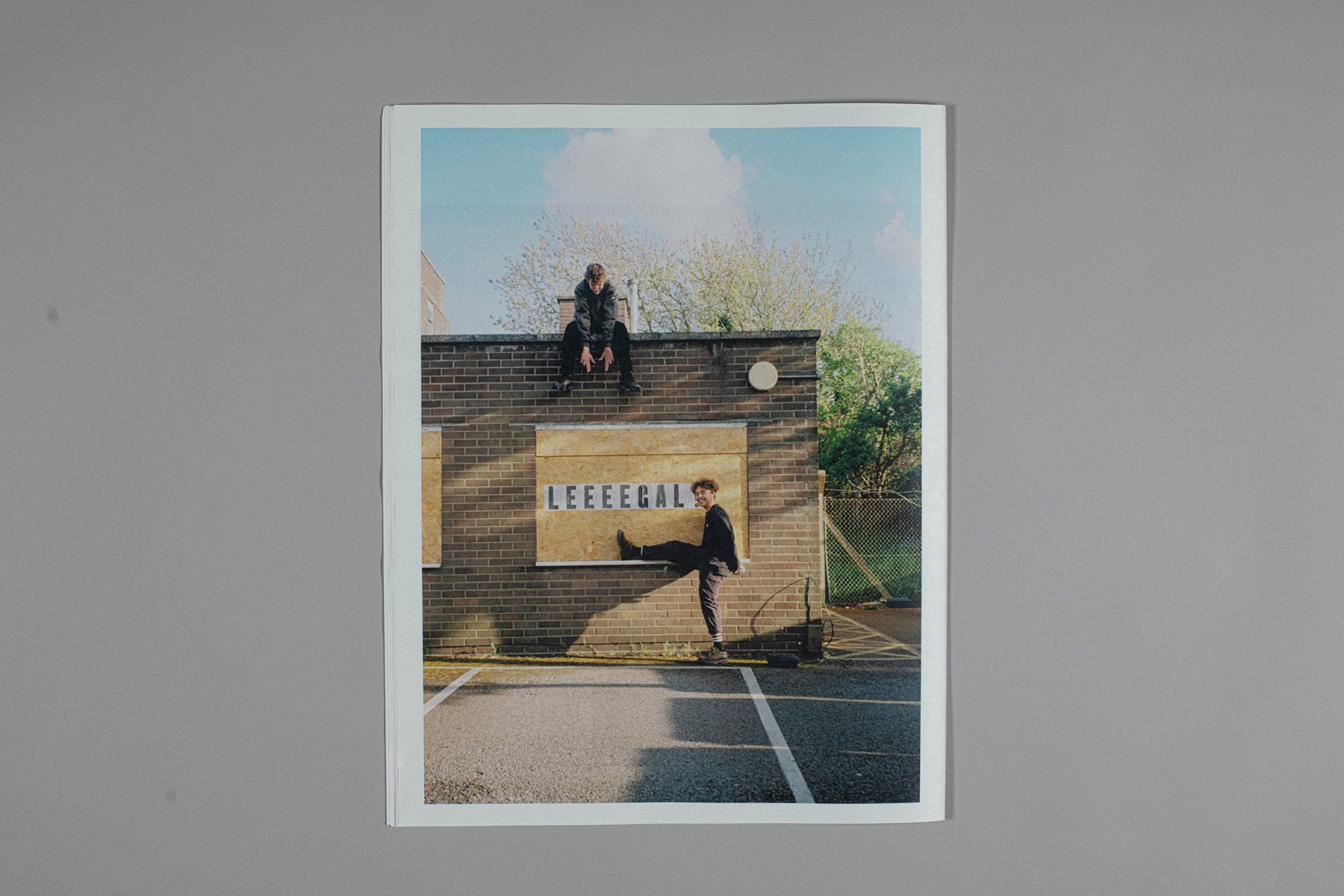
‘LEEEEGAL!’
Pasted-up by: Theo Hersey.
Location: Elm Grove, Brighton.
‘LEEEEGAL!’ Pasted-up by: Theo Hersey. Location: Elm Grove, Brighton.

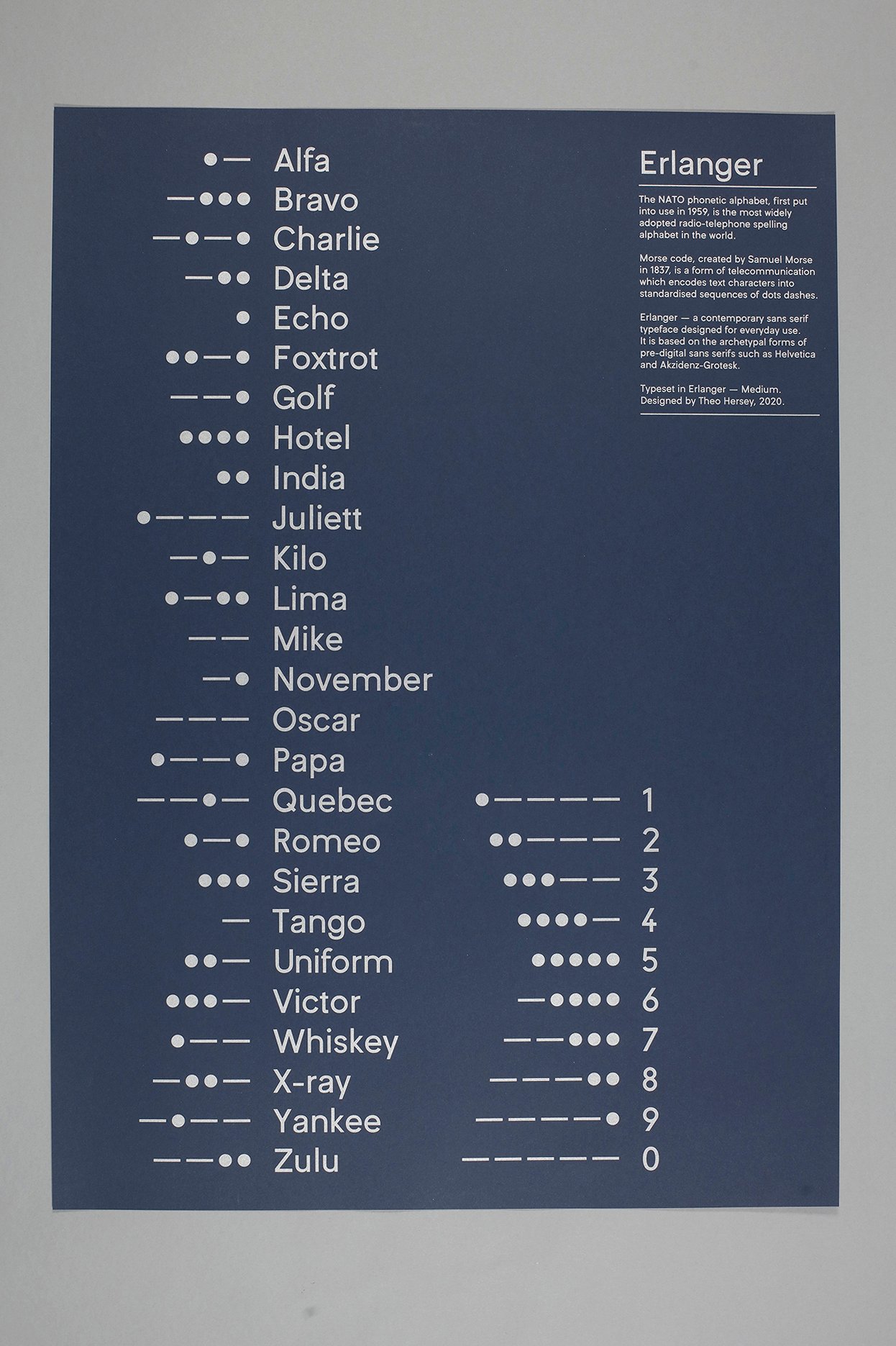
Erlanger

A contemporary sans serif typeface designed for everyday use, based upon the archetypal forms of pre-digital sans serifs such as Helvetica & Akzidenz-Grotesk. Also my first attempt at type design.
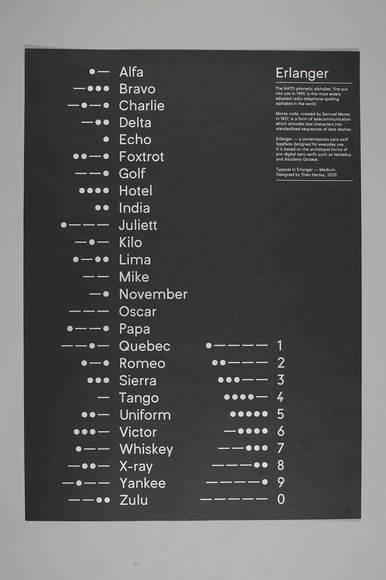
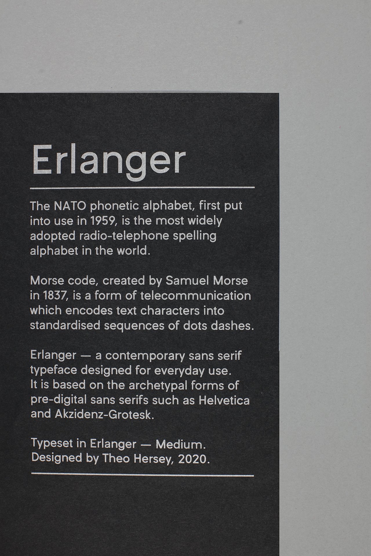
Specimen poster consisting of the NATO phonetic alphabet and corresponding morse code, printed in Pantone silver using offset-lithography. Printed on GF Smith Colorplan Ebony 135gsm.
Information on the three components of the Erlanger specimen poster: the NATO phonetic alphabet, Morse code & Erlanger.
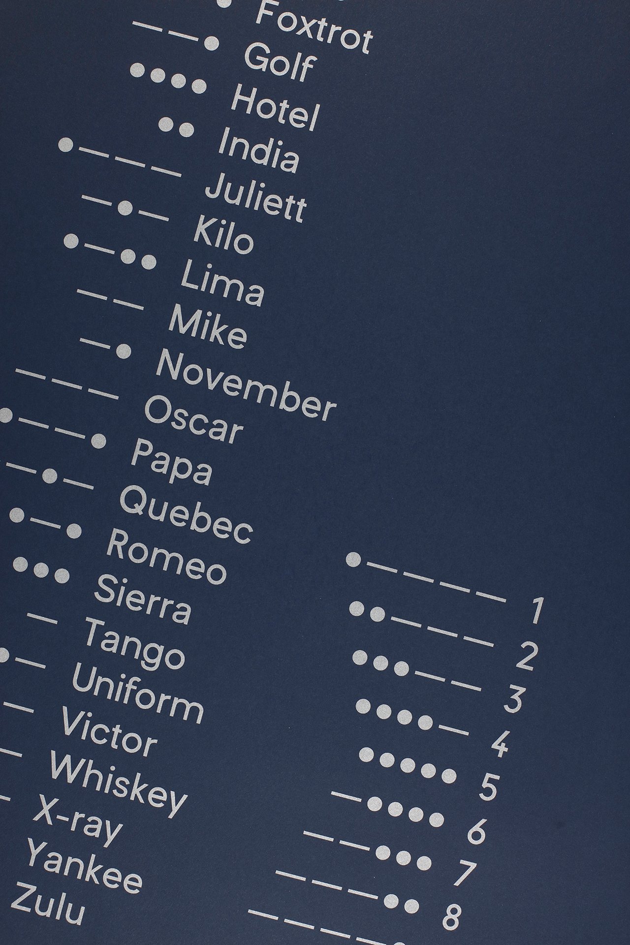
Specimen poster consisting of the NATO phonetic alphabet and corresponding morse code, printed in Pantone silver using offset-lithography. Printed on GF Smith Colorplan Imperial Blue 135gsm.
Finer details on the Imperial Blue 135gsm.

Arbor

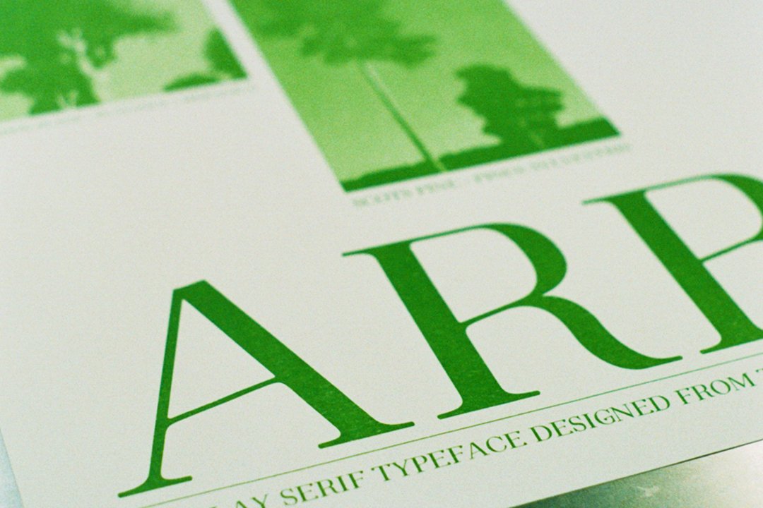
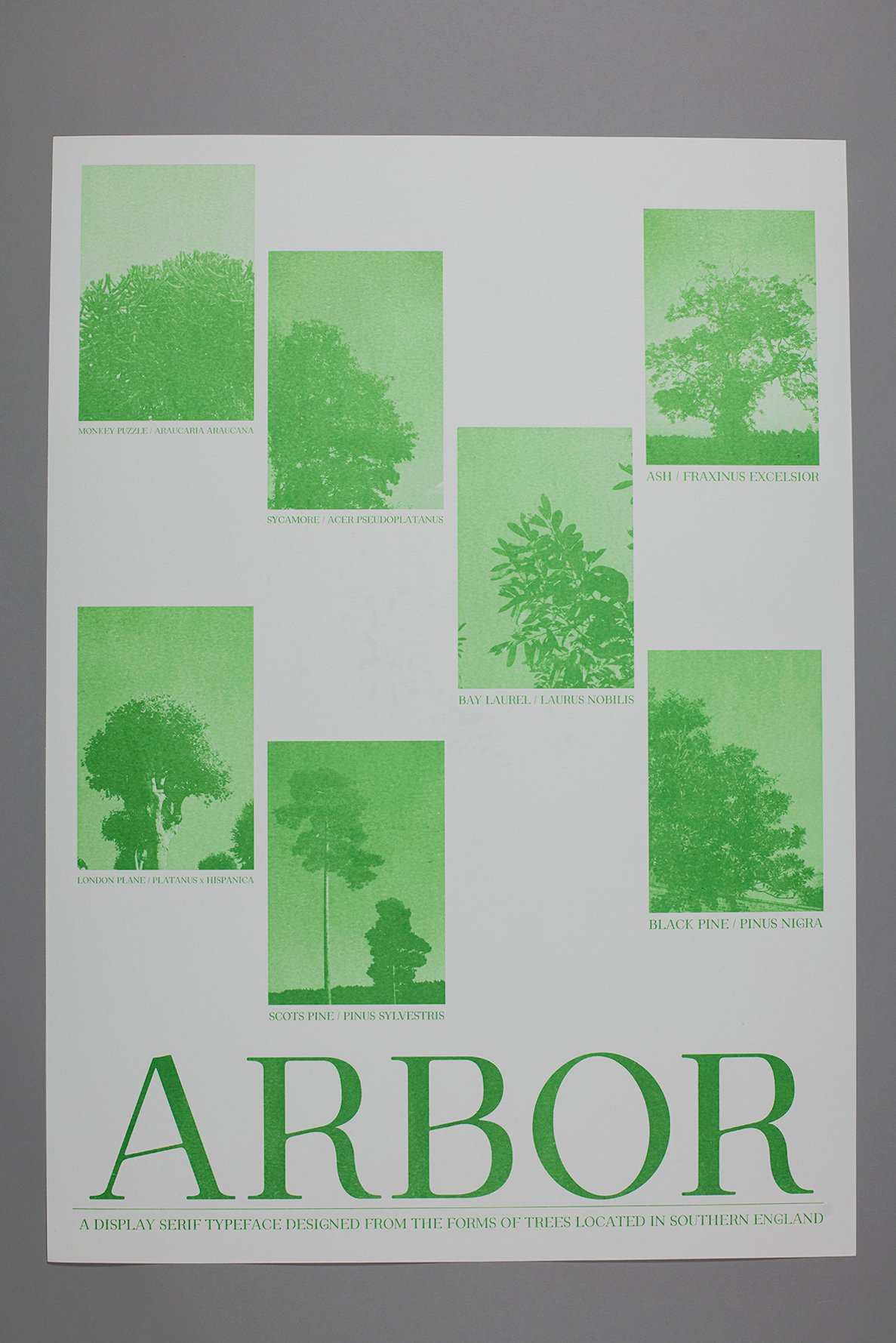
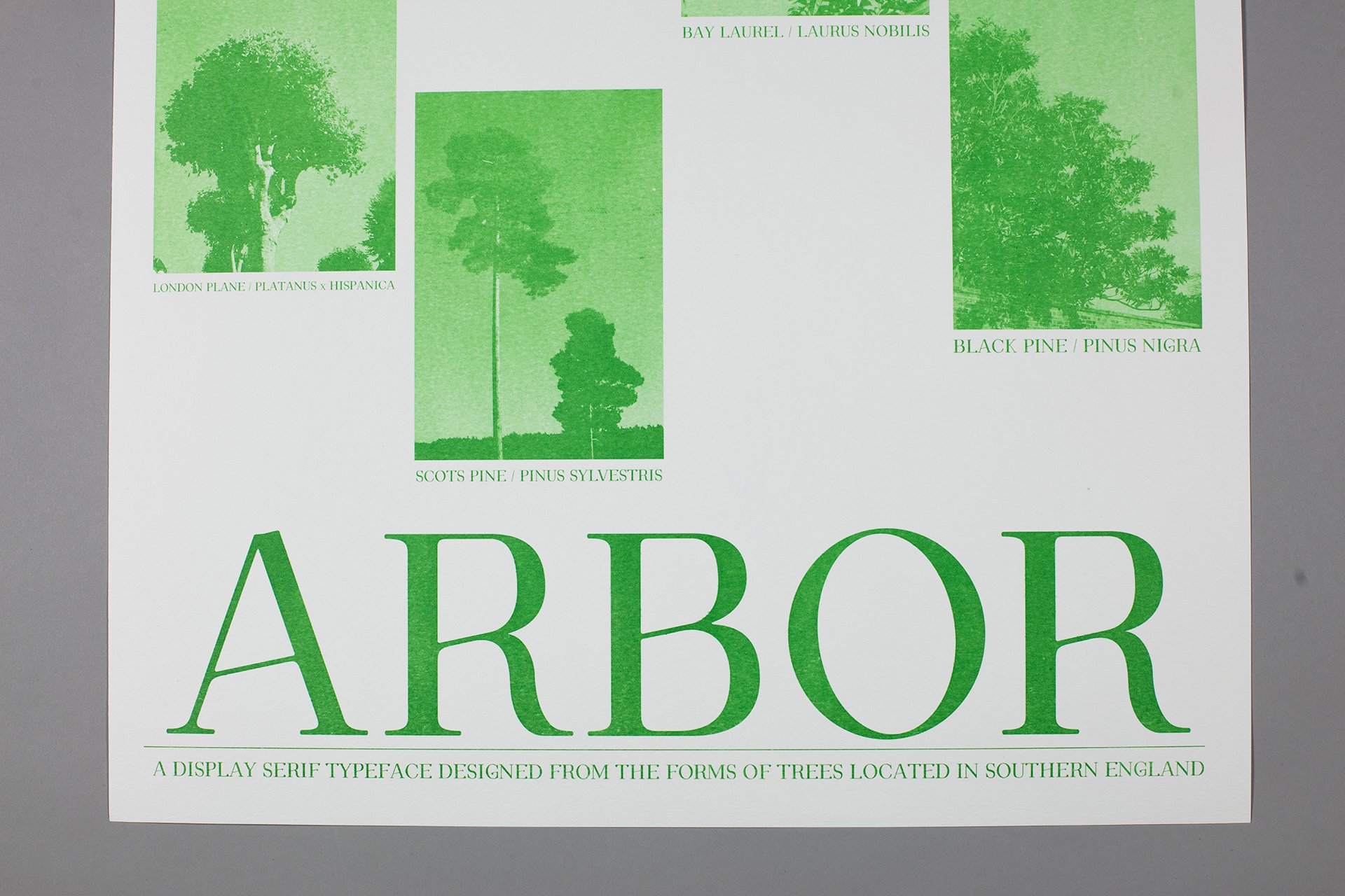
Arbor is a display serif typeface, which takes its structural influence from the forms of trees located in Southern England. Extracting nuances from the organic form of trees has led to Arbor having a slight natural feel to it, whilst remaining in the constraints of functional type design — It features diagonal crossbars, prominent serifs and a high stroke contrast including wide stems, similar to that of tree trunks.
Arbor
Arbor
Macro shot of the specimen poster on the press. Printed on a F.A.G. OP 104 – Beta (Flatbed proofing press) in a mixture of Pantone Silver 877 & Pantone Fluorescent Green 802.