Vitalina Virupajeva
Email address
moc.liamg@avejapuriv.anilativWeb Portfolio
vitalinavi.myportfolio.com/workBiography
I am a creative problem-solver passionate about branding, editorial work, and type design. My practice involves weaving engaging narratives and functional designs across print and digital media. Thanks to the varied nature of each project, I have developed a diverse skill set that spans from printmaking to 3D modelling and motion graphics.
When it comes to graphic design, I view it as an intricate web of interconnected systems. In my projects, I thrive on constructing novel systems and reimagining existing ones.
Portfolio
Levels of Disruption
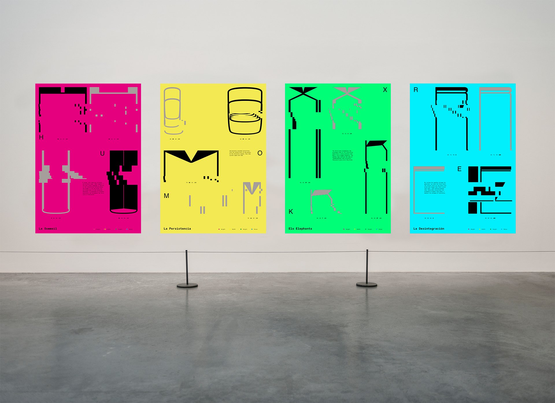
This self-initiated project explores the themes of neutrality and disruption through type design. Drawing inspiration from surrealism, particularly Salvador Dali, I applied a similar distorted effect to letterforms.
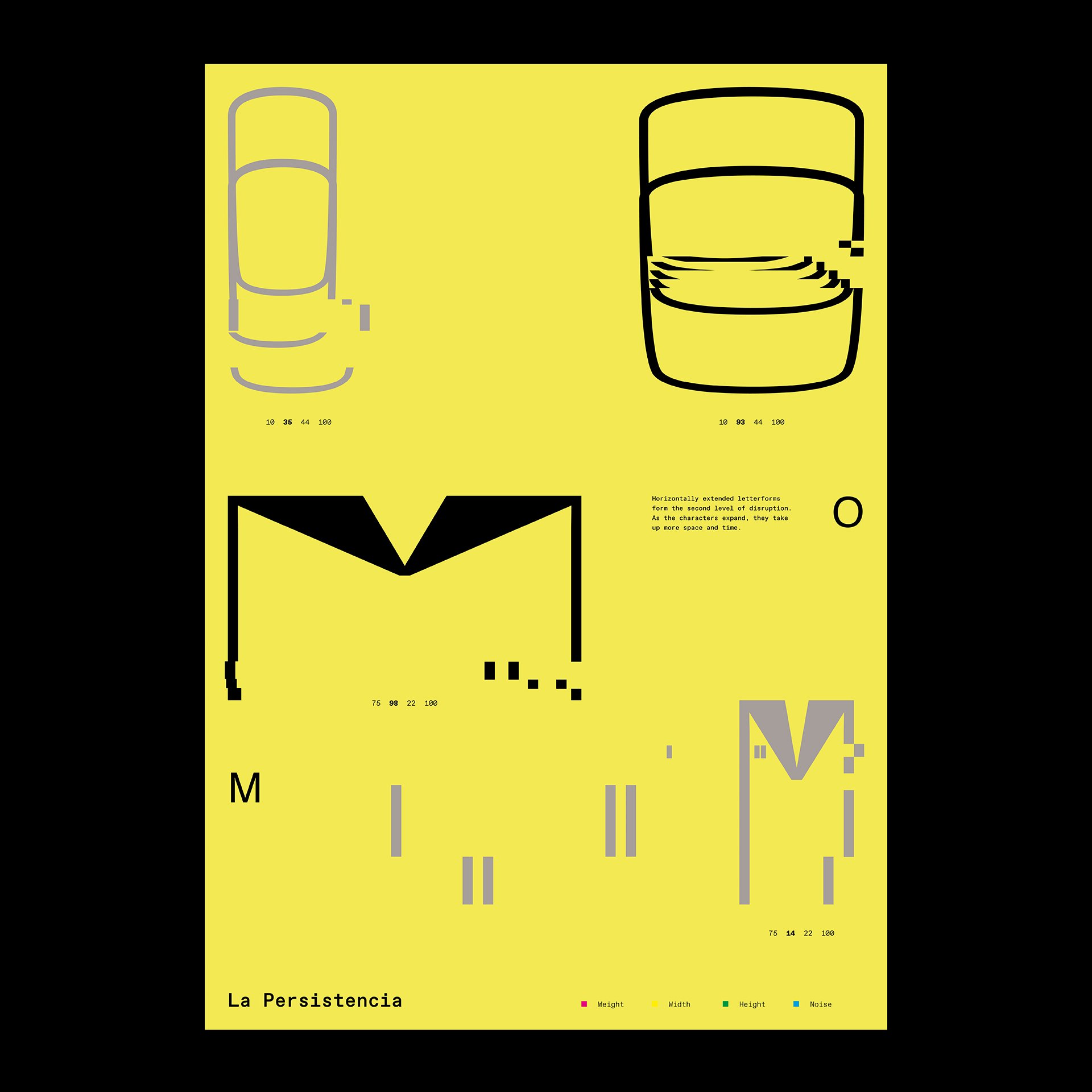
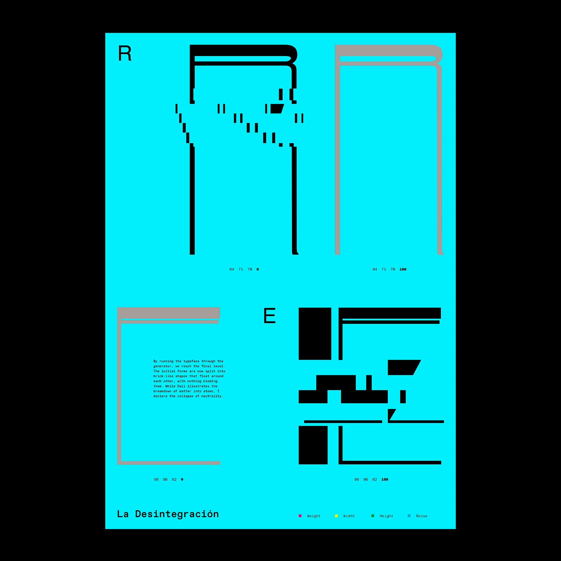
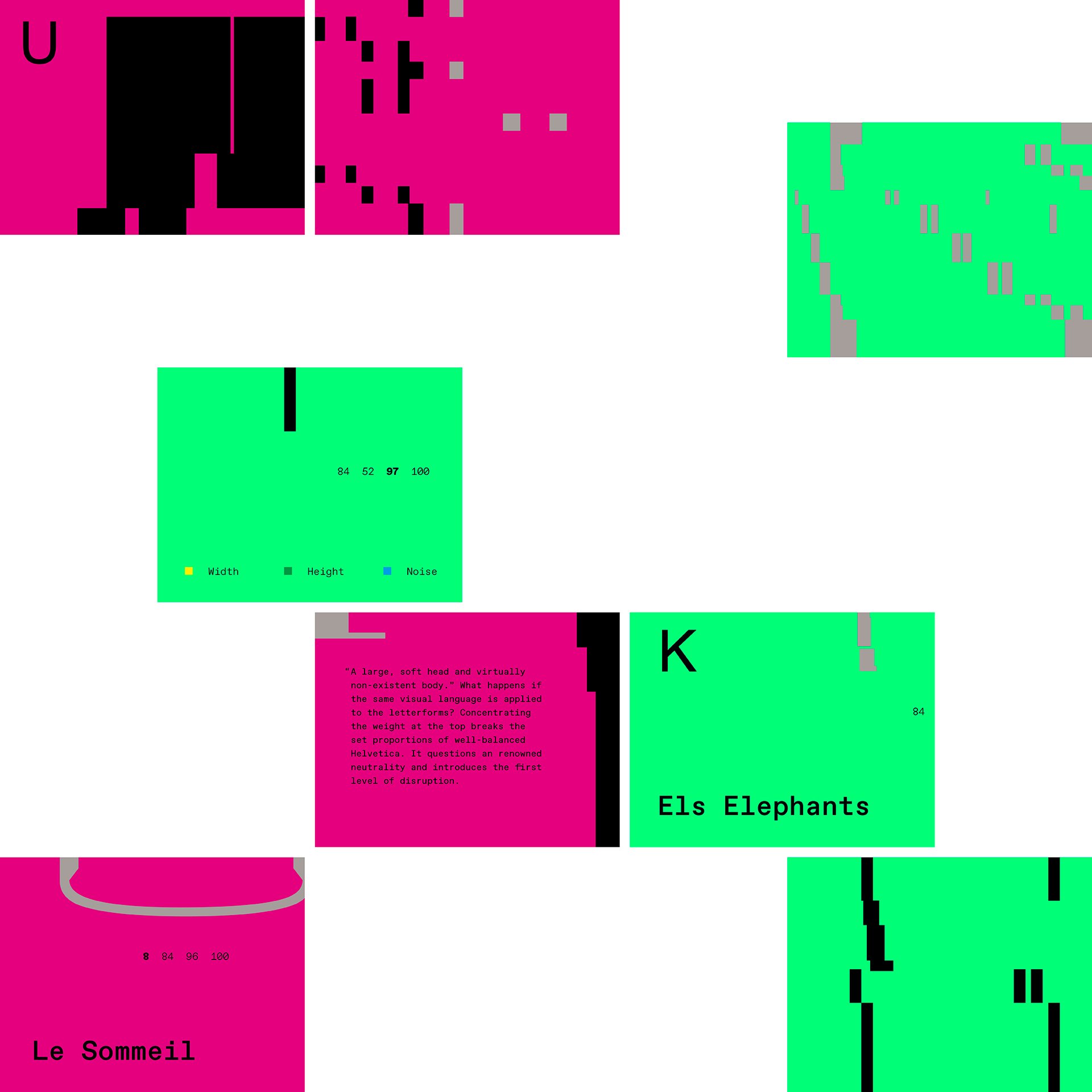
At the core lies Helvetica – the epitome of neutrality and a historic icon in the world of graphic design. I force the original typeface through four levels of disruption by modifying its weight, width, height, and structural integrity. By altering Helvetica, I aim to challenge its inherent detachment and question the industry’s design choices.
The first output of this experiment is a functional variable font that showcases the transition between the neutral and ‘chaotic’ states. The second outcome is a visual essay comprising four posters, each depicting one level of disruption (weight, width, height, and noise).
The viewer notices the visual parallel between the top-heavy letterforms on ‘thin long legs’ and Dali‘s stork-legged elephants; the broken-down pieces of letters and The Disintegration of the Persistence of Memory.
Desire to Waste
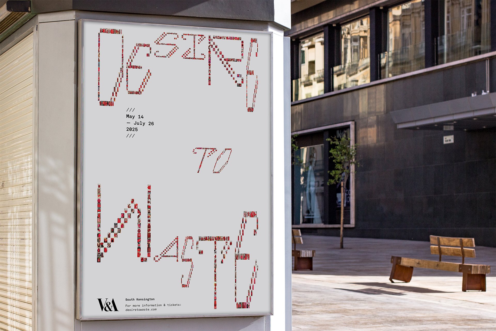
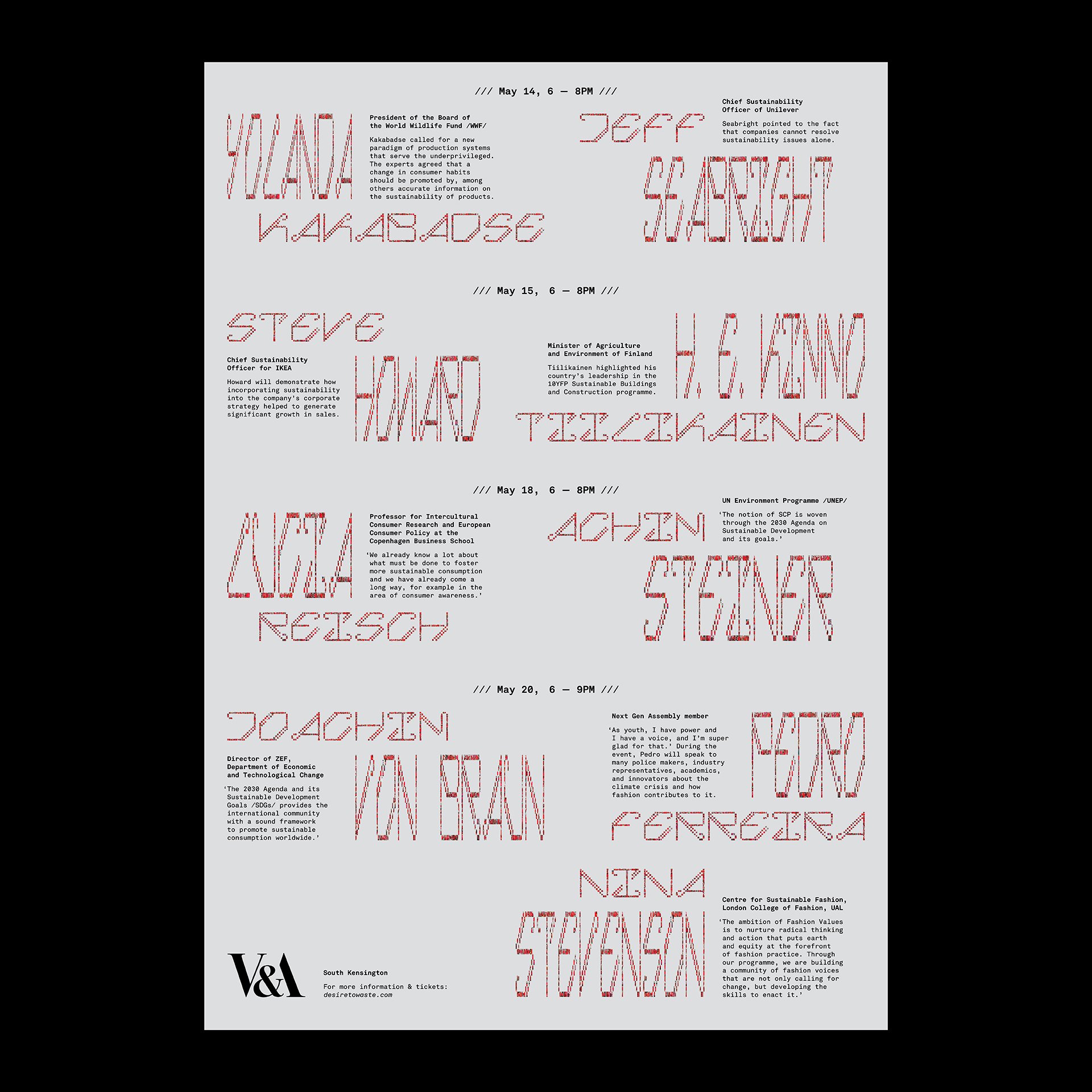
Desire to Waste is a fictional exhibition at the V&A that highlights the connection between human consumption and the global waste problem.
Brands strategically position themselves through captivating narratives established on the human desire for love and social status, thereby driving overconsumption. Presented with a chance to reinvent ourselves with various items, we are now trapped in the vicious cycle of consumer culture, resulting in tons of waste.
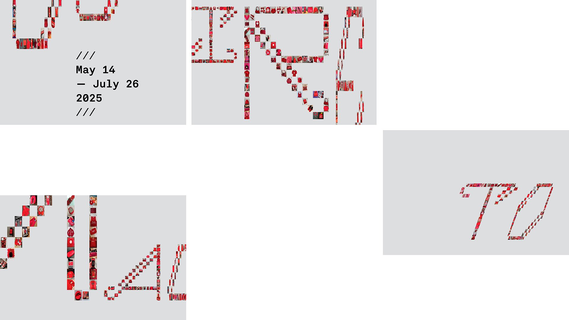
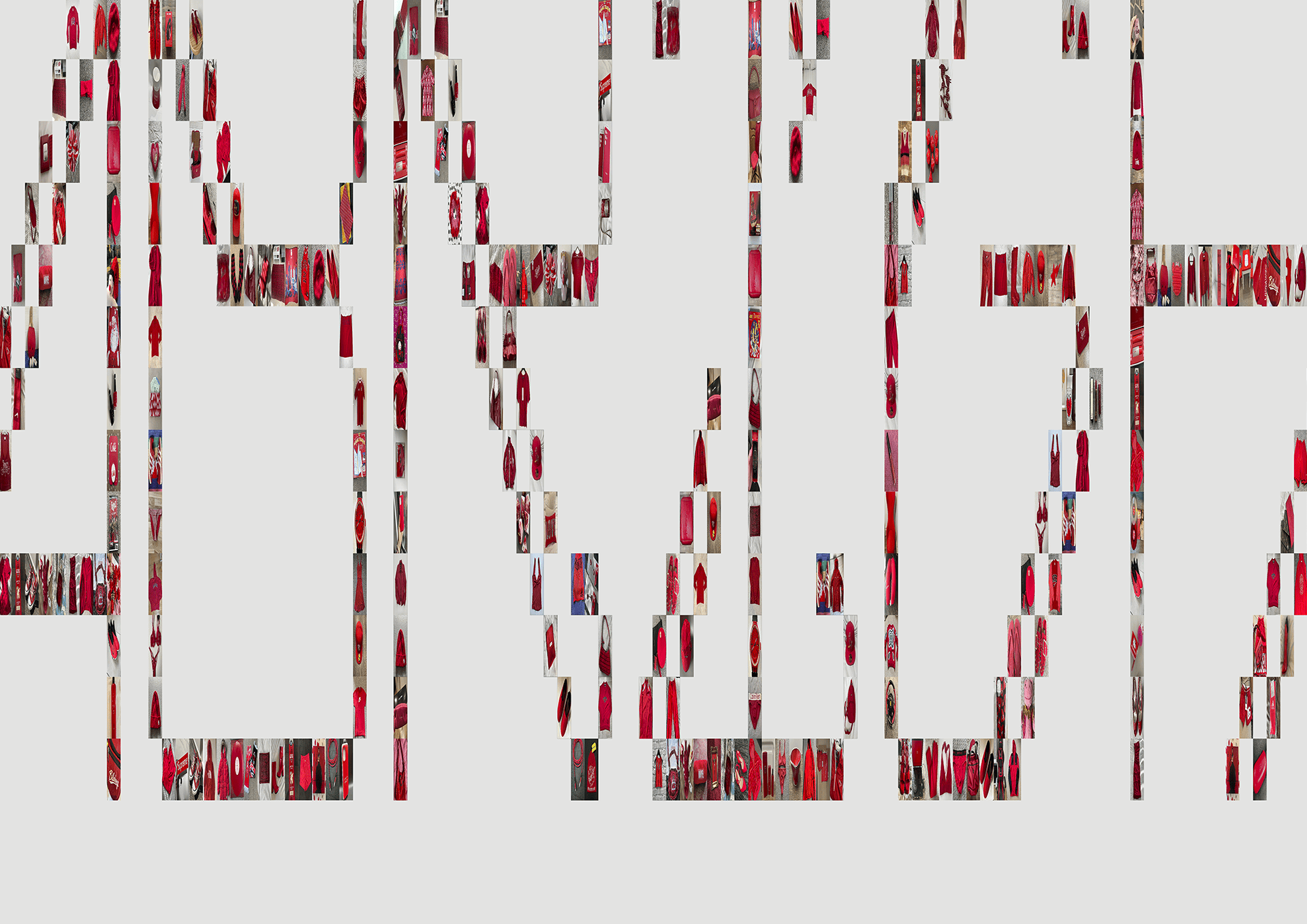
The core of the visual identity is a modular typeface with script-like elements. Each cell contains an ‘item of desire’, further illustrating the redundancy of everyday goods. To construct the letterforms, I used the images from Depop, an online platform that allows you to buy and sell second-hand items. However, I regard it as a global depiction of human waste.
A Generative Exploration of Language and Form
This project examines the Latin alphabet from the point of view of semiotics (the theory of signs and sign systems).
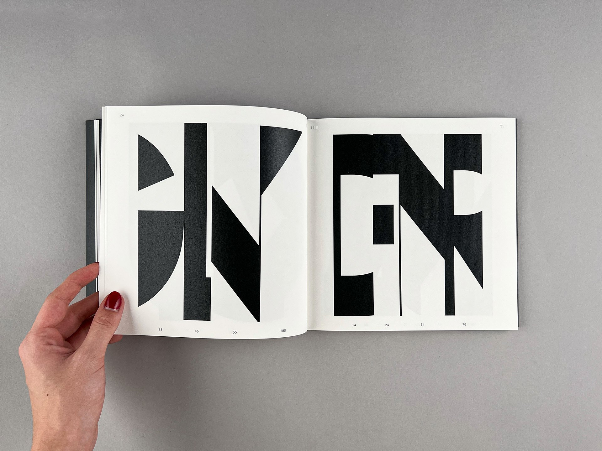
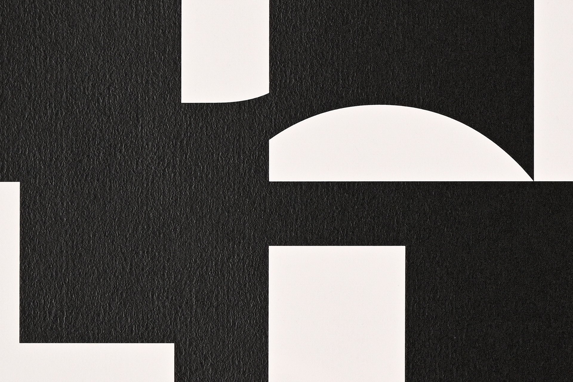
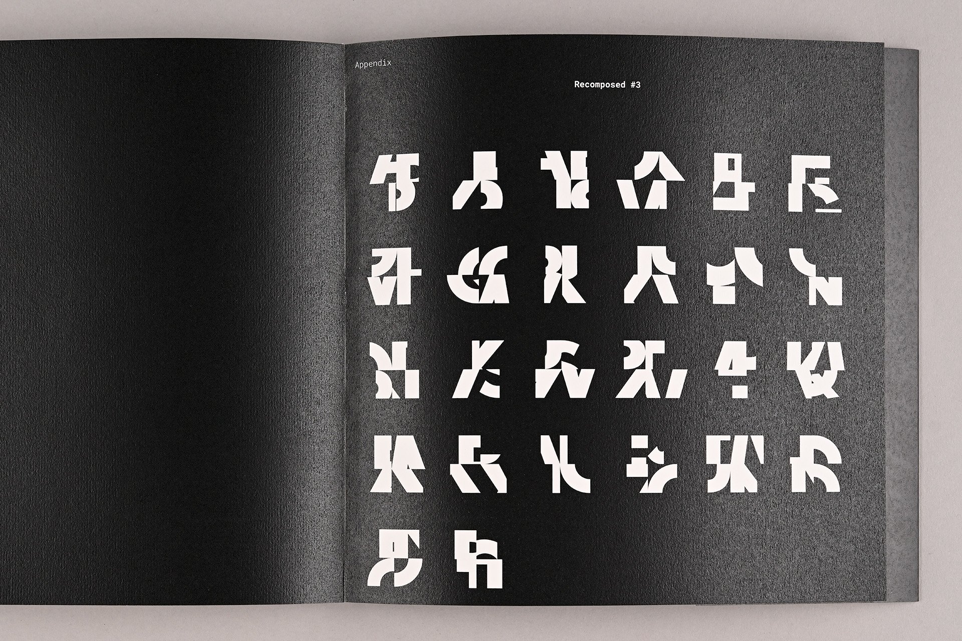
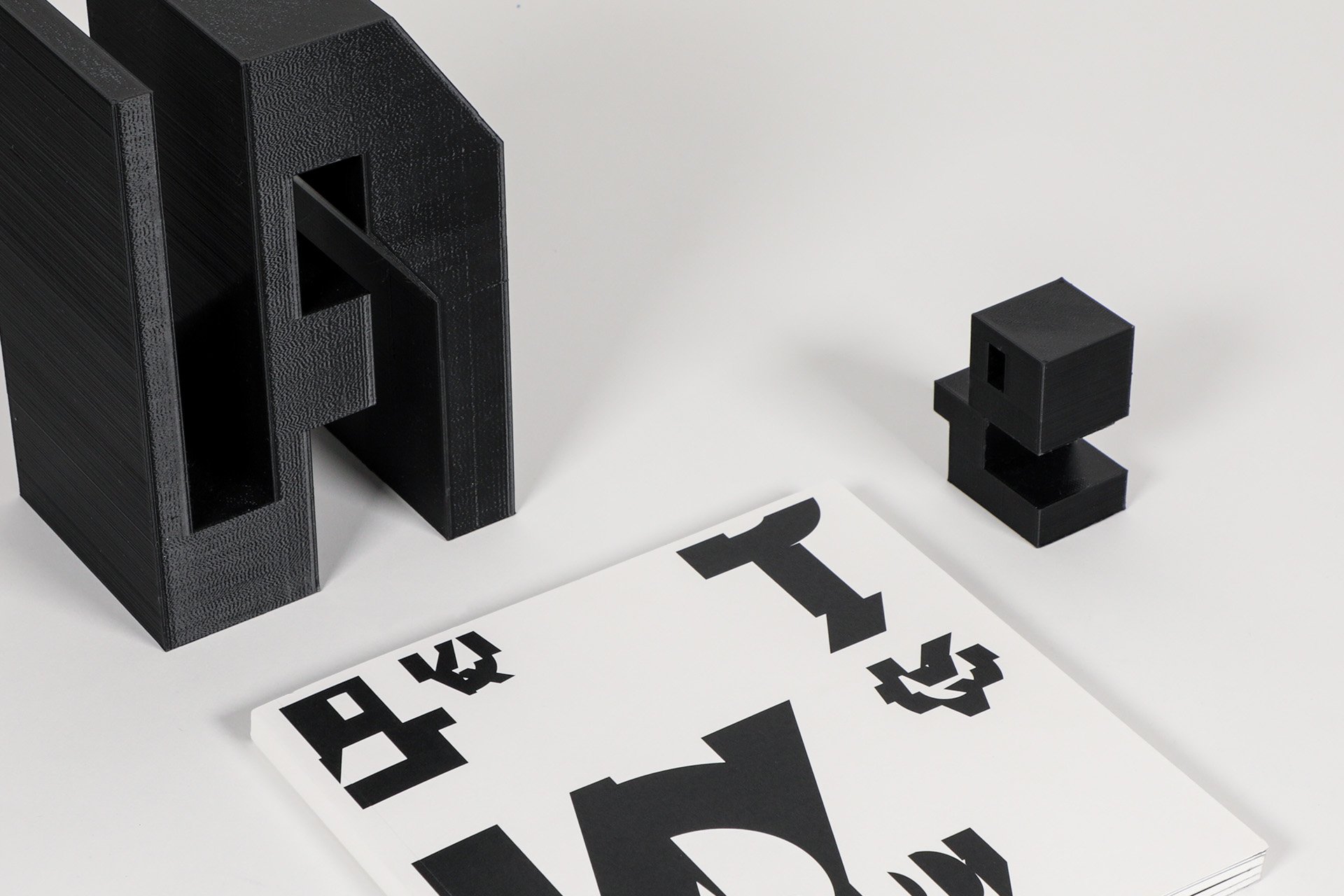
I developed a system that dissects each letter three times in three separate ways – vertically, horizontally, and criss-cross. Then, I assigned each piece a numerical identity and rearranged them randomly into groups of four. This recombination produces forms, some reminiscent of the letters we know, while others morph into entirely novel shapes.
The book encapsulates the diverse outcomes of this experiment, presenting a systematic collection of generative artwork. Each page is an invitation to question, explore, and ultimately redefine the boundaries of language and writing systems.
