Xuezi Hu
Email address
moc.liamg@iiiiizeuxBiography
HELLO EVERYONE!
I am Xuezi Hu, a graphic designer from China.
I am passionate about illustration, typography, book art, moving image, posters and hand works. I love to create and use a combination of traditional and innovative techniques to realise my imagination.
Portfolio
PARADOX POP-UP BOOK
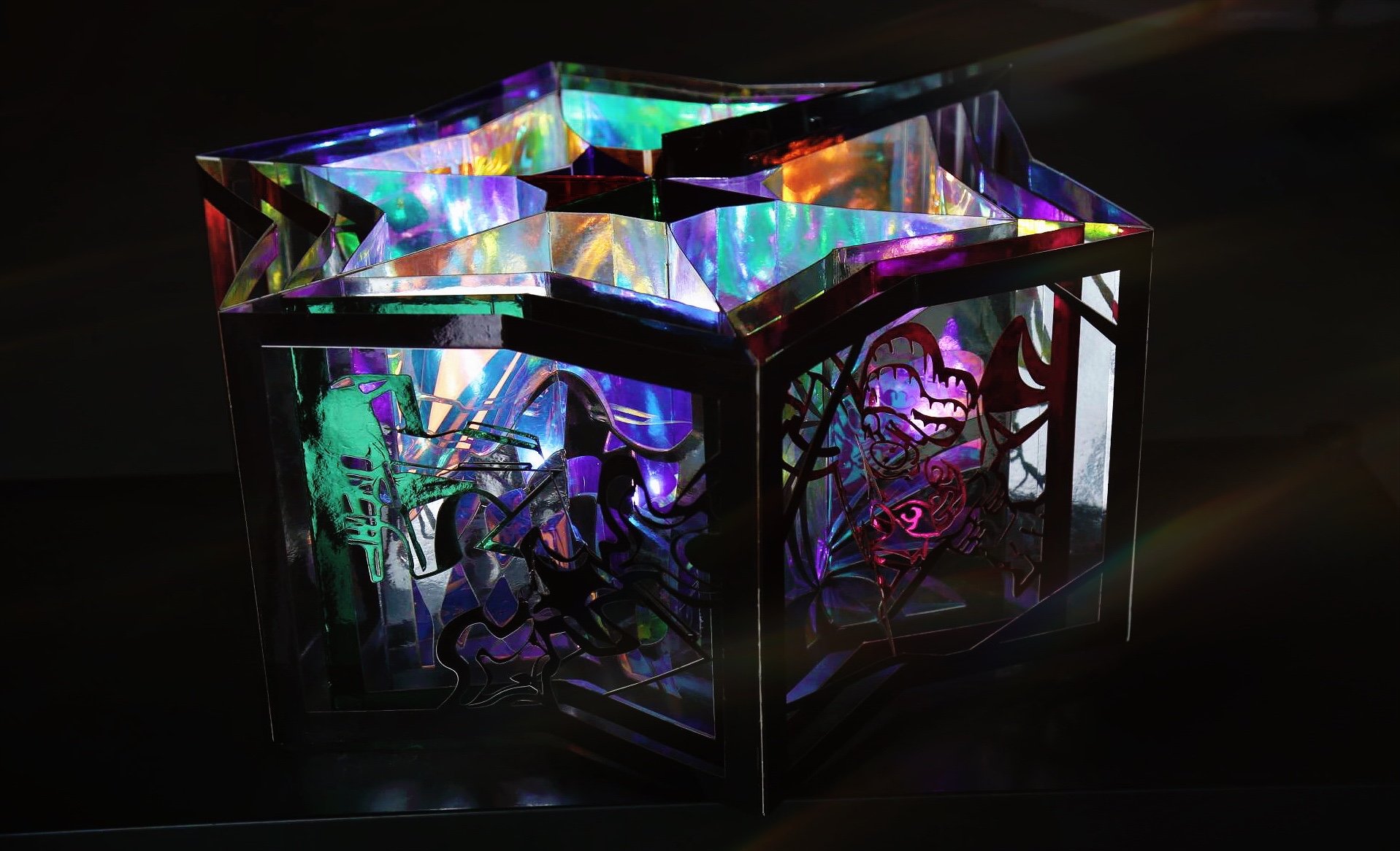
Paradox is an objective virtual world from the perspective of "impossibility". My project aims to implement paradox by hand, in addition to digital design, through a pop-up book design with the theme of inversion.
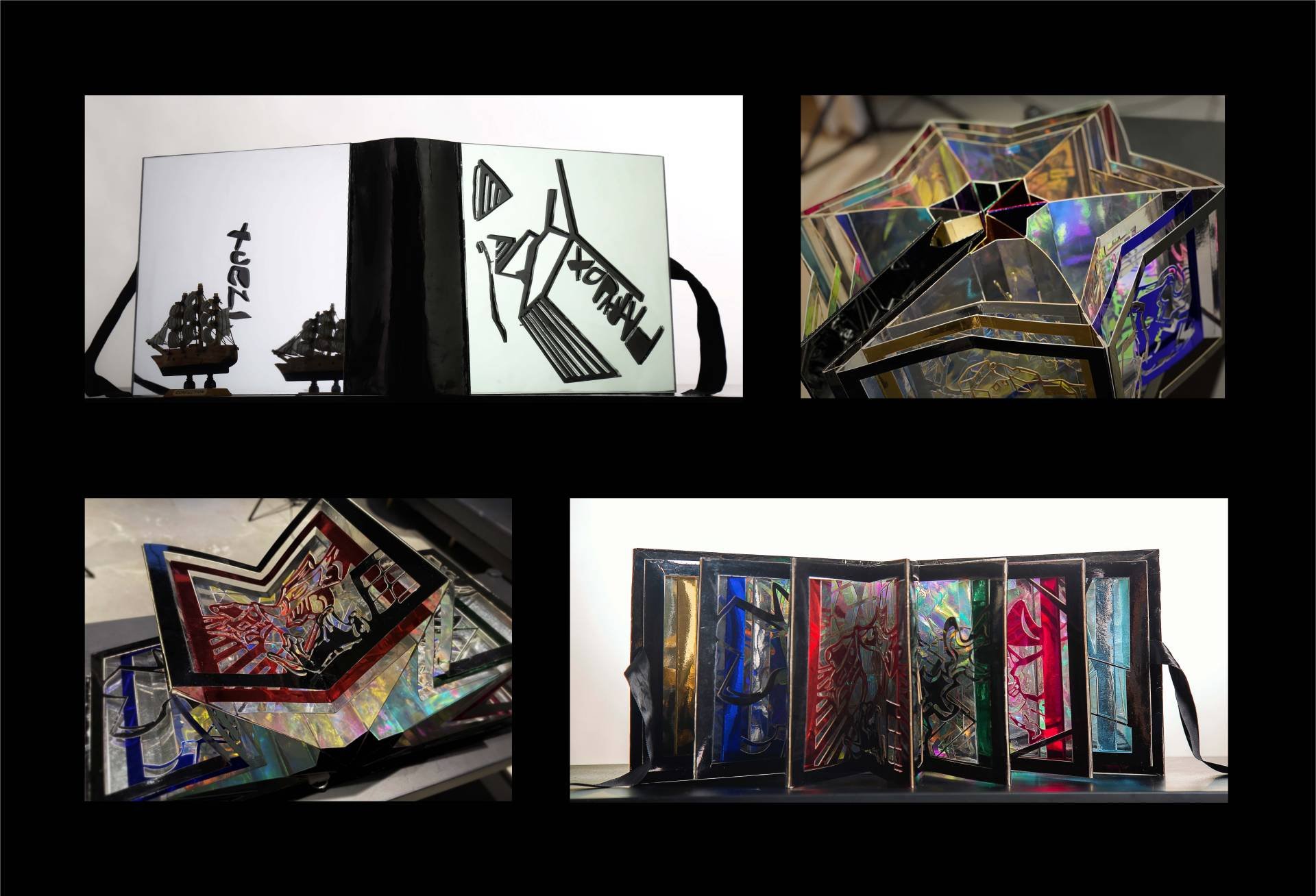
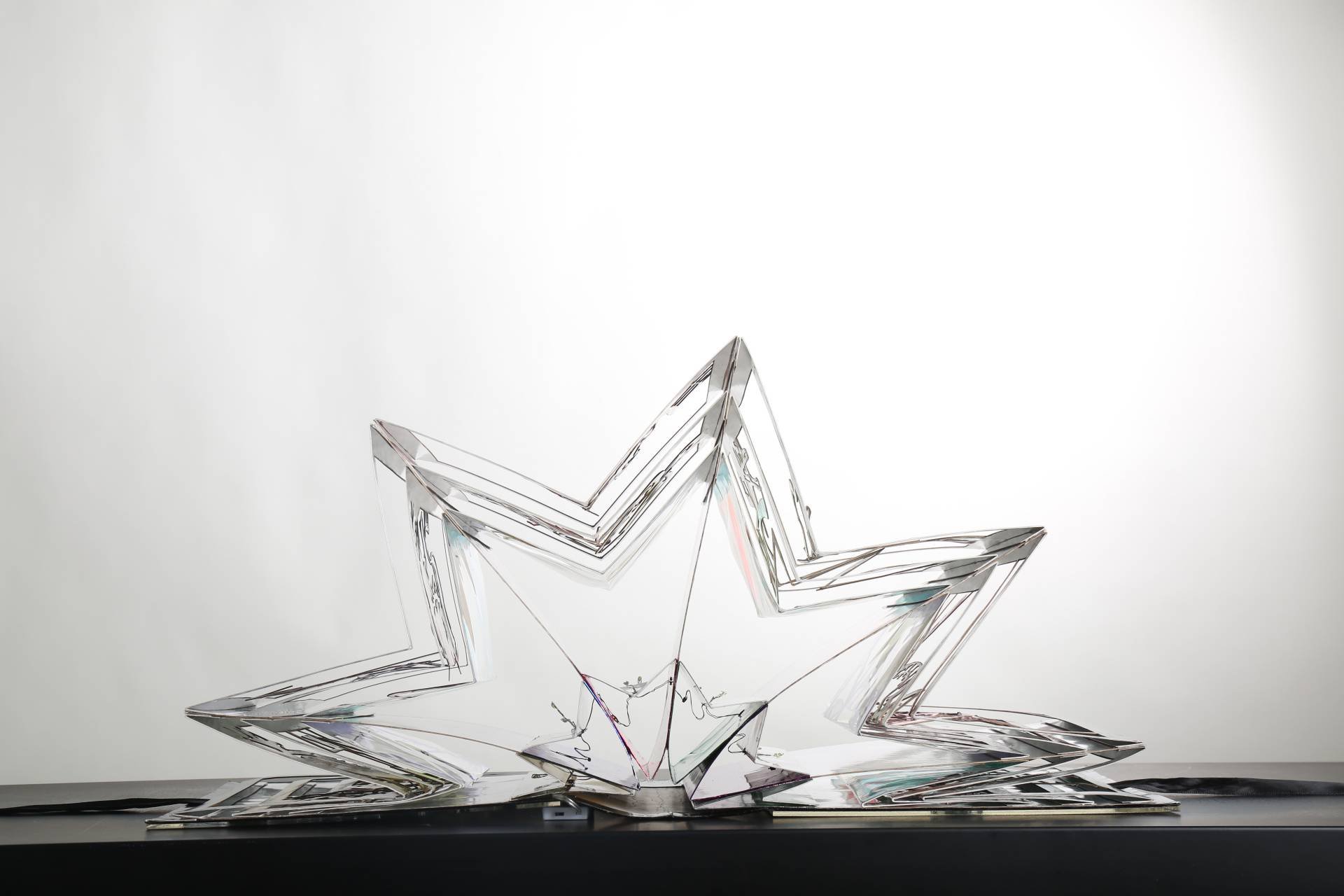
The book is an imaginative dream. I was influenced by traditional palace paper lanterns. I refer to the 360° standard format of the Carousel book. When the pop-up book is opened, it is in the shape of a hexagonal palace lantern. I used reflective paper to represent the upside-down world of different themes for each page. This uses the combination of light and shadow as well as mirror reflection to convey the Paradox concept.
The whole picture is a game and an illusion. This is a colourful story of my dream. I crossed into the four-dimensional space, sky garden, the Garden of Eden, I can see angels and demons, a bridge,a group of pigeons, I landed on a chessboard with an inverted horse and Pisces. Suddenly, I woke up.
The inside of the book uses led lights, my pictures are laser cut into three layers , and finally translucent paper is used as the curtain.
Bring the book to life, like a happy trip in the book.
KEEP AN EYE OUT FOR EACH OTHER
The purpose of the re:act project is to let ALL road users realise the importance of sharing responsibilities, caring for each other with empathy, and change bad habits. The Development strategy: cognition and interactivity, and my slogan: keep an eye out for each other!
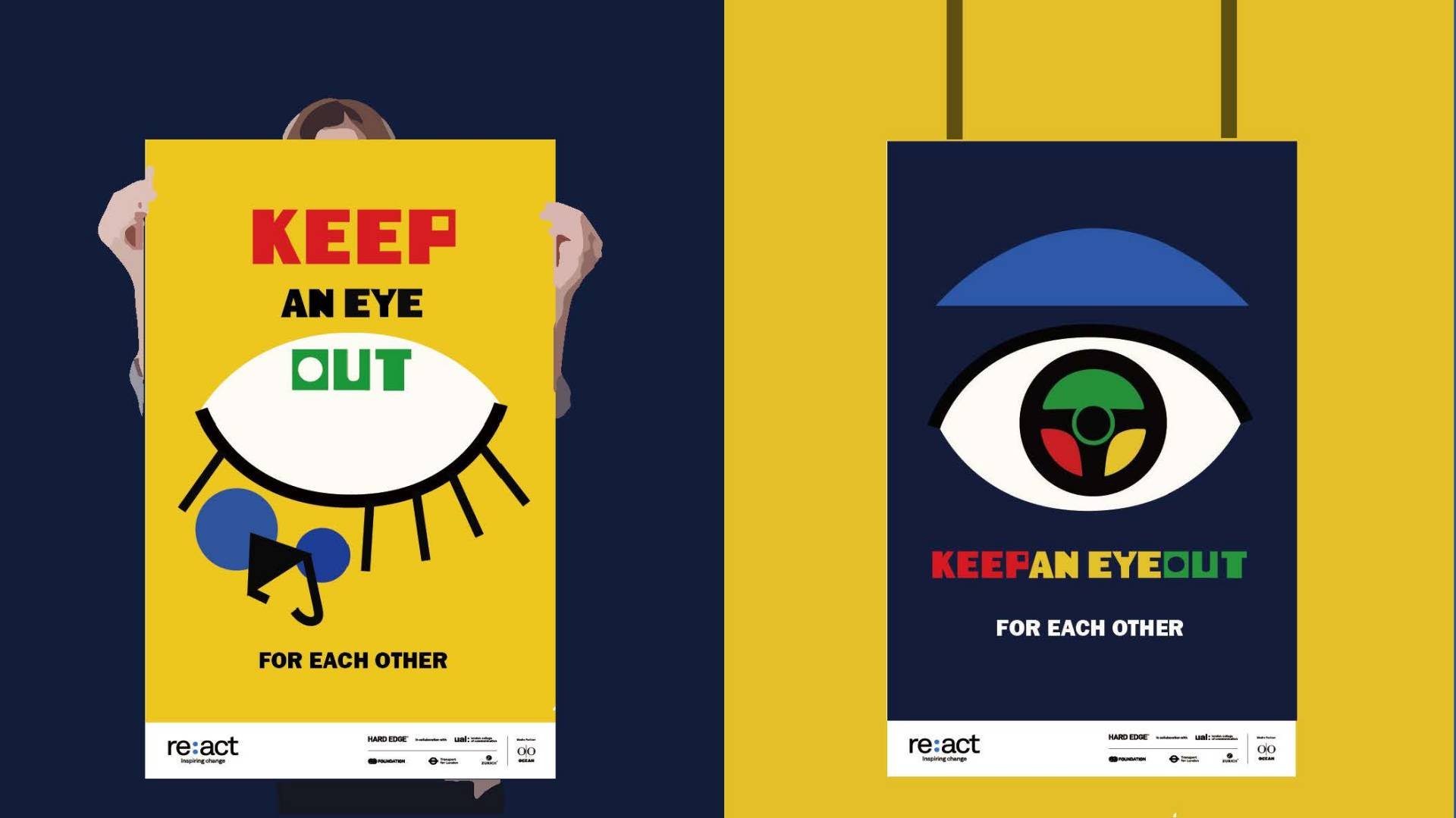
My design concept is about vision and focus. My inspiration is Picasso’s "Peace", which described the eyes as an important way of expressing peace and love.
The graphics are mainly concise and clear, and the colours, lines and patterns are combined into Abstract forms. By using three primary colours, I learned the language of colours.
These are my posters. The overall one is a human eye. The upper part of the right poster shows the blue eyebrow (car window), which means the driver’s larger driving vision environment; the middle pupil symbolises the concentration of attention, and the circle represents the steering wheel with three colour module traffic lights. The combination indicates that the driver must focus, and abide by the traffic rules. The left poster is a closed eye. At the bottom is an inverted bicycle, indicating the serious consequences of ignoring the rules.
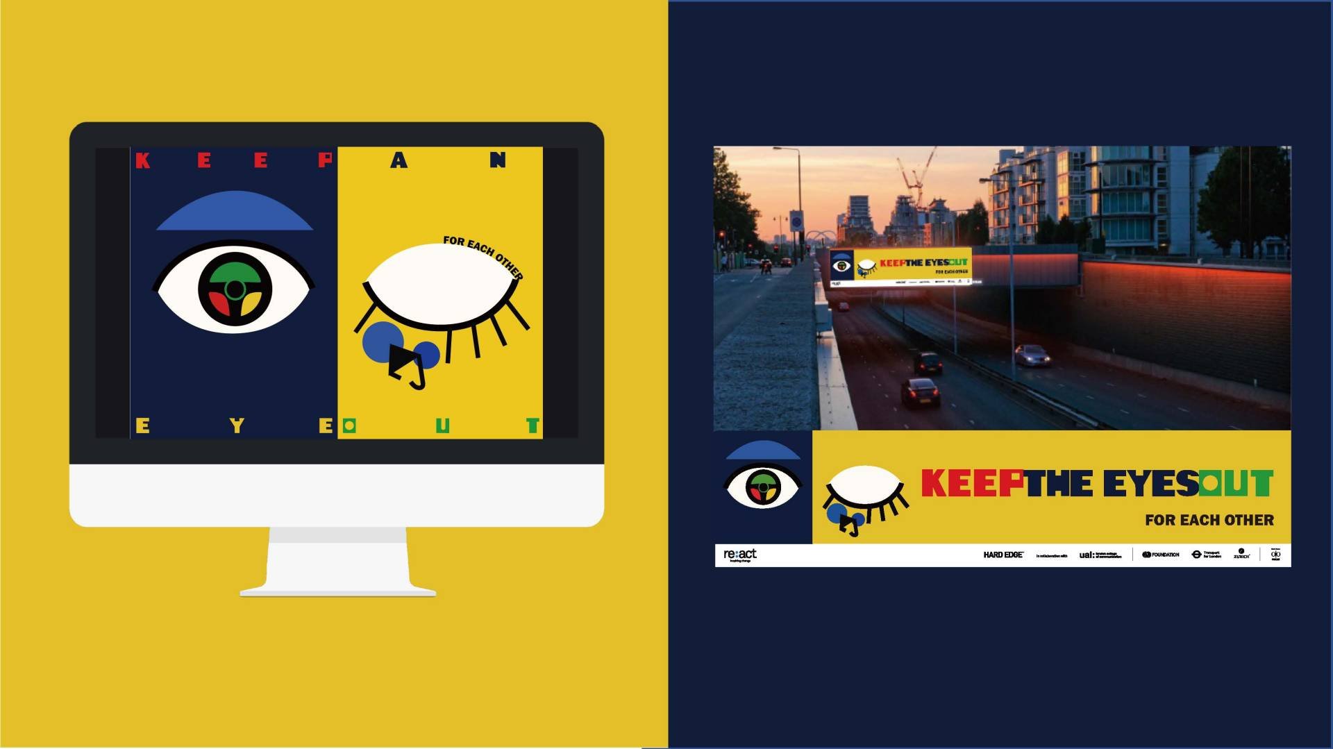
The two posters combine to present a complete eye: Motor vehicles and bicycles (VRUs) are both important parts of residents' travel modes.
In addition, these are my animations. You can see the steering wheel turning in the eyes, and the bicycle accident caused by inattention. An example of the landscape digital billboard first shows a pair of eyes in animation. When people want to explore the meaning, the poster’s slogan is launched.
