Yashica Jain
Email address
moc.liamg@20acihsayniajWeb Portfolio
yashicadesigns.comBiography
Hello there! I’m Yashica, an Indian/Belgian designer currently based in London. I thrive in spaces where norms are ripe for challenge and transformation, finding solace in the freedom to explore uncharted territories. Here, the intersection of my personal insights and the diverse voices around me holds immense value, creating a dynamic environment for intellectual exchange and creative expression. I’m deeply committed to pushing boundaries and reshaping perceptions through my work, constantly seeking new ways to merge unconventional mediums and graphic elements. From crafting mixed media pieces utilising techniques like printing, painting, resin, linocut, woodworking, and more, I’m driven by a passion to create meaningful and distinctive pieces that leave a lasting impact. Always open to collaboration and eager to learn from others’ perspectives.
Portfolio
Hairoot
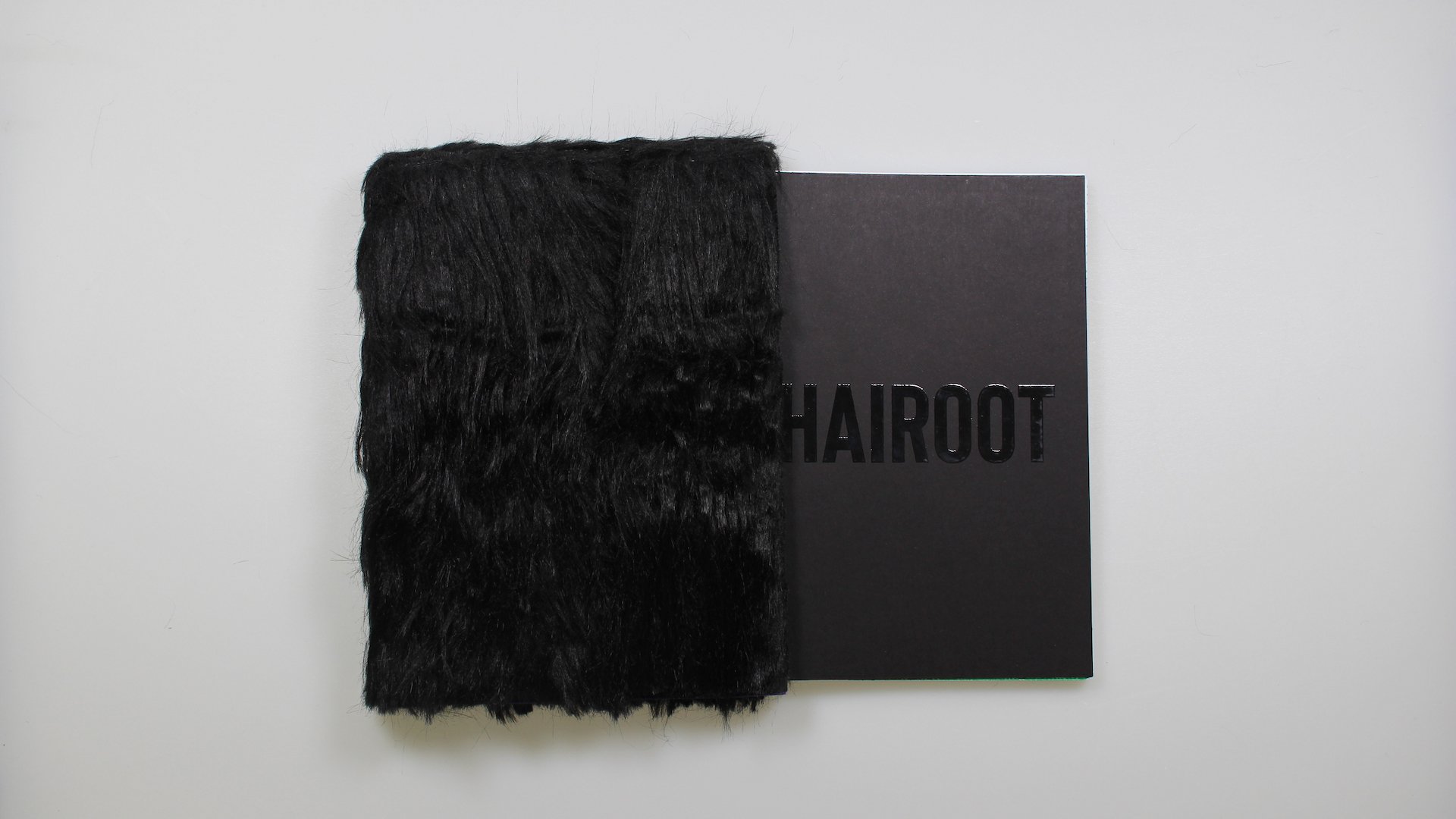
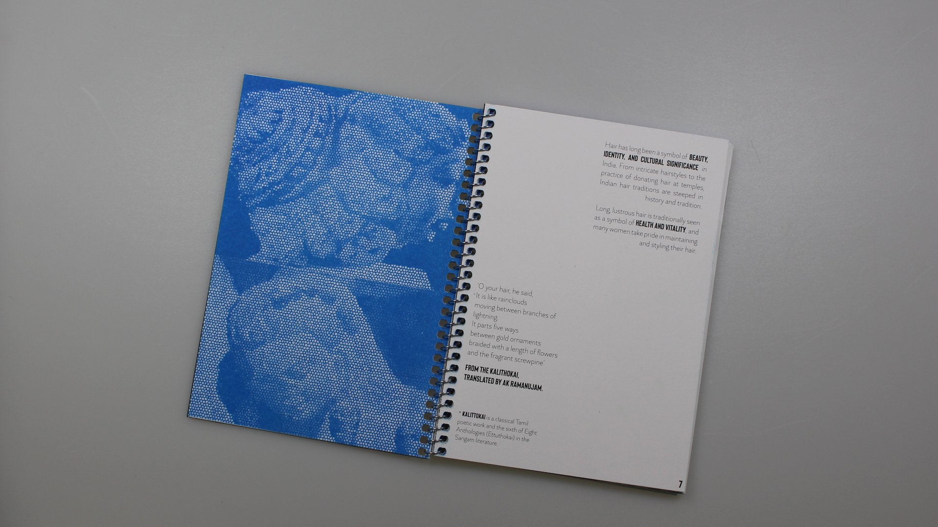
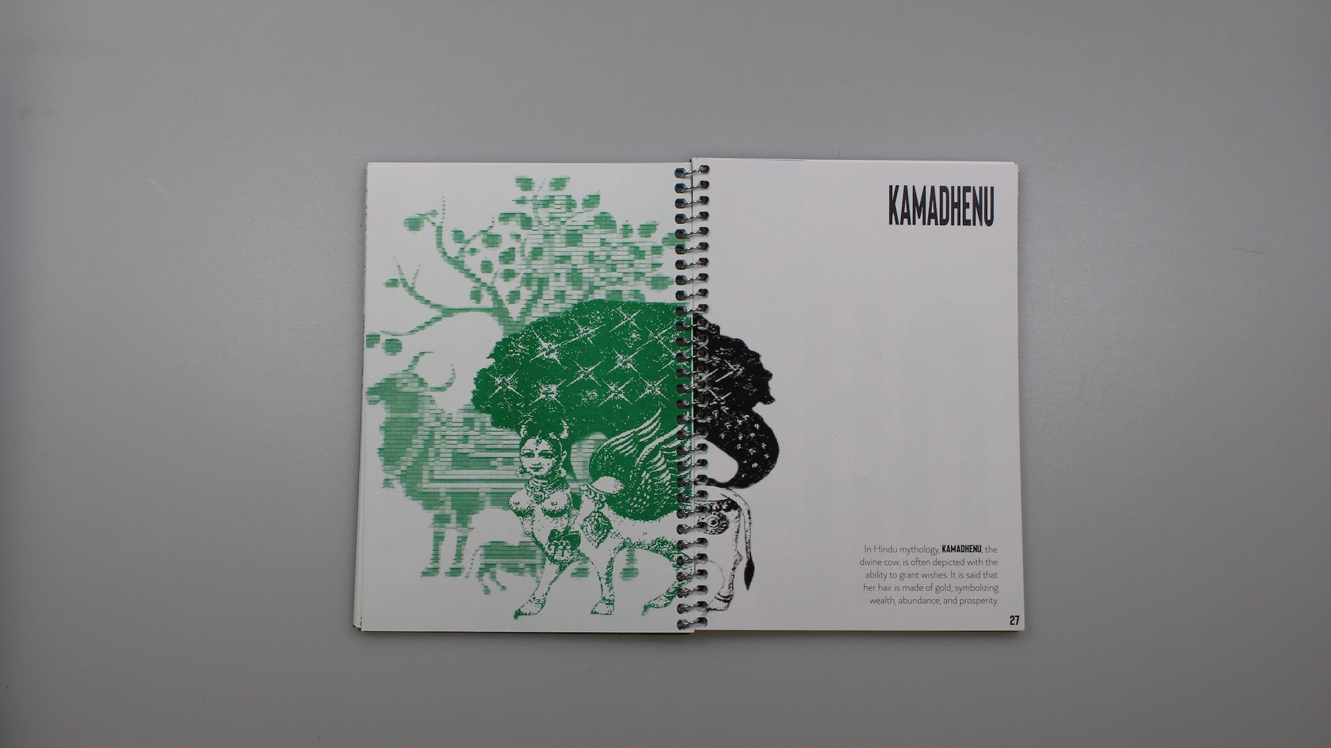
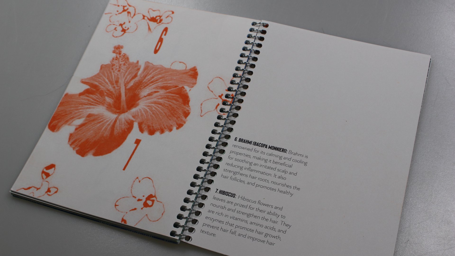
The ‘hairoot’ project represents an intricate and immersive exploration captured within the pages of a meticulously curated deep dive book. This ambitious endeavour, originating from the vision of a first-generation Belgian with Indian heritage, seeks to delve into the profound relationship between hair and Indian culture. Drawing inspiration from personal experiences and familial traditions, this project offers a profound glimpse into the cultural significance of hair within Indian society.
At its core, hairoot is a journey through the multifaceted tapestry of traditions, rituals, and beliefs that revolve around hair. From the spiritual reverence of hair in religious ceremonies to its role in shaping individual and communal identities, every aspect is meticulously examined to reveal the depth of cultural understanding passed down through generations.
Through a blend of captivating storytelling and rigorous research, hairoot aspires to encapsulate the essence of Indian heritage while honouring the diverse perspectives that define the nation. The book serves as a canvas for this narrative, combining riso printing and digital techniques to create a visually stunning and intellectually engaging experience for readers.
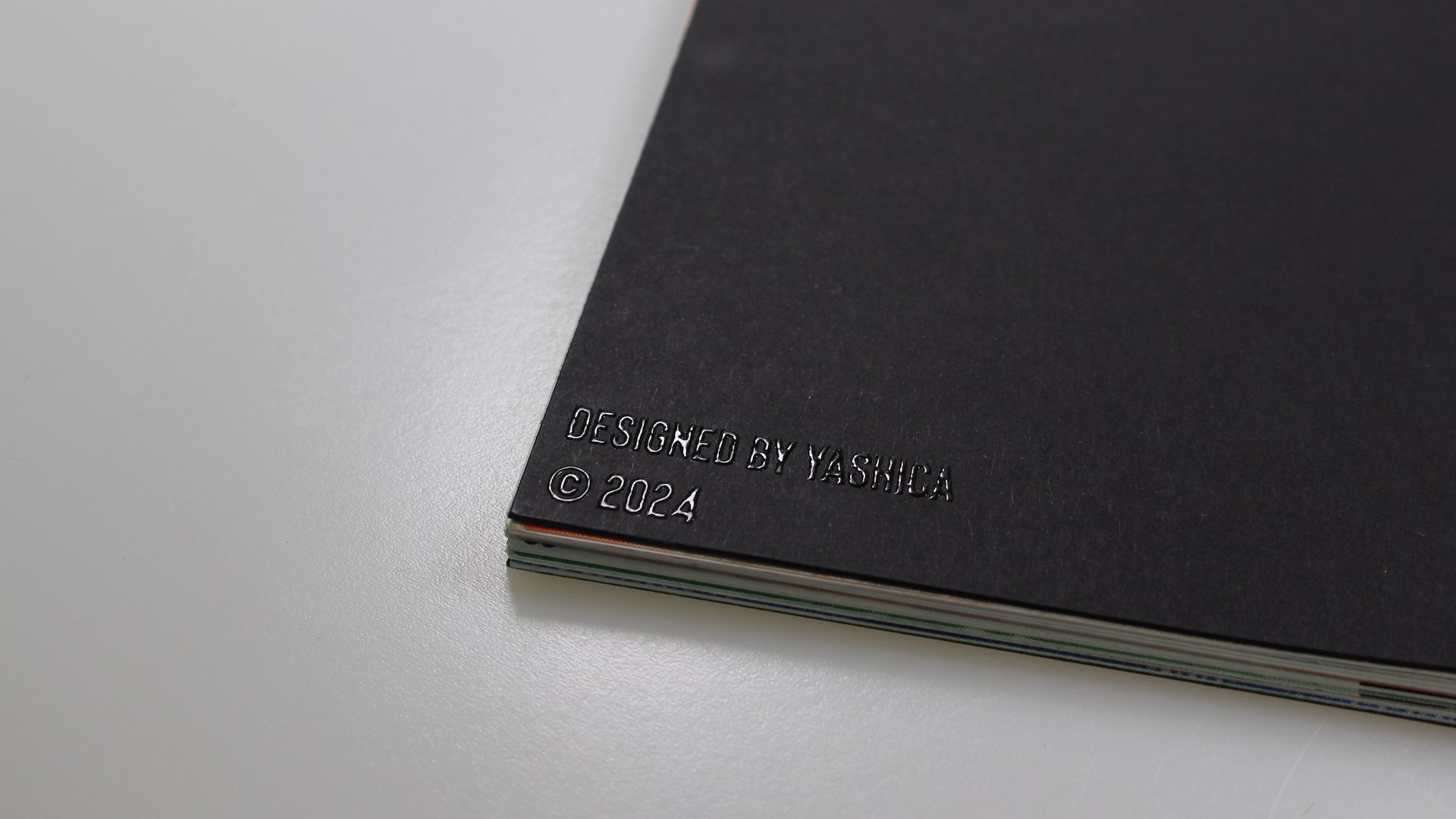
Enhancing the sensory allure of the project is the innovative use of thermographic powder to emboss the cover title. This tactile enhancement adds a tangible dimension to the book, inviting readers to engage with it on a physical level. The raised texture resulting from the powder application ensures that the cover stands out, beckoning readers to embark on a journey of discovery.
In addition to the printed pages, hairoot offers an interactive experience through a unique case crafted from hair. This tactile element serves as a tangible connection to the cultural heritage being explored, allowing readers to physically engage with the project and immerse themselves in its narrative.
Ultimately, hairoot transcends the boundaries of a traditional book, offering readers a deep dive into the rich tapestry of Indian culture and its profound relationship with hair.
‘Desire to Waste’ Brand Identity for V&A Event
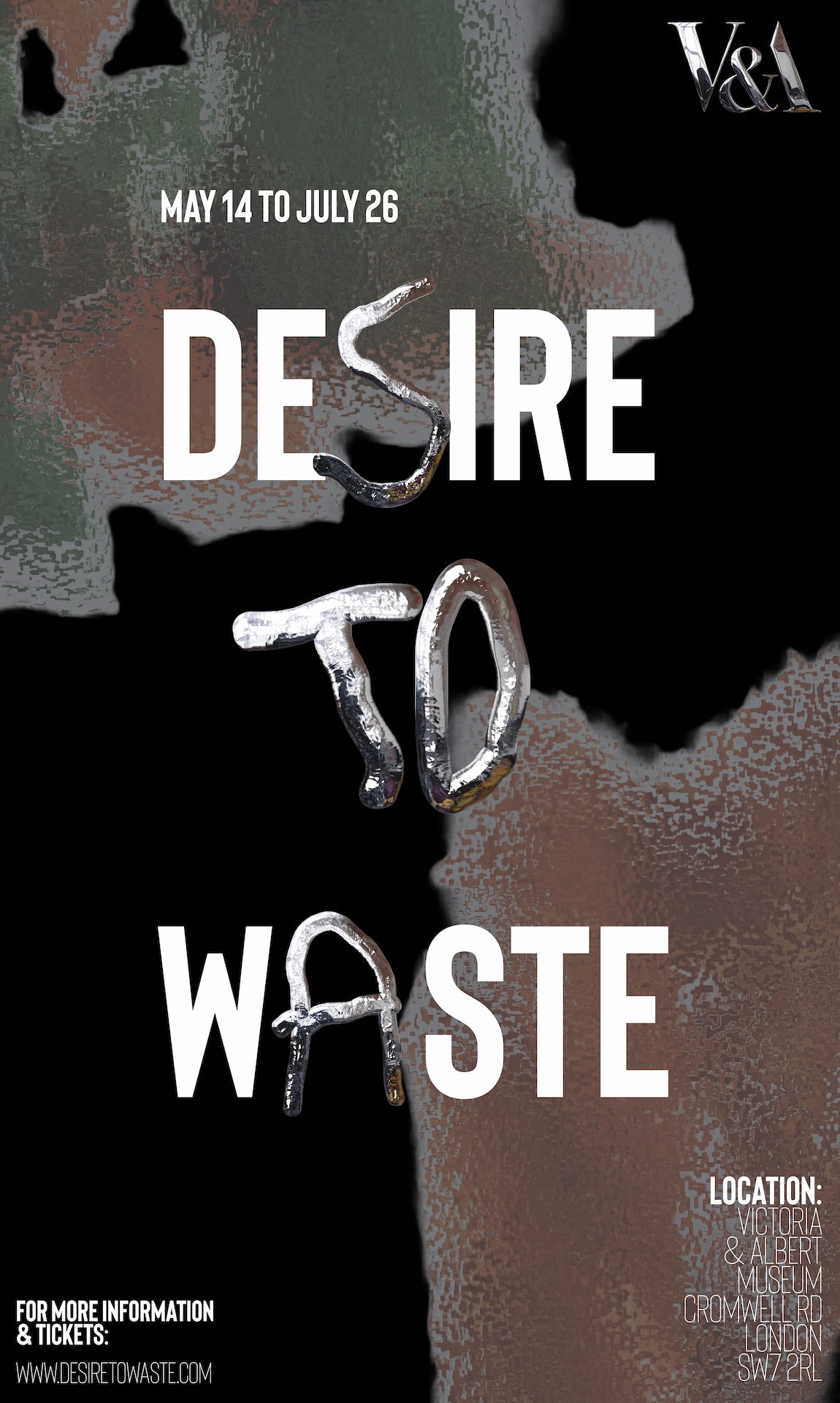
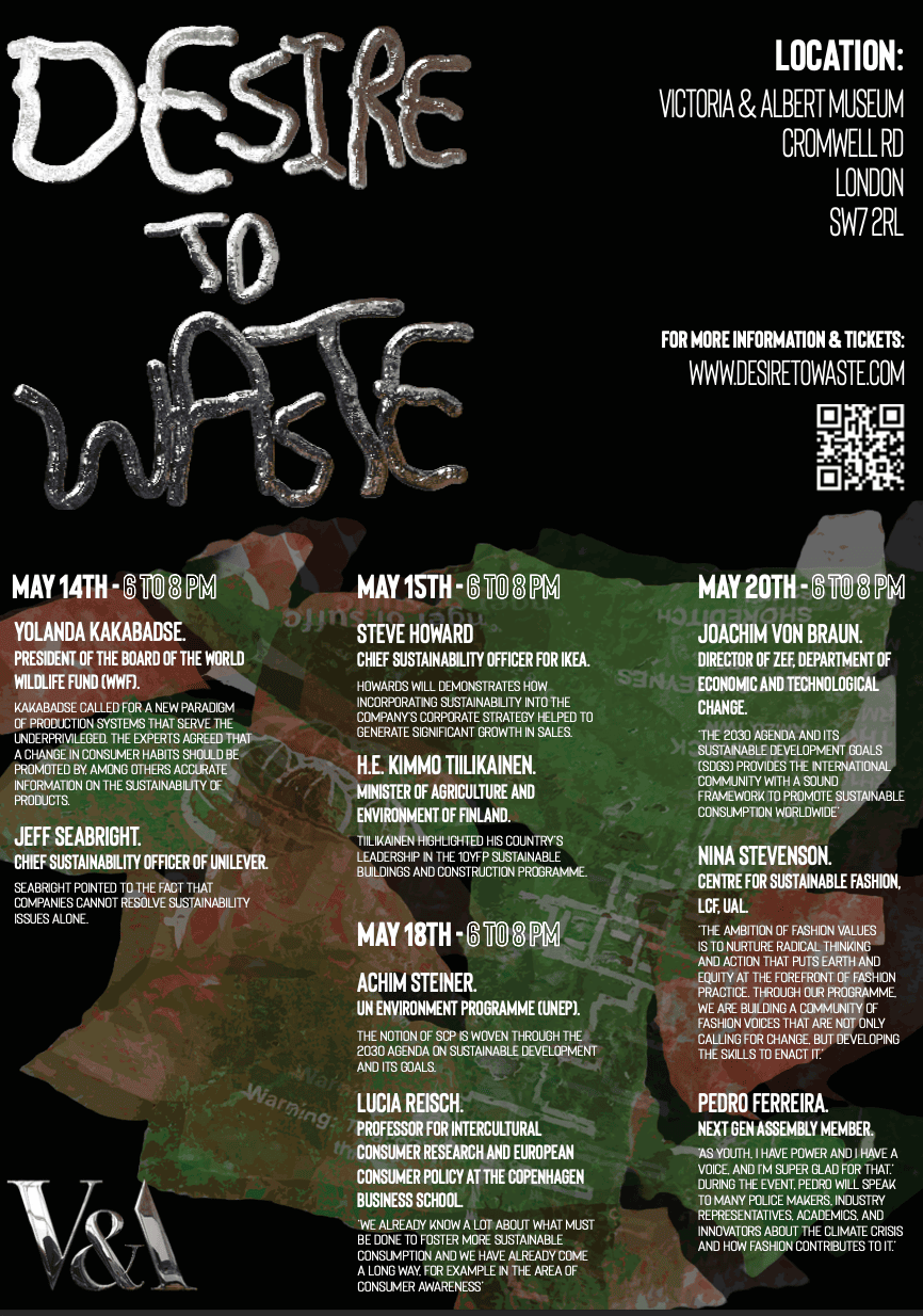
The ‘Desire to Waste’ exhibition, conference, and events series at the V&A presents a fictional yet thought-provoking exploration into the intricate journey from consumer desire to waste. Conceived as part of a wider project, this event concept delves deep into the mechanics of desire and its implications for sustainability.
Drawing inspiration from hypothetical insights provided by the Association for Consumer Research, the event concept underscores the passionate and often impulsive nature of consumer desire. It imagines the urgent need for behavioural change to address the overwhelming quantities of waste generated by human consumption patterns.
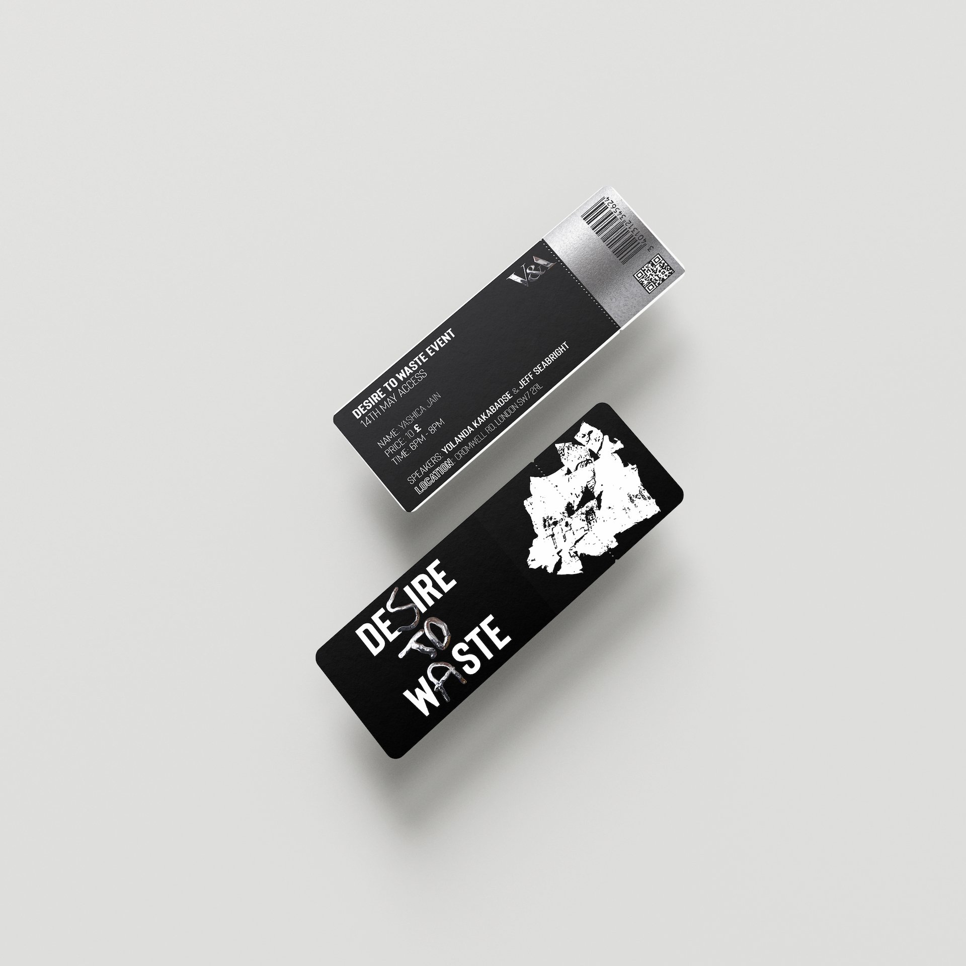
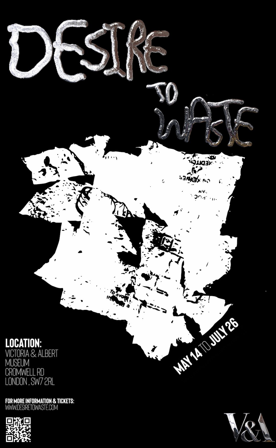
In developing the visual identity for this fictional event, I embarked on a journey of innovation and sustainability. By repurposing scrap materials to create fonts, backgrounds, and other design elements, I aimed to convey a powerful message about the intersection of desire and waste. Each element would tell a story of transformation, inviting viewers to reconsider the value of discarded materials and embrace a more conscious approach to consumption.
As part of this hypothetical endeavour, I crafted a custom metal typeface, infusing the design with a tangible sense of craftsmanship and authenticity. Additionally, I utilised melted plastic from waste bags to create striking background prints, further emphasising the theme of repurposing and renewal.
The resulting posters and invitation would be a compelling reflection of the commitment to sustainability and creative ingenuity. It would serve as an integral component of the brand experience for the ‘Desire to Waste’ event, inviting participants to engage with the complex dynamics of consumer desire and its impact on our hypothetical planet.
My Mom’s Eyes
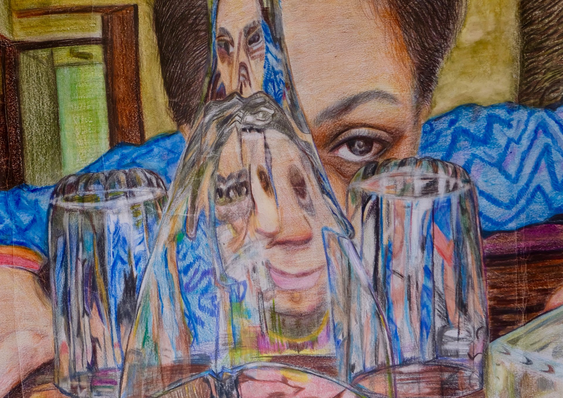
The ‘My Mom's Eyes’ project delves into the complexities of perception through a compelling still life drawing. This artwork navigates the nuanced concept of how individual experiences and events are subject to varying interpretations by different observers. Central to its theme is the recognition that life’s moments can be viewed through diverse lenses, resulting in a multiplicity of understandings.
Within this thought-provoking piece, viewers encounter a distinctive perspective. A feminine figure depicted in the drawing peers through distorted, patterned glass, revealing the intricate layers of emotion and sentiment hidden beneath the surface. This interplay between the viewer’s viewpoint and that of the figure underscores the subjective nature of perception, where each observer extracts unique insights from the same tableau.
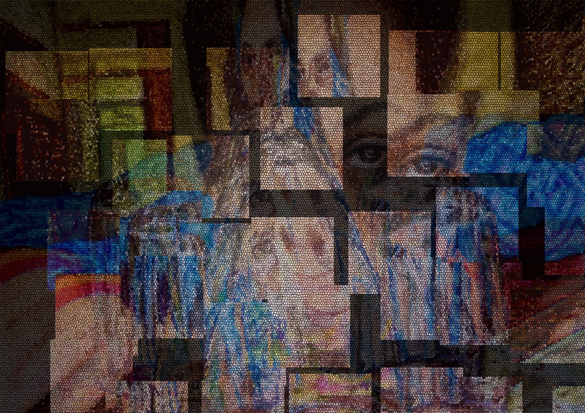
The transformation of the original hand-drawn still life into a graphic representation adds depth and richness to the artwork. Employing coloured pencils, every nuance of shade, dimension, and depth from the initial composition is meticulously replicated with precision and care. This level of craftsmanship revitalises the artwork, heightening its visual impact and inviting viewers to fully immerse themselves in its intricacies.
