Zhengyan Zhu
Email address
moc.liamg@212uhzeneriBiography
Hi there! I am Zhengyan Zhu, a designer who excels at integrating illustration and graphic design, dedicated to creating visually compelling and functional design pieces. I enjoy using colours and illustrations to tell stories, conveying clients’ brand messages and values through unique visual expressions. My work combines creativity with functionality, aiming to deliver a distinctive visual experience for every project.
Portfolio
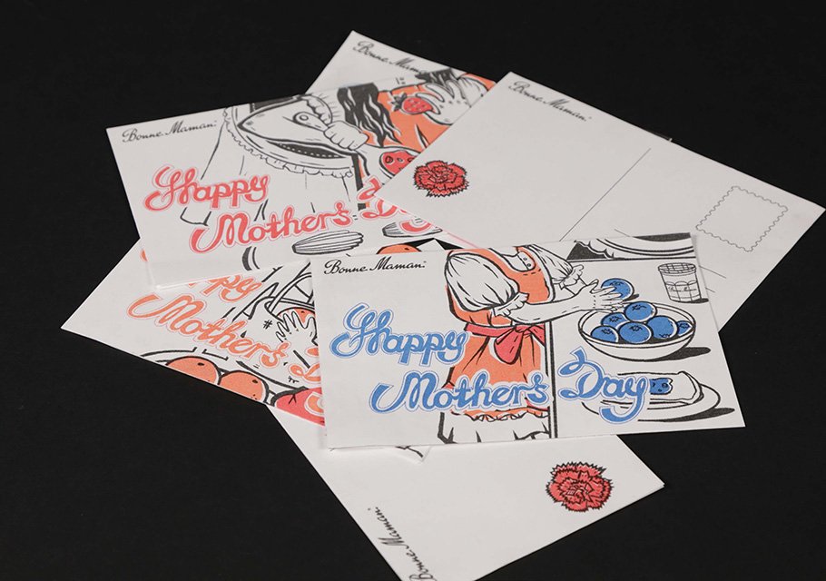
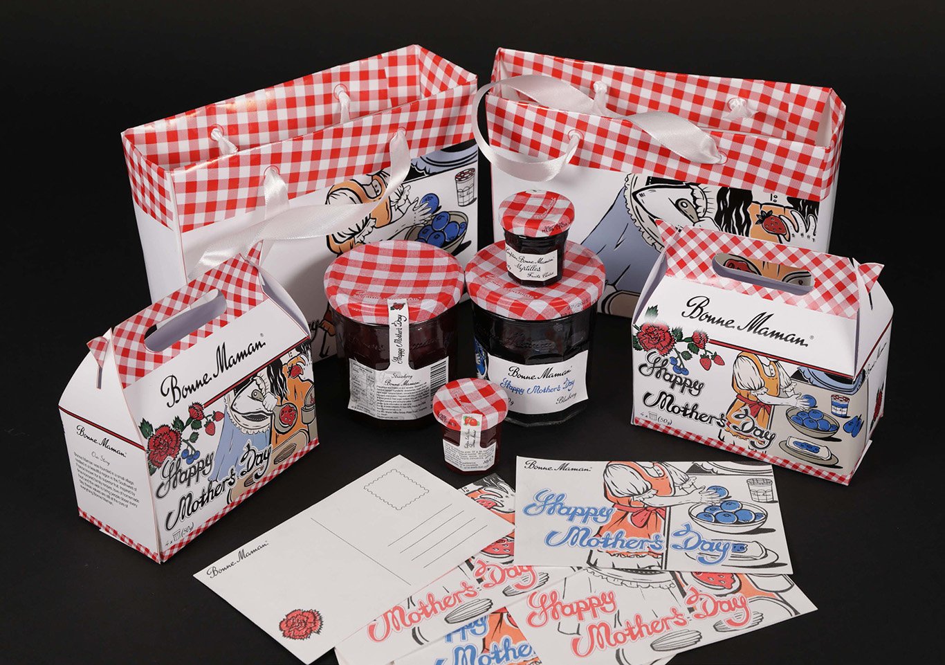
Bonne Maman’s Mother’s Day Limited Edition
Building on my investigation, I aim to create a connected brand project with a foundation in illustration.
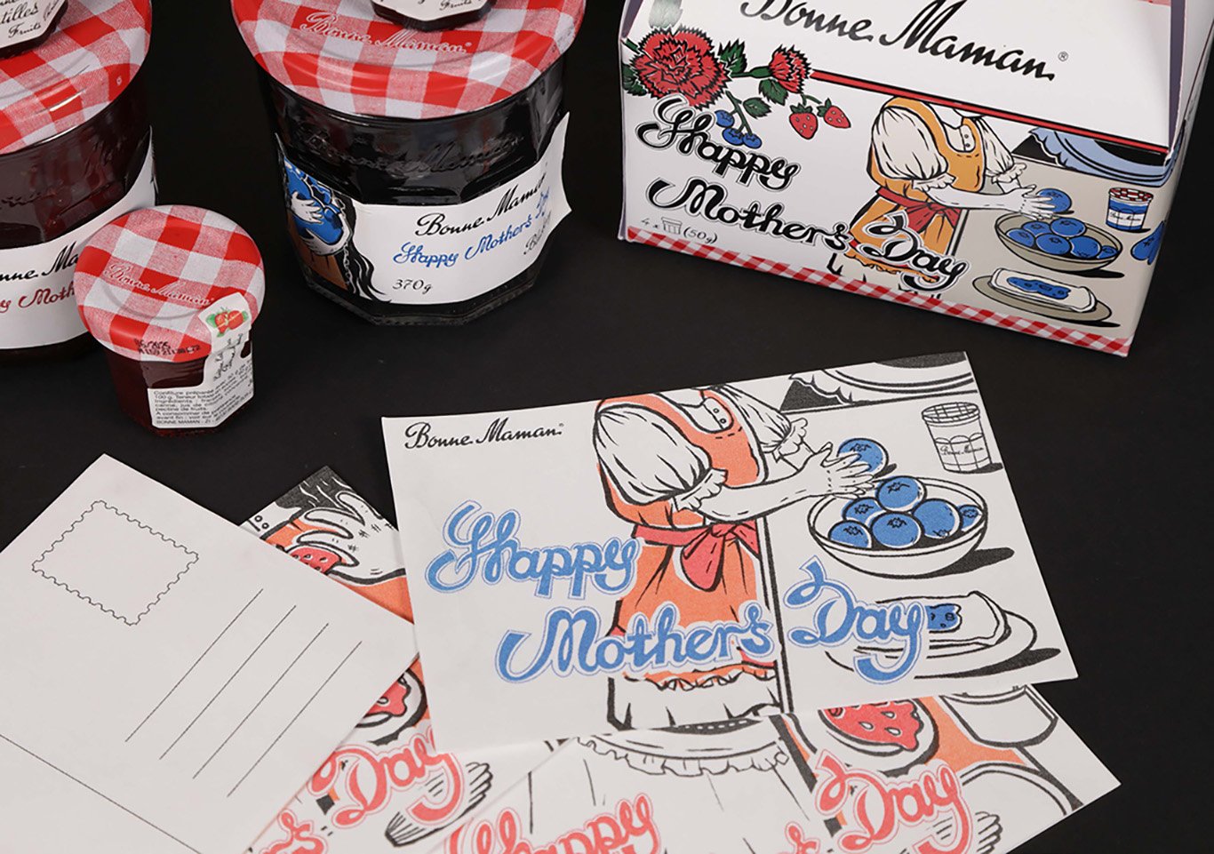
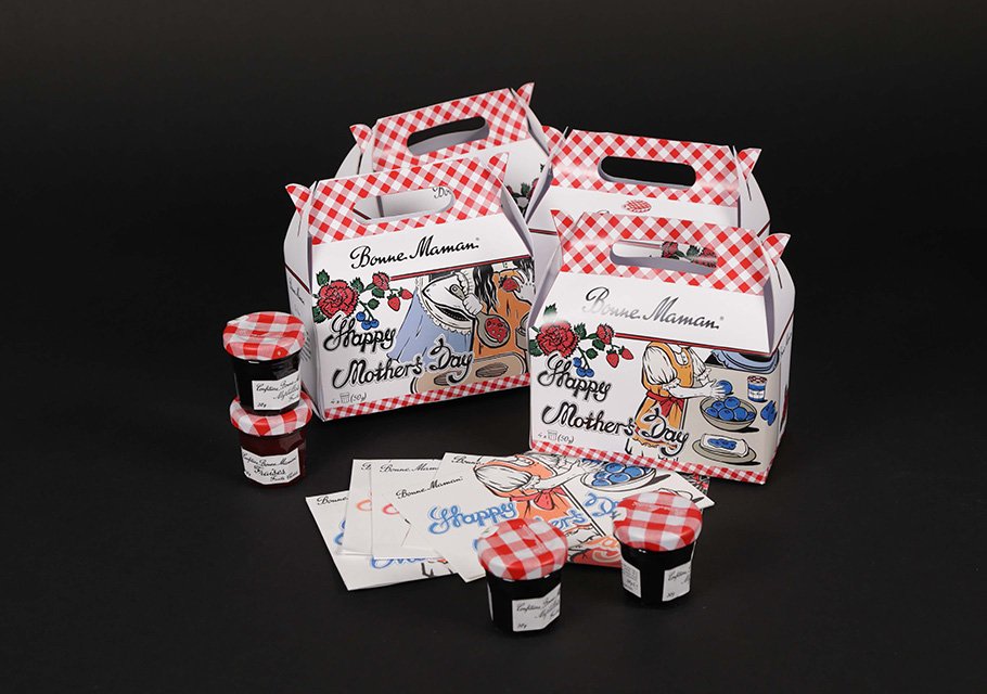
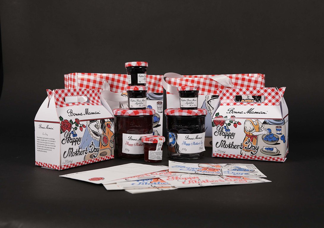
During primary research, I discovered Bonne Maman jam at a supermarket. The design of their jam is exceptionally minimalistic. The brand’s name translates to ‘mom’ in French. Inspired by the brand’s simple style, I intend to craft a Mother’s Day limited edition campaign for their jam with packaging reflecting the brand’s minimalistic aesthetic.
This brand has a distinctive design feature – the jam jar has no internal wrinkles, allowing users to easily scrape out all the jam. Additionally, the label design of the jam is easy to peel off. After using the jam, people can effortlessly remove the label and repurpose the jar elsewhere.
Thinking of my mom’s stamp collection hobby, where she used to cut stamps from letters and soak them in water to separate them from the paper, I envision designing the label in the form of a stamp. Stamps can be easily detached without affecting the jar’s usability. My design concept aims for people to use the stamp, save it, and send it to their mothers/family.
Small and Small Size
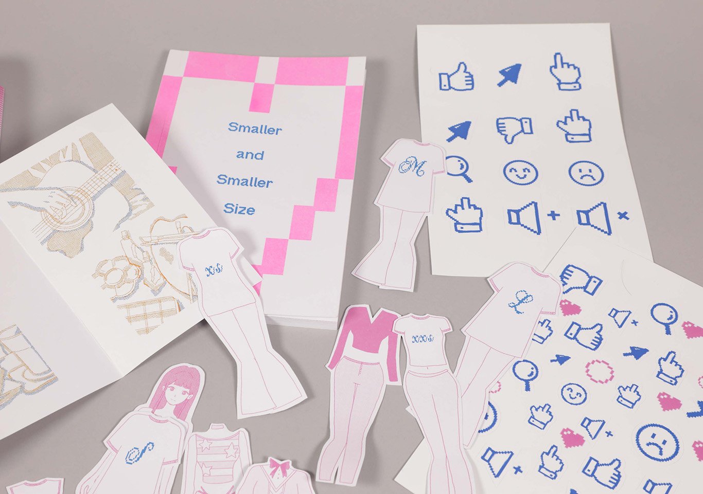
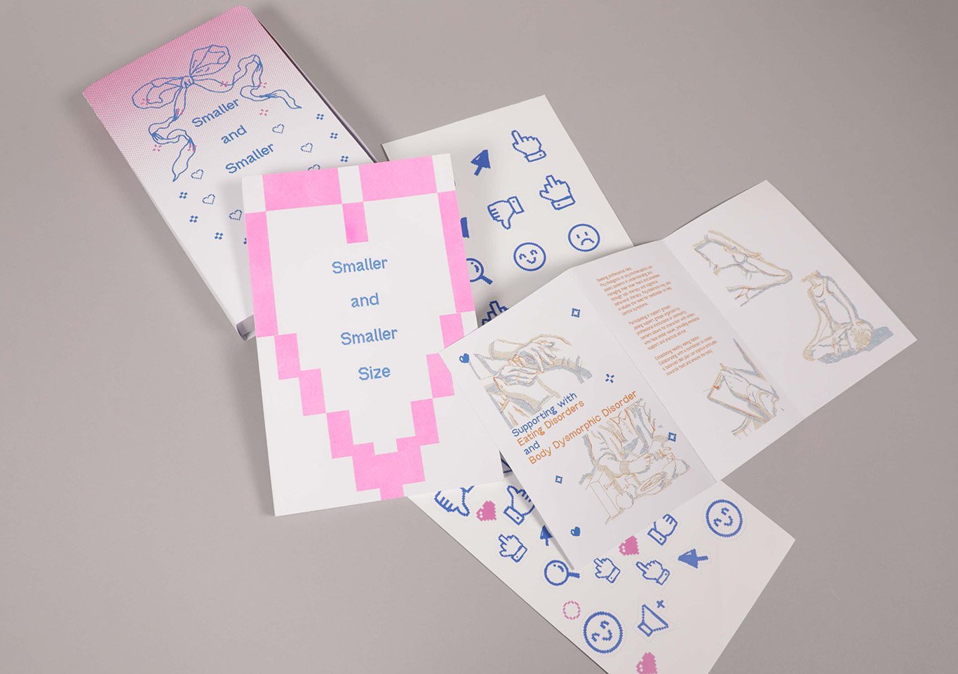
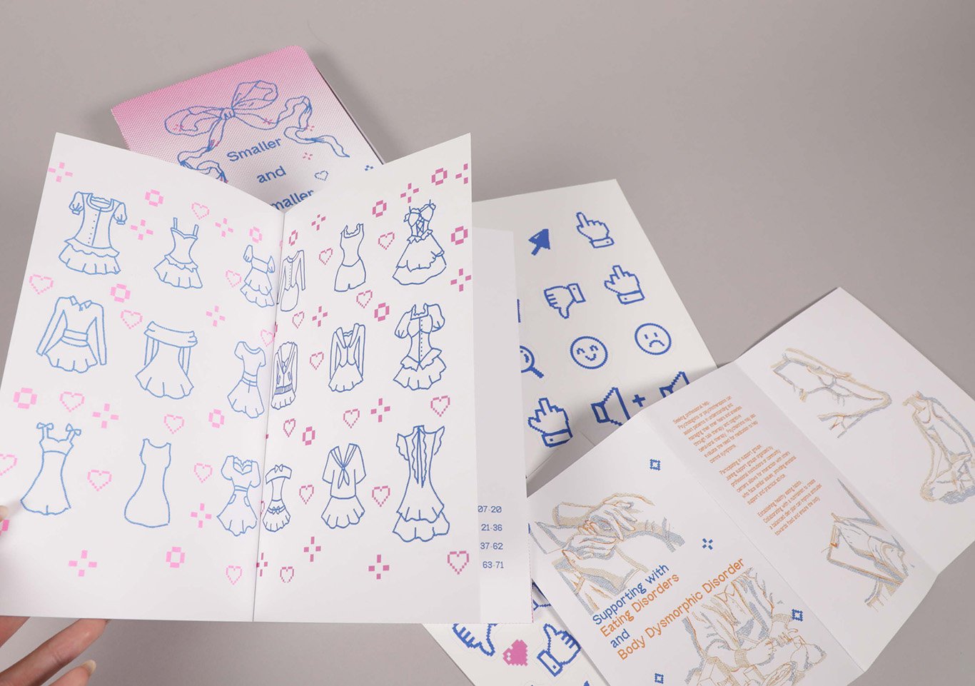
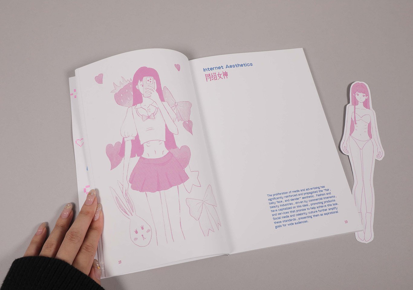
This project provided me with comprehensive experience in the editing and publishing process, from digital design to the final printed product. In this project, I explored the ‘Fair, Baby Face, And Slender’ aesthetic, which has led to increasingly smaller clothing sizes. The book talks about the societal expectations driving this aesthetic trend and highlights stories of individuals harming their bodies to meet these standards. It also addresses the concept of beauty labour, advocating for the acceptance of diverse beauty standards without compromising health.
Throughout the project, I experimented with various layout techniques to balance visual appeal and readability, which was a significant challenge. In the book design, I employed two different illustration styles to add more interest for readers.
For the printing, I used risography for the cover. I love the RGB colours produced by risography. I used the school’s print-finishing resources for perfect-binding, a binding method I tried for the first time. The handmade perfect-binding can open completely, which I found fascinating and ultimately chose for showcasing my book.
I also incorporated interactive elements into the final product, allowing readers to engage with the shrinking sizes through playful stickers. This project taught me how to maintain a balance between readability and visual appeal, which is crucial for facilitating the reader’s experience.

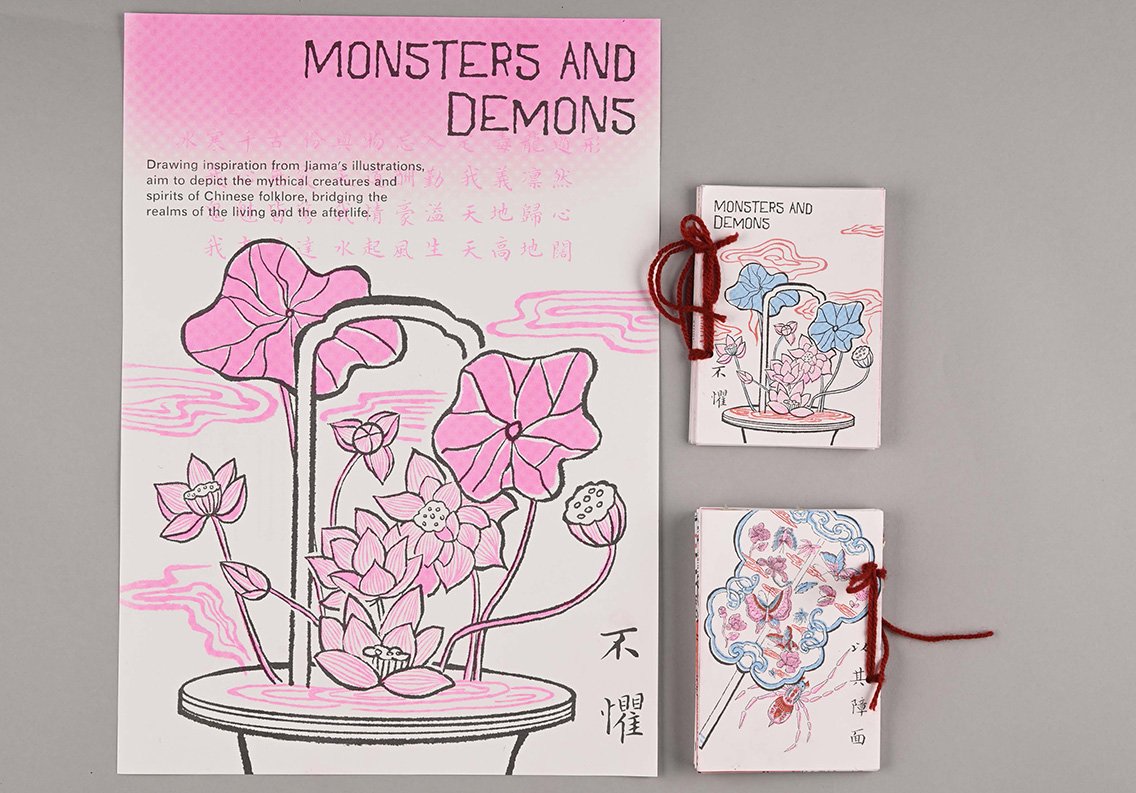
Monsters And Demons
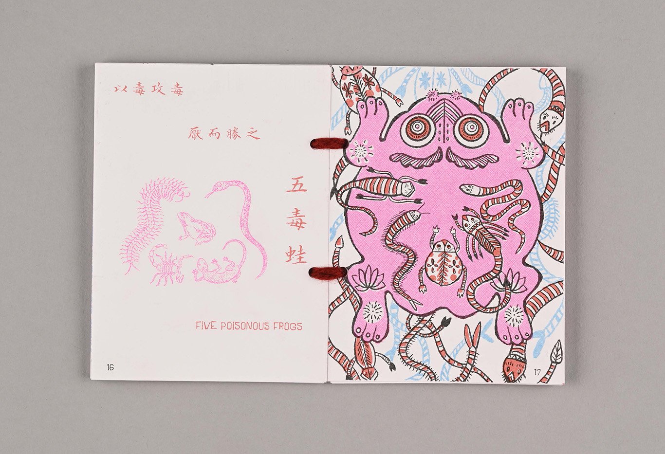
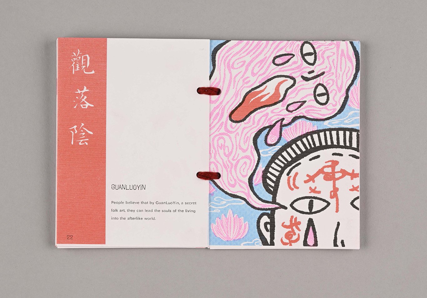
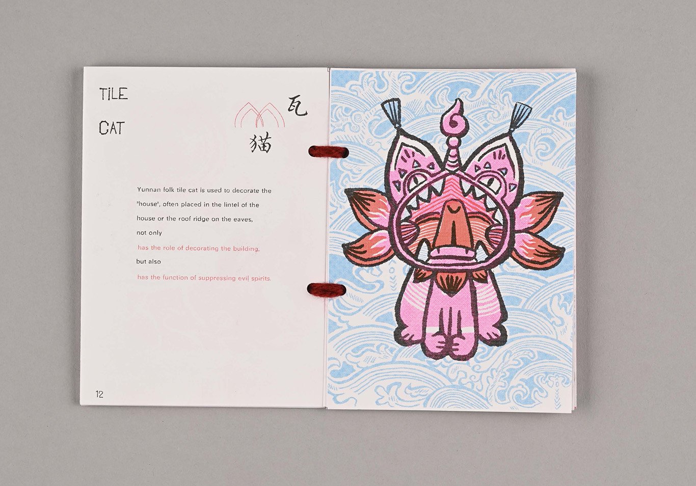
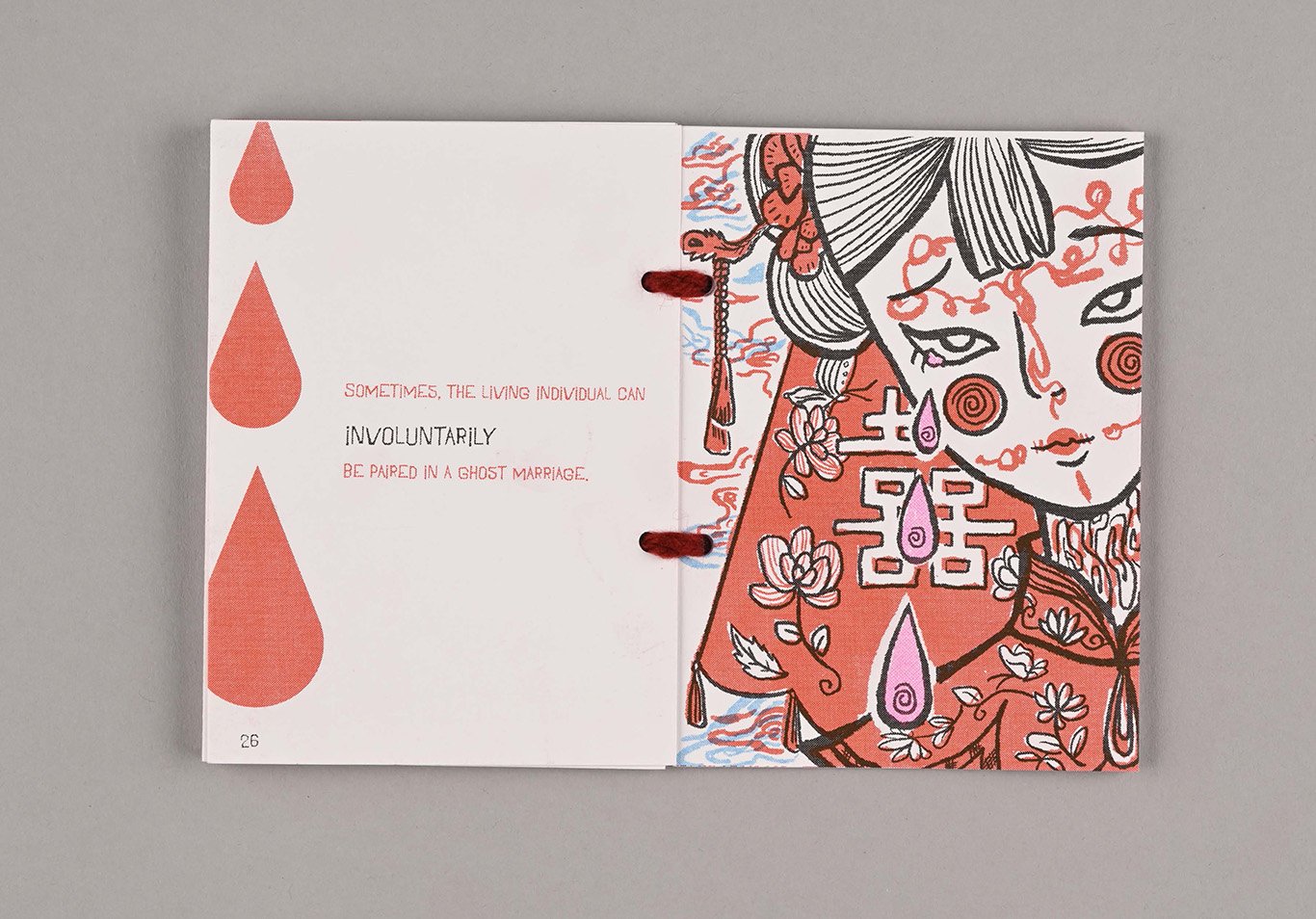
My project was inspired by my thesis, “Analysing Horror Mechanisms in 2D Video Games: A Case Study of ‘Detention’.” I explored the games ‘Detention’ and ‘Devotion’ from the same game company, drawing inspiration from their use of traditional Chinese horror elements. My research delved into people’s beliefs in folk religions and their aspirations for the afterlife. I also gathered visual inspiration from the Jiama tradition of Yunnan, the Rlung Rta of Tibet, and the custom of burning paper money.
I aimed to explore various handmade paper mediums and create illustrations in the Jiama style, investigating what aspects of the death process evoke fear in me. I collected traditional folk horror stories and attempted to visualise them in the Jiama style. For printing, I used Risograph, which represents high saturation colours in an excellent way. In this edition, I experimented with a yarn-sewn binding method that not only gives a vintage feel but also allows my book to lay flat at 180 degrees.
In this book, I used the lotus as the design pattern for both the cover and the poster. Buddhism views the physical world as a muddy morass, and those with aspirations should strive to practice without contamination, withstand temptation, transcend the mundane, and achieve a state of purity, unobstructed. I hope the sacred image of the lotus contrasts sharply with the dark, corrupt themes in the horror stories. This contrast emphasises themes of purity versus corruption, good versus evil, or the corruption of innocence. Visually, the serene image of the lotus juxtaposed with horror elements can create a sense of irony or unease.
