Ziwen Kong (Zoe)
Email address
moc.kooltuo@gnoknewizWeb Portfolio
www.instagram.com/zoekongzwBiography
Ziwen Kong (Zoe Kong) is a graphic designer who comes from China.🥟 She likes all cute things and loves to try various media and materials.👁🗨 She believes that design is one of the best way to express herself.🗯 For both final major projects, she focused on social design.🌍 Using her own observation and research, to give an answer and attitude to social issues.🔫 Rather than doing delicate but empty designs, she prefers rough but alive designs. ⚖️ Now she is looking for a way to enter the commercial design field.
Let’s say, everything is moving forward in the reaching!🛸
Portfolio
The World’s Best Dinner
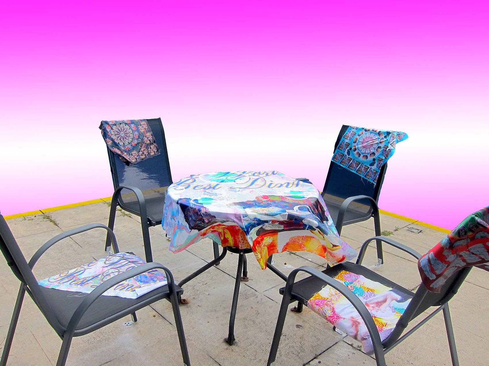
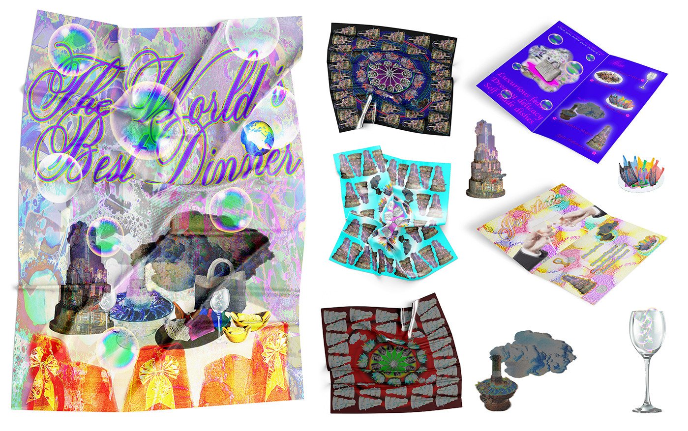
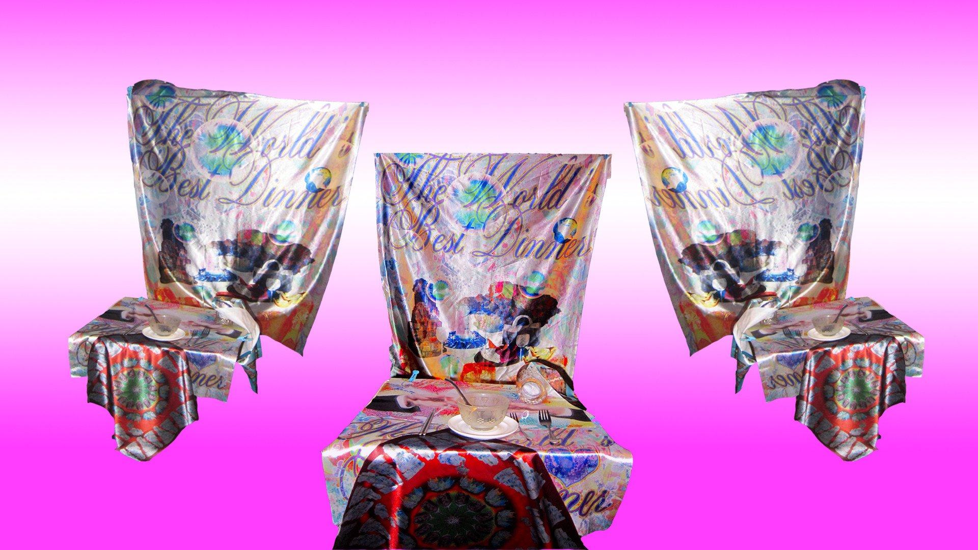
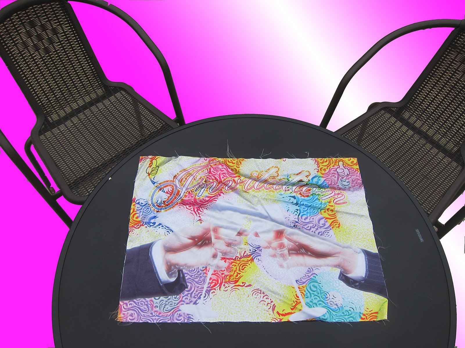
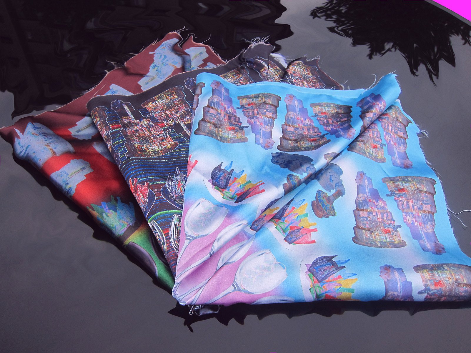
The World’s Best Dinner uses an ironic tone, in the form of illustrations and installations to warn of environmental problems in the process of urban development. The motivation for this project comes from my personal reflection on city life. For the sustainable issues that are sacrificed and neglected in the process of urban development: light pollution, excessive use of plastic, the desire brought by consumerism, and the negative impact of industrial production. These are issues that we often mention and ignore. We need to do something from this moment, otherwise we will eat our own bitter fruit and it will be our last supper.
stop distractions!
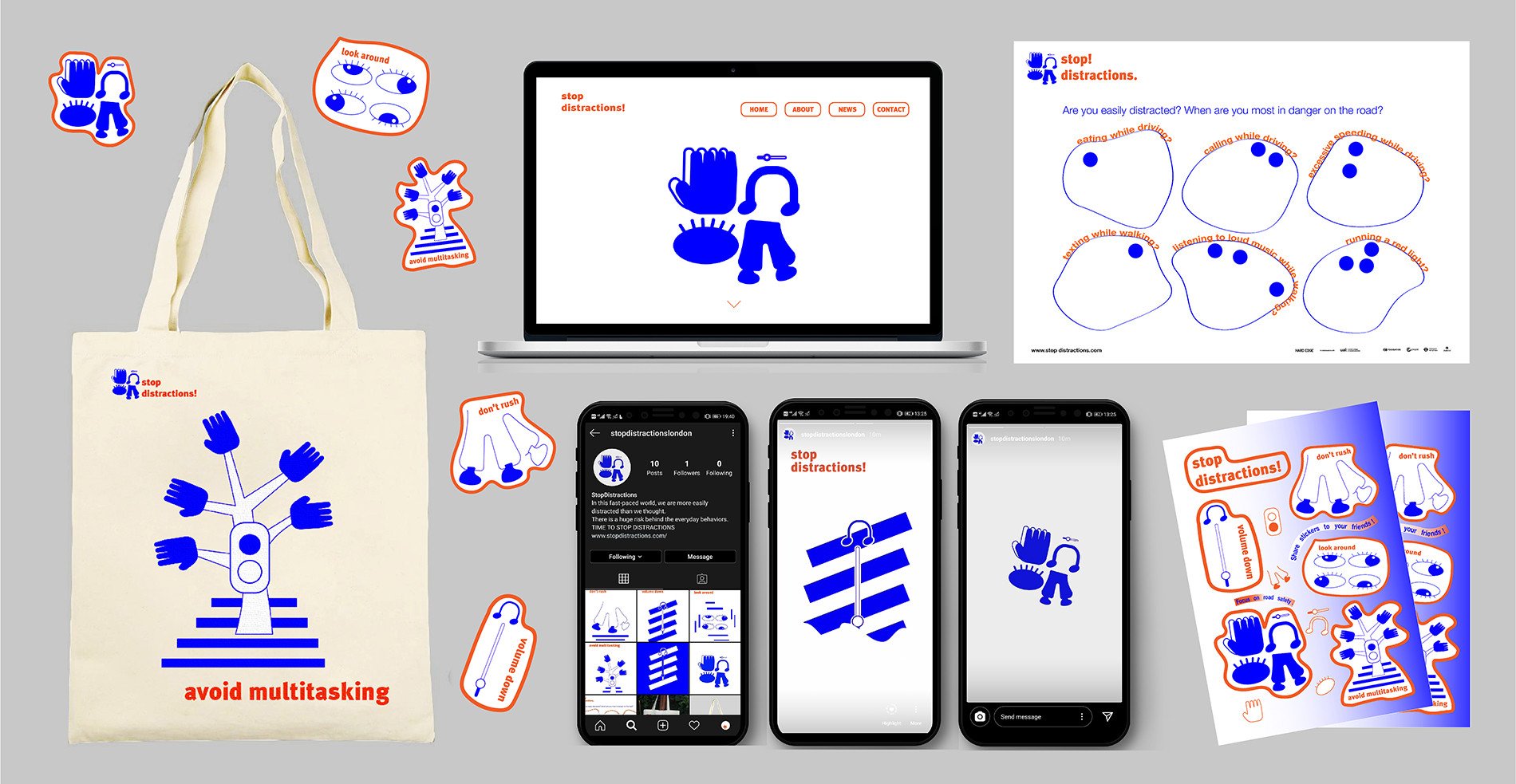
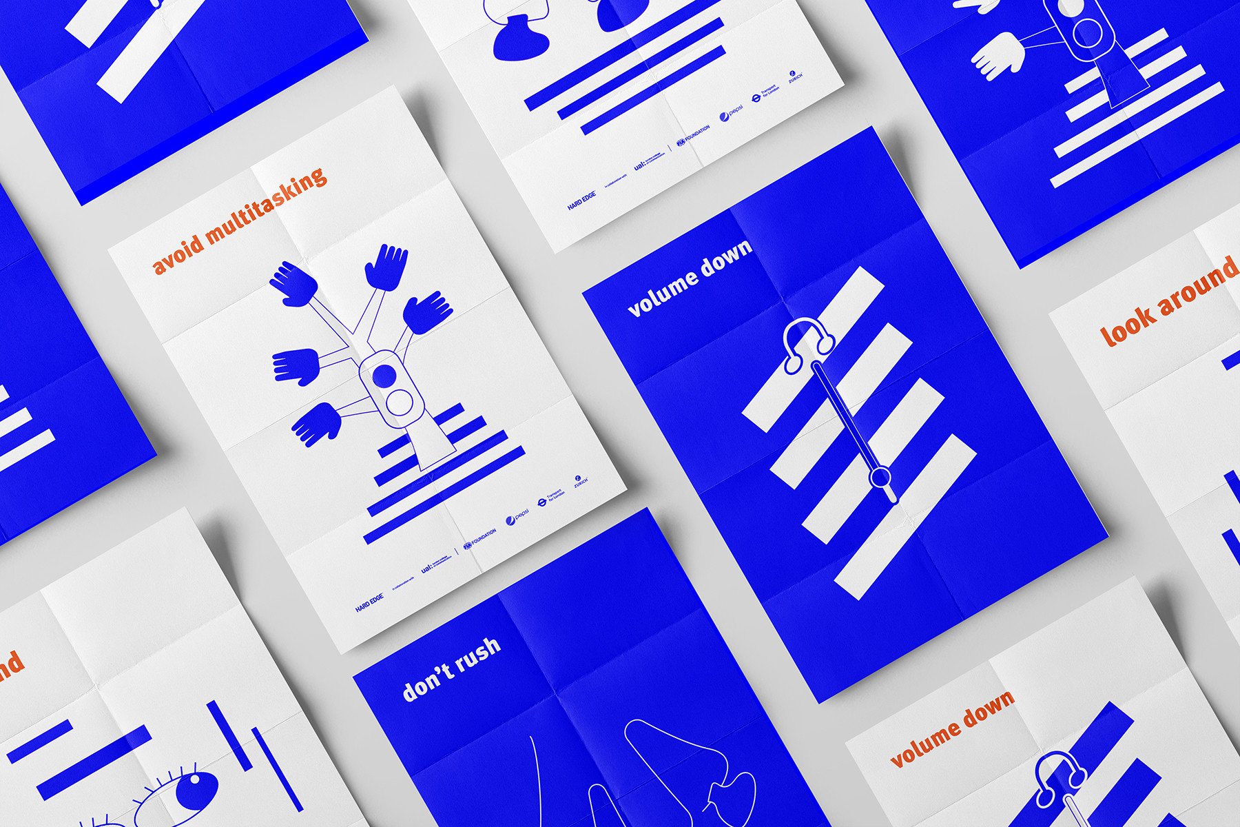
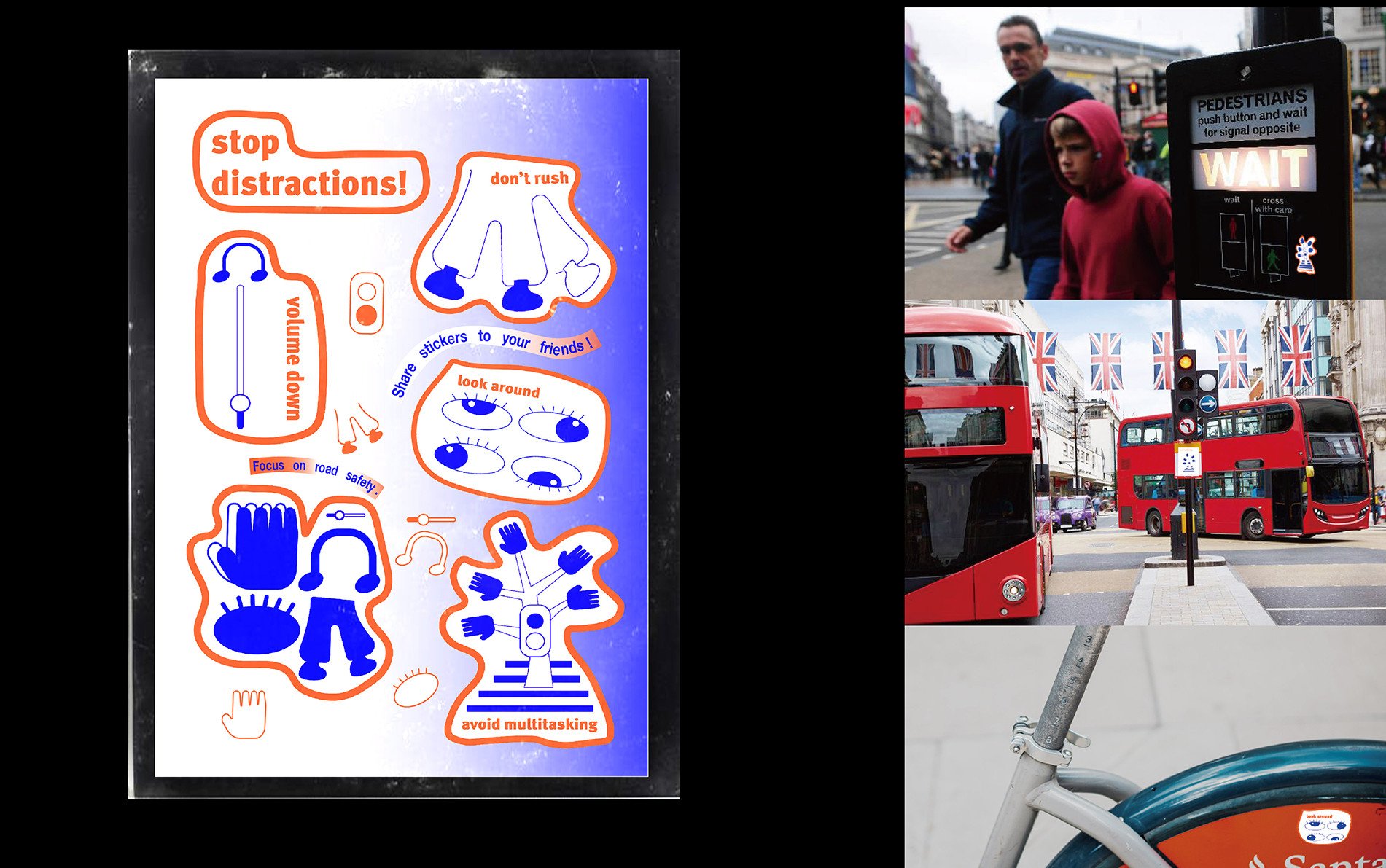
The 2020 Re:act brief challenged students to create a campaign promoting awareness to 18-25 year old road users that distraction is a serious road safety issue. 'stop distractions!' campaign aims to use concise visual language to convey short and powerful logical information. In particular, the campaign has strong messages and rich products, both in online and offline developments.
My strategy was to create a campaign with short and powerful messages, using a vivid and clear visual language. In order to communicate the message more effectively and make it easier for young audiences, I used colloquial language to create one primary messages and four logical phrases.
The first message, 'stop distractions!' became the face and logo of the campaign. The exclamation mark and negative tone are used to attract attentions. This message highlighted that in this fast-paced world, we are more easily distracted than we thought. We eat when we walk, call when we drive, and wear headphones when we ride. There is a huge risk behind our everyday behaviours. It's time to stop distractions!
The four phrases, 'avoid multitasking', 'volume down', 'look around', 'don't rush', is a logical sequence of information. In order to encourage our young audience to pay attention to distractions on the road and provide the practical solutions.
peekaboo
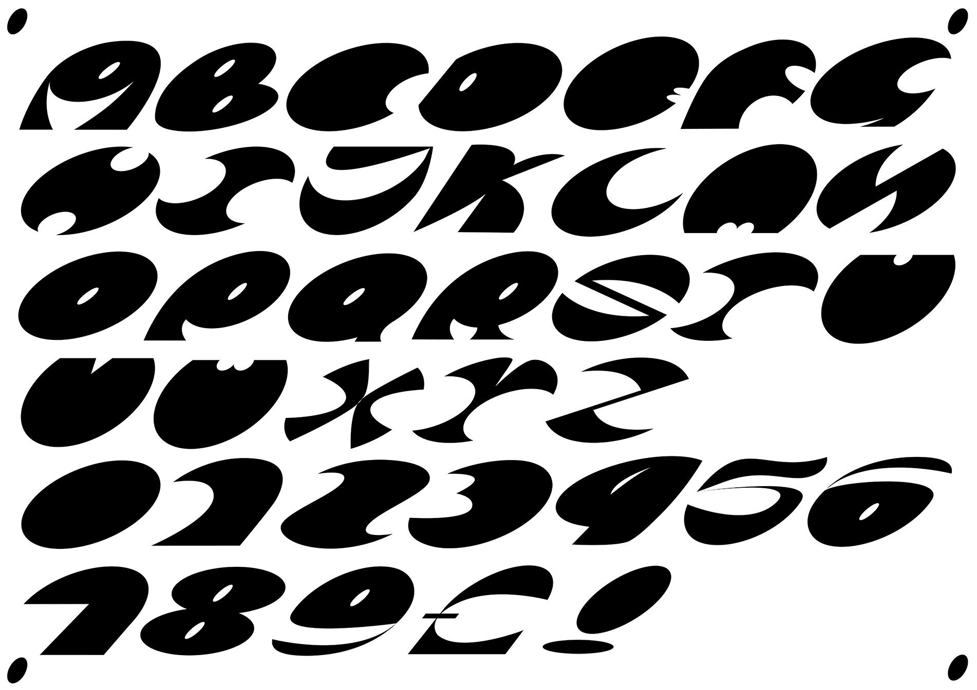
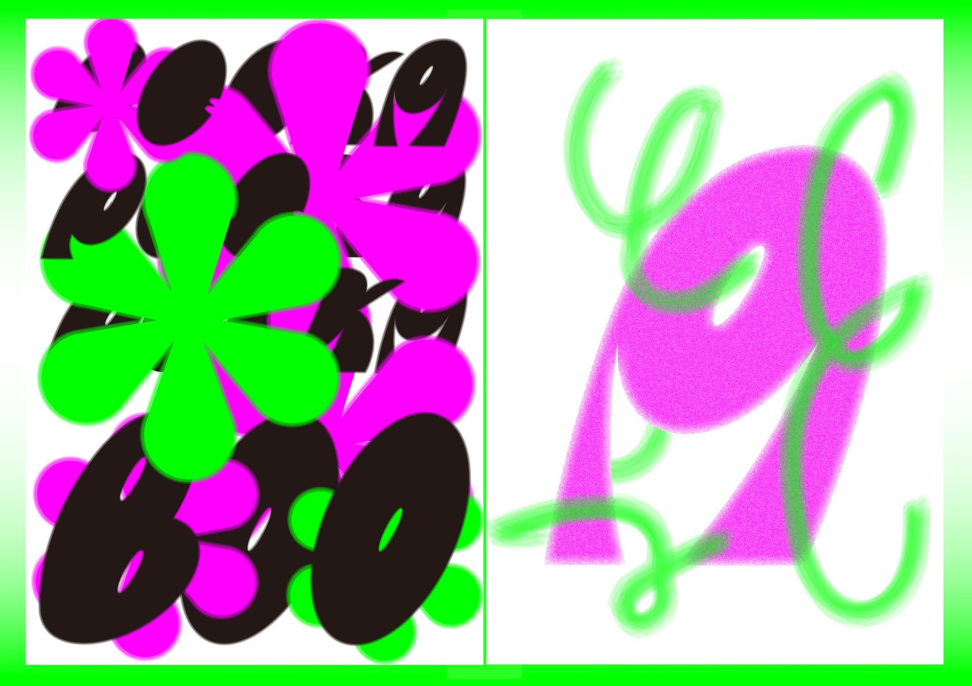
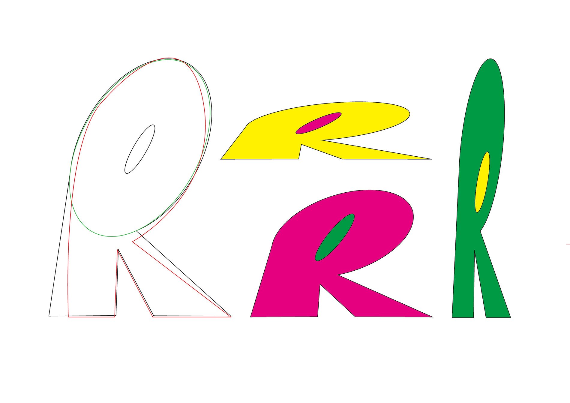
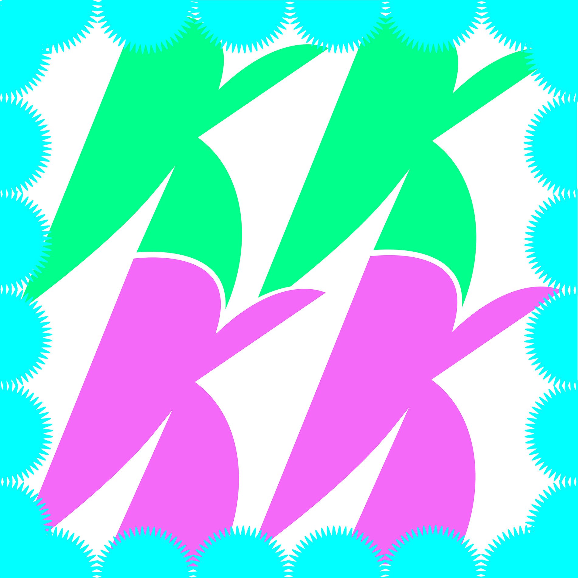
Peekaboo is a playful and cute font, inspired only by a "0", each font is cut from a part of 0. Just like playing hide-and-seek with 0.
